pacman::p_load(GGally, parallelPlot, tidyverse)Chapter 15: Visual Multivariate Analysis with Parallel Coordinates Plot
Hands-on Exercise 5
15 Visual Multivariate Analysis with Parallel Coordinates Plot
15.1 Overview
A parallel coordinates plot (PCP) draws each variable as a parallel vertical axis and each observation as a polyline crossing all axes. PCPs are common in academic and scientific work but less common in business communication, and are more useful for exploratory work than for explanatory communication. This chapter covers static PCPs with ggparcoord() from GGally and interactive ones with parallelPlot.
15.2 Installing and Launching R Packages
Three packages are required:
- GGally for
ggparcoord(), the static parallel coordinates plot - parallelPlot for interactive parallel coordinates plots via D3
- tidyverse for data manipulation
15.3 Data Preparation
The same World Happiness Report 2018 dataset used in Chapter 14 is reused here.
wh <- read_csv("data/WHData-2018.csv")15.4 Plotting Static Parallel Coordinates Plot
15.4.1 Plotting a Simple Parallel Coordinates
The minimal call passes a data frame and a column index range.
ggparcoord(data = wh,
           columns = c(7:12))
NoteThings to learn from the code chunk above
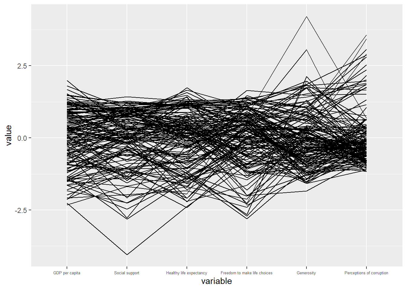
columns = c(7:12) selects the six explanatory variables that contribute to the happiness index. Each line is one country, and each axis is one variable scaled to the 0 to 1 range by default.
TipReading the plot
The basic plot reveals only that the variables span their expected ranges. Without colour or transparency, individual countries are indistinguishable. This is the typical first iteration: a plot that confirms the data loaded correctly but provides no analytical insight.
15.4.2 Plotting Parallel Coordinates with Boxplot
A more informative variant adds region grouping (via colour), uniform scaling, alpha blending, and an overlaid boxplot.
ggparcoord(data = wh,
           columns = c(7:12),
           groupColumn = 2,
           scale = "uniminmax",
           alphaLines = 0.2,
           boxplot = TRUE,
           title = "Parallel Coordinates Plot of World Happiness Variables")
NoteThings to learn from the code chunk above
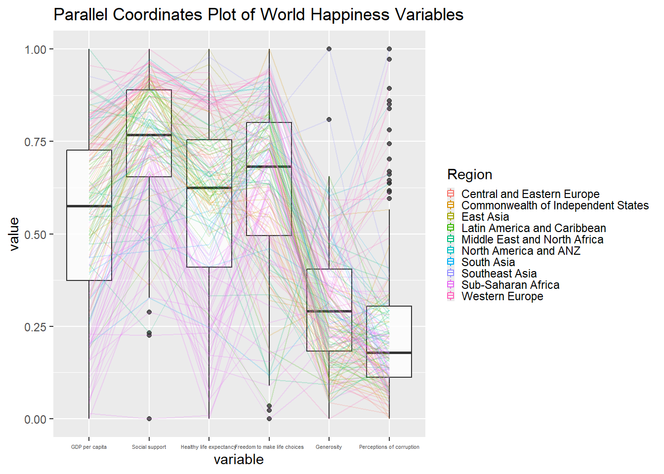
groupColumn = 2 colours each line by region (column 2 of wh). scale = "uniminmax" rescales each variable to the 0 to 1 range so variables with large values do not dominate. alphaLines = 0.2 makes lines partially transparent, which is essential for PCPs to reveal where lines stack densely. boxplot = TRUE overlays a boxplot at each axis, giving the marginal distribution as a reference.
TipReading the plot
With colour, regional patterns start to emerge. Sub-Saharan African lines tend toward low values across most variables. Western European lines tend toward high values. The boxplots provide a reference for typical so individual lines can be judged as ordinary or unusual.
15.4.3 Parallel Coordinates with Facet
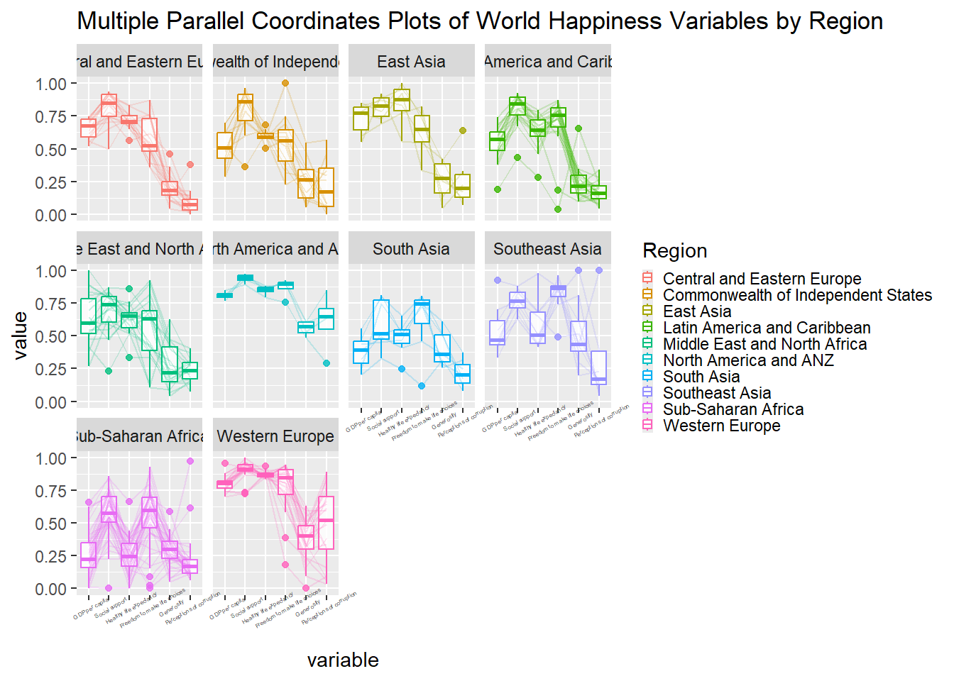
Faceting separates the regions into small multiples, removing the overplotting at the cost of losing the cross-regional comparison in a single panel.
ggparcoord(data = wh,
           columns = c(7:12),
           groupColumn = 2,
           scale = "uniminmax",
           alphaLines = 0.2,
           boxplot = TRUE,
           title = "Multiple Parallel Coordinates Plots of World Happiness Variables by Region") +
  facet_wrap(~ Region)
NoteThings to learn from the code chunk above
facet_wrap(~ Region) produces one PCP panel per region. Some axis labels overlap, which the next iterations rotate to fix.
15.4.4 Rotating x-axis Text Label
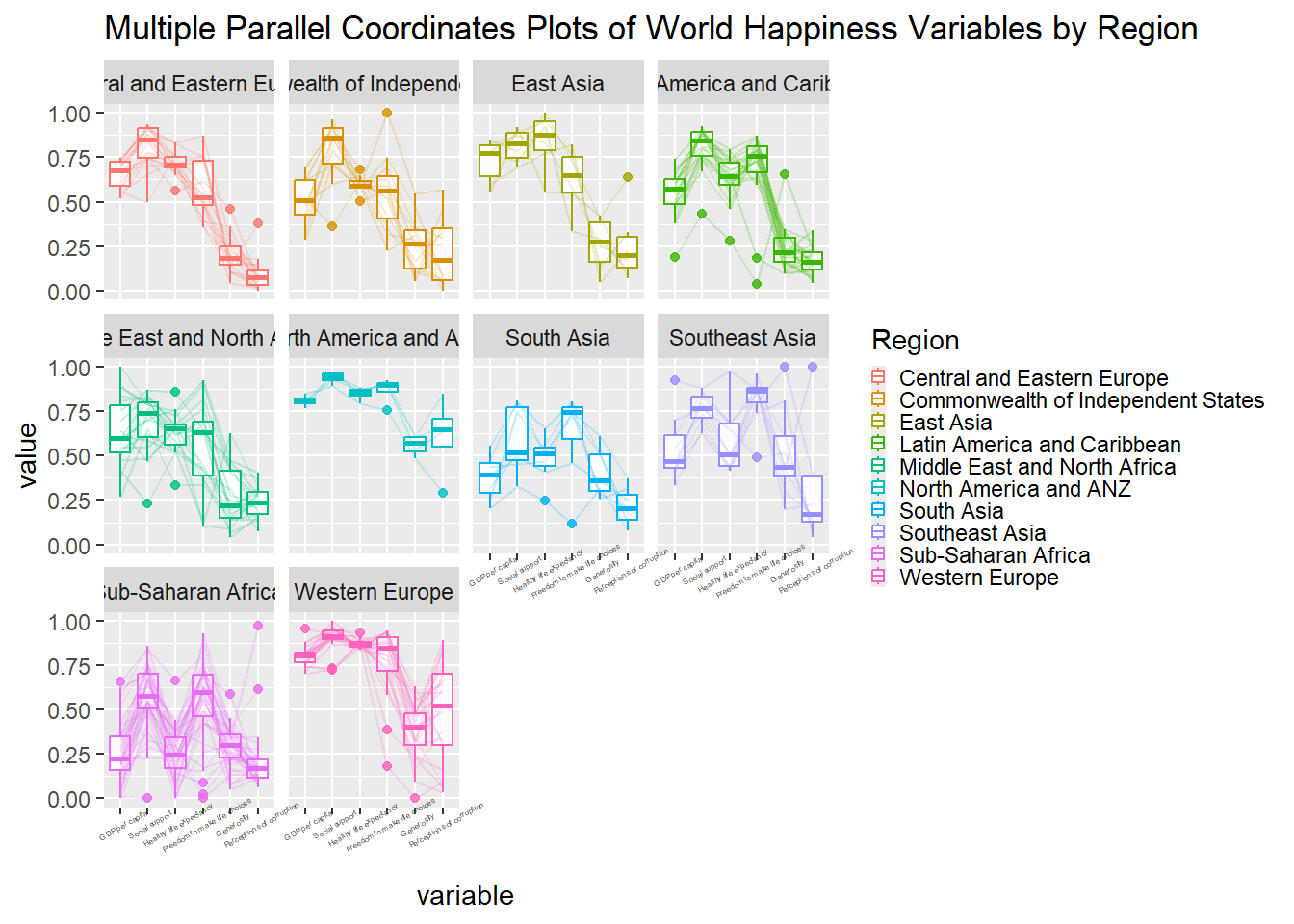
Rotating the labels by 30 degrees reduces overlap.
ggparcoord(data = wh,
           columns = c(7:12),
           groupColumn = 2,
           scale = "uniminmax",
           alphaLines = 0.2,
           boxplot = TRUE,
           title = "Multiple Parallel Coordinates Plots of World Happiness Variables by Region") +
  facet_wrap(~ Region) +
  theme(axis.text.x = element_text(angle = 30))
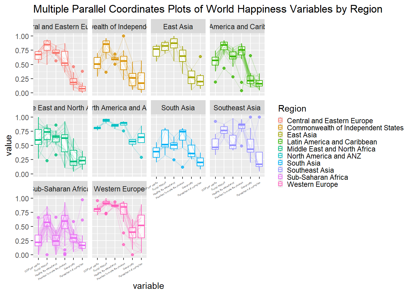
15.4.5 Adjusting the Rotated x-axis Text Label
Rotation alone causes labels to drift into the plot area. Setting hjust = 1 right-aligns the labels at the axis tick.
ggparcoord(data = wh,
           columns = c(7:12),
           groupColumn = 2,
           scale = "uniminmax",
           alphaLines = 0.2,
           boxplot = TRUE,
           title = "Multiple Parallel Coordinates Plots of World Happiness Variables by Region") +
  facet_wrap(~ Region) +
  theme(axis.text.x = element_text(angle = 30, hjust = 1))
NoteThings to learn from the code chunk above
axis.text.x = element_text(angle = 30, hjust = 1) rotates labels by 30 degrees and right-aligns them, preventing both label overlap and intrusion into the plot area.
15.5 Plotting Interactive Parallel Coordinates Plot: parallelPlot Methods
parallelPlot builds D3-based interactive PCPs that support brushing axes and dynamically reordering them.
15.5.1 The Basic Plot
The basic call requires a data frame with the variables of interest.
wh_pcp <- wh %>%
  select("Happiness score", c(7:12))

parallelPlot(wh_pcp,
             width = 320,
             height = 250)
NoteThings to learn from the code chunk above
parallelPlot() produces an HTML widget. Hovering, brushing, and axis reordering are supported interactively. Brushing on one axis filters the data displayed on all other axes. Some axis labels are too long to fit, motivating the rotateTitle argument in the next section.
15.5.2 Rotate Axis Label
rotateTitle = TRUE rotates the axis labels to prevent overlap.
parallelPlot(wh_pcp,
             rotateTitle = TRUE)
TipReading the plot
Clicking any axis recolours the lines by that variable’s value. Clicking on Happiness Score, for example, shows lines coloured from low (red) to high (blue), making the relationship between happiness and each other variable visible at a glance.
15.5.3 Changing the Colour Scheme
The default blue scheme can be replaced via continuousCS.
parallelPlot(wh_pcp,
             continuousCS = "YlOrRd",
             rotateTitle = TRUE)
NoteThings to learn from the code chunk above
continuousCS = "YlOrRd" applies a yellow-orange-red sequential palette. Other options include "Viridis", "Blues", and "Reds".
15.5.4 Parallel Coordinates Plot with Histogram
histoVisibility overlays a histogram on each axis showing the marginal distribution.
histoVisibility <- rep(TRUE, ncol(wh_pcp))

parallelPlot(wh_pcp,
             rotateTitle = TRUE,
             histoVisibility = histoVisibility)
NoteThings to learn from the code chunk above
histoVisibility takes a logical vector with one entry per column, where TRUE shows the histogram and FALSE hides it. The histogram on each axis provides the same marginal-distribution context that the boxplot provided in the static version.
🕹️ LEVEL COMPLETE 🕹️
★ ★ ★ ★ ★
CHAPTER 15 CLEARED!
+1000 XP · ACHIEVEMENT UNLOCKED: Parallel Pathfinder 📊
Press any key to continue…