pacman::p_load(seriation, dendextend, heatmaply, tidyverse, knitr)Chapter 14: Heatmap for Visualising and Analysing Multivariate Data
Hands-on Exercise 5
14 Heatmap for Visualising and Analysing Multivariate Data
14.1 Overview
A heatmap encodes a tabular dataset as a coloured grid, with rows for observations, columns for variables, and cell colour for value. This chapter covers static heatmaps with base R’s heatmap() and interactive heatmaps with heatmaply, plus the three operations that make a heatmap useful: data transformation, clustering, and seriation.
14.2 Installing and Launching R Packages
Four packages are required:
- seriation for optimal leaf ordering of dendrograms
- heatmaply for interactive heatmaps with full ggplot styling
- dendextend for choosing clustering method and number of clusters statistically
- tidyverse for data manipulation
knitr is loaded so kable() can show clean previews of the data.
14.3 Importing and Preparing the Data Set
14.3.1 Importing the Data Set
The World Happiness Report 2018 dataset has been extracted from the original Excel source and saved as WHData-2018.csv.
wh <- read_csv("data/WHData-2018.csv")

kable(head(wh))| Country | Region | Happiness score | Whisker-high | Whisker-low | Dystopia | GDP per capita | Social support | Healthy life expectancy | Freedom to make life choices | Generosity | Perceptions of corruption |
|---|---|---|---|---|---|---|---|---|---|---|---|
| Albania | Central and Eastern Europe | 4.586 | 4.695 | 4.477 | 1.462 | 0.916 | 0.817 | 0.790 | 0.419 | 0.149 | 0.032 |
| Bosnia and Herzegovina | Central and Eastern Europe | 5.129 | 5.224 | 5.035 | 1.883 | 0.915 | 1.078 | 0.758 | 0.280 | 0.216 | 0.000 |
| Bulgaria | Central and Eastern Europe | 4.933 | 5.022 | 4.844 | 1.219 | 1.054 | 1.515 | 0.712 | 0.359 | 0.064 | 0.009 |
| Croatia | Central and Eastern Europe | 5.321 | 5.398 | 5.244 | 1.769 | 1.115 | 1.161 | 0.737 | 0.380 | 0.120 | 0.039 |
| Czech Republic | Central and Eastern Europe | 6.711 | 6.783 | 6.639 | 2.494 | 1.233 | 1.489 | 0.854 | 0.543 | 0.064 | 0.034 |
| Estonia | Central and Eastern Europe | 5.739 | 5.815 | 5.663 | 1.457 | 1.200 | 1.532 | 0.737 | 0.553 | 0.086 | 0.174 |
14.3.2 Preparing the Data
The heatmap should label rows by country, not by row number.
row.names(wh) <- wh$Country
NoteThings to learn from the code chunk above
row.names() assigns a character vector as row identifiers. After this, the heatmap can label each row with the country name rather than a numeric index. heatmap() reads row names from the matrix metadata, not from a column.
14.3.3 Transforming the Data Frame into a Matrix
heatmap() requires a numeric matrix, not a data frame.
wh1 <- dplyr::select(wh, c(3, 7:12))
wh_matrix <- data.matrix(wh)
NoteThings to learn from the code chunk above
data.matrix() converts a data frame into a numeric matrix, with non-numeric columns converted via their underlying integer codes. The matrix is the natural data structure for heatmaps because every cell must be numeric to be coloured.
14.4 Static Heatmap
14.4.1 heatmap() of R Stats
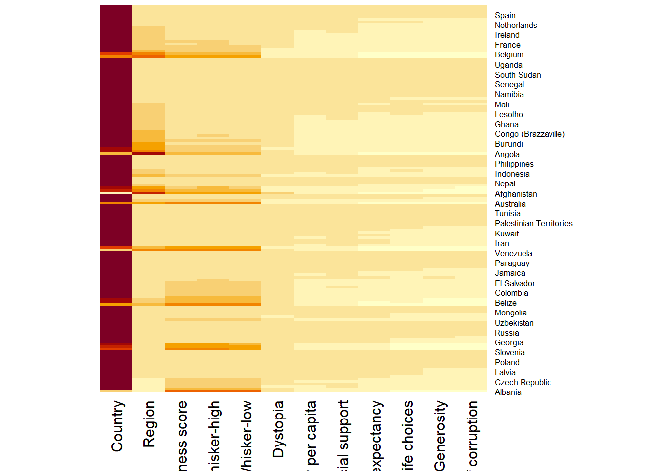
The simplest call uses default arguments, which include row and column dendrogram clustering. Setting Rowv = NA, Colv = NA suppresses the dendrograms.
wh_heatmap <- heatmap(wh_matrix,
                      Rowv = NA, Colv = NA)
NoteThings to learn from the code chunk above
Rowv = NA, Colv = NA switches off both dendrograms, preserving the original row and column order. Without dendrograms, the heatmap behaves like a coloured table.
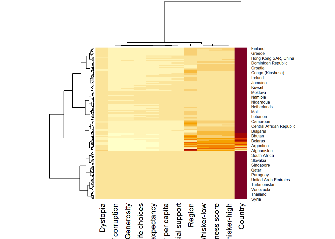
The default version with clustering reorders the rows and columns to bring similar entities together.
wh_heatmap <- heatmap(wh_matrix)
TipReading the plot
The chart is uninformative because one variable, the Happiness Score, has values on the order of hundreds while others sit on a 0 to 1 scale. The colour gradient is dominated by the largest variable, so most cells appear identical. This is the scale dominance problem. Without normalisation, the visualisation collapses to a single column’s worth of information.
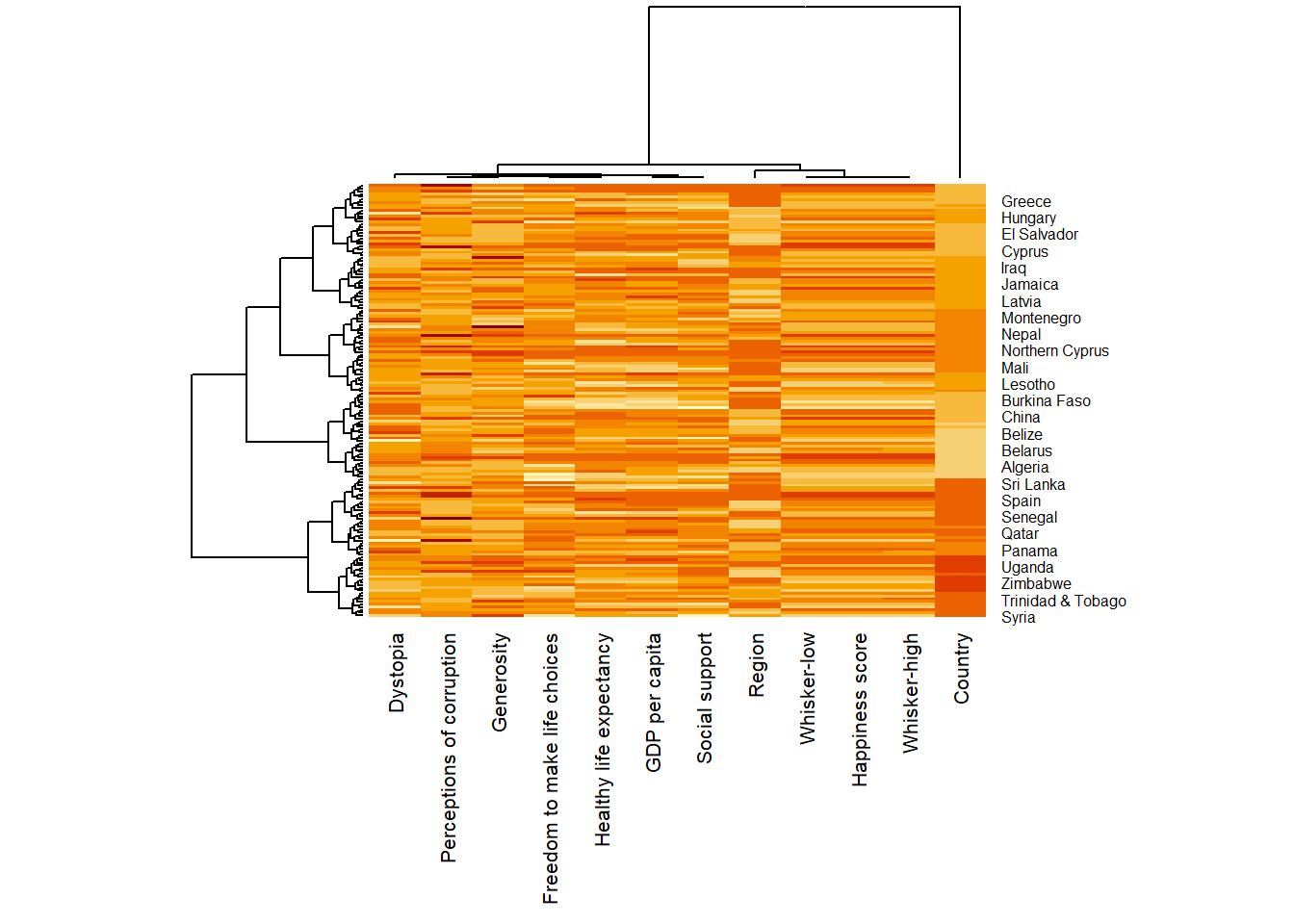
The fix is to scale each column to comparable units. Setting scale = "column" standardises each variable to mean zero and unit variance.
wh_heatmap <- heatmap(wh_matrix,
                      scale = "column",
                      cexRow = 0.6,
                      cexCol = 0.8,
                      margins = c(10, 4))
NoteThings to learn from the code chunk above
scale = "column" z-score-standardises each column. cexRow = 0.6 and cexCol = 0.8 shrink the row and column label fonts so all country names fit. margins = c(10, 4) enlarges the bottom and left margins to accommodate long labels.
TipReading the plot
After scaling, the heatmap becomes interpretable. Countries with similar happiness profiles cluster together, and the column dendrogram groups variables that move together.
14.5 Creating Interactive Heatmap
heatmaply extends the heatmap concept with interactivity (hover, zoom), better default styling, and integrated control over data transformation, clustering, and seriation.
14.5.1 Working with heatmaply
heatmaply(mtcars)The basic call uses default settings.
heatmaply(wh_matrix[, -c(1, 2, 4, 5)])
NoteThings to learn from the code chunk above
The horizontal dendrogram appears on the left in heatmaply, and row labels on the right, which is the inverse of base R’s heatmap(). Excluding columns 1, 2, 4, and 5 removes non-numeric or rank-style columns that are not meaningful to colour. The default colour palette is viridis.
14.5.2 Data Transformation
heatmaply supports three transformation methods.
14.5.2.1 Scaling Method
Scaling subtracts the mean and divides by the standard deviation.
heatmaply(wh_matrix[, -c(1, 2, 4, 5)],
          scale = "column")
14.5.2.2 Normalising Method
Normalising rescales each variable to the 0 to 1 range by subtracting the minimum and dividing by the range.
heatmaply(normalize(wh_matrix[, -c(1, 2, 4, 5)]))14.5.2.3 Percentising Method
Percentising replaces each value with its empirical cumulative percentile (the fraction of observations at or below that value).
heatmaply(percentize(wh_matrix[, -c(1, 2, 4, 5)]))14.5.3 Clustering Algorithm
heatmaply supports several clustering algorithms via dist_method (distance metric) and hclust_method (linkage method).
14.5.4 Manual Approach
The code chunk below specifies Euclidean distance and Ward’s linkage method explicitly.
heatmaply(normalize(wh_matrix[, -c(1, 2, 4, 5)]),
          dist_method = "euclidean",
          hclust_method = "ward.D")
NoteThings to learn from the code chunk above
dist_method = "euclidean" is the standard distance for normally distributed data. hclust_method = "ward.D" minimises within-cluster variance.
14.5.5 Statistical Approach
dend_expend() evaluates linkage methods by an objective criterion, and find_k() selects the optimal number of clusters.
wh_d <- dist(normalize(wh_matrix[, -c(1, 2, 4, 5)]), method = "euclidean")
dend_expend(wh_d)[[3]]
dist_methods hclust_methods optim
1 unknown ward.D 0.6137851
2 unknown ward.D2 0.6289186
3 unknown single 0.4774362
4 unknown complete 0.6434009
5 unknown average 0.6701688
6 unknown mcquitty 0.5020102
7 unknown median 0.5901833
8 unknown centroid 0.6338734wh_clust <- hclust(wh_d, method = "average")
num_k <- find_k(wh_clust)
plot(num_k)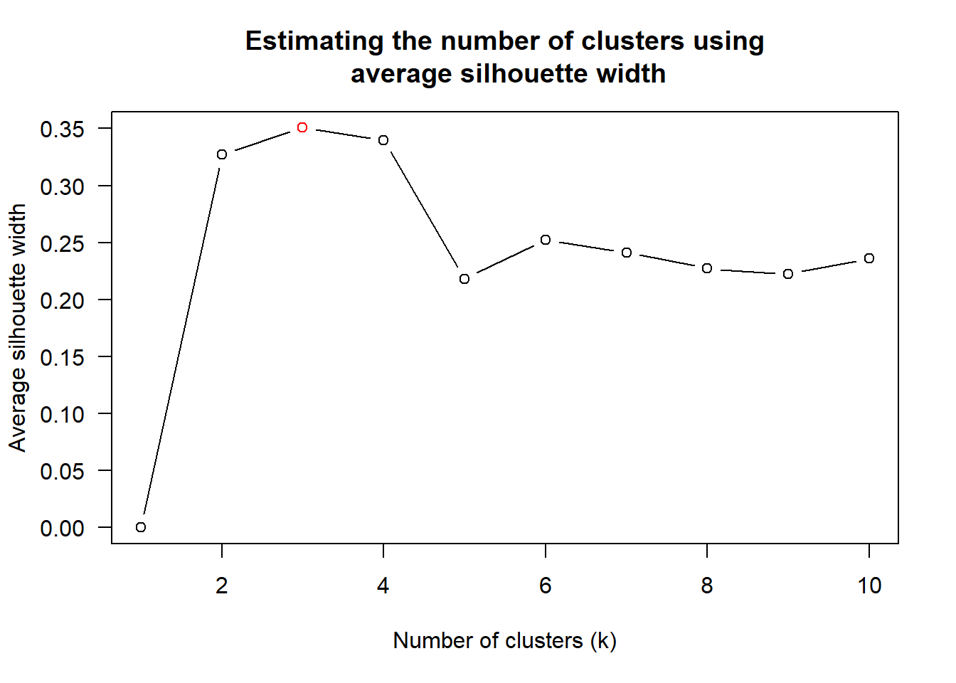
The output recommends average linkage and three clusters.
heatmaply(normalize(wh_matrix[, -c(1, 2, 4, 5)]),
          dist_method = "euclidean",
          hclust_method = "average",
          k_row = 3)
NoteThings to learn from the code chunk above
dend_expend() returns optimum scores for each linkage method. find_k() evaluates cluster counts by silhouette width and selects the optimum. k_row = 3 colours rows by the three identified clusters.
14.5.6 Seriation
Hierarchical clustering produces a dendrogram, but the dendrogram does not uniquely determine the row order. The branches can be flipped without changing the tree structure. Seriation picks the flips that minimise the visual distance between adjacent rows.
heatmaply(normalize(wh_matrix[, -c(1, 2, 4, 5)]),
          seriate = "OLO")
NoteThings to learn from the code chunk above
seriate = "OLO" applies Optimal Leaf Ordering, which tries every valid row order and picks the one where the sum of dissimilarities between adjacent rows is smallest. Other options are "GW" (a faster heuristic), "mean" (the default of base heatmap()), and "none" (no rotation).
14.5.7 Working with Colour Palettes
The default viridis palette can be replaced via the colors argument.
heatmaply(normalize(wh_matrix[, -c(1, 2, 4, 5)]),
          seriate = "none",
          colors = Blues)
14.5.8 The Finishing Touch
The complete code below combines clustering, no seriation, custom colour, custom labels, and a title.
heatmaply(normalize(wh_matrix[, -c(1, 2, 4, 5)]),
          Colv = NA,
          seriate = "none",
          colors = Blues,
          k_row = 5,
          margins = c(NA, 200, 60, NA),
          fontsize_row = 4,
          fontsize_col = 5,
          main = "World Happiness Score and Variables by Country, 2018\nData transformation: normalise method",
          xlab = "World Happiness Indicators",
          ylab = "World Countries")
NoteThings to learn from the code chunk above
k_row = 5 produces five row clusters. margins = c(NA, 200, 60, NA) enlarges the right and top margins to fit long country labels and the title. The main, xlab, and ylab arguments give the chart self-documenting text. Adding #| fig-height: 12 will increase the height of the heatmap for better visual clarity.
TipReading the plot
The five-cluster solution separates the high-happiness Western European and Nordic countries from the lower-scoring sub-Saharan African cluster, with three intermediate clusters covering Latin America, Eastern Europe, and parts of Asia. The variables sort themselves with the wealthier-correlated measures on the same end of the column dendrogram.
🕹️ LEVEL COMPLETE 🕹️
★ ★ ★ ★ ★
CHAPTER 14 CLEARED!
+1000 XP · ACHIEVEMENT UNLOCKED: Heatmap Hero 🔥
Press any key to continue…