pacman::p_load(tidyverse, FunnelPlotR, plotly, knitr)Hands-on Exercise 4
This hands-on exercise covers four chapters (Chapters 8–11) to explore chart types and statistical visualisation methods that are common in academic and policy reports. Two Datasets used are COVID-19_DKI_Jakarta.csv (Jakarta sub-district COVID-19 cases and deaths, 31 July 2021) and Exam_data.csv (a primary school exam scores dataset)
8 Funnel Plots for Fair Comparison
8.1 Overview
Funnel plot is a specially designed data visualisation for conducting unbiased comparison between outlets, stores or business entities. By the end of this hands-on exercise, you will gain hands-on experience on:
plotting funnel plots by using funnelPlotR package,
plotting static funnel plot by using ggplot2 package, and
plotting interactive funnel plot by using both plotly R and ggplot2 packages.
8.2 Installing and Launching R Packages
In this exercise, four R packages will be used. They are:
readr for importing csv into R.
FunnelPlotR for creating funnel plot.
ggplot2 for creating funnel plot manually.
knitr for building static html table.
plotly for creating interactive funnel plot.
8.3 Importing Data
In this section, COVID-19_DKI_Jakarta will be used. The data was downloaded from Open Data Covid-19 Provinsi DKI Jakarta portal. For this hands-on exercise, we are going to compare the cumulative COVID-19 cases and deaths by sub-district (i.e. kelurahan) as at 31st July 2021, DKI Jakarta.
The code chunk below imports the data into R and saves it into a tibble data frame object called covid19.
covid19 <- read_csv("data/COVID-19_DKI_Jakarta.csv") %>%
  mutate_if(is.character, as.factor)

kable(head(covid19))| Sub-district ID | City | District | Sub-district | Positive | Recovered | Death |
|---|---|---|---|---|---|---|
| 3172051003 | JAKARTA UTARA | PADEMANGAN | ANCOL | 1776 | 1691 | 26 |
| 3173041007 | JAKARTA BARAT | TAMBORA | ANGKE | 1783 | 1720 | 29 |
| 3175041005 | JAKARTA TIMUR | KRAMAT JATI | BALE KAMBANG | 2049 | 1964 | 31 |
| 3175031003 | JAKARTA TIMUR | JATINEGARA | BALI MESTER | 827 | 797 | 13 |
| 3175101006 | JAKARTA TIMUR | CIPAYUNG | BAMBU APUS | 2866 | 2792 | 27 |
| 3174031002 | JAKARTA SELATAN | MAMPANG PRAPATAN | BANGKA | 1828 | 1757 | 26 |
8.4 FunnelPlotR methods
The FunnelPlotR package uses ggplot to generate funnel plots. It requires a numerator (events of interest), a denominator (population to be considered) and a group. The key arguments selected for customisation are:
limit: plot limits (95 or 99).label_outliers: to label outliers (true or false).Poisson_limits: to add Poisson limits to the plot.OD_adjust: to add overdispersed limits to the plot.xrangeandyrange: to specify the range to display for axes, acts like a zoom function.Other aesthetic components such as graph title, axis labels etc.
8.4.1 FunnelPlotR methods: The Basic Plot
The code chunk below plots a funnel plot.
funnel_plot(
  .data = covid19,
  numerator = Positive,
  denominator = Death,
  group = `Sub-district`
)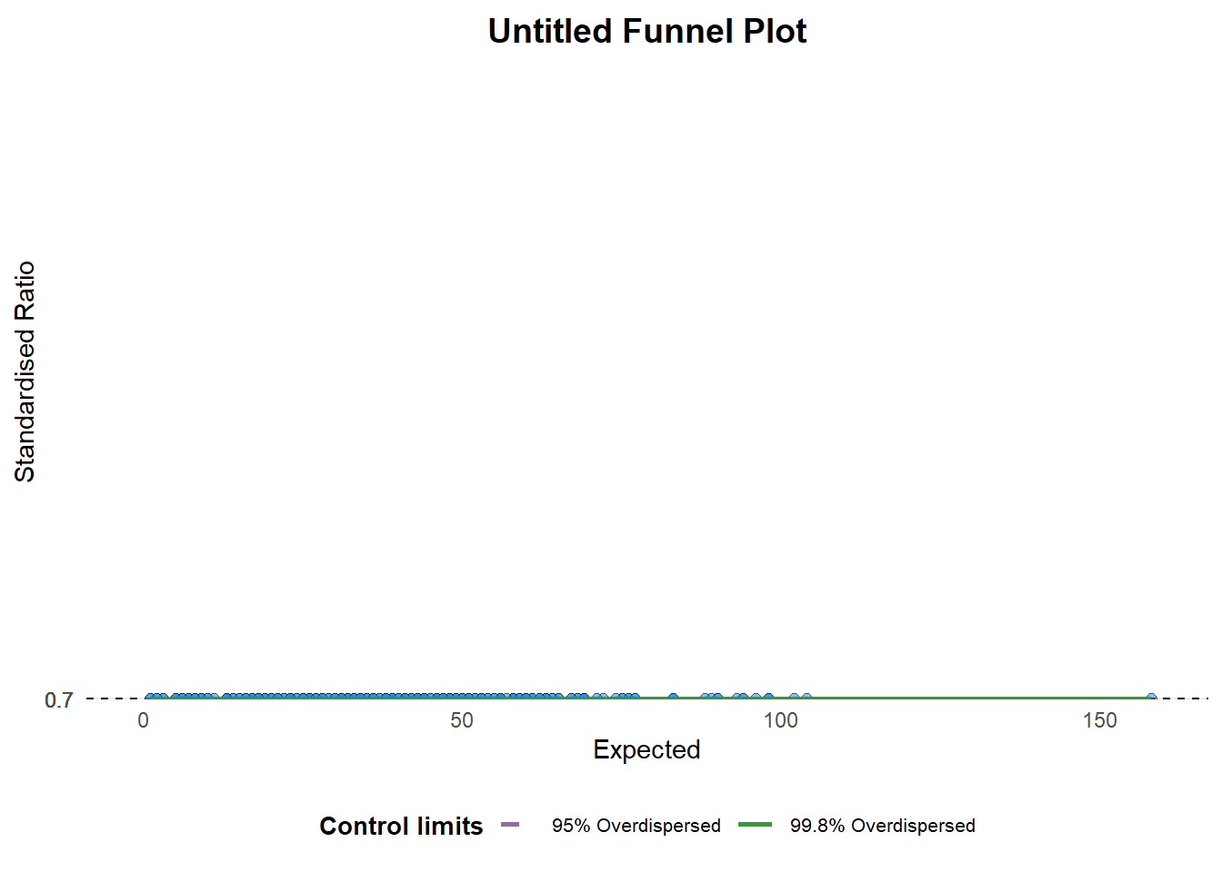
A funnel plot object with 267 points of which 0 are outliers.
Plot is adjusted for overdispersion.
NoteThings to learn from the code chunk above
groupin this function is different from the scatterplot. It defines the level of the points to be plotted i.e. Sub-district, District or City. If City is chosen, there are only six data points.- By default, the
data_typeargument is “SR”. limit: accepted values for plot limit boundaries are 95 or 99, corresponding to 95% or 99.8% quantiles of the distribution.
8.4.2 FunnelPlotR methods: Makeover 1
The code chunk below plots a funnel plot.
funnel_plot(
  .data = covid19,
  numerator = Death,
  denominator = Positive,
  group = `Sub-district`,
  data_type = "PR",     #<<
  title = "",
  xrange = c(0, 6500),  #<<
  yrange = c(0, 0.05)   #<<
)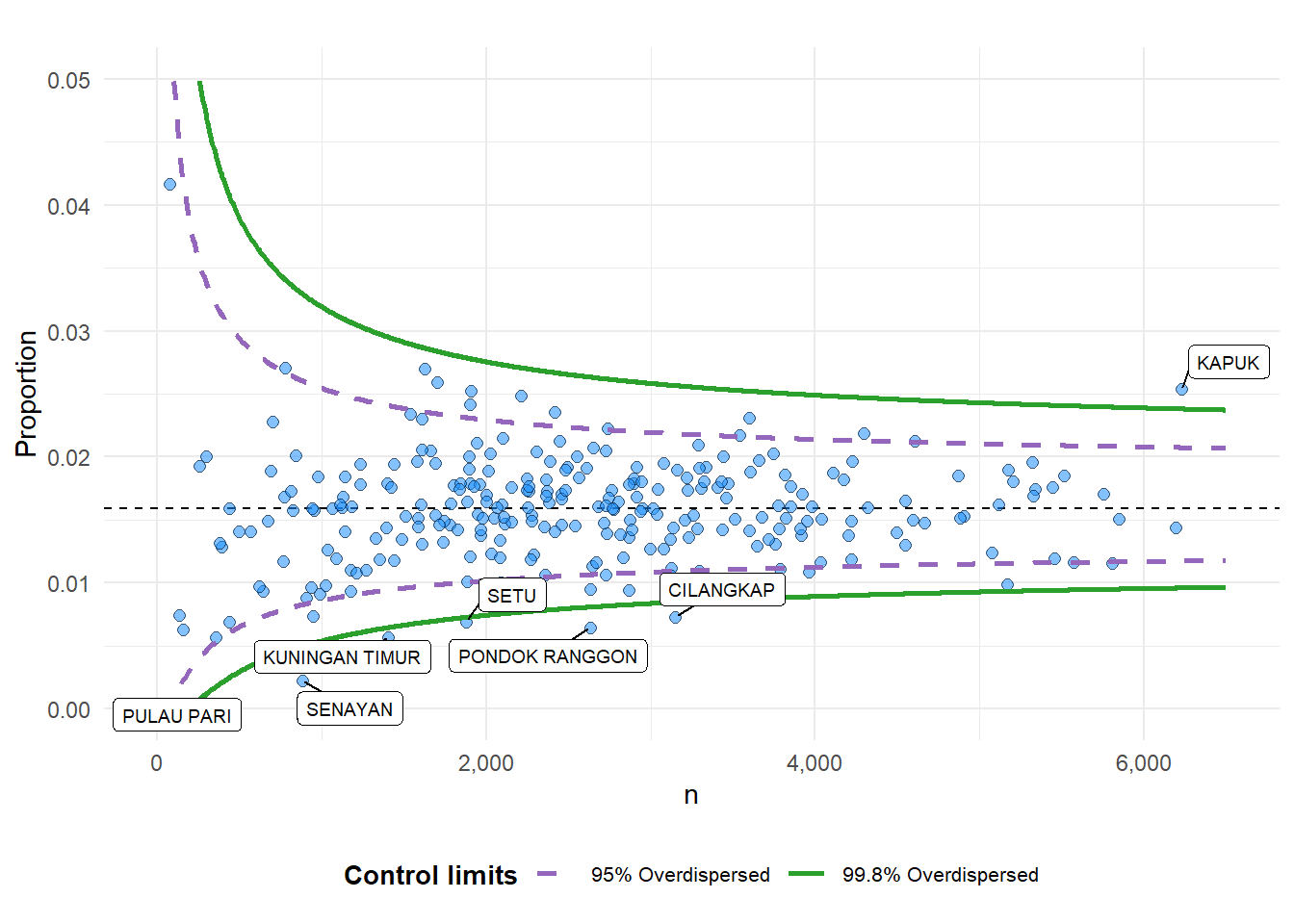
A funnel plot object with 267 points of which 7 are outliers.
Plot is adjusted for overdispersion.
NoteThings to learn from the code chunk above
- The
data_typeargument is changed from default “SR” to “PR” (proportions). xrangeandyrangeare used to set the range of the x-axis and y-axis.
TipReading the plot
Of the 267 sub-districts, 7 fall outside the 99.8% control limit. These are the points the funnel plot flags as having a fatality rate too high to attribute to sampling variation alone. The funnel narrows from left to right because uncertainty in the rate decreases as case counts grow: a sub-district with 100 cases can show a high fatality rate by chance, but one with 5,000 cases cannot.
The seven outliers warrant follow-up investigation as they are not statistical artefacts.
8.4.3 FunnelPlotR methods: Makeover 2
The code chunk below plots a funnel plot.
funnel_plot(
  .data = covid19,
  numerator = Death,
  denominator = Positive,
  group = `Sub-district`,
  data_type = "PR",
  xrange = c(0, 6500),
  yrange = c(0, 0.05),
  label = NA,
  title = "Cumulative COVID-19 Fatality Rate by\nCumulative Total Number of COVID-19 Positive Cases", #<<
  x_label = "Cumulative COVID-19 Positive Cases",
  y_label = "Cumulative Fatality Rate"  #<<
)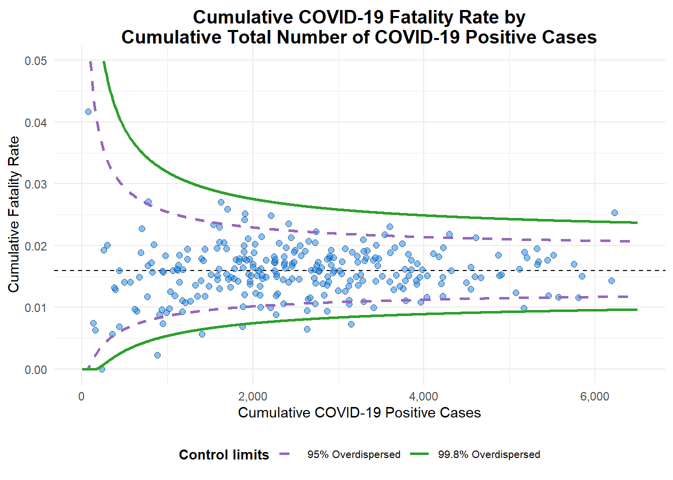
A funnel plot object with 267 points of which 7 are outliers.
Plot is adjusted for overdispersion.
NoteThings to learn from the code chunk above
label = NAremoves the default outlier-labelling feature.titleadds a plot title.x_labelandy_labeladd or edit the x-axis and y-axis titles.
8.5 Funnel Plot for Fair Visual Comparison: ggplot2 methods
In this section, you will gain hands-on experience on building funnel plots step-by-step by using ggplot2. This aims to deepen your working knowledge of ggplot2 to customise specialised data visualisation like funnel plot.
8.5.1 Computing the Basic Derived Fields
To plot the funnel plot from scratch, we need to derive the cumulative death rate and its standard error.
df <- covid19 %>%
  mutate(rate = Death / Positive,
         rate.se = sqrt((rate*(1-rate)) / (Positive))) %>%
  filter(rate > 0)
Next, the fit.mean is computed by using the code chunk below.
fit.mean <- weighted.mean(df$rate, 1/df$rate.se^2)8.5.2 Calculate Lower and Upper Limits for 95% and 99.8% CI
The code chunk below is used to compute the lower and upper limits for 95% and 99.8% confidence interval.
number.seq <- seq(1, max(df$Positive), 1)
number.ll95 <- fit.mean - 1.96 * sqrt((fit.mean*(1-fit.mean)) / (number.seq))
number.ul95 <- fit.mean + 1.96 * sqrt((fit.mean*(1-fit.mean)) / (number.seq))
number.ll998 <- fit.mean - 3.09 * sqrt((fit.mean*(1-fit.mean)) / (number.seq))
number.ul998 <- fit.mean + 3.09 * sqrt((fit.mean*(1-fit.mean)) / (number.seq))
dfCI <- data.frame(number.ll95, number.ul95, number.ll998,
                   number.ul998, number.seq, fit.mean)
8.5.3 Plotting a Static Funnel Plot
In the code chunk below, ggplot2 functions are used to plot a static funnel plot.
p <- ggplot(df, aes(x = Positive, y = rate)) +
  geom_point(aes(label=`Sub-district`),
             alpha=0.4) +
  geom_line(data = dfCI,
            aes(x = number.seq,
                y = number.ll95),
            size = 0.4,
            colour = "grey40",
            linetype = "dashed") +
  geom_line(data = dfCI,
            aes(x = number.seq,
                y = number.ul95),
            size = 0.4,
            colour = "grey40",
            linetype = "dashed") +
  geom_line(data = dfCI,
            aes(x = number.seq,
                y = number.ll998),
            size = 0.4,
            colour = "grey40") +
  geom_line(data = dfCI,
            aes(x = number.seq,
                y = number.ul998),
            size = 0.4,
            colour = "grey40") +
  geom_hline(data = dfCI,
             aes(yintercept = fit.mean),
             size = 0.4,
             colour = "grey40") +
  coord_cartesian(ylim=c(0,0.05)) +
  annotate("text", x = max(df$Positive) * 0.97, y = 0.012,
           label = "95%", size = 3, colour = "grey40") +
  annotate("text", x = max(df$Positive) * 0.97, y = 0.018,
           label = "99.8%", size = 3, colour = "grey40") +
  ggtitle("Cumulative Fatality Rate by Cumulative Number of COVID-19 Cases") +
  xlab("Cumulative Number of COVID-19 Cases") +
  ylab("Cumulative Fatality Rate") +
  theme_light() +
  theme(plot.title = element_text(size=12),
        legend.position = c(0.91,0.85),
        legend.title = element_text(size=7),
        legend.text = element_text(size=7),
        legend.background = element_rect(colour = "grey60", linetype = "dotted"),
        legend.key.height = unit(0.3, "cm"))
p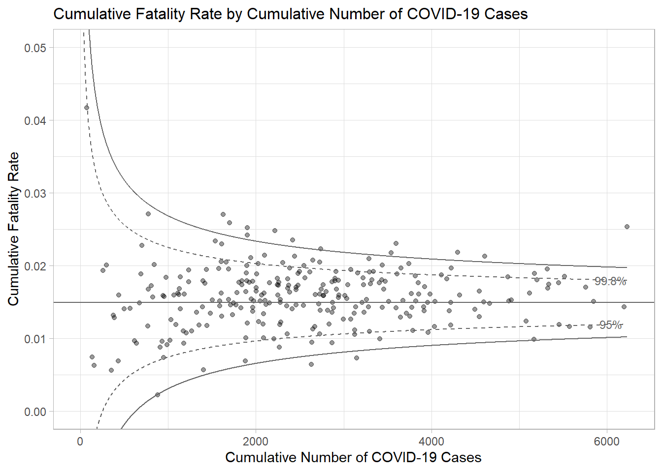
NoteThings to learn from the code chunk above
geom_point()plots the 267 sub-districts withalpha=0.4to handle overplotting.- Four
geom_line()calls draw the dashed 95% and solid 99.8% control limits using values fromdfCI. geom_hline()draws the target mean (overall pooled fatality rate).coord_cartesian(ylim=c(0,0.05))zooms the y-axis without dropping data points outside the range.
TipReading the plot
Building the funnel plot manually exposes the underlying statistics, namely the standard error formula, inverse-variance weighting, and z-score-based control limits, that the FunnelPlotR package abstracts away. The visual interpretation is the same as the package version. Points above the upper boundaries are statistically significant outliers, while points within the funnel are within expected random variation.
8.5.4 Interactive Funnel Plot: plotly + ggplot2
The funnel plot created using ggplot2 functions can be made interactive with ggplotly() of plotly R package.
fp_ggplotly <- ggplotly(p,
  tooltip = c("label",
              "x",
              "y"))
fp_ggplotly
NoteThings to learn from the code chunk above
tooltip = c("label", "x", "y")extracts the Sub-district name (from thelabelaesthetic set in 8.5.3), the case count, and the fatality rate.- The interactive version applies Shneiderman’s mantra: overview (funnel shape and outliers visible immediately), zoom and filter (plotly’s built-in zoom and pan), details on demand (hover to identify a specific sub-district).
9 Visualising Distribution
9.1 Learning Outcome
Visualising distribution is fundamental in statistical analysis. Chapter 1 introduced popular statistical methods for visualising distribution such as histogram, probability density curve, boxplot, notch plot, and violin plot, and how to create them using ggplot2. This section covers two more statistical graphical methods for visualising distribution, (1) the ridgeline plot and (2) the raincloud plot, both built using ggplot2 and its extensions.
9.2 Getting Started
9.2.1 Installing and Loading the Packages
The following R packages will be used in this section:
| Package | Role |
|---|---|
ggridges |
Ridgeline geoms (geom_density_ridges, geom_density_ridges_gradient, stat_density_ridges) |
ggdist |
Distribution + uncertainty geoms (stat_halfeye, stat_dots, slab-interval family) |
ggthemes |
Extra themes (e.g. theme_economist) |
colorspace |
Colour manipulation (lighten(), perceptually uniform palettes) |
tidyverse |
ggplot2 + data wrangling |
The code chunk below will be used to load these R packages into RStudio environment.
pacman::p_load(ggdist, ggridges, ggthemes, colorspace, tidyverse)9.2.2 Data Import
For the purpose of this exercise, Exam_data.csv will be used.
In the code chunk below, read_csv() of readr package is used to import Exam_data.csv into R and assign it to a tibble called exam.
exam <- read_csv("data/Exam_data.csv")

kable(head(exam))| ID | CLASS | GENDER | RACE | ENGLISH | MATHS | SCIENCE |
|---|---|---|---|---|---|---|
| Student321 | 3I | Male | Malay | 21 | 9 | 15 |
| Student305 | 3I | Female | Malay | 24 | 22 | 16 |
| Student289 | 3H | Male | Chinese | 26 | 16 | 16 |
| Student227 | 3F | Male | Chinese | 27 | 77 | 31 |
| Student318 | 3I | Male | Malay | 27 | 11 | 25 |
| Student306 | 3I | Female | Malay | 31 | 16 | 16 |
9.3 Visualising Distribution with Ridgeline Plot
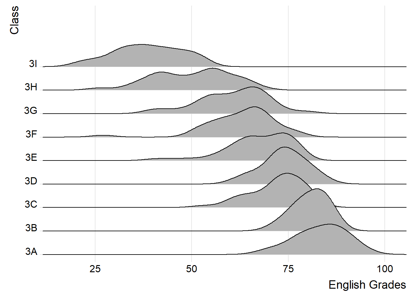
Ridgeline plot (sometimes called Joyplot) show density curves for many groups, stacked vertically with slight overlap. The overlap is the trick that allows you to fit 10–20 distributions in the space a faceted grid would need for 4–5.
The figure below is a ridgeline plot showing the distribution of English scores by class.
ggplot(exam,
       aes(x = ENGLISH,
           y = CLASS)) +
  geom_density_ridges() +
  scale_x_continuous(
    name = "English Grades",
    expand = c(0, 0)
    ) +
  scale_y_discrete(name = "Class", expand = expansion(add = c(0.2, 2.6))) +
  theme_ridges()
NoteThings to learn from the code chunk above
ggplot(aes(x = ENGLISH, y = CLASS))maps the continuous variable to the x-axis and the categorical variable to the y-axis. Each row of the y-axis becomes one ridge.geom_density_ridges()is used here in its default form with no overlap, no styling, no smoothing parameter set. This is the bare-bones output.theme_ridges()from theggridgespackage gives the chart its characteristic clean theme.
TipWhen to use a ridgeline plot
Ridgeline plots make sense when the number of groups to represent is medium to high; a classic faceted layout would take too much space. The fact that groups overlap each other allows more efficient use of space. With fewer than 5 groups, other distribution plots are usually a better choice.
Ridgeline plots work well when there is a clear pattern in the result, for example an obvious ranking across groups. Otherwise groups tend to overlap each other, leading to a messy plot that provides no clear insight.
9.3.1 Plotting ridgeline graph: ggridges method
There are several ways to plot ridgeline plot with R. In this section, you will learn how to plot ridgeline plot by using ggridges package.
ggridges package provides two main geoms to plot ridgeline plots, they are: geom_ridgeline() and geom_density_ridges(). The former takes height values directly to draw the ridgelines, and the latter first estimates data densities and then draws those using ridgelines.
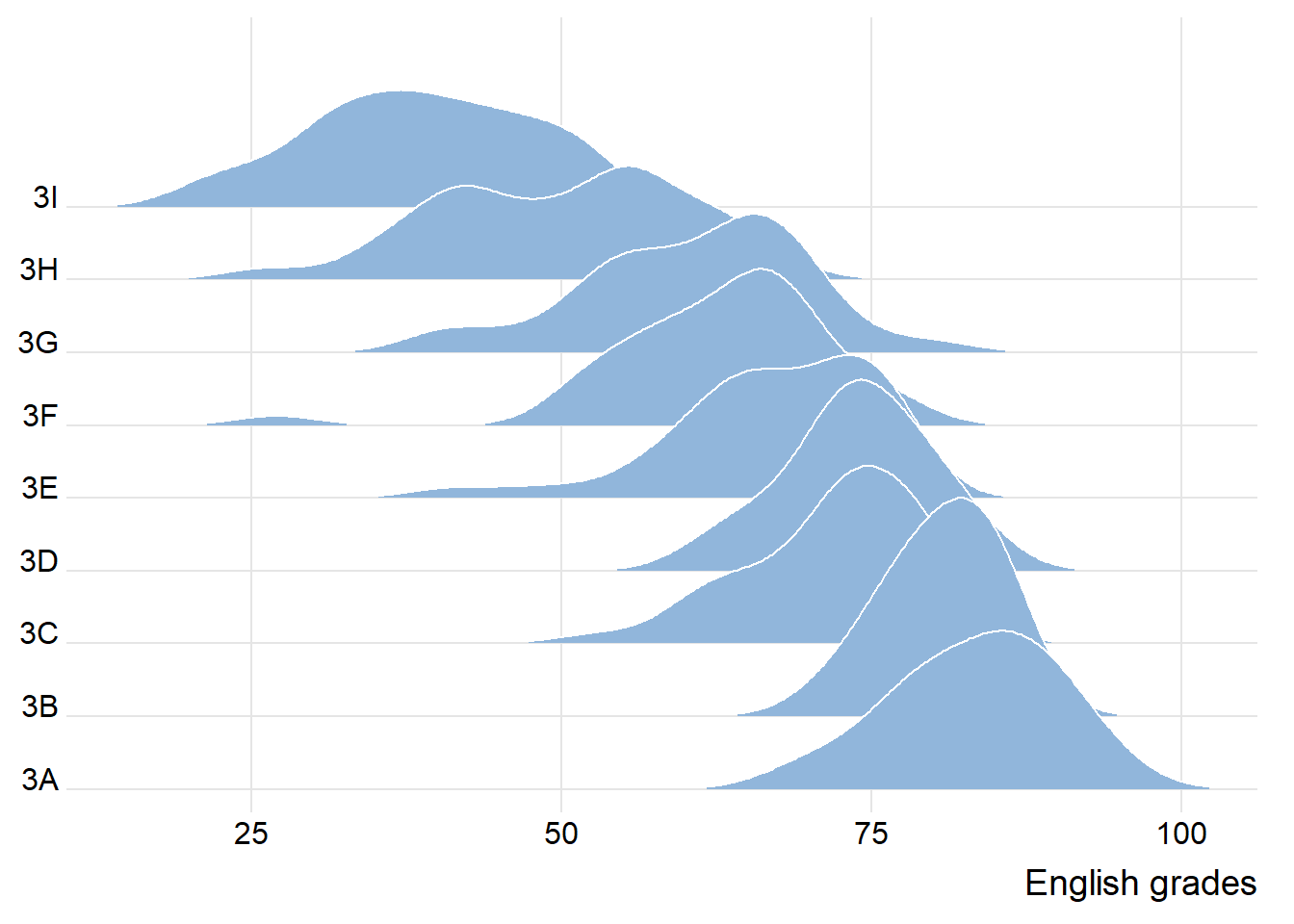
The ridgeline plot below is plotted by using geom_density_ridges().
ggplot(exam,
       aes(x = ENGLISH,
           y = CLASS)) +
  geom_density_ridges(
    scale = 3,
    rel_min_height = 0.01,
    bandwidth = 3.4,
    fill = lighten("#7097BB", .3),
    color = "white"
  ) +
  scale_x_continuous(
    name = "English grades",
    expand = c(0, 0)
  ) +
  scale_y_discrete(name = NULL, expand = expansion(add = c(0.2, 2.6))) +
  theme_ridges()
NoteThings to learn from the code chunk above
scale = 3controls how much the ridges overlap. A value greater than 1 causes overlap; 3 means each ridge is three times the row height.rel_min_height = 0.01trims tails below 1% of the peak — this keeps the chart cleaner.bandwidth = 3.4is the smoothing parameter for the kernel density estimate. Higher values produce smoother curves; lower values reveal more detail.fill = lighten("#7097BB", .3)uses thecolorspacepackage to soften a blue colour by 30%.color = "white"outlines each ridge with white, which separates them visually when overlapping.expand = c(0, 0)on the x-axis removes the default 5% padding so the chart edges align with the data.
9.3.1.1 Reordering Classes by Median Score
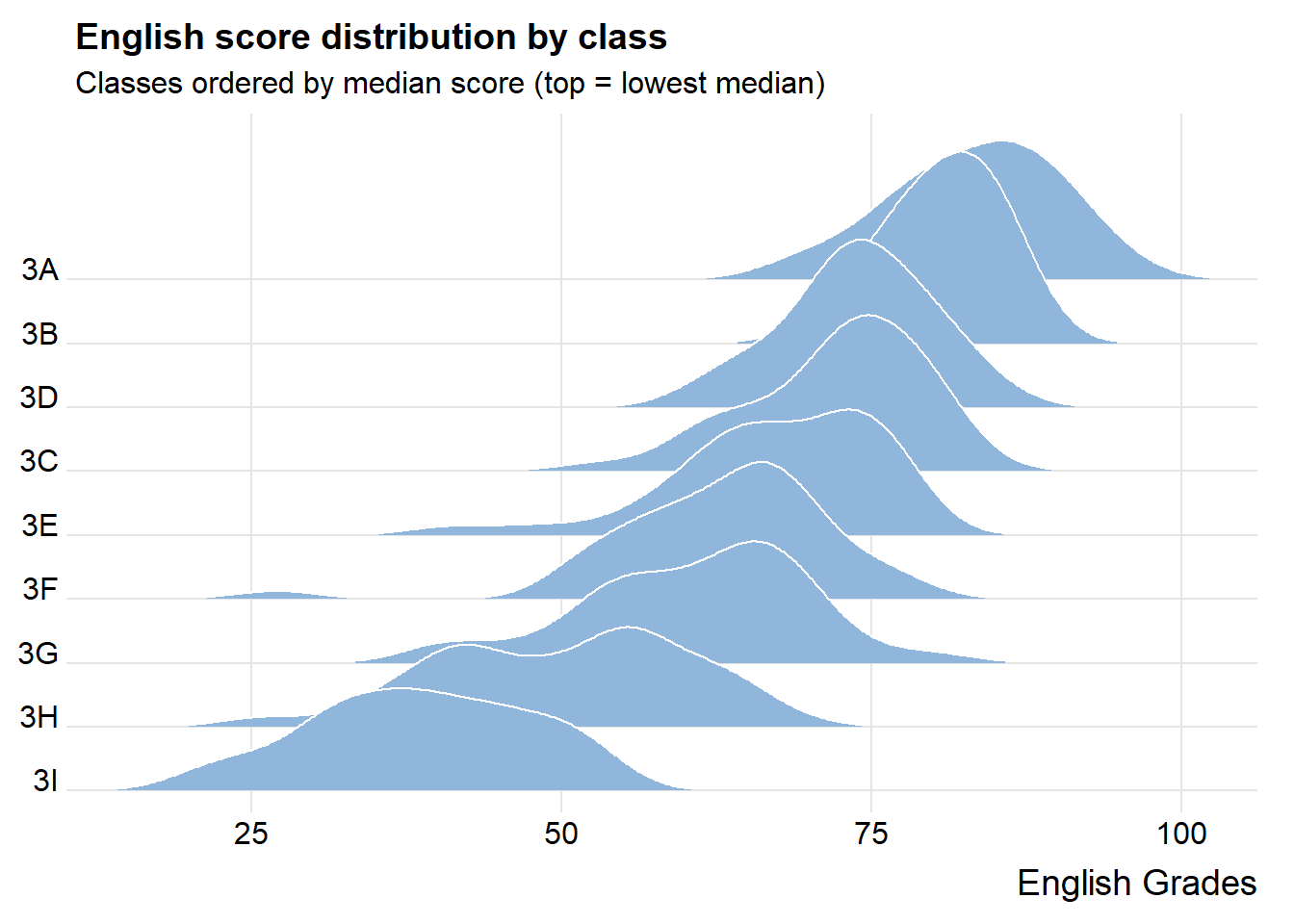
The section reorders the ridgeline plot by median English score to make performance ranking visually easier.
ggplot(exam,
       aes(x = ENGLISH,
           y = fct_reorder(CLASS, ENGLISH, .fun = median))) +
  geom_density_ridges(
    scale = 3,
    rel_min_height = 0.01,
    bandwidth = 3.4,
    fill = lighten("#7097BB", .3),
    color = "white"
  ) +
  scale_x_continuous(name = "English Grades", expand = c(0, 0)) +
  scale_y_discrete(name = NULL, expand = expansion(add = c(0.2, 2.6))) +
  labs(title = "English score distribution by class",
       subtitle = "Classes ordered by median score (top = lowest median)") +
  theme_ridges()
TipWhat changed and why
fct_reorder(CLASS, ENGLISH, .fun = median) is the key function. It reorders the levels of CLASS based on the median of ENGLISH within each class. The chart now reveals the academic ranking directly. The lowest-performing classes sit at the top, the highest at the bottom.
This applies a core design principle: categorical axes should be ordered by the metric, not by the label.
9.3.2 Varying Fill Colour along the x-axis
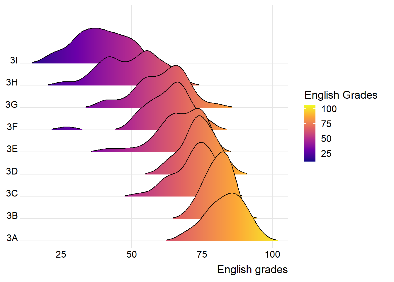
Sometimes we would like to have the area under a ridgeline not filled with a single solid color but rather with colors that vary in some form along the x axis. This effect can be achieved by using either geom_ridgeline_gradient() or geom_density_ridges_gradient(). Both geoms work just like geom_ridgeline() and geom_density_ridges(), except that they allow for varying fill colors. However, they do not allow for alpha transparency in the fill. For technical reasons, we can have changing fill colors or transparency but not both.
ggplot(exam,
       aes(x = ENGLISH,
           y = CLASS,
           fill = stat(x))) +
  geom_density_ridges_gradient(
    scale = 3,
    rel_min_height = 0.01) +
  scale_fill_viridis_c(name = "English Grades",
                       option = "C") +
  scale_x_continuous(
    name = "English grades",
    expand = c(0, 0)
  ) +
  scale_y_discrete(name = NULL, expand = expansion(add = c(0.2, 2.6))) +
  theme_ridges()
NoteThings to learn from the code chunk above
fill = stat(x)maps the fill colour to the x-axis position. As scores increase along x, the fill colour shifts.geom_density_ridges_gradient()is used instead ofgeom_density_ridges()because only the gradient version supports varying fill colours within a single ridge.scale_fill_viridis_c(option = "C")applies the “plasma” variant of the viridis palette — a perceptually uniform, colour-blind-safe sequential palette.- The gradient version does not support alpha transparency in the fill — it is one or the other.
9.3.3 Mapping the Probabilities Directly onto Colour
Besides providing additional geom objects to support plotting ridgeline plots, the ggridges package also provides a stat function called stat_density_ridges() that replaces stat_density() of ggplot2.
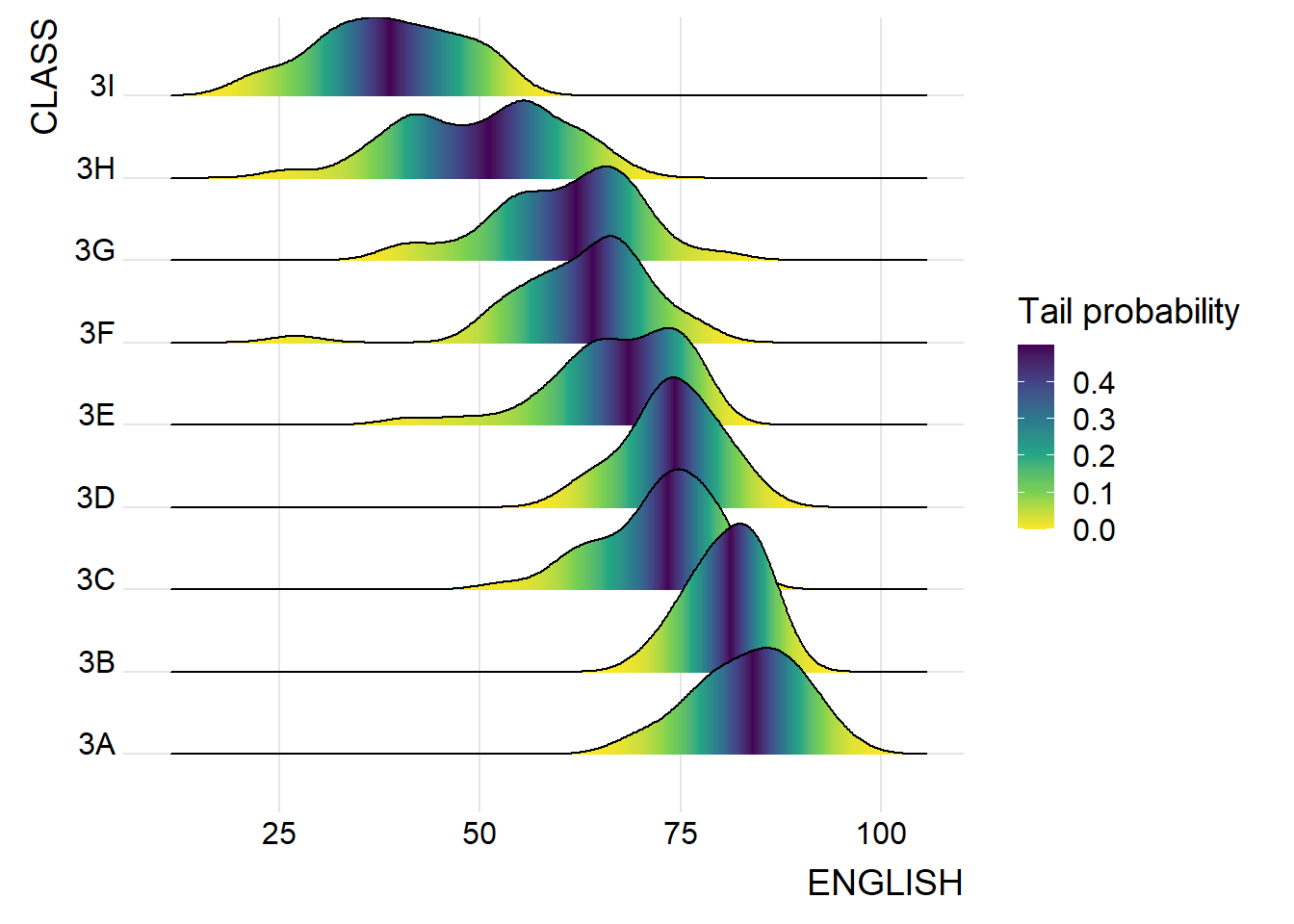
Figure below is plotted by mapping the probabilities calculated by using stat(ecdf) which represent the empirical cumulative density function for the distribution of English score.
ggplot(exam,
       aes(x = ENGLISH,
           y = CLASS,
           fill = 0.5 - abs(0.5-stat(ecdf)))) +
  stat_density_ridges(geom = "density_ridges_gradient",
                      calc_ecdf = TRUE) +
  scale_fill_viridis_c(name = "Tail probability",
                       direction = -1) +
  theme_ridges()
NoteThings to learn from the code chunk above
fill = 0.5 - abs(0.5 - stat(ecdf))is the key transformation.stat(ecdf)runs from 0 (left tail) to 1 (right tail). The expression maps the median (ecdf = 0.5) to 0.5 and both tails (ecdf = 0 or 1) to 0. The result is a “distance from nearest tail” measure.calc_ecdf = TRUEmust be set instat_density_ridges()for the ECDF computation to be available downstream.direction = -1reverses the viridis scale so darker colours mark the tails (extreme values) rather than the centre.
TipReading the plot
The addition of colour highlights extreme values within each distribution. Dark regions at both ends of each ridge indicate the upper and lower tails; light regions mark the densely populated centre.
This is useful for spotting whether a class has unusually heavy tails or skew. Classes with broad dark regions on one side suggest skew toward that direction. Classes with narrow centres and broad tails suggest more variable performance.
9.3.4 Ridgeline Plots with Quantile Lines
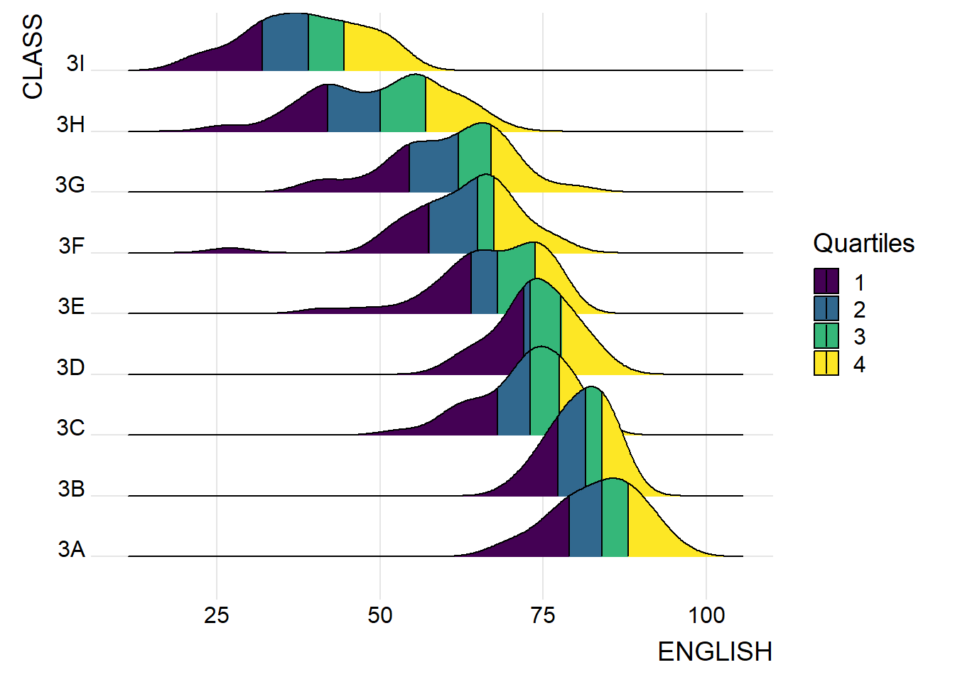
By using geom_density_ridges_gradient(), we can colour the ridgeline plot by quantile, via the calculated stat(quantile) aesthetic as shown in the figure below.
ggplot(exam,
       aes(x = ENGLISH,
           y = CLASS,
           fill = factor(stat(quantile))
           )) +
  stat_density_ridges(
    geom = "density_ridges_gradient",
    calc_ecdf = TRUE,
    quantiles = 4,
    quantile_lines = TRUE) +
  scale_fill_viridis_d(name = "Quartiles") +
  theme_ridges()
NoteThings to learn from the code chunk above
fill = factor(stat(quantile))makes the fill discrete (categorical), so each quantile gets its own colour from the palette.quantiles = 4divides each density into 4 equal-mass regions (quartiles).quantile_lines = TRUEdraws vertical lines at quartile boundaries, making the cuts visually explicit.scale_fill_viridis_d()(note the_dfor discrete) provides four visually distinguishable colours for the four quartiles.
TipReading the plot
This view makes the median (the boundary between Q2 and Q3) and IQR (the span of the middle two quartiles) visually accessible without computing them separately.
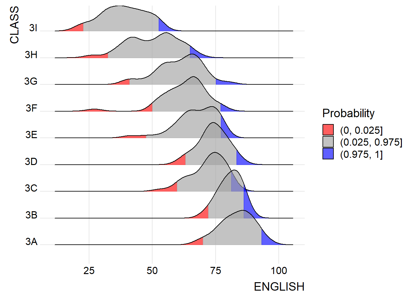
Instead of using numbers to define the quantiles, we can also specify quantiles by cut points such as 2.5% and 97.5% tails to colour the ridgeline plot as shown in the figure below.
ggplot(exam,
       aes(x = ENGLISH,
           y = CLASS,
           fill = factor(stat(quantile))
           )) +
  stat_density_ridges(
    geom = "density_ridges_gradient",
    calc_ecdf = TRUE,
    quantiles = c(0.025, 0.975)
    ) +
  scale_fill_manual(
    name = "Probability",
    values = c("#FF0000A0", "#A0A0A0A0", "#0000FFA0"),
    labels = c("(0, 0.025]", "(0.025, 0.975]", "(0.975, 1]")
  ) +
  theme_ridges()
NoteThings to learn from the code chunk above
quantiles = c(0.025, 0.975)specifies cut points (rather than equal-mass quantile counts), splitting the density into three regions: the 2.5% lower tail, the middle 95%, and the 2.5% upper tail.scale_fill_manual()overrides the default palette with three explicit hex colours. TheA0suffix on each (#FF0000A0,#A0A0A0A0,#0000FFA0) sets alpha transparency to 62.5%.- The diverging red-grey-blue palette implies the lower and upper tails are conceptually opposed — an editorial choice that fits exam scores (low = concerning, high = exemplary) but might not fit neutral distributions.
TipReading the plot
This version highlights extreme values directly. The narrow red and blue regions at the tails mark unusually low and high scores within each class. Most of the data falls in the grey central band.
9.4 Visualising Distribution with Raincloud Plot
A raincloud plot layers three views of the same data:
A half-density (the “cloud”) distributional shape
A boxplot summary
Dot plot (the “rain”) of raw observations of the individual data points
Below will show how to plot a raincloud plot to visualise the distribution of English score by race. It is created by using functions provided by ggdist and ggplot2 packages.
9.4.1 Plotting a Half Eye Graph
First, we will plot a Half-Eye graph by using stat_halfeye() of ggdist package.
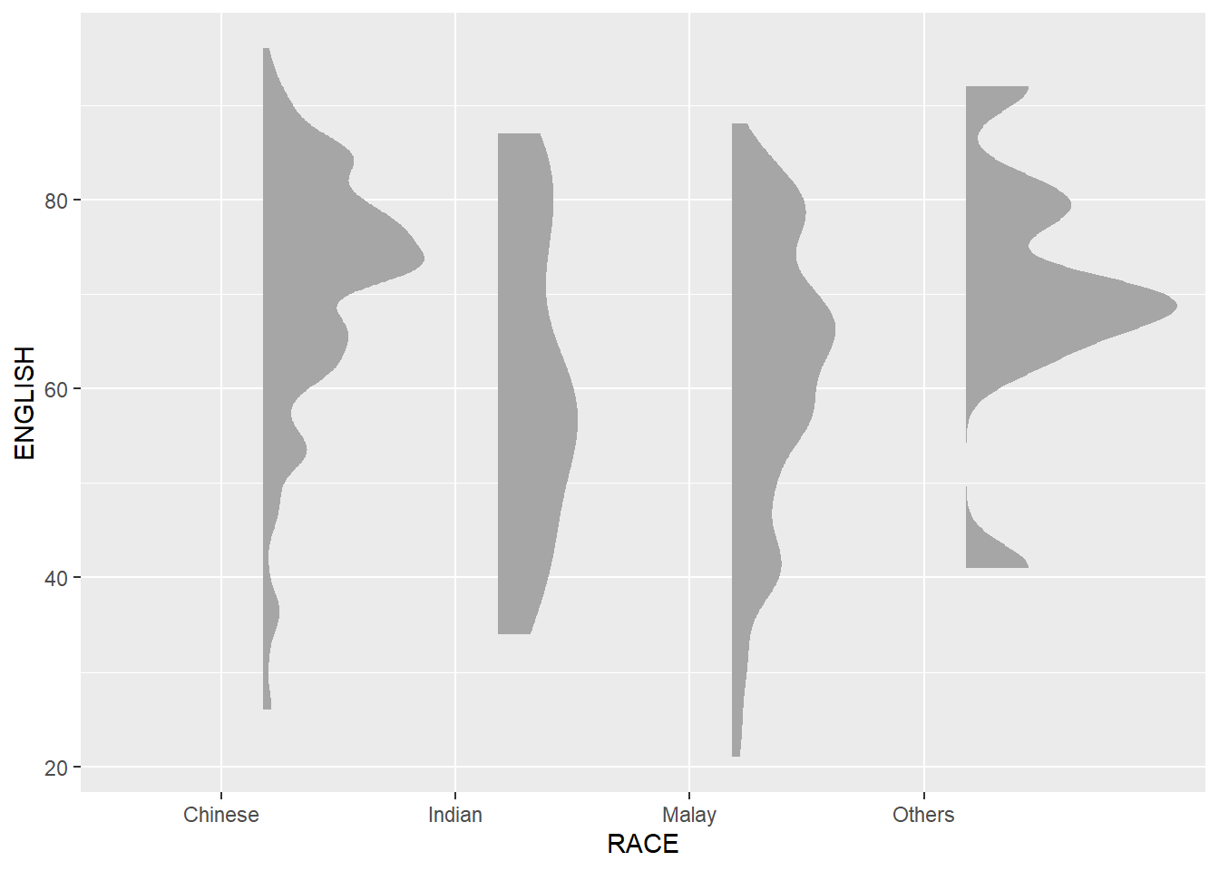
This produces a Half Eye visualization, which contains a half-density and a slab-interval.
ggplot(exam,
       aes(x = RACE,
           y = ENGLISH)) +
  stat_halfeye(adjust = 0.5,
               justification = -0.2,
               .width = 0,
               point_colour = NA)
NoteThings to learn from the code chunk above
stat_halfeye()fromggdistproduces a half-violin (density on one side of the categorical axis) plus, by default, an interval and a point estimate.adjust = 0.5halves the default smoothing bandwidth, producing a more detailed density curve.justification = -0.2shifts the half-violin slightly off the axis tick to leave room for the boxplot in the next layer..width = 0suppresses the interval (the slab);point_colour = NAsuppresses the point estimate. Together they leave just the cloud.
TipReading the plot
This is the first layer of the raincloud, the density layer. Distributional differences across race groups are visible. Some groups have unimodal, symmetric distributions while others show wider spread or hints of bimodality.
9.4.2 Adding the boxplot with geom_boxplot()
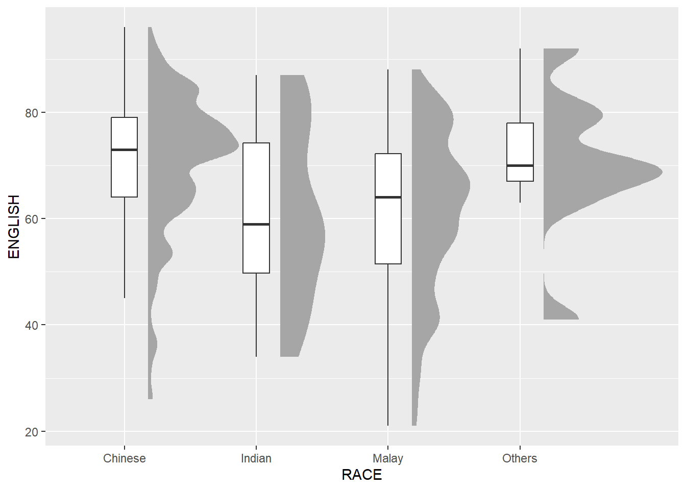
Next, we will add the second geometry layer using geom_boxplot() of ggplot2. This produces a narrow boxplot. The width = .20 argument keeps the boxplot narrow so it fits next to the half-violin, and outlier.shape = NA suppresses outlier dots which would duplicate the dot layer later when added in 9.4.3.
ggplot(exam,
       aes(x = RACE,
           y = ENGLISH)) +
  stat_halfeye(adjust = 0.5,
               justification = -0.2,
               .width = 0,
               point_colour = NA) +
  geom_boxplot(width = .20,
               outlier.shape = NA)
NoteThings to learn from the code chunk above
geom_boxplot(width = .20)draws a narrow boxplot — the small width keeps it from competing visually with the half-violin.outlier.shape = NAsuppresses the default outlier dots. They would duplicate the dot plot layer added in 9.4.3.- The boxplot is centred on the categorical tick, between the half-violin (right) and the upcoming dot layer (left).
TipReading the plot
Adding the boxplot layer overlays Tukey’s five-number summary onto the density. The shape (from the violin) and the summary statistics (median line, IQR box, whiskers) can be seen at a glance.
This solves the boxplot’s inability to reveal multimodality. If a distribution were bimodal, the boxplot alone would mask it, but when combined with the half-violin, both views are visible simultaneously.
9.4.3 Adding the Dot Plots with stat_dots
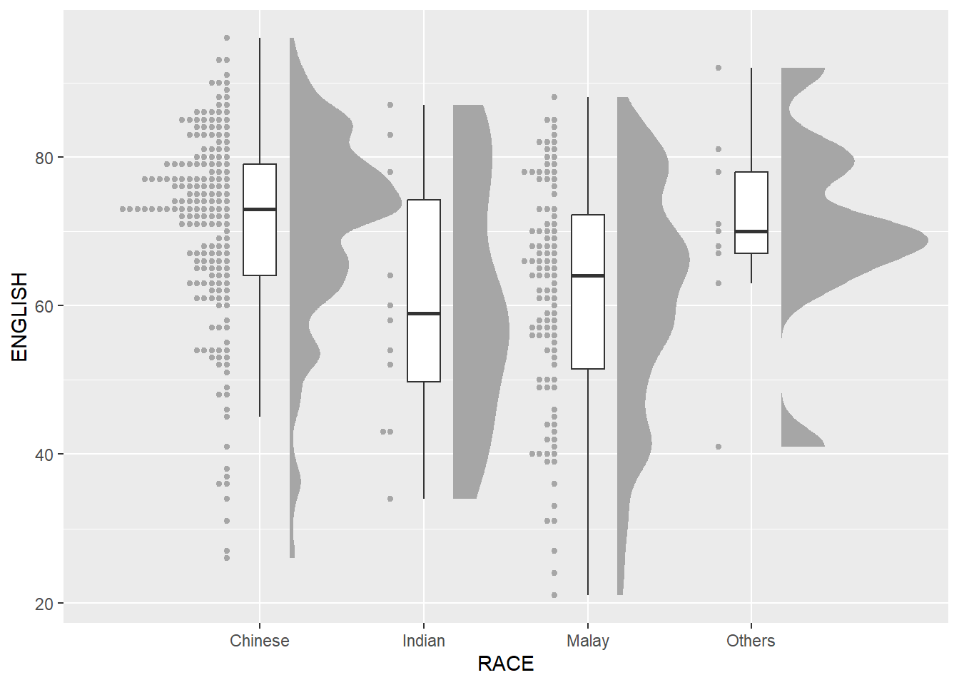
Next, we will add the third geometry layer using stat_dots() of ggdist package. This produces a half-dotplot, which is similar to a histogram where the number of dots in each bin indicates the number of samples.
ggplot(exam,
       aes(x = RACE,
           y = ENGLISH)) +
  stat_halfeye(adjust = 0.5,
               justification = -0.2,
               .width = 0,
               point_colour = NA) +
  geom_boxplot(width = .20,
               outlier.shape = NA) +
  stat_dots(side = "left",
            justification = 1.2,
            binwidth = .5,
            dotsize = 2)
NoteThings to learn from the code chunk above
stat_dots()is a Wilkinson dot plot — one dot per observation, stacked into bins. It is conceptually similar to a histogram but uses individual dots instead of bars.side = "left"places the dots on the opposite side of the half-violin (which is on the right).binwidth = .5controls how scores are bucketed before stacking. Smaller values give finer detail; larger values smooth.dotsize = 2scales the dot size relative to the binwidth.
TipReading the plot
The dots are the “rain” and every individual observation appears in the chart. For groups with small n, the dots make sample size visually obvious as small clusters of rain and shows that the density estimate above is built on thin evidence.
Combined with the half-violin and the boxplot, the chart now contains three views of the same data, the shape (cloud), summary (boxplot), and individual points (rain).
9.4.4 Finishing Touch
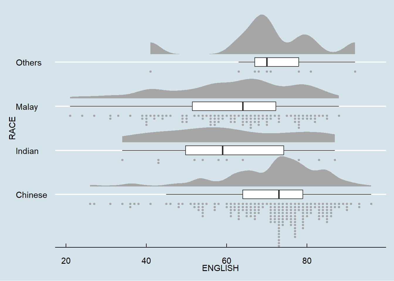
Lastly, coord_flip() of the ggplot2 package will be used to flip the raincloud chart horizontally so that the dots appear to “fall” from the clouds above, giving it the raincloud appearance. At the same time, theme_economist() of ggthemes package is used to give the raincloud chart a professional publication style look.
ggplot(exam,
       aes(x = RACE,
           y = ENGLISH)) +
  stat_halfeye(adjust = 0.5,
               justification = -0.2,
               .width = 0,
               point_colour = NA) +
  geom_boxplot(width = .20,
               outlier.shape = NA) +
  stat_dots(side = "left",
            justification = 1.2,
            binwidth = .5,
            dotsize = 1.5) +
  coord_flip() +
  theme_economist()
TipReading the plot
The final raincloud reveals that the Chinese race group shows a roughly symmetric, single-peaked distribution. The Indian and Malay groups show more spread and lower medians. The “Others” group has so few observations that its density estimate should be interpreted cautiously.
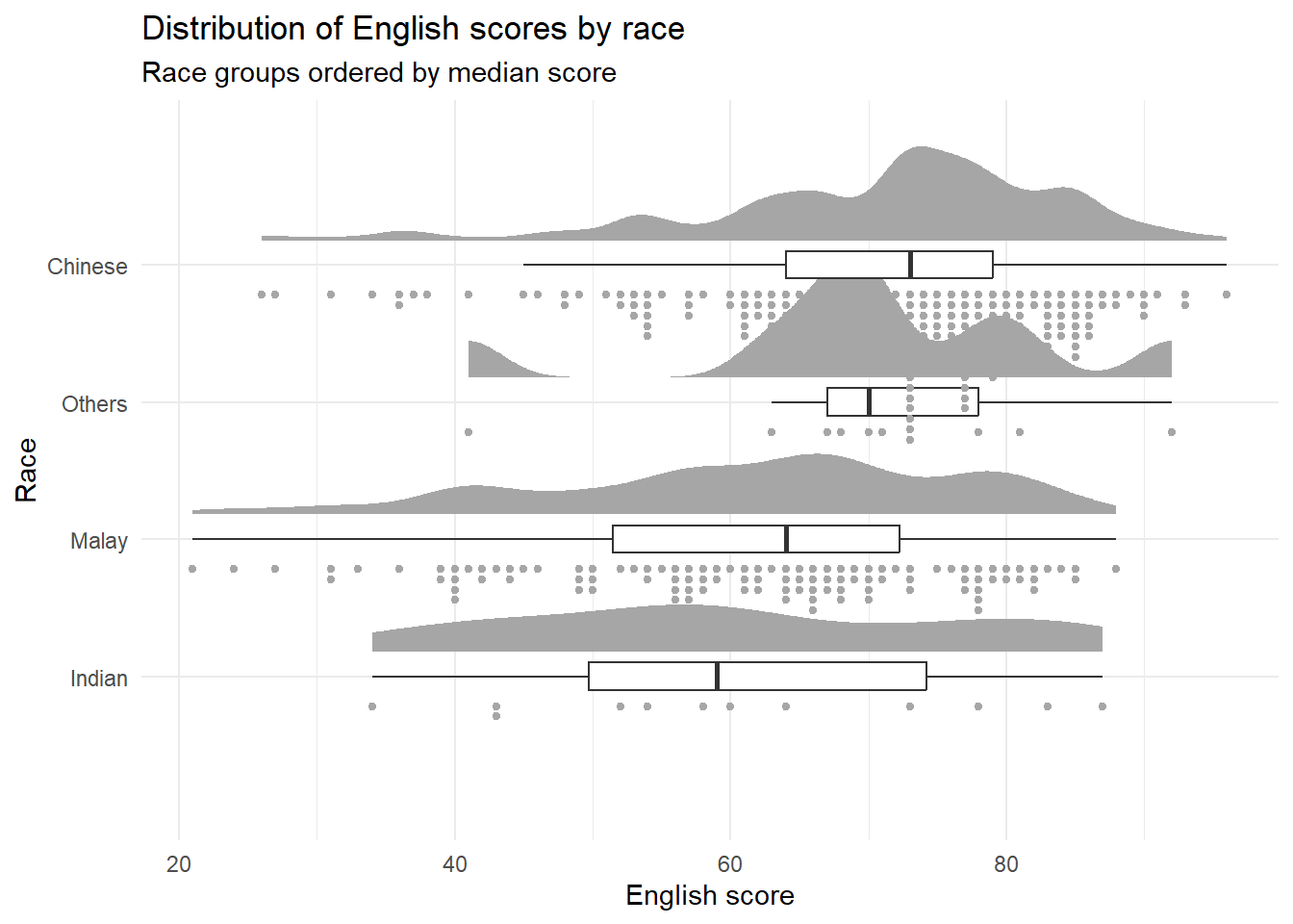
9.4.4.1 Reordering Race by Median Score
ggplot(exam,
       aes(x = fct_reorder(RACE, ENGLISH, .fun = median),
           y = ENGLISH)) +
  stat_halfeye(adjust = 0.5,
               justification = -0.2,
               .width = 0,
               point_colour = NA) +
  geom_boxplot(width = .20,
               outlier.shape = NA) +
  stat_dots(side = "left",
            justification = 1.2,
            binwidth = .5,
            dotsize = 1.5) +
  coord_flip() +
  labs(title = "Distribution of English scores by race",
       subtitle = "Race groups ordered by median score",
       x = "Race", y = "English score") +
  theme_minimal()
NoteThings to learn from the code chunk above
fct_reorder(RACE, ENGLISH, .fun = median)reorders the levels ofRACEby the median English score within each group.theme_minimal()replacestheme_economist()from 9.4.4 because the blue background of the Economist theme reduces contrast with the half-violin and the serif fonts hurt legibility.
TipWhat changed and why
Race groups are now ordered by performance, and the theme is more legible.
10 Visual Statistical Analysis
10.1 Learning Outcome
The chapter focuses on the ggstatsplot package, which produces graphics that bundle statistical test results directly into the plot. Two related packages — performance (model diagnostic plots) and parameters (visualising model coefficients) are related and are worth exploring after this chapter.
The conceptual paradigm: statistical inference and visualisation should appear together in one chart, not in separate tables and figures. This reduces the cognitive load between observation and conclusion.
10.2 Visual Statistical Analysis with ggstatsplot
ggstatsplot  is an extension of the ggplot2 package for creating graphics with details from statistical tests included in the information-rich plots themselves.
To provide alternative statistical inference methods by default.
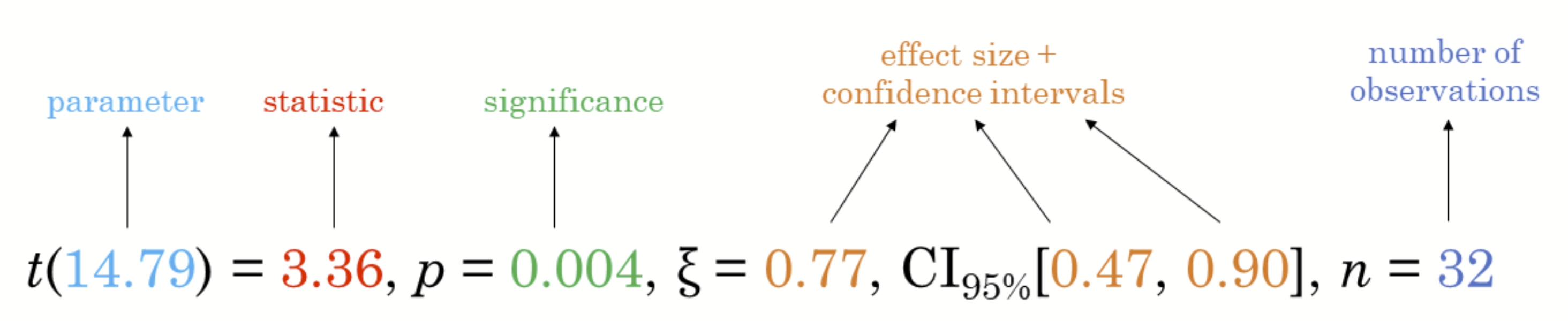
To follow best practices for statistical reporting. For all statistical tests reported in the plots, the default template abides by the APA gold standard for statistical reporting. For example, here are results from a robust t-test:
10.3 Getting Started
10.3.1 Installing and Launching R Packages
In this exercise, ggstatsplot and tidyverse will be used.
pacman::p_load(ggstatsplot, tidyverse)10.3.2 Importing Data
exam <- read_csv("data/Exam_data.csv")

kable(head(exam))| ID | CLASS | GENDER | RACE | ENGLISH | MATHS | SCIENCE |
|---|---|---|---|---|---|---|
| Student321 | 3I | Male | Malay | 21 | 9 | 15 |
| Student305 | 3I | Female | Malay | 24 | 22 | 16 |
| Student289 | 3H | Male | Chinese | 26 | 16 | 16 |
| Student227 | 3F | Male | Chinese | 27 | 77 | 31 |
| Student318 | 3I | Male | Malay | 27 | 11 | 25 |
| Student306 | 3I | Female | Malay | 31 | 16 | 16 |
10.3.3 One-Sample test:gghistostats() method
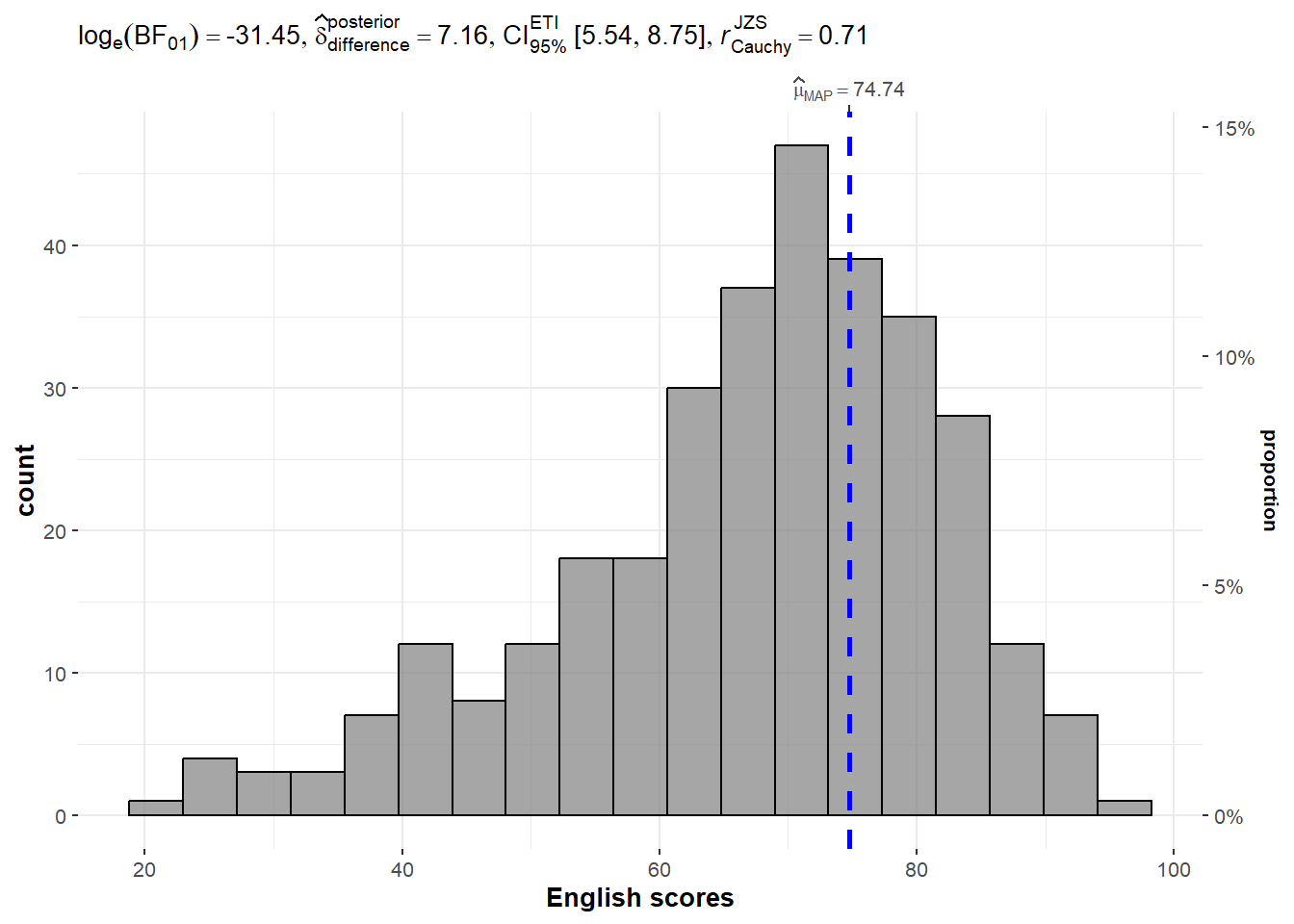
gghistostats() runs a one-sample test, comparing the sample mean to a hypothesised value (e.g. test.value = 60, asking “is the mean English score different from 60?”) and visualises the result as a histogram.
set.seed(1234)

gghistostats(
  data = exam,
  x = ENGLISH,
  type = "bayes",
  test.value = 60,
  xlab = "English scores"
)
NoteKey Arguments
type = "bayes"— runs a Bayesian one-sample test, returning a Bayes Factor instead of a p-valuetest.value = 60— the null hypothesis valueset.seed(1234)— Bayesian methods use Monte Carlo simulation; setting the seed makes results reproducible
10.3.4 Unpacking the Bayes Factor
The Bayes Factor (BF₁₀) is the ratio of the likelihood of H₁ to H₀ given the data. It’s the Bayesian analogue of a p-value, but with two key advantages:
It can quantify evidence for the null (a p-value can’t — non-significance ≠ evidence for null).
It’s a continuous measure of evidence strength, not a binary reject/fail-to-reject.

The Schwarz criterion is an approximation to the Bayes Factor and is useful when you don’t want to do full Bayesian computation.
10.3.5 How to Intepret Bayes Factor
A Bayes Factor can be any positive number. One of the most common interpretations is the standard Jeffreys (1961) interpretation table, slightly modified by Lee & Wagenmakers in 2013:
| BF₁₀ | Interpretation |
|---|---|
| > 100 | Extreme evidence for H₁ |
| 30–100 | Very strong |
| 10–30 | Strong |
| 3–10 | Moderate |
| 1–3 | Anecdotal |
| 1 | No evidence |
| 1/3–1 | Anecdotal evidence for H₀ |
| 1/10–1/3 | Moderate for H₀ |
| 1/30–1/10 | Strong for H₀ |
| 1/100–1/30 | Very strong for H₀ |
| < 1/100 | Extreme evidence for H₀ |
10.3.6 Two-Sample Mean Test:ggbetweenstats()
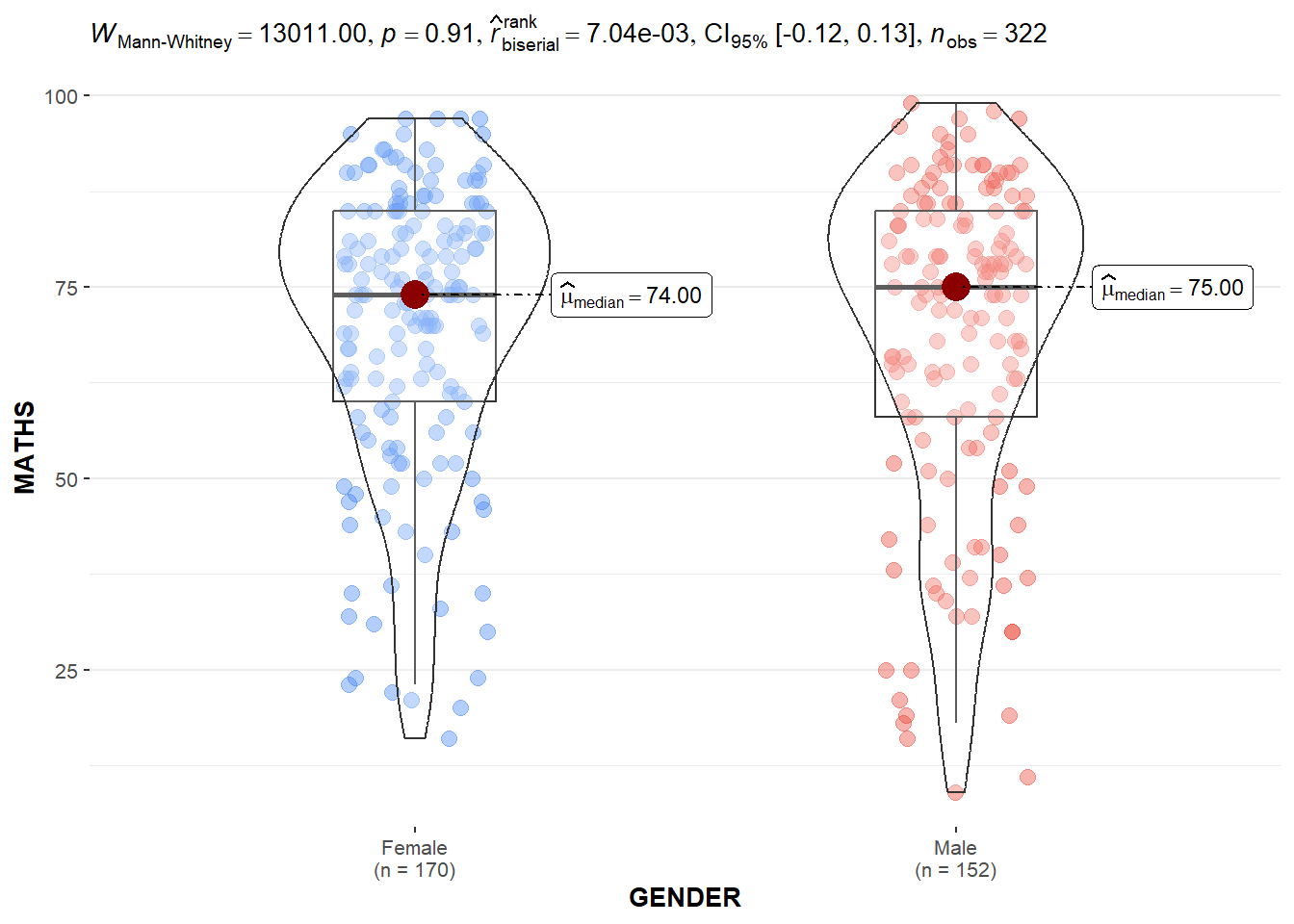
ggbetweenstats() compares a numeric variable across two or more independent groups. With two groups (Male vs Female here), it’s a two-sample test. The chart combines a violin + boxplot + jittered raw points, with the test result displayed in the header.
ggbetweenstats(
  data = exam,
  x = GENDER,
  y = MATHS,
  type = "np",
  messages = FALSE
)
NoteThings to learn from the code chunk above
ggbetweenstats()compares a numeric outcome across two or more independent groups.x = GENDERis the categorical grouping variable;y = MATHSis the numeric outcome.type = "np"runs the non-parametric test — Mann-Whitney U for 2 groups, Kruskal-Wallis for 3+ groups. The non-parametric choice is appropriate when the data is non-normal or contains outliers.- The plot combines a violin (distribution shape), a boxplot (summary statistics), and jittered raw points (individual observations).
TipReading the plot
The chart reports the median MATHS score for males and females, the rank-biserial effect size, the test statistic, the p-value, and sample sizes, all in one annotated panel. The visual comparison and the inferential claim appear together, eliminating the cognitive gap between “what does the chart show” and “is it statistically significant”.
The effect size matters as much as the p-value. A statistically significant difference with a small effect size may not be practically meaningful. A non-significant difference with a large effect size may warrant follow-up with a larger sample.
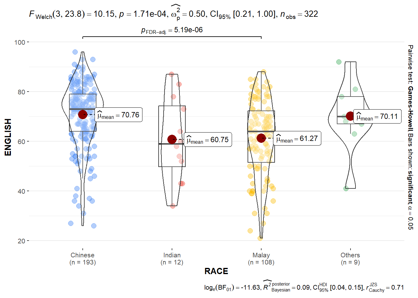
10.3.7 One-way ANOVA Test:ggbetweenstats() method
This section has the same function as 10.3.6, but with 3+ groups (RACE: Chinese, Indian, Malay, Others), so it runs a one-way ANOVA with type = "p".
ggbetweenstats(
  data = exam,
  x = RACE,
  y = ENGLISH,
  type = "p",
  mean.ci = TRUE,
  pairwise.comparisons = TRUE,
  pairwise.display = "s",
  p.adjust.method = "fdr",
  messages = FALSE
)
NoteThings to learn from the code chunk above
- With three or more groups (Chinese, Indian, Malay, Others),
ggbetweenstats()runs a one-way ANOVA whentype = "p". mean.ci = TRUEdisplays a 95% confidence interval around each group mean.pairwise.comparisons = TRUEruns post-hoc tests between every pair of groups.pairwise.display = "s"shows only significant pairs in the chart annotations. Alternatives: “ns” for only non-significant pairs, “all” for everything.p.adjust.method = "fdr"applies False Discovery Rate (Benjamini-Hochberg) correction. Alternatives: “bonferroni” (more conservative), “holm” (step-down), “none” (no correction).
TipReading the plot
The chart shows the overall ANOVA F-statistic and p-value testing the null hypothesis that all four race groups have the same mean English score. The brackets between groups annotate which specific pairwise comparisons are significant after multiple-comparison correction.
The choice of correction method matters. FDR, which is used here, is liberal and is appropriate when expecting multiple true positives in exploratory analysis. Bonferroni is more conservative and reduces false positives at the cost of statistical power. Justifying this choice in a real analysis is part of the methodological transparency a reader should expect.
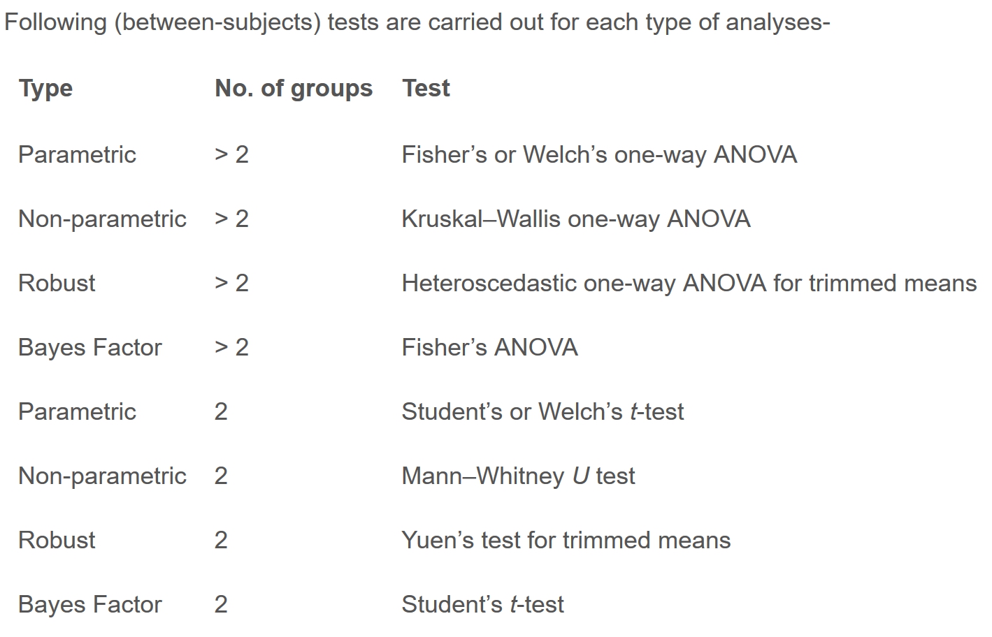
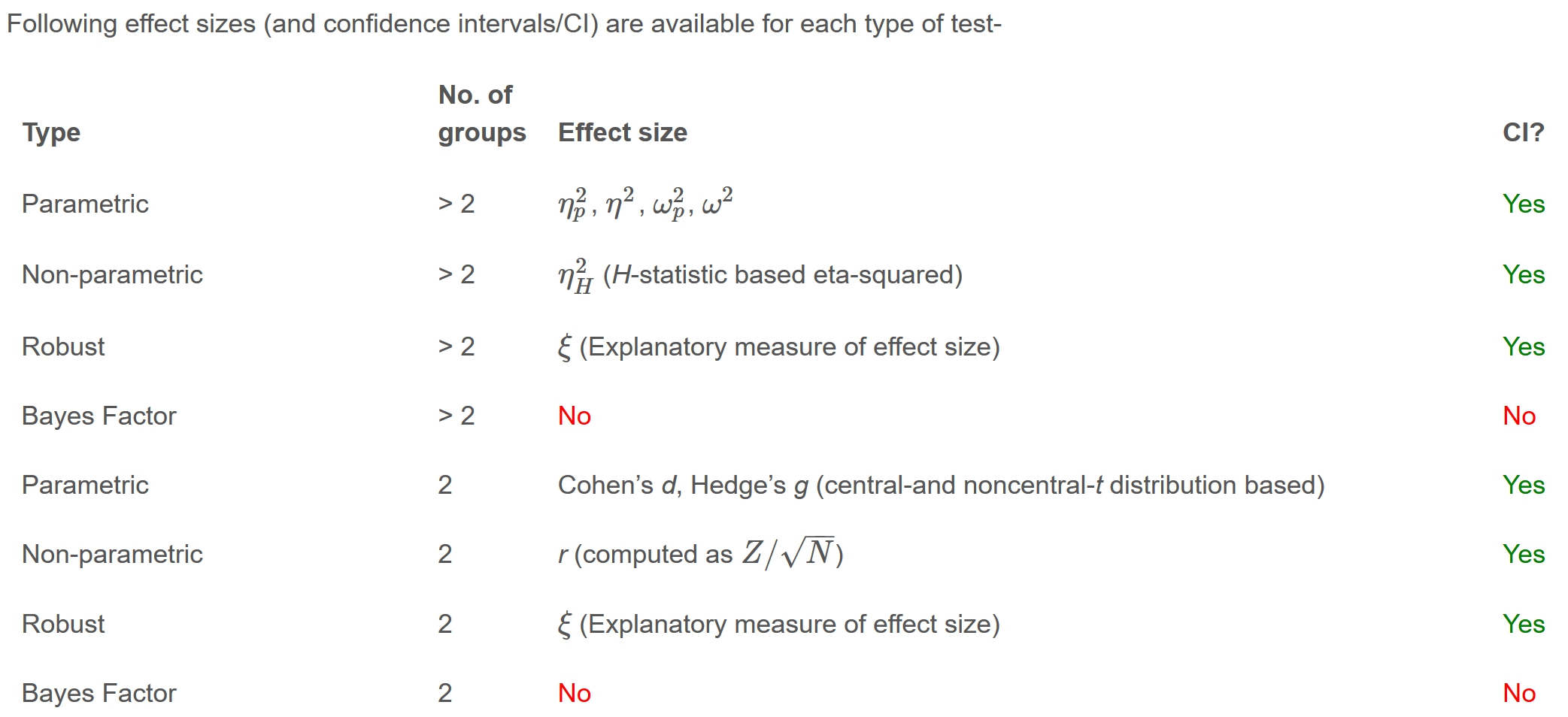
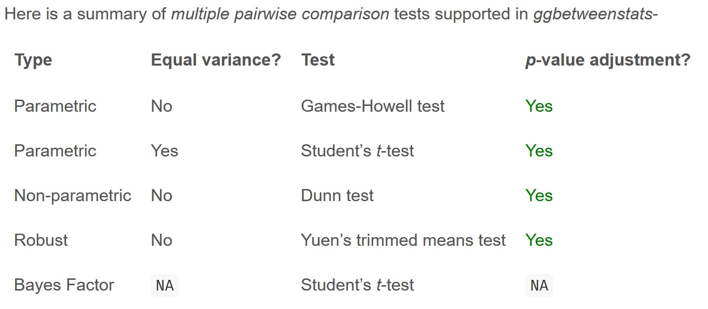
10.3.7.1 ggbetweenstats- Summary of Tests
Reference tables below shows the output of the ggbetweenstats() tests under these combinations:
Number of groups (2 vs 2+)
Test type (parametric, non-parametric, robust, Bayes)
Independence (between-subjects vs within-subjects via ggwithinstats())
| Groups | type = “p” | type = “np” | type = “r” | type = “bayes” |
|---|---|---|---|---|
| 2 | Welch’s t-test | Mann-Whitney U | Yuen’s trimmed mean | Bayesian t-test |
| 3+ | One-way ANOVA | Kruskal-Wallis | Heteroscedastic ANOVA | Bayesian ANOVA |
10.3.8 Significance Test of Correlation: ggscatterstats()
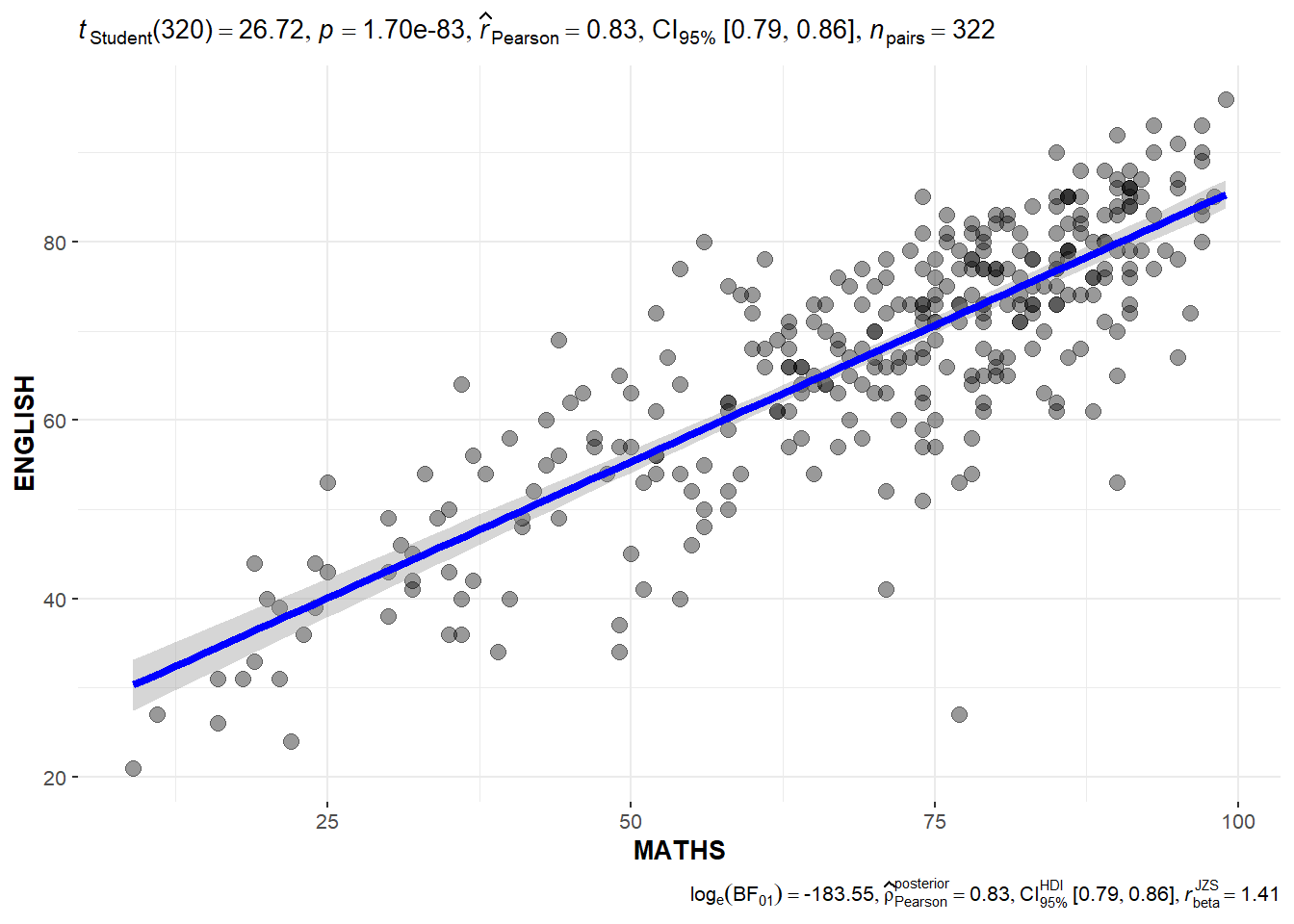
ggscatterstats() is used to build a visual (scatterplot with a correlation test)for Significant Test of Correlation between Maths scores and English Scores. The default is using Pearson’s r. The plot shows raw points + regression line + confidence band, with header reporting r, t-statistic, df, p-value, and 95% CI.
ggscatterstats(
  data = exam,
  x = MATHS,
  y = ENGLISH,
  marginal = FALSE
  )
NoteThings to learn from the code chunk above
ggscatterstats()produces a scatterplot with a correlation test embedded in the header strip.- The default test is Pearson’s r (parametric, assuming linear relationship and normal residuals). Switch to
type = "np"for Spearman’s ρ if the relationship is monotonic but not necessarily linear. marginal = FALSEsuppresses the marginal density plots that would otherwise appear on each axis. The default is TRUE — keep it on for richer information.- The header reports the correlation coefficient, t-statistic, degrees of freedom, p-value, and 95% confidence interval.
TipReading the plot
The scatter shows the joint distribution of MATHS and ENGLISH scores. The fitted regression line and confidence band visualise the linear relationship, while the correlation coefficient quantifies its strength.
A high correlation, where r is close to ±1, indicates that the two variables move together. A coefficient near 0 indicates no linear relationship. The narrow confidence band on the regression line indicates that the slope estimate is precise. A wide band would suggest the relationship is uncertain even if visually apparent.
10.3.9 Significance Test of Association (Dependence): ggbarstats() methods
ggbarstats() runs a chi-square test of independence on a contingency table (e.g. GENDER × MATHS_bins) and visualises the result as a stacked proportion bar chart with chi-sq, df, p-value, Cramér’s V (effect size), and Bayes Factor.
exam1 <- exam %>%
  mutate(MATHS_bins = cut(MATHS,
                          breaks = c(0,60,75,85,100))
)
The code below uses ggbarstats() to build a visual for Significant Test of Association.
ggbarstats(exam1,
           x = MATHS_bins,
           y = GENDER)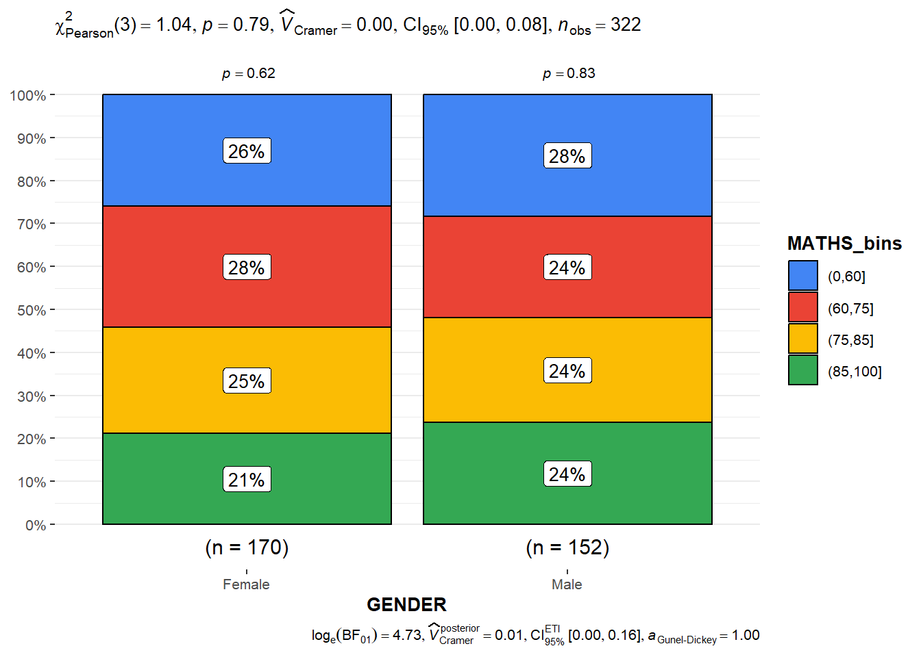
NoteThings to learn from the code chunk above
cut(MATHS, breaks = c(0, 60, 75, 85, 100))bins the continuous MATHS scores into four ordinal categories (0,60], (60,75], (75,85], (85,100].ggbarstats(x = MATHS_bins, y = GENDER)runs a chi-square test of independence between the two categorical variables and visualises the result as stacked proportion bars.- The header reports the chi-square statistic, degrees of freedom, p-value, Cramér’s V (effect size), and Bayes Factor.
- Cramér’s V interpretation: 0.1 = small effect, 0.3 = medium, 0.5 = large.
TipReading the plot
The stacked bars show the proportion of each MATHS performance band within each gender. If the two variables were independent, the bands would be similar across both genders; visible differences in the band heights indicate association.
Note the trade-off: binning the continuous MATHS variable into four categories loses information. A test on the raw scores (using ggbetweenstats()) would be more powerful. The categorical-categorical approach is justified when the bins represent meaningful thresholds (e.g. pass/fail, grade boundaries), not arbitrary cuts.
11 Visualising Uncertainty
Most data visualisations show point estimates such as a mean, a median, a single prediction, and treat them as if they were certain. However, every estimate from sample data carries uncertainty, and visualisations that hide this uncertainty lead to over-confident conclusions.
This chapter introduces the toolkit for making uncertainty visible: error bars (SE and CI), confidence intervals, gradient intervals, and Hypothetical Outcome Plots (HOPs). The intellectual lineage traces back to Wilke’s Fundamentals of Data Visualization Ch. 16, Cleveland’s work on graphical inference, and Hullman et al.’s research on HOPs (which arose from psychological evidence that static error bars are systematically misinterpreted by readers).
TipReferences
Hullman, J., Resnick, P., & Adar, E. (2015). Hypothetical outcome plots outperform error bars and violin plots for inferences about reliability of variable ordering. PLOS ONE.
Wilke, C. O. (2019). Fundamentals of Data Visualization, Chapter 16.
11.1 Learning Outcome
The chapter teaches four ways to plot uncertainty:
Standard error bars and confidence intervals using
ggplot2Interactive error bars combining
ggplot2,plotly,DT, andcrosstalkAdvanced uncertainty visualisations with
ggdist(point-intervals, gradient-intervals)Hypothetical Outcome Plots (HOPs) with
ungeviz, where animation cycles through plausible outcomes from the sampling distribution
A point estimate is a single number (e.g. mean), but its uncertainty must be shown alongside it as standard error, confidence interval, or credible interval. Uncertainty visualisation should be a default, not an afterthought.
11.2 Getting Started
11.2.1 Installing and Loading the Packages
The packages used in this chapter and their roles:
| Package | Role |
|---|---|
tidyverse |
Data wrangling and ggplot2 |
plotly |
Converting ggplot to interactive plots via ggplotly() |
gganimate |
Frame-by-frame animation, used for HOPs in 11.5 |
DT |
Interactive HTML tables |
crosstalk |
Linked brushing/filtering between widgets |
ggdist |
Distribution and uncertainty geoms |
ggridges and colorspace are loaded as carry-overs from earlier chapters; they are not strictly required for this chapter but kept for consistency.
pacman::p_load(plotly, crosstalk, DT,
               ggdist, ggridges, colorspace,
               gganimate, tidyverse)
11.2.2 Data Import
The same Exam_data.csv dataset from Chapters 9 and 10 is used.
exam <- read_csv("data/Exam_data.csv")11.3 Visualising the Uncertainty of Point Estimates: ggplot2 methods
The section establishes the conceptual distinction between a point estimate (a single number summarising the data typically used for a mean or median) and its uncertainty (standard error, confidence interval, or credible interval).
Important
Don’t confuse the uncertainty of a point estimate with the variation in the sample.
The summary statistics are computed for plotting:
my_sum <- exam %>%
  group_by(RACE) %>%
  summarise(
    n=n(),
    mean=mean(MATHS),
    sd=sd(MATHS)
    ) %>%
  mutate(se=sd/sqrt(n-1))
The result is a tibble with one row per RACE: count, mean MATHS score, standard deviation, and standard error. The chapter uses the formula sd/√(n−1), though the standard formula for the SE of the mean is sd/√n. The numerical difference is small but worth noting.
NoteThings to learn from the code chunk above
group_by(RACE)groups observations by race so subsequent summaries are computed per group.summarise()computes the count, mean, and standard deviation of MATHS within each group.mutate(se = sd/sqrt(n-1))derives the standard error. Note: the conventional formula issd/sqrt(n); then-1denominator used here is non-standard and produces slightly wider SEs for small groups.- The output is saved as a tibble called
my_sum, used in the plotting steps that follow.
TipReading the table
The table shows the inputs to the uncertainty plots that follow. The Chinese group has the largest n at 193 and therefore the smallest SE, meaning that its mean estimate is most precise. The “Others” group has the smallest n at 9, which produces a wide SE. This indicates that uncertainty around its mean is substantial. Smaller samples consistently produce wider intervals throughout this chapter, and this is the underlying principle that the visualisations make geometric.
| RACE | n | mean | sd | se |
|---|---|---|---|---|
| Chinese | 193 | 76.50777 | 15.69040 | 1.132357 |
| Indian | 12 | 60.66667 | 23.35237 | 7.041005 |
| Malay | 108 | 57.44444 | 21.13478 | 2.043177 |
| Others | 9 | 69.66667 | 10.72381 | 3.791438 |
knitr::kable(head(my_sum), format = 'html')11.3.1 Plotting Standard Error Bars of Point Estimates
The plot layers two geoms:
geom_errorbar() which draws vertical lines from mean-se to mean+se — i.e. ±1 SE geom_point() which draws the mean as a red dot at the centre of each error bar
Each race gets one error bar around its mean MATHS score. The bars represent ±1 standard error, which corresponds to a roughly 68% confidence interval under normality.
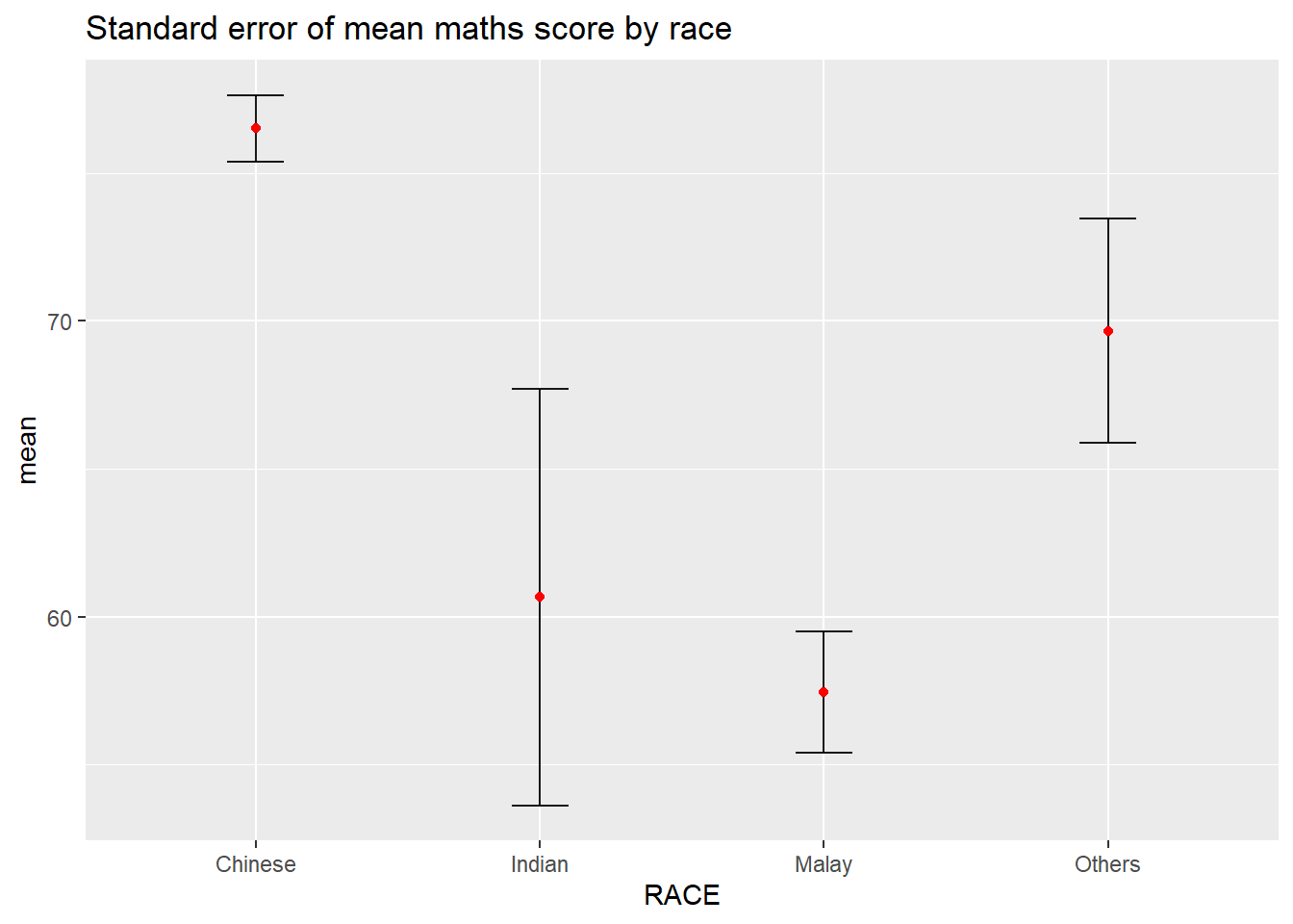
ggplot(my_sum) +
  geom_errorbar(
    aes(x=RACE,
        ymin=mean-se,
        ymax=mean+se),
    width=0.2,
    colour="black",
    alpha=0.9,
    linewidth=0.5) +
  geom_point(aes
           (x=RACE,
            y=mean),
           stat="identity",
           color="red",
           size = 1.5,
           alpha=1) +
  ggtitle("Standard error of mean maths score by race")
NoteThings to learn from the code chunk above
geom_errorbar(aes(ymin = mean - se, ymax = mean + se))draws ±1 SE bars around each group’s mean.geom_point()plots the mean as a red dot at the centre of each error bar.width = 0.2sets the horizontal width of the error bar caps.linewidth = 0.5controls the thickness of the error bar lines.- The chart uses ±1 SE, which corresponds to roughly a 68% confidence interval under normality.
TipReading the plot
Each red dot marks the mean MATHS score for one race group; the vertical line shows ±1 SE around that mean.
Critically, the chart does not label what kind of uncertainty the error bars represent. A reader could mistake them for 95% confidence intervals (which are roughly twice as wide). Always label the error bar type explicitly in the title, subtitle, or caption.
11.3.2 Plotting Confidence Interval of Point Estimates
This plot extends the previous one in 11.3.1 in two ways:
- Error bars now represent ±1.96 SE = 95% confidence interval, the conventional CI.
- The x-axis is sorted by descending mean using reorder(RACE, -mean)
The 1.96 multiplier comes from the standard normal distribution: 95% of the area falls within ±1.96 SDs of the mean.
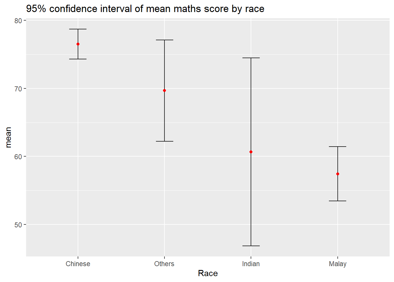
ggplot(my_sum) +
  geom_errorbar(
    aes(x=reorder(RACE, -mean),
        ymin=mean-1.96*se,
        ymax=mean+1.96*se),
    width=0.2,
    colour="black",
    alpha=0.9,
    linewidth=0.5) +
  geom_point(aes
           (x=RACE,
            y=mean),
           stat="identity",
           color="red",
           size = 1.5,
           alpha=1) +
  labs(x = "Race",
       title = "95% confidence interval of mean maths score by race")
NoteThings to learn from the code chunk above
- The error bar formula changes from
mean ± setomean ± 1.96*se, producing a 95% confidence interval under the normal approximation. reorder(RACE, -mean)sorts the x-axis by descending mean — the highest-performing group appears first.- The 1.96 multiplier comes from the standard normal distribution: 95% of probability lies within ±1.96 standard deviations of the mean.
TipReading the plot
Compared to 11.3.1, the error bars are now roughly twice as wide because they represent a 95% CI rather than ±1 SE. The reordering makes the ranking visually obvious. Chinese has the highest mean MATHS score, followed by Others, Indian, and Malay.
The 1.96 multiplier assumes that the normal approximation is valid. For small groups, such as Others with n=9 and Indian with n=12, the t-distribution would give wider, more accurate intervals. Using qt(0.975, df = n-1) instead of 1.96 is more defensible for small samples.
11.3.3 Visualising the Uncertainty of Point Estimates with Interactive Error Bars
This combines three packages into a linked dashboard widget:
crosstalk::SharedData$new()— wraps the dataframe so that selections in one widget update the otherggplotly()— converts the ggplot to a plotly object with hover tooltipsDT::datatable()— renders the same data as an interactive HTML tablebscols()— Bootstrap-style column layout, here splitting the screen 4/8 between plot and table
The error bars use ±2.58 SE, which corresponds to a 99% confidence interval (z = 2.576 for 99% under normality). The custom HTML tooltip embedded in text = paste(…) is what ggplotly(tooltip = “text”) displays on hover.
shared_df = SharedData$new(my_sum)

bscols(widths = c(4,8),
       ggplotly((ggplot(shared_df) +
                   geom_errorbar(aes(
                     x=reorder(RACE, -mean),
                     ymin=mean-2.58*se,
                     ymax=mean+2.58*se),
                     width=0.2,
                     colour="black",
                     alpha=0.9,
                     size=0.5) +
                   geom_point(aes(
                     x=RACE,
                     y=mean,
                     text = paste("Race:", `RACE`,
                                  "<br>N:", `n`,
                                  "<br>Avg. Scores:", round(mean, digits = 2),
                                  "<br>99% CI:[",
                                  round((mean-2.58*se), digits = 2), ",",
                                  round((mean+2.58*se), digits = 2),"]")),
                     stat="identity",
                     color="red",
                     size = 1.5,
                     alpha=1) +
                   xlab("Race") +
                   ylab("Average Scores") +
                   theme_minimal() +
                   theme(axis.text.x = element_text(
                     angle = 45, vjust = 0.5, hjust=1)) +
                   ggtitle("99% Confidence interval of average <br>maths scores by race")),
                tooltip = "text"),
       DT::datatable(shared_df,
                     rownames = FALSE,
                     class="compact",
                     width="100%",
                     options = list(pageLength = 10,
                                    scrollX=T),
                     colnames = c("Race",
                                  "No. of pupils",
                                  "Avg Scores",
                                  "Std Dev",
                                  "Std Error")) %>%
         formatRound(columns=c('mean', 'sd', 'se'),
                     digits=2))
NoteThings to learn from the code chunk above
SharedData$new()fromcrosstalkwraps the dataframe so multiple widgets stay synchronised — clicking a row in the table highlights the corresponding point in the plot.ggplotly()converts the ggplot object into an interactive plotly chart with hover tooltips.- The custom HTML tooltip is built using
paste()with<br>line breaks;tooltip = "text"tells plotly to display this content. bscols(widths = c(4, 8))arranges the plot and the table side-by-side using Bootstrap’s 12-column grid (4 for the plot, 8 for the table).- The error bars use ±2.58 SE, corresponding to a 99% confidence interval (z = 2.576 for 99% under normality).
TipReading the plot
The plot provides the overview, the table allows sorting and searching, and hovering on either widget gives full numerical context for any specific row or point.
The 99% CI is more conservative than the conventional 95%, producing wider bars and fewer apparent significant differences. Choosing 99% would typically be motivated by very high stakes, such as medical decisions, or by strict false-positive control.
11.4 Visualising Uncertainty: ggdist Package
ggdist is positioned as the modern unified solution for uncertainty visualisation. Its core philosophy: uncertainty is a distribution, regardless of whether it comes from a frequentist or Bayesian source. Frequentist uncertainty becomes confidence/bootstrap distributions; Bayesian uncertainty is the posterior. Both are visualised with the same geoms.
The package provides three families of geoms:
Slabintervals (
stat_pointinterval,stat_gradientinterval,stat_eye, etc.) — combine a point estimate, an interval, and optionally a - distribution shape -Dotsintervals (
stat_dots) — render distributions as quantile dotsLineribbons (
stat_lineribbon) — for time-varying uncertainty
11.4.1 Visualising the Uncertainty: stat_pointinterval()
stat_pointinterval() computes summary statistics from raw data (no need to pre-aggregate as in 11.3) and plots:
A central point (default: median)
One or more interval bars (default: 66% and 95%)
exam %>%
  ggplot(aes(x = RACE,
             y = MATHS)) +
  stat_pointinterval() +
  labs(
    title = "Visualising confidence intervals of mean math score",
    subtitle = "Mean Point + Multiple-interval plot")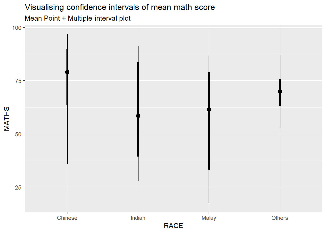
NoteThings to learn from the code chunk above
stat_pointinterval()computes summary statistics directly from raw data — no need to pre-aggregate into a summary tibble as in 11.3.- The default settings show the median as the central point and 66% and 95% quantile intervals of the data distribution.
- The thicker bar represents the 66% interval; the thinner bar extends to the 95% interval.
- Important: these are quantile intervals of the data, not confidence intervals of the mean. They describe where the data fall, not the precision of the mean estimate.
TipReading the plot
Each group shows its median MATHS score with two intervals. The inner thick bar contains 66% of the data, while the outer thin bar contains 95%. Wider intervals indicate more spread within the group, while tighter intervals indicate concentrated scores.
The chart’s title says “confidence intervals of mean math score”, but the default behaviour shows median and quantile intervals of the data, not CI of the mean. Conflating these is a common source of misinterpretation. The next section (11.4.2) shows how to specify exact intervals to fix this.
exam %>%
  ggplot(aes(x = RACE, y = MATHS)) +
  stat_pointinterval(.width = 0.95,
  .point = median,
  .interval = qi) +
  labs(
    title = "Visualising confidence intervals of median math score",
    subtitle = "Median Point + Multiple-interval plot")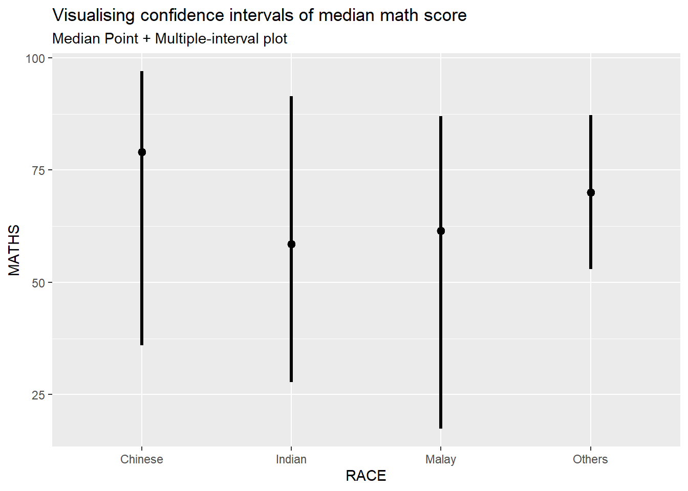
NoteThings to learn from the code chunk above
.width = 0.95requests a single 95% interval (instead of the default 66% and 95%)..point = medianmakes the point estimate the median (this is the default)..interval = qiuses a quantile interval —hdi(highest density interval) is the alternative, useful for skewed distributions.
TipReading the plot
This version shows a single 95% quantile interval per group, more interpretable than the layered 66%+95% display. For inference about the mean, see 11.4.2 below where point_interval = "mean_qi" switches the central statistic to the mean.
11.4.2 Visualising the Uncertainty of Point Estimates: ggdist methods
The plot below shows 95% and 99% confidence intervals.
# 95% and 99% intervals
exam %>%
  ggplot(aes(x = RACE, y = MATHS)) +
  stat_pointinterval(
    .width = c(0.95, 0.99),
    point_interval = "mean_qi",
    show.legend = FALSE) +
  labs(
    title = "Mean MATHS score by race with 95% and 99% intervals",
    subtitle = "Thicker bars = 95% interval; thinner extensions = 99% interval",
    x = "Race",
    y = "MATHS score")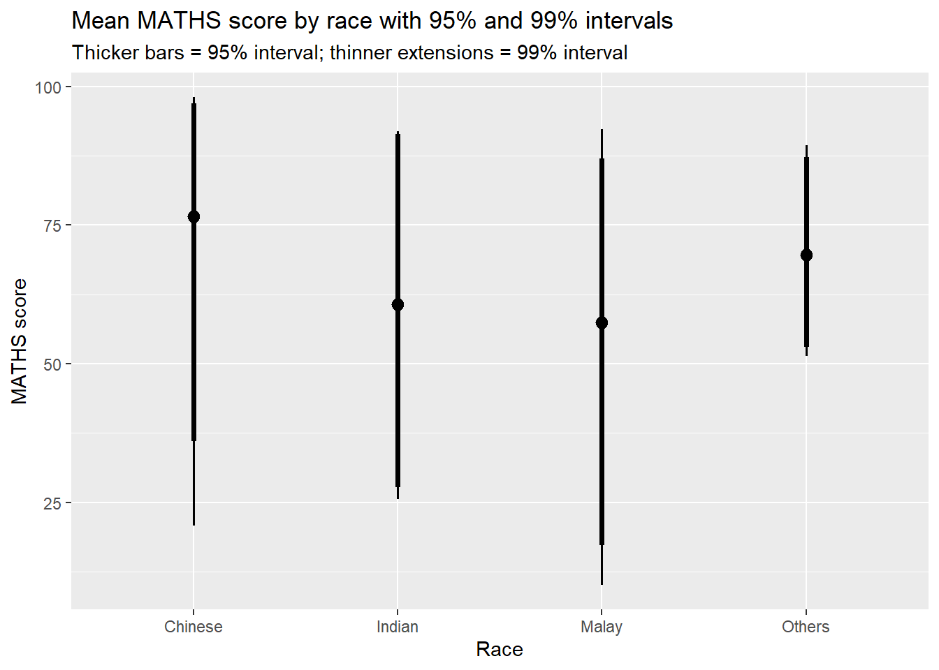
NoteThings to learn from the code chunk above
.width = c(0.95, 0.99)requests two intervals simultaneously — both render in one chart with different visual weights (thicker bar = 95%, thinner extension = 99%).point_interval = "mean_qi"switches from median (default) to mean as the central statistic, plus quantile intervals.show.legend = FALSEhides the legend, keeping the chart clean.
TipReading the plot
This version makes the relationship between confidence level and interval width visible directly. The 95% interval, shown as the thicker bar, is narrower. The 99% interval, shown as the thinner extension, is wider. Both are computed from the same data, however the higher confidence level demands a wider interval to capture the additional uncertainty.
11.4.3 Visualising the Uncertainty of Point Estimates: ggdist methods
stat_gradientinterval() replaces the discrete interval bars with a continuous gradient and the colour fades from intense (high probability density) at the centre to transparent (low density) at the tails.
exam %>%
  ggplot(aes(x = RACE,
             y = MATHS)) +
  stat_gradientinterval(
    fill = "skyblue",
    show.legend = TRUE
  ) +
  labs(
    title = "Visualising confidence intervals of mean math score",
    subtitle = "Gradient + interval plot")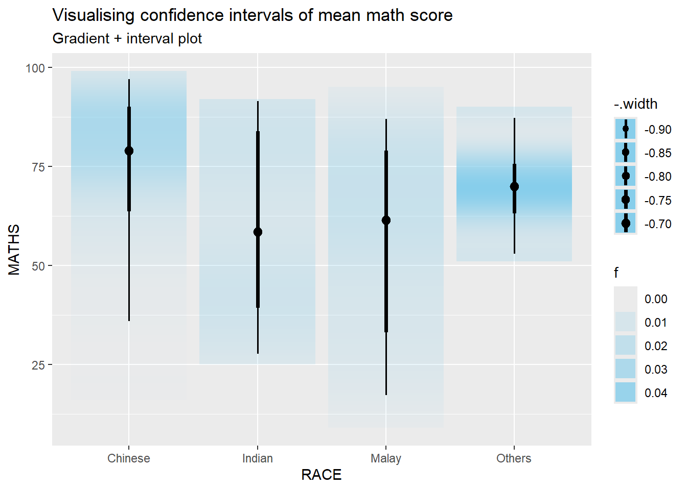
NoteThings to learn from the code chunk above
stat_gradientinterval()replaces discrete interval bars with a continuous colour gradient — the fill fades from intense (high probability density) at the centre to transparent (low density) at the tails.fill = "skyblue"sets the base colour. The gradient interpolates between this and transparency.- The gradient version shows the smooth structure of uncertainty rather than imposing arbitrary cutoff thresholds.
TipReading the plot
Compared to discrete interval bars, the gradient communicates uncertainty more intuitively for non-statistical audiences. There is no arbitrary line where “significant” begins, just a visual fading away from the central estimate.
There is a trade-off to consider. Gradient intervals are harder to use for inferential claims because they do not mark specific thresholds. For academic publication where the conventional 95% CI is expected, stat_pointinterval() remains the safer choice. For exploratory or public-facing communication, gradient intervals reduce misinterpretation.
11.5 Visualising Uncertainty with Hypothetical Outcome Plots (HOPs)
HOPs visualise uncertainty by animating through plausible draws from the sampling distribution. Instead of a static confidence interval, different bootstrap samples flicker on the screen, and uncertainty is conveyed through the variability of the animation. Hullman et al. (2015) showed that viewers interpret this more accurately than static error bars, particularly for non-statistical audiences.
11.5.1 Installing ungeviz Package
devtools::install_github("wilkelab/ungeviz")11.5.2 Loading the ungeviz Package
library(ungeviz)11.5.3 Visualising Uncertainty with Hypothetical Outcome Plots (HOPs)
Example of building a HOP combining jittered raw points with animated geom_hpline() (horizontal lines representing sample means).
ggplot(data = exam,
       aes(x = factor(RACE),
           y = MATHS)) +
  geom_point(position = position_jitter(
    height = 0.3,
    width = 0.05),
    size = 0.4,
    color = "#0072B2",
    alpha = 1/2) +
  geom_hpline(data = sampler(25,
                             group = RACE),
              height = 0.6,
              color = "#D55E00") +
  theme_bw() +
  transition_states(.draw, 1, 3)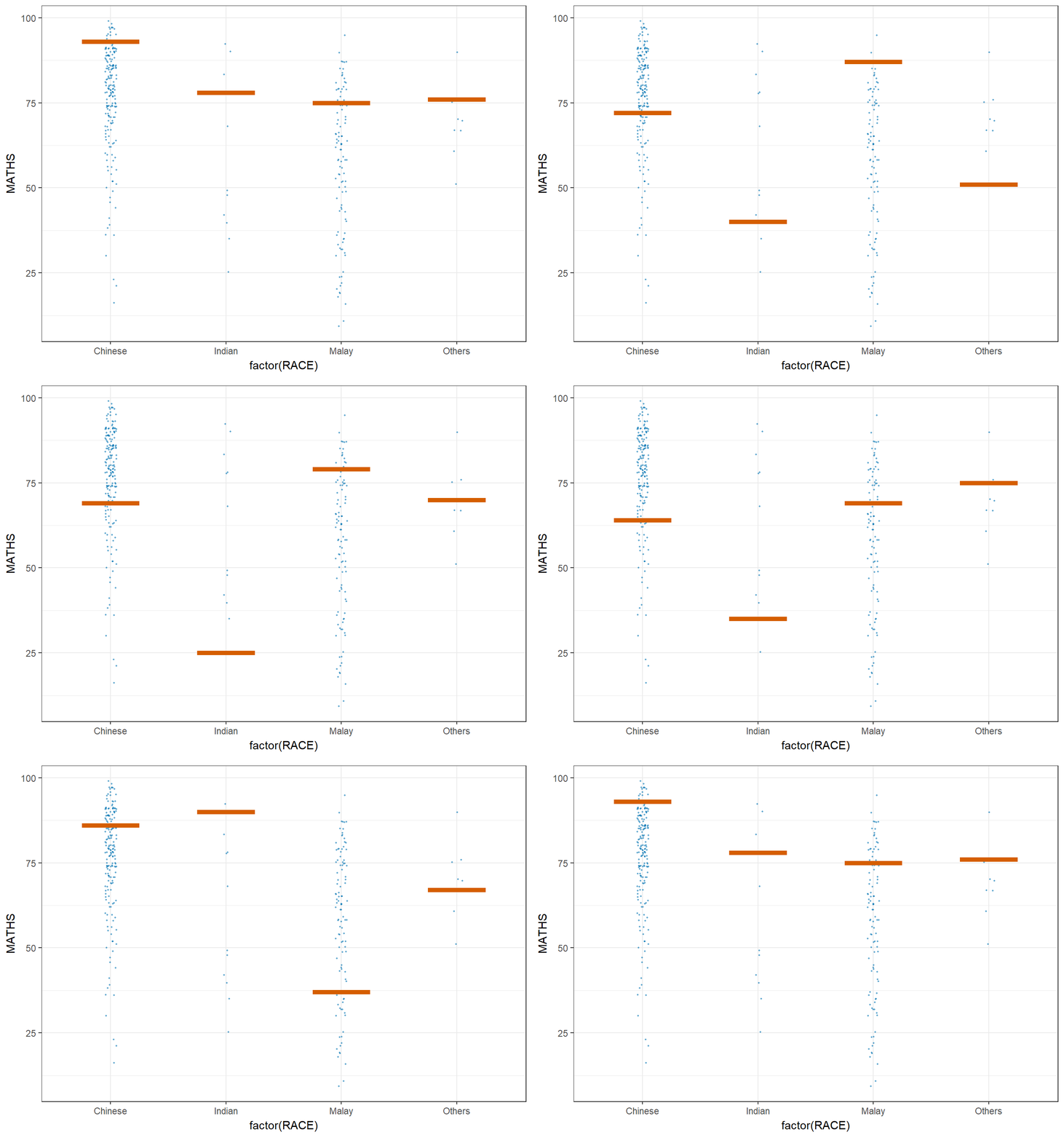
NoteThings to learn from the code chunk above
geom_point(position = position_jitter(...))plots all raw observations with slight randomness to avoid overplotting.sampler(25, group = RACE)from theungevizpackage draws 25 random subsamples within each race group.geom_hpline()draws a short horizontal line at the mean of each subsample — these are the lines that animate.transition_states(.draw, 1, 3)fromgganimatecycles the animation through the 25 subsamples. The numbers control transition length and pause length.- Colours
#0072B2(blue) and#D55E00(orange) come from Wong’s 2011 colour-blind-safe palette.
TipReading the plot
The orange horizontal lines flicker across plausible mean positions. Each frame shows one bootstrap sample’s group means. The eye integrates the variability across frames, producing an intuitive sense of how much the mean estimate would vary if the sample were redrawn.
Hullman, Resnick, and Adar (2015) showed empirically that viewers interpret animated frames more accurately than static error bars, particularly for non-statistical audiences. The flickering visually conveys uncertainty in a way that a fixed bar cannot. Wider visual flicker corresponds to greater statistical uncertainty.
🕹️ LEVEL COMPLETE 🕹️
★ ★ ★ ★ ★
CHAPTER 8 to 11 CLEARED!
+1000 XP · ACHIEVEMENT UNLOCKED: Visualisation Guru 📊
Press any key to continue…