Show the code
pacman::p_load(
tidyverse, lubridate, patchwork,
ggdist, ggridges, ggstatsplot, corrplot,
GGally, treemapify, ggiraph, heatmaply,
plotly, DT,
scales, ggrepel, knitr, colorspace,
gganimate, gifski, ragg
)Exploring profitability and volatility in a Spanish motor insurance portfolio

Yee Weicong Mark
May 23, 2026
June 23, 2026

Motor insurance portfolios in Europe are under pressure. The cost of bodily injury claims has been climbing, vehicle repair costs have followed a similar trajectory, and premiums in many books have not kept pace. Visual analytics offers a way to expose where the deterioration is concentrated, instead of relying only on aggregate combined ratios that hide the structure underneath.
The setting for this exercise comes from the Swiss Re sigma 4/2019 report, which observes that insurers often carry underperforming portfolios where the root causes of poor profitability and high volatility are unknown. The argument the report makes is that visual analytics can reveal underlying loss drivers and help refine segmentation and underwriting strategy.
The dataset comes from a Spanish non life insurer specialising in motor insurance and is hosted on Mendeley Data. It covers three calendar years of policy year exposures across roughly 354,000 records. Each row represents one policy in one year, with information on the policyholder, the vehicle, the coverage structure, the premiums collected for each coverage, the claim counts, the incurred amounts, and the time on risk.
The variable documentation published alongside the dataset on Mendeley Data groups the columns into four blocks. The first block describes the policy and the insured. The second block describes the driver and the vehicle. The third block records the premium for each coverage. The fourth block records the exposure, claim counts, and incurred amounts for each coverage.
The task is to apply univariate and bivariate visual analytics techniques to discover the distributions and characteristics of the variables, and to investigate the factors influencing the profitability and volatility of the portfolio.
Two definitions shape the analysis, profitability and volatility. Profitability in motor insurance is measured through the loss ratio, which is incurred claims divided by earned premium. A loss ratio under one means the line is profitable before expenses. Volatility refers to how much the incurred amount swings from policy to policy, captured by tail percentiles and the coefficient of variation rather than by mean alone, because the loss distribution is heavy tailed.
The packages below cover wrangling, statistical visualisation, layout composition, and statistical testing. The pacman package is used to load and install in a single call.
| Package | Role in this exercise |
|---|---|
tidyverse |
Data wrangling, ggplot2 for the grammar of graphics |
lubridate |
Calendar arithmetic on the licence year |
patchwork |
Composing multiple panels into one figure |
ggdist |
Half eye and rain cloud geoms for distribution visualisation |
ggridges |
Ridgeline plots for comparing many distributions |
ggstatsplot |
Statistical annotation directly on the plot, including ggcorrmat |
corrplot |
Corrgrams with hierarchical clustering reordering |
GGally |
Parallel coordinates plot via ggparcoord |
treemapify |
Treemap geoms in the ggplot2 grammar |
ggiraph |
Interactive ggplot2 layer for tooltip and hover |
heatmaply |
Interactive heatmaps with clustering and normalisation |
plotly |
Converting ggplot objects to interactive HTML widgets |
DT |
Interactive HTML data tables with sort and search |
scales |
Axis formatting, percentage and currency labels |
ggrepel |
Non overlapping labels |
knitr |
Tables via kable |
colorspace |
Perceptually uniform palettes |
gganimate |
Animated ggplot2 graphics for Hypothetical Outcome Plots |
ragg |
High-quality PNG renderer that resolves the gganimate device conflict |
The dataset arrives as a semicolon delimited CSV. read_delim from readr handles the delimiter and a fast first pass at column types.
[1] 354140 47
The data has 354,140 rows and 47 columns, matching the cookbook.
The first check is the schema, to confirm column types and to see the column names against the cookbook’s four blocks.
Rows: 354,140
Columns: 47
$ insured_id <dbl> 1, 2, 2, 2, 3, 3, 3, 4, 4, 4, 5, 5, 5, 6, …
$ year <dbl> 2022, 2022, 2023, 2024, 2022, 2023, 2024, …
$ policy_type <chr> "COMP_E", "COMP_E", "COMP_E", "COMP_E", "C…
$ policy_status <chr> "C", "A", "A", "A", "A", "A", "A", "A", "A…
$ business_type <chr> "NB", "P", "P", "P", "NB", "P", "P", "NB",…
$ payment_frequency <chr> "A", "A", "A", "A", "S", "S", "S", "A", "A…
$ bonus_score <chr> "G", "G", "G", "G", "G", "G", "G", "G", "G…
$ driver_age <dbl> 48, 43, 44, 45, 45, 46, 47, 32, 33, 34, 39…
$ vehicle_age <dbl> 22, 24, 25, 26, 26, 27, 28, 12, 13, 14, 20…
$ age_driving_licence <dbl> 26, 19, 19, 18, 19, 19, 19, 19, 19, 19, 19…
$ fuel_type <chr> "G", "D", "D", "D", "D", "D", "D", "D", "D…
$ vehicle_value <dbl> 149511.44, 65065.12, 65065.12, 65065.12, 5…
$ seats <dbl> 4, 8, 8, 8, 7, 7, 7, 5, 5, 5, 5, 5, 5, 5, …
$ power_to_weight_ratio <dbl> 3.92, 10.15, 10.15, 10.15, 9.19, 9.19, 9.1…
$ vehicle_brand <chr> "PORSCHE", "MERCEDES", "MERCEDES", "MERCED…
$ municipality_type <chr> "I", "I", "I", "I", "I", "I", "I", "I", "I…
$ circulation_area <chr> "U", "U", "U", "U", "R", "R", "R", "R", "R…
$ total_premium <dbl> 279.5576, 546.6234, 548.7526, 584.6324, 68…
$ liability_premium <dbl> 30.60232, 114.33336, 110.66689, 122.09253,…
$ property_damage_premium <dbl> 121.9127, 303.1060, 304.9560, 305.2251, 35…
$ theft_premium <dbl> 112.361489, 80.784824, 83.521384, 107.8868…
$ fire_premium <dbl> 3.832441, 7.826861, 6.151465, 5.842892, 7.…
$ glass_premium <dbl> 8.305788, 30.091751, 32.861626, 31.101584,…
$ legal_protection_premium <dbl> 2.043622, 7.812747, 7.655637, 10.084173, 6…
$ occupants_premium <dbl> 0.4992053, 2.6679084, 2.9395659, 2.3992827…
$ total_claims <dbl> 0, 0, 1, 2, 0, 0, 0, 0, 0, 0, 0, 0, 0, 5, …
$ liability_claims <dbl> 0, 0, 1, 1, 0, 0, 0, 0, 0, 0, 0, 0, 0, 0, …
$ liability_property_claims <dbl> 0, 0, 1, 1, 0, 0, 0, 0, 0, 0, 0, 0, 0, 0, …
$ liability_injury_claims <dbl> 0, 0, 0, 0, 0, 0, 0, 0, 0, 0, 0, 0, 0, 0, …
$ property_claims <dbl> 0, 0, 0, 1, 0, 0, 0, 0, 0, 0, 0, 0, 0, 5, …
$ theft_claims <dbl> 0, 0, 0, 0, 0, 0, 0, 0, 0, 0, 0, 0, 0, 0, …
$ fire_claims <dbl> 0, 0, 0, 0, 0, 0, 0, 0, 0, 0, 0, 0, 0, 0, …
$ glass_claims <dbl> 0, 0, 0, 0, 0, 0, 0, 0, 0, 0, 0, 0, 0, 0, …
$ legal_protection_claims <dbl> 0, 0, 0, 0, 0, 0, 0, 0, 0, 0, 0, 0, 0, 0, …
$ occupants_claims <dbl> 0, 0, 0, 0, 0, 0, 0, 0, 0, 0, 0, 0, 0, 0, …
$ total_incurred <dbl> 0.000, 0.000, 233.013, 2586.361, 0.000, 0.…
$ liability_incurred <dbl> 0.000, 0.000, 233.013, 1035.000, 0.000, 0.…
$ liability_property_incurred <dbl> 0.000, 0.000, 233.013, 1035.000, 0.000, 0.…
$ liability_injury_incurred <dbl> 0.000, 0.000, 0.000, 0.000, 0.000, 0.000, …
$ property_incurred <dbl> 0.000, 0.000, 0.000, 1551.361, 0.000, 0.00…
$ theft_incurred <dbl> 0, 0, 0, 0, 0, 0, 0, 0, 0, 0, 0, 0, 0, 0, …
$ fire_incurred <dbl> 0, 0, 0, 0, 0, 0, 0, 0, 0, 0, 0, 0, 0, 0, …
$ glass_incurred <dbl> 0, 0, 0, 0, 0, 0, 0, 0, 0, 0, 0, 0, 0, 0, …
$ legal_protection_incurred <dbl> 0, 0, 0, 0, 0, 0, 0, 0, 0, 0, 0, 0, 0, 0, …
$ occupants_incurred <dbl> 0, 0, 0, 0, 0, 0, 0, 0, 0, 0, 0, 0, 0, 0, …
$ total_exposure <dbl> 0.09863014, 1.00000000, 1.00000000, 1.0000…
$ liability_exposure <dbl> 0.09863014, 1.00000000, 1.00000000, 1.0000…
Three aspects can be observed from the schema. First, the policy descriptors (policy_type, policy_status, business_type, payment_frequency, bonus_score, fuel_type, municipality_type, circulation_area) arrive as character codes and need recoding into factors before they can be used as grouping variables. Second, the premium and incurred columns appear in parallel pairs across eight coverage lines plus a total, matching the cookbook’s premiums and exposure blocks. Third, the exposure variable arrives as a numeric ranging across partial and multi year contracts, which makes per exposure aggregation the right strategy for cross policy comparisons.
The schema does not surface the range of year. A separate count confirms the span and the distribution of records across years.
| Year | Policy years |
|---|---|
| 2022 | 67172 |
| 2023 | 118835 |
| 2024 | 168133 |
The dataset covers 2022 through 2024, with the record count more than doubling over the period from 67,031 in 2022 to 168,302 in 2024.
The next check is missingness column by column, because the wrangling decisions depend on how concentrated the gaps are.
raw |>
summarise(across(everything(), ~ sum(is.na(.x)))) |>
pivot_longer(everything(), names_to = "variable", values_to = "missing") |>
filter(missing > 0) |>
mutate(pct = missing / nrow(raw)) |>
arrange(desc(missing)) |>
kable(caption = "Variables with missing values",
col.names = c("Variable", "Missing rows", "Share"),
digits = 4)| Variable | Missing rows | Share |
|---|---|---|
| fuel_type | 1287 | 0.0036 |
| vehicle_value | 513 | 0.0014 |
| vehicle_age | 2 | 0.0000 |
| age_driving_licence | 2 | 0.0000 |
Only four variables carry any missing values, and all four affect well under one percent of rows. fuel_type has the largest gap at 1,287 rows. Since the share is small, the affected rows will be dropped instead of imputing to have a cleaner analysis.
A five number summary of the numeric variables is done to establish the scale of each and flags any unexpected values.
driver_age vehicle_age age_driving_licence vehicle_value
Min. :18.00 Min. : 0.00 Min. : 0.00 Min. : 1630
1st Qu.:39.00 1st Qu.:17.00 1st Qu.:19.00 1st Qu.: 18608
Median :48.00 Median :25.00 Median :20.00 Median : 24730
Mean :49.01 Mean :25.92 Mean :22.99 Mean : 26977
3rd Qu.:58.00 3rd Qu.:35.00 3rd Qu.:25.00 3rd Qu.: 32252
Max. :90.00 Max. :68.00 Max. :80.00 Max. :374034
NA's :2 NA's :2 NA's :513
seats power_to_weight_ratio total_premium total_incurred
Min. :2.000 Min. : 0.00 Min. : 0.0 Min. : 0.0
1st Qu.:5.000 1st Qu.:10.74 1st Qu.: 146.1 1st Qu.: 0.0
Median :5.000 Median :12.05 Median : 257.9 Median : 0.0
Mean :5.084 Mean :12.33 Mean : 296.7 Mean : 208.6
3rd Qu.:5.000 3rd Qu.:13.73 3rd Qu.: 385.0 3rd Qu.: 0.0
Max. :9.000 Max. :64.81 Max. :5107.6 Max. :571128.3
total_claims total_exposure
Min. : 0.0000 Min. :0.0000
1st Qu.: 0.0000 1st Qu.:0.4438
Median : 0.0000 Median :0.8384
Mean : 0.2177 Mean :0.7069
3rd Qu.: 0.0000 3rd Qu.:1.0000
Max. :18.0000 Max. :1.0000
The summary surfaces three points for consideration. First, total_incurred has a median of zero and a maximum near 580,000 EUR, which is right tail heavy and should be plotted on a log scale or to filter to claiming policies. Second, vehicle_value spans from low hundreds to over 370,000 EUR, and quintile transformation should be used in the bivariate analysis. Third, age_driving_licence reports the driver’s age at the time of licence issuance (mean 23, range 0–80), not a calendar year. Subtracting it from driver_age gives the number of years of driving experience. The wrangling section derives a licence_tenure variable using this formula.
The exploratory checks in Section 3 identified three categories of preparation work before analysis can begin: removing the small number of incomplete records, replacing opaque single-letter codes with readable labels, and computing variables the raw dataset does not supply directly. Each decision is documented below.
All three steps are implemented in a standalone preparation script prepare_data.R. Running the script once produces data/motor_clean.csv, which this report loads at the end of this section. This separation keeps the analytical document focused on insight rather than transformation mechanics, and eliminates rendering failures.
The missingness audit in Section 3.3 identified four variables with gaps: fuel_type (1,287 rows), vehicle_value, vehicle_age, and age_driving_licence (each under 300 rows). All four fall below one percent of the total. The affected rows are dropped rather than imputed because the share is small enough that removal does not materially alter the distribution of any variable, and because the missing fields are underwriting inputs that cannot be reliably inferred from the remaining columns. The working dataset retains 352,338 rows, which is 99.5 percent of the original 354,140.
Dropping is justifiable here because the missingness is small. If fuel_type were missing in 10 percent of rows, creating an “Unknown” category would be the safer choice — dropping at that scale could bias aggregate metrics by systematically excluding a particular vehicle or driver segment.
The raw dataset encodes eight categorical variables as single-letter or short codes (TP, G, NB, U, and so on). These codes are compact for storage but create unreadable axes and legend entries when plotted directly. Each code is replaced with a descriptive label and converted to an ordered or unordered factor so that charts respect a meaningful sequence rather than defaulting to alphabetical ordering.
Factor level order is meaningful where inherent ordering exists — policy_type runs from minimum cover to fully comprehensive, and bonus_score runs from best to worst driving history. For variables without a natural order, levels follow logical domain groupings. The full mapping is shown in the table below.
recoding_map <- tribble(
~Variable, ~`Original code`, ~`Recoded label`,
"policy_type", "TP", "Third party only",
"policy_type", "TPG", "Third party + glass",
"policy_type", "CC", "Third party + 2 covers",
"policy_type", "COMP_E", "Comprehensive with excess",
"policy_type", "COMP_N", "Comprehensive no excess",
"policy_status", "A", "Active",
"policy_status", "C", "Cancelled",
"business_type", "NB", "New business",
"business_type", "P", "Portfolio renewal",
"payment_frequency", "A", "Annual",
"payment_frequency", "S", "Semiannual",
"payment_frequency", "Q", "Quarterly",
"bonus_score", "G", "Good history",
"bonus_score", "N", "Neutral",
"bonus_score", "B", "Bad history",
"fuel_type", "D", "Diesel",
"fuel_type", "G", "Gasoline",
"municipality_type", "I", "Inland",
"municipality_type", "C", "Coastal",
"municipality_type", "IS", "Islands",
"circulation_area", "U", "Urban",
"circulation_area", "R", "Rural"
)
recoding_map |> kable(caption = "Categorical variable recoding map")| Variable | Original code | Recoded label |
|---|---|---|
| policy_type | TP | Third party only |
| policy_type | TPG | Third party + glass |
| policy_type | CC | Third party + 2 covers |
| policy_type | COMP_E | Comprehensive with excess |
| policy_type | COMP_N | Comprehensive no excess |
| policy_status | A | Active |
| policy_status | C | Cancelled |
| business_type | NB | New business |
| business_type | P | Portfolio renewal |
| payment_frequency | A | Annual |
| payment_frequency | S | Semiannual |
| payment_frequency | Q | Quarterly |
| bonus_score | G | Good history |
| bonus_score | N | Neutral |
| bonus_score | B | Bad history |
| fuel_type | D | Diesel |
| fuel_type | G | Gasoline |
| municipality_type | I | Inland |
| municipality_type | C | Coastal |
| municipality_type | IS | Islands |
| circulation_area | U | Urban |
| circulation_area | R | Rural |
The factor function preserves the level order as specified. This matters because alphabetical ordering would scatter related categories — for example, COMP_E and COMP_N would be separated from each other and from CC if sorted alphabetically.
Three derived variables make the analysis cleaner and more direct. All three are computed in prepare_data.R and are present as ready-to-use columns in motor_clean.csv.
The first is licence tenure (licence_tenure), expressed as the number of years a driver has held a licence. The data dictionary confirms that age_driving_licence is the driver’s age at the time of licence issuance (mean 23 years, range 0–80), not a calendar year. Subtracting it from driver_age gives the actual driving experience in years — for example, a driver who obtained their licence at age 20 and is currently 45 has a tenure of 25 years. A small number of records produce a negative value due to data entry errors; these are floored at zero as the most conservative interpretation. The validated output ranges from 0 to 68 years with a median of 25.
The second is driver age band (age_band), in ten-year intervals from 18 to 75 plus an over-75 group. The 18–25 band isolates young drivers as a single high-risk cohort, which is standard practice in motor pricing because claim frequency for this group is materially higher than for any other. The 76+ band isolates senior drivers as a separate cohort. The remaining ten-year bands group drivers with broadly similar risk profiles.
The third is vehicle value quintile (value_quintile), computed with ntile. A quintile divides a ranked variable into five equal-sized groups: group 1 contains the cheapest 20 percent of vehicles, group 5 the most expensive 20 percent. The transformation removes the influence of heavy right skew — raw vehicle values span from a few hundred EUR to over 374,000 EUR, and a linear analysis on the raw scale would let the top decile dominate every aggregate metric. The quintile gives every value band equal weight in the rest of the analysis.
The three preparation steps above are implemented in prepare_data.R and their output consolidated into data/motor_clean.csv. Loading it here with explicit col_types restores the factor level order that was preserved as label strings in the CSV.
ins <- readr::read_csv(
"data/motor_clean.csv.gz",
col_types = readr::cols(
policy_type = readr::col_factor(levels = c("TP", "TPG", "CC", "COMP_E", "COMP_N")),
policy_status = readr::col_factor(levels = c("Active", "Cancelled")),
business_type = readr::col_factor(levels = c("New business", "Portfolio renewal")),
payment_frequency = readr::col_factor(levels = c("Annual", "Semiannual", "Quarterly")),
bonus_score = readr::col_factor(levels = c("Good history", "Neutral", "Bad history")),
fuel_type = readr::col_factor(levels = c("Diesel", "Gasoline")),
municipality_type = readr::col_factor(levels = c("Inland", "Coastal", "Islands")),
circulation_area = readr::col_factor(levels = c("Urban", "Rural")),
year = readr::col_factor(levels = c("2022", "2023", "2024"), ordered = TRUE),
age_band = readr::col_factor(
levels = c("18-25","26-35","36-45",
"46-55","56-65","66-75","76+"),
ordered = TRUE),
value_quintile = readr::col_factor(
levels = c("Q1 Lowest","Q2","Q3","Q4","Q5 Highest"),
ordered = TRUE)
),
show_col_types = FALSE
)
# Confirm dimensions match expected output from prepare_data.R
cat(nrow(ins), "rows,", ncol(ins), "columns\n")352338 rows, 50 columns
The clean dataset contains 352,338 rows and 50 columns: the original 47 from the raw file plus licence_tenure, age_band, and value_quintile. All subsequent sections use ins as their data source.
Loss ratio and claim frequency are computed dozens of times in this report across different groupings. A small helper enforces a single definition and avoids subtle bugs from re-computation.
portfolio_metrics <- function(df, ...) {
df |>
group_by(...) |>
summarise(
policies = n(),
exposure = sum(total_exposure, na.rm = TRUE),
premium = sum(total_premium, na.rm = TRUE),
incurred = sum(total_incurred, na.rm = TRUE),
claims = sum(total_claims, na.rm = TRUE),
.groups = "drop"
) |>
mutate(
loss_ratio = incurred / premium,
claim_freq = claims / exposure,
avg_premium = premium / exposure,
severity = incurred / pmax(claims, 1)
)
}The function returns the building blocks (policies, exposure, premium, incurred, claims) and the four ratios that follow from them. Loss ratio is aggregated as a ratio of sums rather than a mean of ratios.
The exploratory section establishes the shape of each variable before any segmented analysis. Understanding what each variable looks like in isolation reveals where skew, outliers, and dominant categories sit, which shapes every subsequent chart choice. Numerical variables get histograms paired with boxplots; categorical variables get bar charts ordered by coverage breadth or by frequency. The goal is to know the data before asking it questions.
Before plotting, summary statistics establish the scale and the share of zero claim policies.
target_summary <- tibble(
Metric = c("Min", "1st quartile", "Median", "Mean", "3rd quartile", "Max"),
`Total premium (EUR)` = c(
min(ins$total_premium),
quantile(ins$total_premium, 0.25),
median(ins$total_premium),
mean(ins$total_premium),
quantile(ins$total_premium, 0.75),
max(ins$total_premium)
),
`Total incurred (EUR)` = c(
min(ins$total_incurred),
quantile(ins$total_incurred, 0.25),
median(ins$total_incurred),
mean(ins$total_incurred),
quantile(ins$total_incurred, 0.75),
max(ins$total_incurred)
)
)
target_summary |>
kable(digits = 0, format.args = list(big.mark = ","))| Metric | Total premium (EUR) | Total incurred (EUR) |
|---|---|---|
| Min | 0 | 0 |
| 1st quartile | 146 | 0 |
| Median | 258 | 0 |
| Mean | 296 | 208 |
| 3rd quartile | 384 | 0 |
| Max | 5,108 | 571,128 |
| Policy years | With at least one claim | Total claim count | Zero claim share |
|---|---|---|---|
| 352338 | 41978 | 76542 | 88.1% |
The table confirms three points the chart below visualises. The charts show a histogram of the distributions of total premium and total uncurred amount. The boxplot below each histogram anchors the median and IQR, while the histogram shows the full shape.
# Premium histogram with median and mean reference lines
hist_prem <- ggplot(ins, aes(x = total_premium)) +
geom_histogram(bins = 40, fill = "#2C5282", colour = "white") +
geom_vline(xintercept = median(ins$total_premium),
colour = "grey20", linetype = "dashed") +
geom_vline(xintercept = mean(ins$total_premium),
colour = "#D55E00", linetype = "dashed") +
scale_x_continuous(labels = label_dollar(prefix = "\u20ac"),
limits = c(0, 1500)) +
labs(title = "Total premium per policy year",
subtitle = "Heavy right skew. Most policies pay under \u20ac400.",
x = NULL, y = "Number of policy years") +
theme_minimal()
# Boxplot stacked below the histogram
box_prem <- ggplot(ins, aes(x = total_premium, y = "")) +
geom_boxplot(fill = "grey80", outlier.alpha = 0.05, outlier.size = 0.6) +
stat_summary(fun = mean, geom = "point", colour = "#D55E00", size = 3) +
scale_x_continuous(labels = label_dollar(prefix = "\u20ac"),
limits = c(0, 1500)) +
labs(x = "Total premium", y = NULL) +
theme_minimal() +
theme(axis.text.y = element_blank())
# Filter to claiming policies for the incurred plots
inc_nonzero <- ins |> filter(total_incurred > 0)
hist_inc <- ggplot(inc_nonzero, aes(x = total_incurred)) +
geom_histogram(bins = 40, fill = "#D55E00", colour = "white") +
geom_vline(xintercept = median(inc_nonzero$total_incurred),
colour = "grey20", linetype = "dashed") +
geom_vline(xintercept = mean(inc_nonzero$total_incurred),
colour = "#2C5282", linetype = "dashed") +
scale_x_continuous(labels = label_dollar(prefix = "\u20ac"),
limits = c(0, 6000)) +
labs(title = "Total incurred per policy year (policies with at least one claim)",
subtitle = paste0("Among the ", scales::comma(nrow(inc_nonzero)),
" claiming policy years, the mean is well above the median."),
x = NULL, y = "Number of policy years") +
theme_minimal()
box_inc <- ggplot(inc_nonzero, aes(x = total_incurred, y = "")) +
geom_boxplot(fill = "grey80", outlier.alpha = 0.05, outlier.size = 0.6) +
stat_summary(fun = mean, geom = "point", colour = "#2C5282", size = 3) +
scale_x_continuous(labels = label_dollar(prefix = "\u20ac"),
limits = c(0, 6000)) +
labs(x = "Total incurred", y = NULL) +
theme_minimal() +
theme(axis.text.y = element_blank())
# Compose with patchwork
wrap_plots(hist_prem, box_prem, hist_inc, box_inc,
ncol = 1, heights = c(1, 0.25, 1, 0.25))
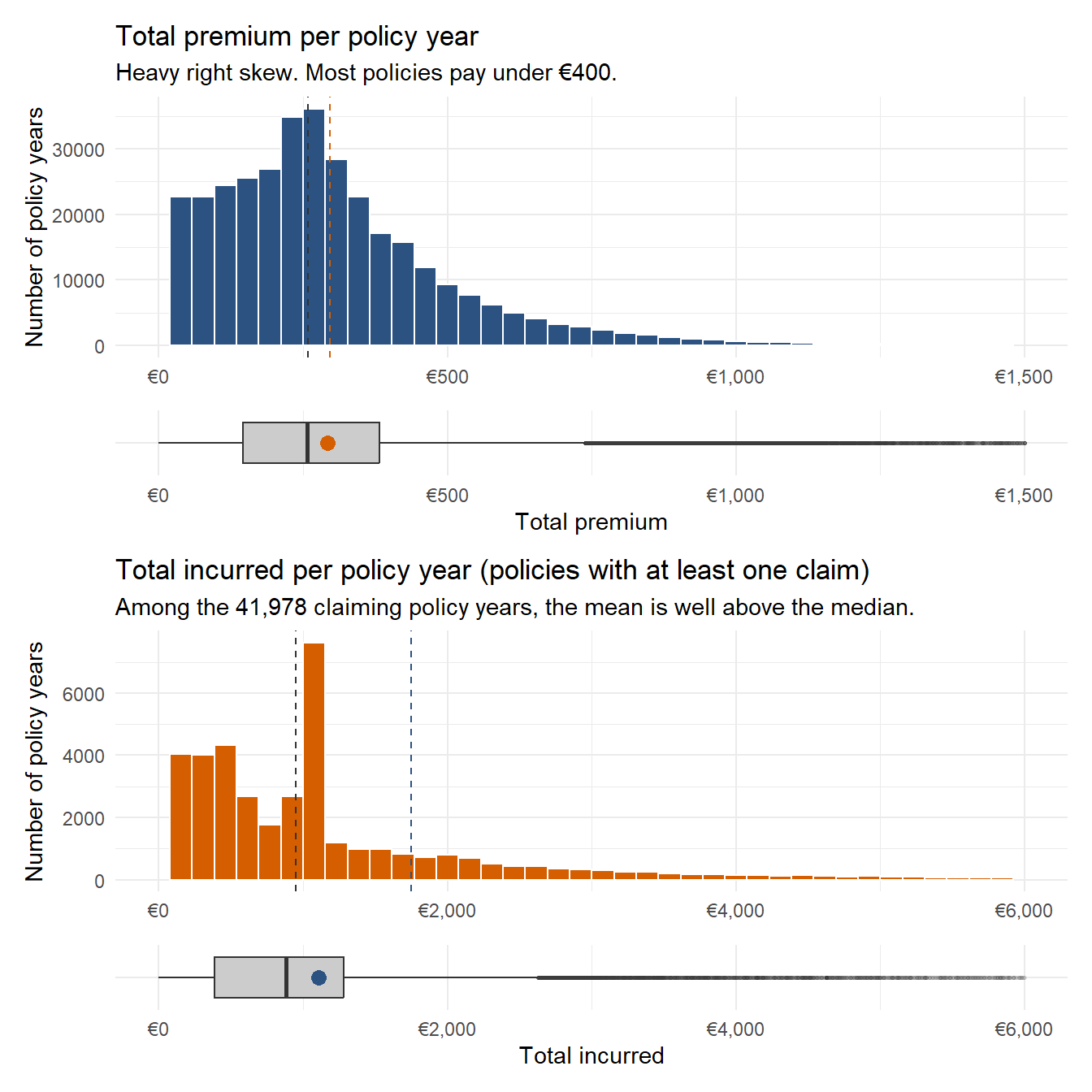
The premium distribution is right skewed but reasonably concentrated. The median (258 EUR) sits below the mean (296 EUR), and shows a right skew.The interquartile range sits between 175 EUR (Q1) and 367 EUR (Q3), with most policies paying between those values. The incurred distribution is more extreme. The zero claim share is 86 percent of policy years, which is why the histogram filters to the claiming subset only and the policy years that pay no claim are not plotted. Among the 14 percent that do claim, the mean is roughly 1,750 EUR but the median is under 1,000 EUR, with a tail well past 5,000 EUR and a maximum near 580,000 EUR. Any chart of incurred amounts later should take this into consideration.
Placing the boxplot below the histogram rather than above makes for easier comparison of the distribution in the histogramand the median, IQR, and outliers from the boxplot.
These three numerical variables are the core underwriting inputs in motor insurance. Driver age is shown as the binned age_band variable will be used throughout the bivariate analysis, while vehicle age and licence tenure are shown as continuous densities to surface the shape of each distribution. The summary statistics below describe the raw continuous values for all three. Hover over any bar in the driver age band chart to see the exact policy count and share.
age_summary <- ins |>
select(`Driver age` = driver_age,
`Vehicle age` = vehicle_age,
`Licence tenure` = licence_tenure) |>
pivot_longer(everything(), names_to = "Variable", values_to = "Years") |>
group_by(Variable) |>
summarise(
Min = min(Years),
Q1 = quantile(Years, 0.25),
Median = median(Years),
Mean = mean(Years),
Q3 = quantile(Years, 0.75),
Max = max(Years),
SD = sd(Years),
.groups = "drop"
)
age_summary |> kable(digits = 1)| Variable | Min | Q1 | Median | Mean | Q3 | Max | SD |
|---|---|---|---|---|---|---|---|
| Driver age | 18 | 39 | 48 | 49.0 | 58 | 90 | 12.1 |
| Licence tenure | 0 | 17 | 25 | 26.0 | 35 | 68 | 11.6 |
| Vehicle age | 0 | 17 | 25 | 25.9 | 35 | 68 | 11.6 |
# Driver age band — interactive bars with tooltip and data_id
driver_counts <- ins |>
count(age_band) |>
mutate(pct = n / sum(n),
tip = paste0(age_band, ": ", comma(n),
" policies (", percent(pct, accuracy = 0.1), ")"))
p_age <- ggplot(driver_counts, aes(x = age_band, y = n)) +
geom_col_interactive(aes(tooltip = tip, data_id = age_band),
fill = "#2C5282") +
scale_y_continuous(labels = label_number(scale = 1e-3, suffix = "k")) +
labs(title = "Driver age band", x = NULL, y = "Policy years") +
theme_minimal()
# Vehicle age — pre-computed data frame (avoids inline data ops inside girafe)
vehicle_df <- ins |> select(vehicle_age)
vehicle_med <- median(vehicle_df$vehicle_age)
p_vehicle <- ggplot(vehicle_df, aes(x = vehicle_age)) +
geom_histogram(bins = 30, fill = "#D55E00", colour = "white") +
geom_vline(xintercept = vehicle_med,
linetype = "dashed", colour = "grey30") +
labs(title = "Vehicle age", x = "Years", y = "Count") +
theme_minimal()
# Licence tenure — pre-computed data frame so girafe renderer has a clean object.
# ins$licence_tenure was derived in Section 4.3; filter <= 60 drops implausible values.
licence_df <- ins |>
filter(licence_tenure <= 60) |>
select(licence_tenure)
licence_med <- median(licence_df$licence_tenure)
p_licence <- ggplot(licence_df, aes(x = licence_tenure)) +
geom_histogram(bins = 30, fill = "#009E73", colour = "white") +
geom_vline(xintercept = licence_med,
linetype = "dashed", colour = "grey30") +
labs(title = "Licence tenure", x = "Years held", y = "Count") +
theme_minimal()
girafe(ggobj = p_age + p_vehicle + p_licence,
width_svg = 11, height_svg = 4)Driver age sits around a median of 49 years with an interquartile range from 39 to 58. The age band chart confirms that the 46-55 band is the largest single cohort, followed by 36-45 and 56-65. The 18-25 and 76+ bands are the smallest, each holding under 5 percent of policy years. Vehicle age has a median of 16 years and a heavier right tail, with the third quartile at 23 and the maximum above 80. Licence tenure has a median of 24 years and is the most unimodal of the three, with a peak around twenty years and a thin left tail of newly licensed drivers.
The portfolio descriptors get a faceted bar chart so they can be read together. Bars are ordered by inherent meaning where one exists (coverage breadth, bonus score) and by frequency otherwise. There are eight categorical descriptors.
cat_long <- ins |>
select(year, policy_type, policy_status, business_type,
payment_frequency, bonus_score, fuel_type, circulation_area) |>
mutate(across(everything(), as.character)) |>
pivot_longer(everything(), names_to = "variable", values_to = "level") |>
count(variable, level) |>
group_by(variable) |>
mutate(pct = n / sum(n)) |>
ungroup() |>
mutate(variable = factor(variable,
levels = c("year", "policy_type", "policy_status",
"business_type", "payment_frequency",
"bonus_score", "fuel_type",
"circulation_area")))
ggplot(cat_long, aes(x = level, y = pct)) +
geom_col(fill = "#2C5282") +
facet_wrap(~ variable, scales = "free", ncol = 3) +
scale_y_continuous(labels = percent_format(accuracy = 1)) +
labs(x = NULL, y = "Share of policies",
title = "Portfolio composition by descriptor") +
theme_minimal() +
theme(axis.text.x = element_text(angle = 30, hjust = 1, size = 7))
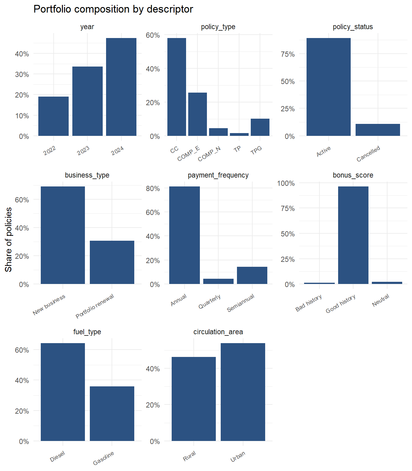
The book is growing fast which can be seen as 2024 contributes 47 percent of all policy years, up from 19 percent in 2022, so almost half of everything in this dataset is recent. CC (third party plus two additional covers) is the dominant product at 58 percent, followed by comprehensive with excess at 26 percent. Comprehensive without excess (COMP_N) and basic third party (TP) are the smallest segments. The portfolio is heavily skewed toward annual paying customers with a good bonus history, on diesel vehicles, in inland municipalities. The 11 percent cancellation is worth keeping in mind because cancelled policies often correlate with claims related issues.
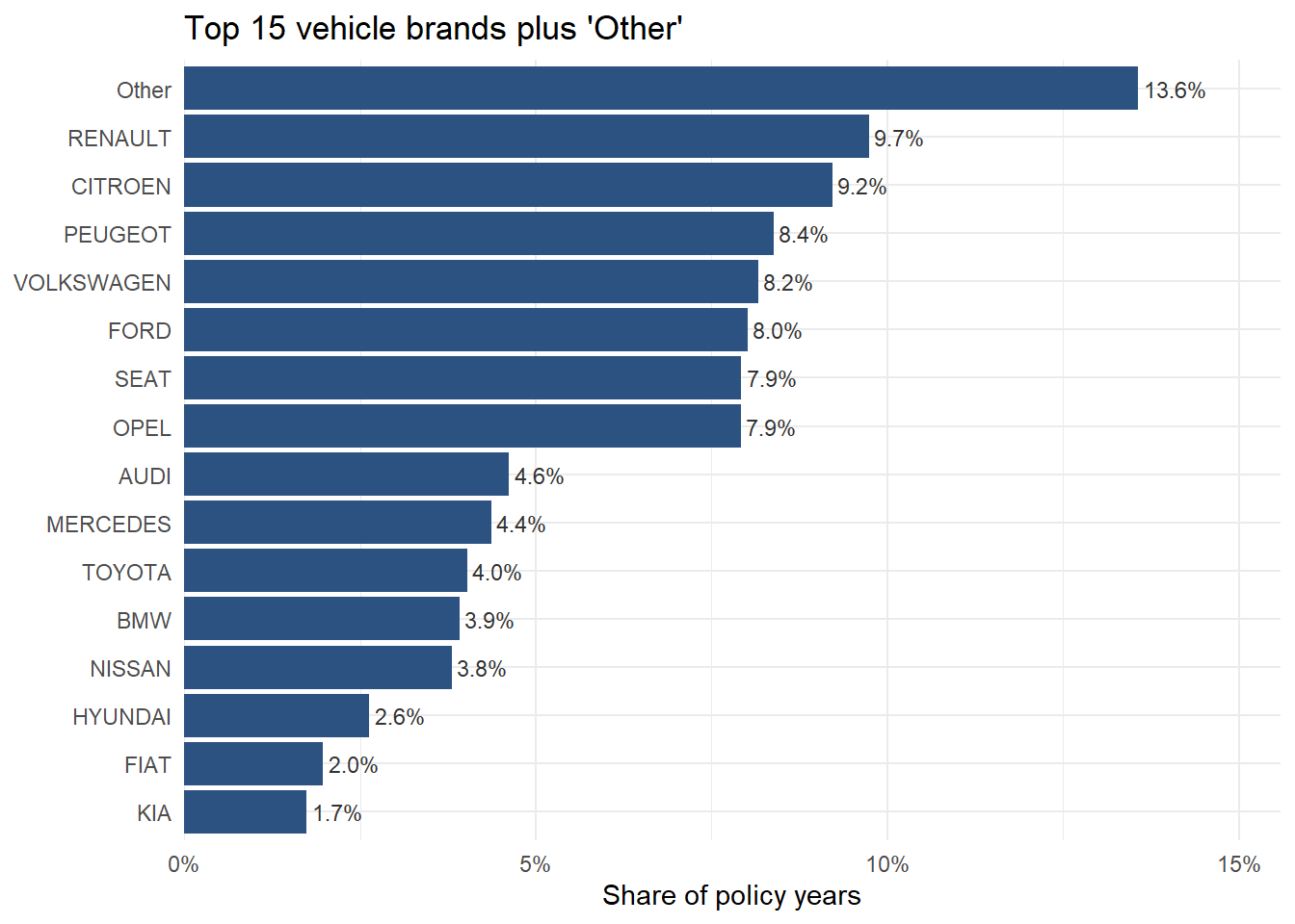
Vehicle brand has 68 distinct values, which exceeds what a bar chart can show legibly. The top 15 brands will be kept and the rest will be grouped as “other” as showing all 68 bars will be cluttered and hard to read. The chart will then be sorted by frequency.
# bar chart, with fct_lump_n to keep only the top 15 brands
brand_tbl <- ins |>
mutate(brand_grouped = fct_lump_n(vehicle_brand, n = 15,
other_level = "Other")) |>
count(brand_grouped, sort = TRUE) |>
mutate(pct = n / sum(n),
brand_grouped = fct_reorder(brand_grouped, n))
ggplot(brand_tbl, aes(x = brand_grouped, y = pct)) +
geom_col(fill = "#2C5282") +
geom_text(aes(label = percent(pct, accuracy = 0.1)),
hjust = -0.1, size = 3, colour = "grey20") +
scale_y_continuous(labels = percent_format(accuracy = 1),
expand = expansion(mult = c(0, 0.15))) +
coord_flip() +
labs(title = "Top 15 vehicle brands plus 'Other'",
x = NULL, y = "Share of policy years") +
theme_minimal()
The stacked bar below shows the year-on-year mix of policy types. Each year’s bar sums to 100 percent, so the bar shows composition rather than volume. Hover any segment to read the exact share.
mix_data <- ins |>
count(year, policy_type) |>
group_by(year) |>
mutate(pct = n / sum(n),
tip = paste0(policy_type, "\n", year, ": ",
percent(pct, accuracy = 0.1))) |>
# Sort by policy_type within each year so the cumulative position
# calculation aligns with how geom_col stacks the bars. Then compute
# the midpoint of each segment manually as a label y-coordinate.
arrange(year, desc(policy_type)) |>
group_by(year) |>
mutate(label_y = cumsum(pct) - pct / 2) |>
ungroup()
p_stack <- ggplot(mix_data, aes(x = year, y = pct, fill = policy_type)) +
geom_col_interactive(aes(tooltip = tip, data_id = policy_type),
position = "stack") +
# Percentage labels removed; exact shares available via hover tooltip
scale_y_continuous(labels = percent_format(accuracy = 1)) +
scale_fill_brewer(palette = "Set2") +
labs(title = "Portfolio mix by policy type and year",
subtitle = "Bars sum to 100 percent",
x = NULL, y = "Share of book", fill = "Policy type") +
theme_minimal()
girafe(ggobj = p_stack, width_svg = 9, height_svg = 5)The composition table below records the underlying counts and three-year totals for reference.
ins |>
count(year, policy_type) |>
pivot_wider(names_from = year, values_from = n, values_fill = 0) |>
mutate(
`Three year total` = `2022` + `2023` + `2024`,
`2022 share` = scales::percent(`2022` / sum(`2022`), accuracy = 0.1),
`2024 share` = scales::percent(`2024` / sum(`2024`), accuracy = 0.1),
`Mix shift (ppt)` = scales::percent(
(`2024` / sum(`2024`)) - (`2022` / sum(`2022`)),
accuracy = 0.1
)
) |>
kable(
caption = "Policy years by type and year, with mix shift from 2022 to 2024",
format.args = list(big.mark = ",")
)| policy_type | 2022 | 2023 | 2024 | Three year total | 2022 share | 2024 share | Mix shift (ppt) |
|---|---|---|---|---|---|---|---|
| TP | 852 | 1,870 | 2,979 | 5,701 | 1.3% | 1.8% | 0.5% |
| TPG | 7,513 | 12,102 | 16,373 | 35,988 | 11.2% | 9.8% | -1.4% |
| CC | 39,672 | 68,367 | 96,278 | 204,317 | 59.3% | 57.6% | -1.7% |
| COMP_E | 15,647 | 29,907 | 44,766 | 90,320 | 23.4% | 26.8% | 3.4% |
| COMP_N | 3,206 | 6,018 | 6,788 | 16,012 | 4.8% | 4.1% | -0.7% |
CC dominates the book throughout, holding around 58 percent of each year’s volume. COMP_E is the second product at roughly 26 percent. The mix shift column in the table below quantifies the change from 2022 to 2024 for each product: the broad stability of the composition means that the loss ratio movement examined in the bivariate section is a portfolio wide phenomenon rather than the result of one product growing faster than another.
With the data shape established, the next step will be to analyse if the portfolio is losing profitability over time, and if so, where is the deterioration concentrated. This is done by looking at the loss ratio across the different segments. The sections starts by confirming the aggregate trend, then identifying which product lines and driver segments are pulling the loss ratio up, and finally checking whether the pricing model is responding correctly. Statistical tests are also done to validate the charts.
The first bivariate shows if the portfolio held its profitability over the three years and the accompanying trend of the claim frequency and the average premium. The below plots show the aggregated portfolio metrics by policy year.
# bar charts composed with patchwork
yearly <- ins |> portfolio_metrics(year)
p_lr <- ggplot(yearly, aes(x = year, y = loss_ratio)) +
geom_col(fill = "#D55E00") +
geom_text(aes(label = percent(loss_ratio, accuracy = 0.1)),
vjust = -0.4, size = 3.6) +
geom_hline(yintercept = 1, linetype = "dashed", colour = "grey50") +
scale_y_continuous(labels = percent_format(),
expand = expansion(mult = c(0, 0.15))) +
labs(title = "Loss ratio", x = NULL, y = NULL) +
theme_minimal()
p_freq <- ggplot(yearly, aes(x = year, y = claim_freq)) +
geom_col(fill = "#2C5282") +
geom_text(aes(label = number(claim_freq, accuracy = 0.001)),
vjust = -0.4, size = 3.6) +
scale_y_continuous(expand = expansion(mult = c(0, 0.15))) +
labs(title = "Claim frequency", x = NULL, y = NULL) +
theme_minimal()
p_prem <- ggplot(yearly, aes(x = year, y = avg_premium)) +
geom_col(fill = "#009E73") +
geom_text(aes(label = dollar(avg_premium, prefix = "\u20ac", accuracy = 1)),
vjust = -0.4, size = 3.6) +
scale_y_continuous(labels = label_dollar(prefix = "\u20ac"),
expand = expansion(mult = c(0, 0.15))) +
labs(title = "Avg premium per exposure", x = NULL, y = NULL) +
theme_minimal()
wrap_plots(p_lr, p_freq, p_prem, nrow = 1) +
plot_annotation(title = "Aggregate portfolio metrics by year")
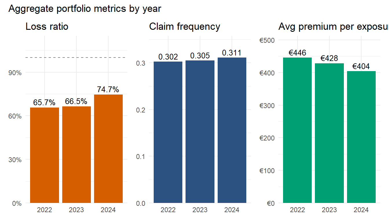
Loss ratio rose from 66 percent in 2022 to 75 percent in 2024, a 14 percent relative increase. Claim frequency drifted up only slightly, from 0.302 to 0.311, which is not significant. Average premium per exposure showed a decline, falling from 446 EUR to 404 EUR over the three years. The charts show that premium pricing is dropping while claim cost holds steady, and this would naturally results in the loss ratio increasing. Further analysis will be done to determine which segments are pulling the loss ratio up.
The first segment to investigate is the policy type.
# bar chart with conditional fill on loss_ratio > 0.7 threshold
by_type <- ins |> portfolio_metrics(policy_type)
ggplot(by_type, aes(x = policy_type, y = loss_ratio)) +
geom_col(aes(fill = loss_ratio > 0.7), show.legend = FALSE) +
geom_text(aes(label = percent(loss_ratio, accuracy = 0.1)),
vjust = -0.4, size = 3.6) +
geom_hline(yintercept = 0.7, linetype = "dashed", colour = "grey50") +
scale_fill_manual(values = c("FALSE" = "#009E73", "TRUE" = "#D55E00")) +
scale_y_continuous(labels = percent_format(),
expand = expansion(mult = c(0, 0.15)),
limits = c(0, 1)) +
labs(title = "Loss ratio by policy type, 2022 to 2024 aggregate",
x = NULL, y = "Loss ratio") +
theme_minimal() +
theme(axis.text.x = element_text(angle = 30, hjust = 1, size = 8))
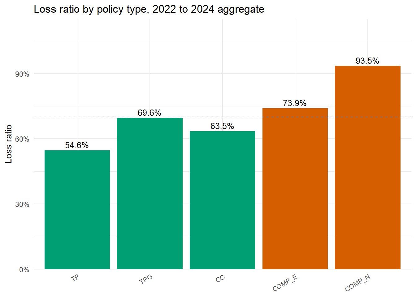
The five policy types fall into three bands. The baseline loss ratio will be set to 70 percent and follows directly from the structure of the combined ratio. The combined ratio equals the loss ratio plus the expense ratio, and a combined ratio at or below 100 percent marks the underwriting break-even point. P&C insurers in Europe typically operate at expense ratios in the range of 25 to 35 percent, so a loss ratio of 70 percent leaves sufficient margin before expenses to remain profitable on underwriting. The exact threshold would vary by the insurer’s cost base. TP (third party only) and CC (third party plus two additional covers) sit well inside the green zone under the reference line. TPG (third party plus glass) sits just under at 69 percent. COMP_E (comprehensive with excess) crosses the line at 74 percent. COMP_N (comprehensive without excess) sits in its own band at 94 percent, very close to the underwriting break even point before expenses are included. The pattern is logical as COMP_N having no excess means all small claim cost will also fall on the insurer, so claim frequency should rise sharply. The next chart will investigate if that is the case.
Loss ratio equals claim frequency multiplied by claim severity divided by average premium. Plotting frequency and severity side by side reveals which factor has more influence.
# facet_wrap pattern
by_type_long <- by_type |>
select(policy_type, claim_freq, severity) |>
pivot_longer(c(claim_freq, severity), names_to = "metric", values_to = "value") |>
mutate(metric = recode(metric,
claim_freq = "Claim frequency (claims per exposure)",
severity = "Severity (mean incurred per claim)"))
ggplot(by_type_long, aes(x = policy_type, y = value, fill = metric)) +
geom_col(show.legend = FALSE) +
geom_text(aes(label = ifelse(metric == "Claim frequency (claims per exposure)",
number(value, accuracy = 0.01),
dollar(value, prefix = "\u20ac", accuracy = 1))),
vjust = -0.4, size = 3.2) +
scale_fill_manual(values = c("#2C5282", "#D55E00")) +
scale_y_continuous(expand = expansion(mult = c(0, 0.15))) +
facet_wrap(~ metric, scales = "free_y") +
labs(x = NULL, y = NULL,
title = "Severity and claim frequency by policy type") +
theme_minimal() +
theme(axis.text.x = element_text(angle = 30, hjust = 1, size = 7))
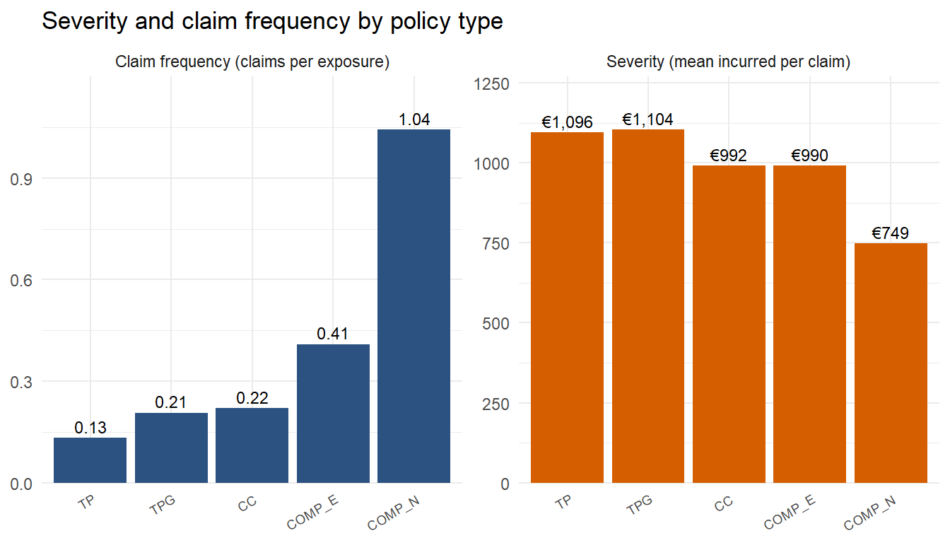
Severity is roughly stable across policy types, sitting between 750 EUR and 1,100 EUR per claim with COMP_N showing the lowest severity. Frequency varies by a factor of nearly eight, from 0.13 claims per exposure on TP to 1.04 on COMP_N. This shows that COMP_N policyholders are not having worse accidents, and supports the reasoning that they are claiming for every small loss because there is no excess to absorb small losses. To reduce the loss ratio, COMP_N would need to either have higher loading or reintroduce an excess amount.
The previous two charts looked at aggregates over three years. The next chart checks whether the loss ratio increase is across the board or specific to particular policies. Hover over any line to isolate that policy type’s trajectory.
# geom_line_interactive and geom_point_interactive with data_id hover-to-highlight pattern
by_type_year <- ins |> portfolio_metrics(policy_type, year)
by_type_year <- by_type_year |>
mutate(tooltip = paste0(policy_type, "\n",
"Year: ", year, "\n",
"Loss ratio: ", percent(loss_ratio, accuracy = 0.1)))
p_trajectories <- ggplot(by_type_year,
aes(x = year, y = loss_ratio,
group = policy_type, colour = policy_type)) +
geom_line_interactive(aes(data_id = policy_type, tooltip = policy_type),
linewidth = 1) +
geom_point_interactive(aes(data_id = policy_type, tooltip = tooltip),
size = 3) +
geom_hline(yintercept = 1, linetype = "dashed", colour = "grey60") +
scale_colour_brewer(palette = "Set1") +
scale_y_continuous(labels = percent_format()) +
labs(title = "Loss ratio by policy type and year",
x = NULL, y = "Loss ratio", colour = "Policy type") +
theme_minimal()
girafe(ggobj = p_trajectories, width_svg = 8, height_svg = 5,
options = list(opts_hover(css = "stroke-width:2.5px;opacity:1;"),
opts_hover_inv(css = "opacity:0.2;")))The loss ratio for every policy type except CC increases. COMP_N rose from 73 percent to 102 percent in two years, and is the only line that crosses the underwriting break even point. COMP_E and TPG climbed in step from around 60 to 80 percent. TP (the smallest book) more than doubled from 30 percent to 65 percent. CC, the largest book, oscillated around 65 percent and is the only segment holding steady. Overall there is a general increase across the board in loss ratio with TP increasing the most but still having the lowest loss ratio, and COMP_N in second and should be of more concern as it increased pass the underwriting break even point.
geom_line_interactive and geom_point_interactive are the ggiraph counterparts of the standard ggplot geoms. The data_id aesthetic groups the information for one policy type so they highlight together on hover, and the opts_hover_inv option fades unhovered elements to 20 percent opacity.
Bonus score is a proxy for the insurer’s assessment of the policyholder, set at underwriting. A policyholder with a bad claims history pays a higher premium. The next part investigates if the current loading plan is sufficient.
# patchwork side-by-side
by_bonus <- ins |> portfolio_metrics(bonus_score)
p_prem <- ggplot(by_bonus, aes(x = bonus_score, y = avg_premium)) +
geom_col(fill = "#2C5282") +
geom_text(aes(label = dollar(avg_premium, prefix = "\u20ac", accuracy = 1)),
vjust = -0.4, size = 3.6) +
scale_y_continuous(labels = label_dollar(prefix = "\u20ac"),
expand = expansion(mult = c(0, 0.15))) +
labs(title = "Average premium per exposure", x = NULL, y = NULL) +
theme_minimal()
p_lr <- ggplot(by_bonus, aes(x = bonus_score, y = loss_ratio)) +
geom_col(fill = "#D55E00") +
geom_text(aes(label = percent(loss_ratio, accuracy = 0.1)),
vjust = -0.4, size = 3.6) +
geom_hline(yintercept = 0.7, linetype = "dashed", colour = "grey50") +
scale_y_continuous(labels = percent_format(),
expand = expansion(mult = c(0, 0.15))) +
labs(title = "Loss ratio", x = NULL, y = NULL) +
theme_minimal()
p_prem + p_lr
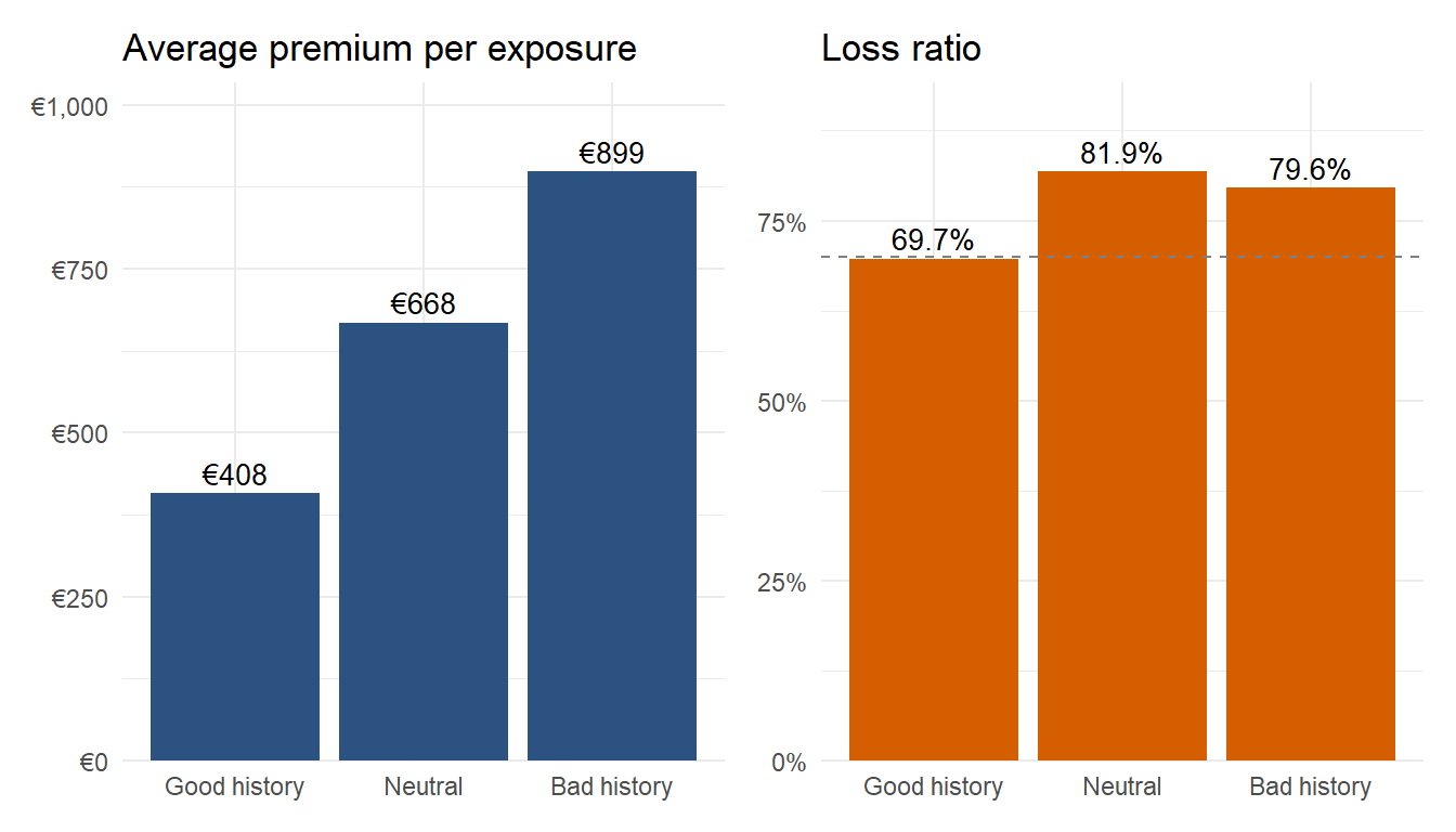
In a normal system, good history drivers should run a low loss ratio at low premium, neutral drivers should sit roughly at break even, and bad history drivers should run a low loss ratio at high premium because the loading more than offsets their elevated risk. While the data shows that the trend is roughly correct, the loss ratio overall is too high. Good drivers have a loss ratio at the reference line of 70 percent. Neutral drivers and bad driver both sit above with loss ratio of 82 percent and 80 percent respectively. Overall, the loading should be reviewed for calibration. A look at the year on year breakdown helps determine the calibration.
# ggiraph hover pattern
by_bonus_year <- ins |> portfolio_metrics(bonus_score, year) |>
mutate(tooltip = paste0(bonus_score, "\n",
"Year: ", year, "\n",
"Loss ratio: ", percent(loss_ratio, accuracy = 0.1)))
p_bonus_line <- ggplot(by_bonus_year,
aes(x = year, y = loss_ratio,
group = bonus_score, colour = bonus_score)) +
geom_line_interactive(aes(data_id = bonus_score, tooltip = bonus_score),
linewidth = 1) +
geom_point_interactive(aes(data_id = bonus_score, tooltip = tooltip),
size = 3) +
geom_hline(yintercept = 1, linetype = "dashed", colour = "grey60") +
scale_colour_manual(values = c("Good history" = "#009E73",
"Neutral" = "grey50",
"Bad history" = "#D55E00")) +
scale_y_continuous(labels = percent_format()) +
labs(title = "Loss ratio by bonus score and year",
x = NULL, y = "Loss ratio", colour = "Bonus score") +
theme_minimal()
girafe(ggobj = p_bonus_line, width_svg = 8, height_svg = 4,
options = list(opts_hover(css = "stroke-width:2.5px;opacity:1;"),
opts_hover_inv(css = "opacity:0.2;")))Bad history policies climbed from 53 percent to 93 percent loss ratio in two years, and the neutral segment overshot bad history briefly in 2024 at 102 percent. Good history policies climbed too but stayed inside acceptable territory. It can be observed that the loadings for the risky segments have not kept pace with experience. The pricing model needs the bad and neutral tiers recalibrated using recent claim data rather than a uniform rate increase across all tiers.
Driver age in motor insurance is widely expected to follow a U shape, where the youngest and oldest drivers carry the highest risk and middle-aged drivers the lowest. The next section checks whether this portfolio conforms to that expectation.
by_age <- ins |> portfolio_metrics(age_band)
# Panel 1: loss ratio
p_lr <- ggplot(by_age, aes(x = age_band, y = loss_ratio)) +
geom_col(aes(fill = loss_ratio > 0.7), show.legend = FALSE) +
geom_text(aes(label = percent(loss_ratio, accuracy = 0.1)),
vjust = -0.4, size = 3.2) +
geom_hline(yintercept = 0.7, linetype = "dashed", colour = "grey50") +
scale_fill_manual(values = c("FALSE" = "#009E73", "TRUE" = "#D55E00")) +
scale_y_continuous(labels = percent_format(),
expand = expansion(mult = c(0, 0.15))) +
labs(title = "Loss ratio by driver age band",
x = NULL, y = "Loss ratio") +
theme_minimal()
# Panel 2: average premium
p_prem <- ggplot(by_age, aes(x = age_band, y = avg_premium)) +
geom_col(fill = "#2C5282") +
geom_text(aes(label = dollar(avg_premium, prefix = "\u20ac", accuracy = 1)),
vjust = -0.4, size = 3.2) +
scale_y_continuous(labels = label_dollar(prefix = "\u20ac"),
expand = expansion(mult = c(0, 0.15))) +
labs(title = "Average premium per exposure",
x = NULL, y = "EUR") +
theme_minimal()
p_lr + p_prem
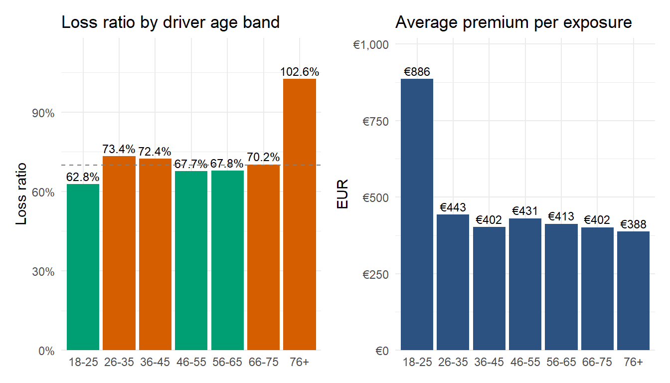
The chart shows that the 18-25 group has a loss ratio of 63 percent, the middle bands sit between roughly 68 and 73 percent, and the 76+ band jumps to 102 percent. The average premium per exposure chart does not follow a typical U shape. The average premium curve shows high loading on the 18-25 band, well above the portfolio average, which is consistent with the expectation for young drivers. However, the loading flattens after that, and at the over 75 end pricing falls back to 390 EUR, which is below the portfolio average. The pricing model treats older drivers as low risk when the data says they have crossed the underwriting break even point. The 76+ segment is small at about 0.8 percent of the book, so the financial impact is limited, but it is a clear signal that the senior driver tariff needs review.
A violin plot shows the full shape of the incurred distribution for each product by mirroring a kernel density estimate on both sides. Overlaying a narrow boxplot inside the violin allows comparison with the median and the IQR. The chart is restricted to claiming policies and uses a log scale to handle the heavy right tail.
# violin and boxplot combined
claims_violin <- ins |>
filter(total_incurred > 0) |>
mutate(policy_type = fct_reorder(policy_type, total_incurred, .fun = median))
ggplot(claims_violin, aes(x = policy_type, y = total_incurred, fill = policy_type)) +
geom_violin(alpha = 0.7, colour = NA, scale = "width") +
geom_boxplot(width = 0.08, outlier.shape = NA, colour = "grey20",
fill = "white", alpha = 0.8) +
scale_y_log10(labels = label_dollar(prefix = "\u20ac"),
breaks = c(50, 250, 1000, 5000, 50000)) +
coord_cartesian(ylim = c(50, 50000)) +
scale_fill_brewer(palette = "Set2", guide = "none") +
labs(title = "Distribution of incurred per claim by policy type",
subtitle = "Ordered by median. Log scale. Claiming policies only.",
x = NULL, y = "Incurred per claim (log scale)") +
theme_minimal() +
theme(axis.text.x = element_text(angle = 30, hjust = 1, size = 7))
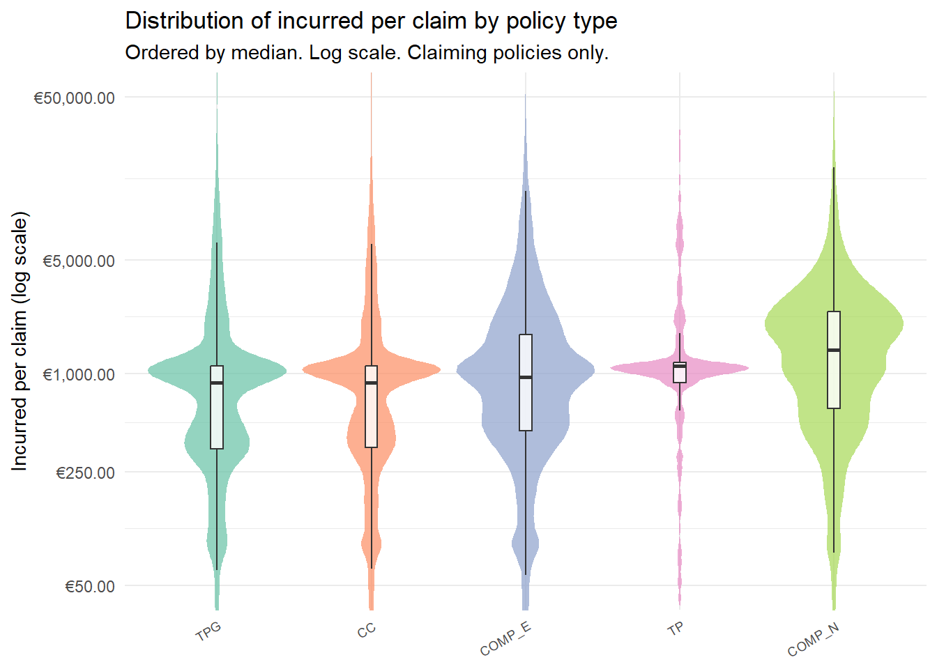
The medians sit between roughly €880 and €1,400 across the five products. CC and TPG share the lowest median at around €880. COMP_E sits slightly above at around €956. TP follows at €1,114. COMP_N has the highest median at around €1,399, and the broadest distribution shown by the width of the violin, not only indicating its claims are spread more evenly across the range than the others, but also that the individual claims are larger. With COMP_N having a high loss ratio, this results further emphasises that this policy should be one of the focus areas of redesign.
geom_violin is used to encode the full density shape without requiring sampling, and scale = "width" normalises all violins to the same maximum width so narrow groups are not visually marginalised by wider ones. The narrow geom_boxplot inside the violin uses outlier.shape = NA to suppress outlier dots, which would otherwise double-plot with the violin’s own tails. fct_reorder sorts products from lowest to highest median incurred so the chart reads as a progression.
The Kruskal Wallis test is the nonparametric equivalent of ANOVA and is appropriate here because incurred amounts are heavy tailed and not normally distributed. The test is to find out when the comprehensive products show higher loss ratios than third party products, is that gap driven by genuinely more expensive individual claims, or just by chance variation in the sample.
claims_only <- ins |> filter(total_incurred > 0)
kw_result <- kruskal.test(total_incurred ~ policy_type, data = claims_only)
ggplot(claims_only,
aes(x = policy_type, y = total_incurred, fill = policy_type)) +
geom_boxplot(alpha = 0.7, outlier.alpha = 0.05, outlier.size = 0.6) +
scale_y_log10(labels = label_dollar(prefix = "\u20ac"),
breaks = c(50, 250, 1000, 5000, 50000)) +
# coord_cartesian clips the display range without removing points from the statistical computation
coord_cartesian(ylim = c(50, 50000)) +
scale_fill_brewer(palette = "Set2", guide = "none") +
labs(
title = "Distribution of incurred per claim by policy type",
subtitle = paste0("Kruskal Wallis chi squared = ",
round(kw_result$statistic, 1),
", df = ", kw_result$parameter,
", p < 0.001"),
x = NULL,
y = "Incurred per claim (log scale)"
) +
theme_minimal() +
theme(axis.text.x = element_text(angle = 30, hjust = 1, size = 7))
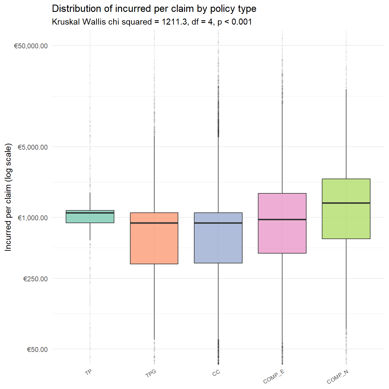
The Kruskal Wallis test confirms a chi-squared statistic well above the critical value with a p value below 0.001. We can conclude that the cost differences between policy types are real and not due to chance. COMP products genuinely produce more expensive individual claims than TP or CC.
The log scale on the y axis is needed because the raw incurred distribution spans from below 50 EUR to over 500,000 EUR, and a linear scale would compress all the boxes into the lower edge.
The violin and the Kruskal Wallis test confirm that claim costs differ between products. The next question is where on the cost scale the products diverge. Is COMP_N’s loss ratio problem caused by many small cheap claims, or by a few catastrophic large ones? An empirical cumulative distribution function (ECDF) is used to visualise this. Each curve shows what share of that product’s claims fall below a given cost.
Before the chart, a table of cost thresholds across products quantifies the divergence.
ecdf_table <- ins |>
filter(total_incurred > 0) |>
group_by(policy_type) |>
summarise(
`Claims under 250 EUR` = scales::percent(mean(total_incurred < 250), accuracy = 0.1),
`Claims under 500 EUR` = scales::percent(mean(total_incurred < 500), accuracy = 0.1),
`Claims under 1,000 EUR` = scales::percent(mean(total_incurred < 1000), accuracy = 0.1),
`Median incurred (EUR)` = round(median(total_incurred)),
.groups = "drop"
)
ecdf_table |> kable(caption = "Cumulative share of claims below cost thresholds, by policy type")| policy_type | Claims under 250 EUR | Claims under 500 EUR | Claims under 1,000 EUR | Median incurred (EUR) |
|---|---|---|---|---|
| TP | 11.9% | 17.2% | 30.8% | 1114 |
| TPG | 16.3% | 37.6% | 54.4% | 882 |
| CC | 17.5% | 36.1% | 53.8% | 882 |
| COMP_E | 13.1% | 28.9% | 51.2% | 954 |
| COMP_N | 8.7% | 20.0% | 37.5% | 1392 |
claims_only <- ins |> filter(total_incurred > 0)
ggplot(claims_only, aes(x = total_incurred, colour = policy_type)) +
stat_ecdf(geom = "step", linewidth = 1) +
geom_hline(yintercept = 0.5, colour = "grey50", linetype = "dashed") +
scale_x_log10(
labels = label_dollar(prefix = "\u20ac"),
breaks = c(100, 250, 500, 1000, 2500, 5000, 10000, 25000)
) +
coord_cartesian(xlim = c(100, 25000)) +
scale_y_continuous(labels = percent, breaks = c(0, 0.25, 0.5, 0.75, 1)) +
scale_colour_brewer(palette = "Set1", name = "Policy type") +
labs(
title = "Cumulative distribution of incurred per claim by policy type",
subtitle = "A curve to the left at any threshold means a higher share of small claims. A curve to the right means a heavier tail of large claims.",
x = "Incurred per claim (log scale)",
y = "Cumulative share of claims"
) +
theme_minimal() + # replaced theme_va()
theme(legend.position = "right",
axis.text.x = element_text(angle = 30, hjust = 1))
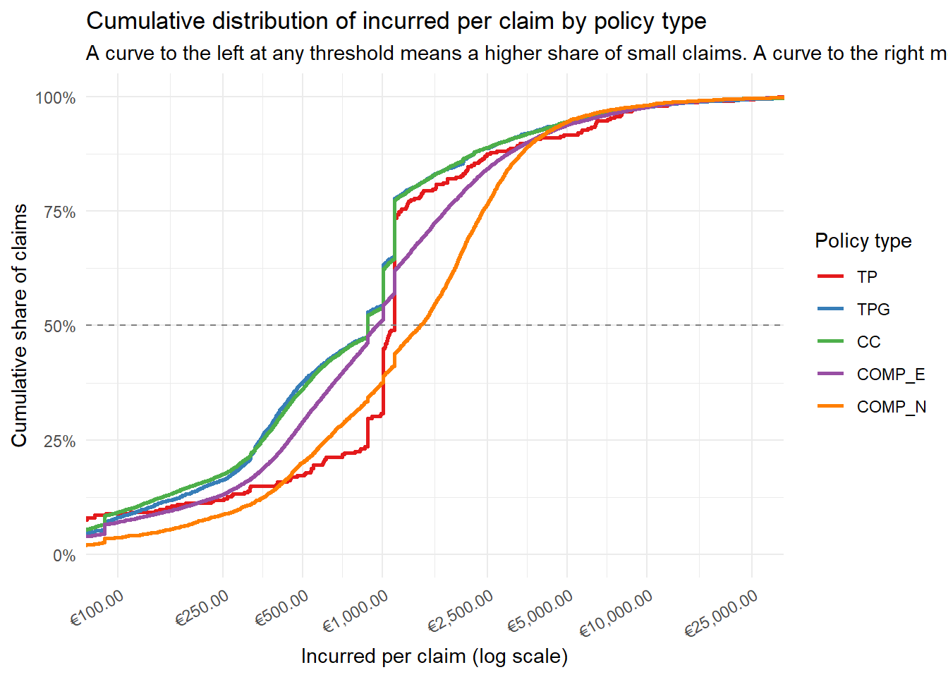
The 50 percent dashed line shows the product’s median claim cost. CC and TPG cross the line first, followed by COMP_E, then TP, and finally COMP_N furthest to the right. The horizontal spread between the curves at any given cumulative share shows how different the products are at that part of the cost scale. COMP_N’s curve sits consistently to the right of all others below the 80 percent mark, which means COMP_N has fewer small claims and more medium-cost claims compared to the other policies. Above 10,000 EUR the curves converge, indicating that large losses are generally rare and similar in scale across all products.
This pattern supports the loss ratio analysis where COMP_N’s loss ratio problem stems from the distribution of mid-sized claims being shifted upward rather than from a heavier catastrophic tail. The combined cumulative table above gives the exact percentages at three reference thresholds (250, 500, and 1,000 EUR) for verification.
The previous tests focused on the cost of individual claims. This section analyses if the likelihood of making any claim at all differ depending on how the policyholder pays. Annual payers and quarterly payers are the two groups. A chi-square test checks whether the proportion who claim in each group is different enough to be statistically meaningful rather than random variation.
# ggbarstats for chi-squared test of association
ins_test <- ins |>
mutate(any_claim = total_claims > 0)
ggbarstats(
data = ins_test,
x = any_claim,
y = payment_frequency,
type = "parametric",
bf.message = FALSE,
proportion.test = TRUE,
label = "percentage",
title = "Share of policies with at least one claim, by payment frequency",
xlab = NULL,
ylab = "Share of policies",
legend.title = "At least one claim"
)
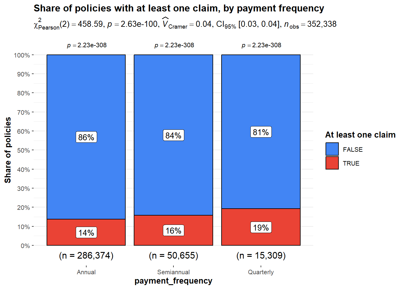
The chi square statistic is highly significant and test confirms quarterly payers claim significantly more often. Quarterly payers are about 30 percent more likely to file at least one claim than annual payers. This would mean that quarterly payers need to be loaded more to reduce loss ratio.
The bivariate analysis established which segments have elevated loss ratios. The next section uses multivariate geometry to show the interaction of three or more dimensions simultaneously to observe what factors are causing the high loss ratio.
Two things need to be shown at the same time. The absolute loss ratio for each age band and product combination identifies which cells cross the 70 percent profitability threshold. The relative pattern within each product column identifies which age bands are unusually hot for that specific product. A single interactive heatmap with hierarchical clustering can visualise both. The colour shows the raw loss ratio. The percentage value is displayed inside each cell. The tooltip gives exact values and the underlying premium and claims data. The dendrograms attached to the rows and columns group cells that behave similarly across the matrix, which surfaces structural patterns that the colour alone may not.
# heatmaply
heat_df <- ins |>
group_by(age_band, policy_type) |>
summarise(loss_ratio = sum(total_incurred) / sum(total_premium),
policies = n(), .groups = "drop") |>
filter(policies >= 200)
heat_matrix <- heat_df |>
select(-policies) |>
pivot_wider(names_from = policy_type, values_from = loss_ratio) |>
column_to_rownames("age_band") |>
as.matrix()
cell_labels <- ifelse(is.na(heat_matrix), "",
scales::percent(heat_matrix, accuracy = 1))
heatmaply(
heat_matrix,
cellnote = cell_labels,
cellnote_size = 11,
cellnote_textposition = "middle center",
scale = "none",
dist_method = "euclidean",
hclust_method = "ward.D",
colors = diverging_hcl(50, palette = "Blue-Red 3"),
limits = c(0.4, 1.3),
k_row = 3,
k_col = 2,
margins = c(80, 80, 40, 20),
fontsize_row = 10,
fontsize_col = 10,
main = "Loss ratio by age band and policy type",
xlab = "Policy type",
ylab = "Driver age band",
label_names = c("Age band", "Policy type", "Loss ratio")
)Two distinct patterns can be observed. The 76+ row is the most uniformly red across products with the hottest cell of 128% for CC policy. Secondly, the COMP_N policy has red across all age groups. The 18 to 25 row is mostly blue and the middle age bands sit close to the 70 percent threshold for most products.
heatmaply from the heatmaply package wraps a plotly heatmap with row and column dendrograms and adds hover tooltips automatically. The cellnote argument writes the loss ratio percentage into each cell, while cellnote_textposition = "middle center" keeps the labels aligned. Setting scale = "none" preserves the raw loss ratio values so the colour encodes absolute profitability rather than relative deviation. The diverging_hcl palette from colorspace is perceptually balanced. k_row = 3 and k_col = 2 draw rectangles around the major clusters identified by Ward linkage, making the groupings explicit. Cells with fewer than 200 policies are excluded before building the matrix because loss ratios on small samples are too volatile to be informative.
This section analyses if the cost ratio increase is due to the increase in typical claim cost through the years. A quantile line chart is used to show the drift explicit by plotting the median and the 90th percentile of incurred per claim against year, with one line per bonus score group. The median tracks the typical claim cost while the 90th percentile tracks the upper end of the distribution where reserve risk sits.
# combined geoms + facet_wrap
drift_data <- ins |>
filter(total_incurred > 0) |>
group_by(year, bonus_score) |>
summarise(
median_inc = median(total_incurred),
p90_inc = quantile(total_incurred, 0.9),
.groups = "drop"
) |>
pivot_longer(c(median_inc, p90_inc),
names_to = "metric", values_to = "value") |>
mutate(metric = recode(metric,
median_inc = "Median (typical claim)",
p90_inc = "90th percentile (tail risk)"),
metric = factor(metric, levels = c("Median (typical claim)",
"90th percentile (tail risk)")))
ggplot(drift_data, aes(x = year, y = value,
colour = bonus_score, group = bonus_score)) +
geom_line(linewidth = 1.1) +
geom_point(size = 3) +
geom_text(aes(label = paste0("\u20ac", scales::comma(round(value)))),
vjust = -1, size = 2.8, show.legend = FALSE) +
facet_wrap(~ metric, scales = "free_y") +
scale_y_continuous(labels = label_dollar(prefix = "\u20ac"),
expand = expansion(mult = c(0.15, 0.18))) +
scale_colour_manual(values = c("Good history" = "#009E73",
"Neutral" = "grey50",
"Bad history" = "#D55E00"),
name = "Bonus score") +
labs(title = "Claim cost drift by year and bonus score",
x = NULL, y = "Incurred per claim (EUR)") +
theme_minimal() +
theme(legend.position = "top")
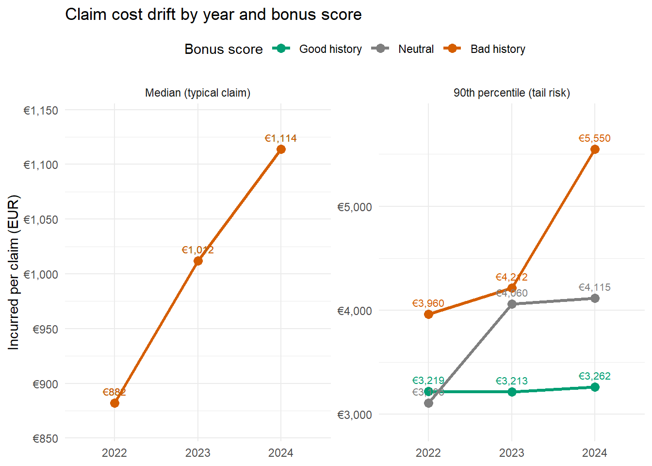
Bad history claim costs are increasing fast on both the typical claim and the tail. The median rising 26% and P90 rising 40% means not just the rare big claims are getting worse but every claim from a bad history drivers are getting more expensive. Tail risk for Neutral drivers also jumped sharply in 2023. Good-history drivers are the only stable segment. Their claim costs barely moved on either metric. This indicates that premiums review should first focus on drivers with bad history.
This section decomposes the loss ratio into its two structural drivers and shows how much money each product earns to absorb its losses. Claim frequency on the x-axis answers how often claims happen per unit of exposure. Severity on the y-axis answers how much each individual claim costs. The product of these two numbers, divided by the average premium per exposure, is the loss ratio. The bubble size shows the premium volume. Hover over the bubble to reveal a tooltip with the precise loss ratio, frequency, severity, and premium.
# geom_point_interactive with tooltip + data_id
fs <- ins |> portfolio_metrics(policy_type, year) |>
mutate(tip = paste0(policy_type, ", ", year, "\n",
"Loss ratio: ", percent(loss_ratio, accuracy = 0.1), "\n",
"Premium: ",
dollar(premium / 1e6, prefix = "\u20ac",
suffix = "M", accuracy = 0.1)))
p_bubble <- ggplot(fs, aes(x = claim_freq, y = severity,
size = premium, colour = policy_type)) +
geom_point_interactive(aes(tooltip = tip, data_id = policy_type),
alpha = 0.7) +
geom_text(aes(label = year), size = 2.8, colour = "grey20") +
scale_size(range = c(4, 18),
labels = label_dollar(prefix = "\u20ac", scale = 1e-6,
suffix = "M")) +
scale_y_log10(labels = label_dollar(prefix = "\u20ac")) +
scale_colour_brewer(palette = "Set1") +
labs(title = "Claim severity versus claim frequency by policy type and year",
x = "Claim frequency", y = "Severity per claim",
size = "Premium volume", colour = "Policy type") +
theme_minimal()
girafe(ggobj = p_bubble, width_svg = 9, height_svg = 5,
options = list(opts_hover(css = "stroke-width:2px;opacity:1;"),
opts_hover_inv(css = "opacity:0.2;")))COMP_N forms a tight cluster on the far right at high frequency and low severity which is typical of a product with no excess. The severity decreased towards 2024 but the frequency increased showing that frequency is the factor for the loss ratio. All other policies show an increase in severity but around the same frequency, showing severity is the issue.
The bubble chart compares products on two axes plus volume. A parallel coordinates plot extends that to four axes simultaneously, which means the loss ratio, claim frequency, average premium, and average severity can all be compared at once for each product. The contribution to the analysis is that it surfaces the shape of each product’s profile across all four metrics in one chart, which helps confirm whether two products that look similar on the loss ratio actually share the same underlying risk structure. If two products with similar loss ratios trace different polyline shapes, the loss ratio is being driven by different combinations of frequency, severity, and pricing, which means they call for different remedies.
# ggparcoord from GGally
pcp_data <- ins |>
group_by(policy_type) |>
summarise(
`Loss ratio` = sum(total_incurred) / sum(total_premium),
`Claim frequency` = sum(total_claims) / sum(total_exposure),
`Avg premium` = sum(total_premium) / sum(total_exposure),
`Avg severity` = sum(total_incurred) / pmax(sum(total_claims), 1),
.groups = "drop"
)
ggparcoord(pcp_data,
columns = 2:5,
groupColumn = 1,
scale = "uniminmax",
showPoints = TRUE,
alphaLines = 0.8,
splineFactor = FALSE) +
scale_colour_brewer(palette = "Set1") +
labs(title = "Policy type profiles across four portfolio metrics",
subtitle = "Axes rescaled to 0 to 1 so the shape of the polyline conveys the joint profile",
x = NULL, y = "Normalised value",
colour = "Policy type") +
theme_minimal() +
theme(axis.text.x = element_text(angle = 20, hjust = 1))
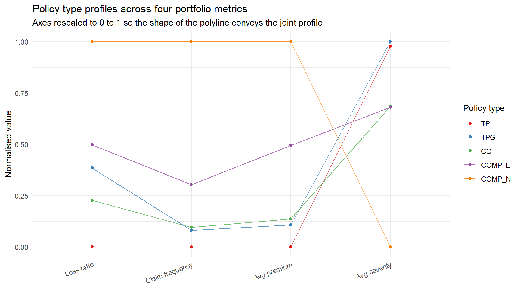
The polylines reveal each product’s structural profile. COMP_N climbs to the top of the claim frequency axis and the loss ratio axis while sitting near the bottom on severity. This is the polyline shape of a product priced as if accidents are occasional but actually paying out on every small bump. TP runs along the bottom of both frequency and loss ratio, the expected profile for a stripped down third party product. CC and COMP_E trace similar shapes, which is consistent with their being variants of the same comprehensive concept and suggests a shared remedy may apply to both.
ggparcoord from GGally accepts column indices rather than aesthetic mappings. scale = "uniminmax" rescales each axis to 0 to 1 so no single variable dominates by magnitude. splineFactor = FALSE keeps lines straight, because curved interpolation between distinct metrics has no analytical meaning.
Profitability is the loss ratio and it measures average outcomes of the policies. But the capital an insurer must hold is driven by what can go wrong at the extremes of the distribution, not by the average. This section analyses whether among the policies that do claim, how concentrated and how volatile are the losses. The answer shapes reinsurance strategy and capital allocation.
A Lorenz curve is used to establish how concentrated the losses are. The Lorenz curve sorts policies from smallest to largest incurred and plots cumulative share of policies against cumulative share of incurred. A book where every policy contributes equally to losses would trace the 45 degree line. The further the curve sags below the diagonal, the more concentrated the losses sit in a small number of policies. The gap between the curve and the diagonal is the Gini coefficient, a single number between zero (perfect equality) and one (one policy holds all the losses).
lorenz_data <- ins |>
arrange(total_incurred) |>
mutate(
cum_share_policies = row_number() / n(),
cum_share_incurred = cumsum(total_incurred) / sum(total_incurred)
)
n_pol <- nrow(lorenz_data)
gini <- 1 - 2 * sum(lorenz_data$cum_share_incurred) / n_pol + 1 / n_pol
lorenz_thresholds <- tibble(
`Top % of policies by incurred` = c("Top 1%", "Top 5%", "Top 10%", "Top 25%", "Bottom 80%"),
`Share of total incurred` = scales::percent(
c(
1 - approx(lorenz_data$cum_share_policies,
lorenz_data$cum_share_incurred, xout = 0.99)$y,
1 - approx(lorenz_data$cum_share_policies,
lorenz_data$cum_share_incurred, xout = 0.95)$y,
1 - approx(lorenz_data$cum_share_policies,
lorenz_data$cum_share_incurred, xout = 0.90)$y,
1 - approx(lorenz_data$cum_share_policies,
lorenz_data$cum_share_incurred, xout = 0.75)$y,
approx(lorenz_data$cum_share_policies,
lorenz_data$cum_share_incurred, xout = 0.80)$y
),
accuracy = 0.1
)
)
lorenz_thresholds |>
DT::datatable(
caption = "Loss concentration thresholds. Sortable.",
options = list(dom = "t", pageLength = 5, ordering = TRUE),
rownames = FALSE
)ref_points <- tibble(
cum_share_policies = c(0.80, 0.90, 0.95),
cum_share_incurred = approx(lorenz_data$cum_share_policies,
lorenz_data$cum_share_incurred,
xout = c(0.80, 0.90, 0.95))$y
)
ggplot(lorenz_data, aes(x = cum_share_policies, y = cum_share_incurred)) +
geom_ribbon(aes(ymin = cum_share_incurred, ymax = cum_share_policies),
fill = "#D55E00", alpha = 0.15) + # warm -> #D55E00
geom_abline(slope = 1, intercept = 0, colour = "grey50", linetype = "dashed") +
geom_line(colour = "#0072B2", linewidth = 0.9) + # acc -> #0072B2
geom_point(data = ref_points,
aes(x = cum_share_policies, y = cum_share_incurred),
colour = "#D55E00", size = 2.5) + # warm -> #D55E00
geom_text(data = ref_points,
aes(label = paste0("(",
scales::percent(cum_share_policies, accuracy = 1),
", ",
scales::percent(cum_share_incurred, accuracy = 1),
")")),
nudge_x = 0.02, nudge_y = -0.05, size = 3.2, hjust = 0,
colour = "grey20") +
annotate("text", x = 0.05, y = 0.92,
label = paste0("Gini coefficient: ", round(gini, 3)),
hjust = 0, size = 4.5, fontface = "bold", colour = "#0072B2") + # acc -> #0072B2
annotate("text", x = 0.05, y = 0.86,
label = "Higher Gini means more concentrated losses",
hjust = 0, size = 3, colour = "grey40") +
scale_x_continuous(labels = percent, expand = expansion(mult = c(0, 0.02))) +
scale_y_continuous(labels = percent, expand = expansion(mult = c(0, 0.02))) +
labs(
title = "Lorenz curve of incurred amount across all policies",
subtitle = "Reference points marked at the 80th, 90th, and 95th percentiles",
x = "Cumulative share of policies (sorted by incurred ascending)",
y = "Cumulative share of incurred"
) +
theme_minimal() + # replaced theme_va()
coord_equal()
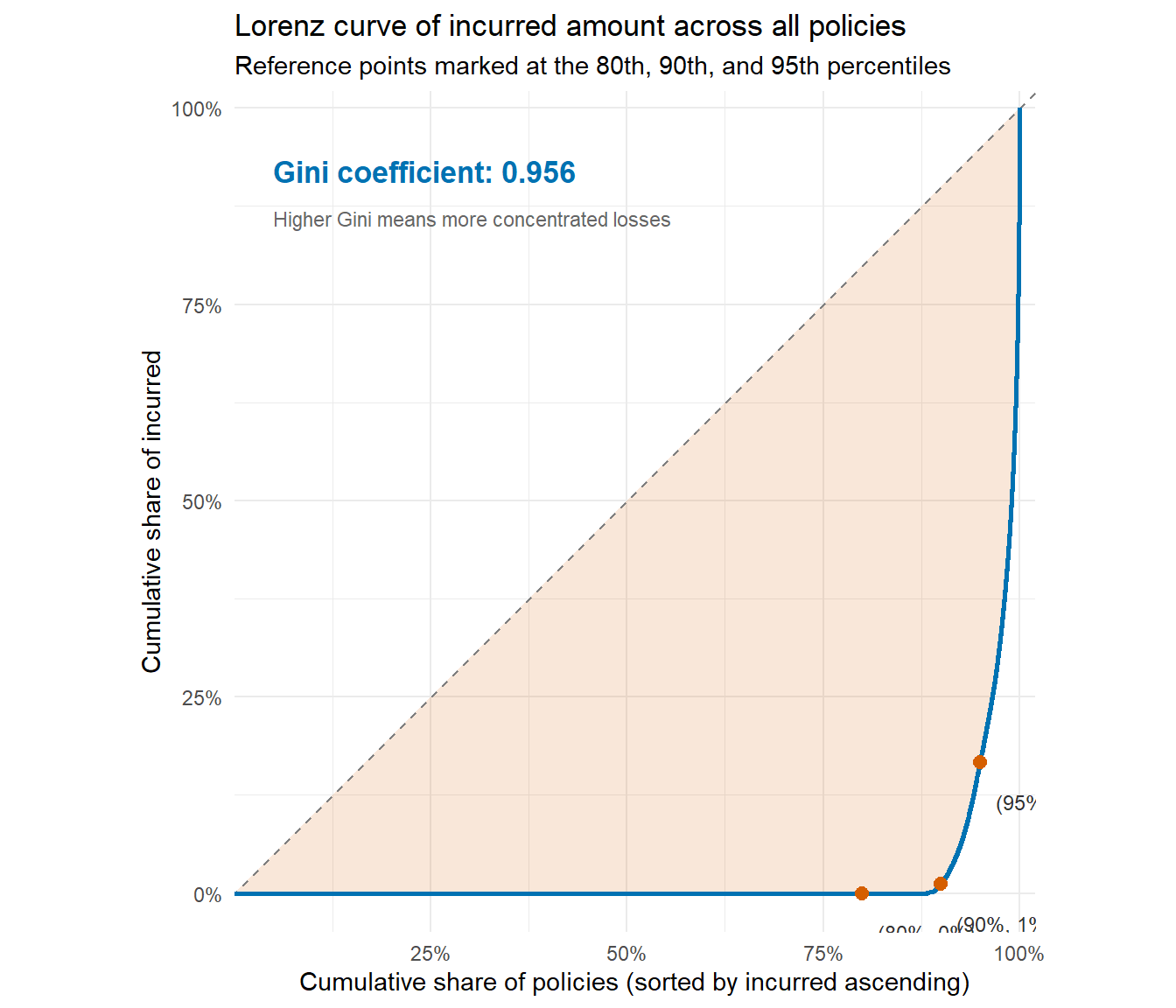
The Gini coefficient is 0.96, which is high even by insurance standards. The bottom 80 percent of policies account for less than 5 percent of total incurred, which means four out of every five policies in the book contribute almost nothing to losses. The top 5 percent of policies account for over 80 percent of incurred, and the top 1 percent alone carry roughly half of total incurred cost. Reinsurance protection should be calibrated against the very top of the distribution rather than against average loss since uniform rate increases applied across the whole book disproportionately punish the 80 percent who are not driving losses.
The Lorenz curve is constructed entirely from base dplyr verbs (arrange, cumsum, row_number). The Gini coefficient is one line of arithmetic, computed as one minus twice the area under the curve. The shaded ribbon between the curve and the diagonal makes the area of inequality visible without needing to compute or annotate it separately, which applies the data ink ratio principle by encoding the same concept (concentration) through two reinforcing visual channels (curve position and ribbon area). The coord_equal call forces the plot to render with equal x and y units, which is essential for a Lorenz curve because a stretched aspect ratio would distort the relationship between the curve and the diagonal.
The total premium has eight coverage components. Decomposing the total loss ratio into per coverage loss ratios reveals which lines are profitable and which are loss making within each product. Loss ratio by coverage line.
coverages <- tribble(
~coverage, ~premium_col, ~incurred_col,
"Liability", "liability_premium", "liability_incurred",
"Property damage", "property_damage_premium", "property_incurred",
"Glass", "glass_premium", "glass_incurred",
"Occupants", "occupants_premium", "occupants_incurred",
"Fire", "fire_premium", "fire_incurred",
"Theft", "theft_premium", "theft_incurred",
"Legal protection", "legal_protection_premium", "legal_protection_incurred"
)
coverage_lr <- coverages |>
rowwise() |>
mutate(
premium = sum(ins[[premium_col]], na.rm = TRUE),
incurred = sum(ins[[incurred_col]], na.rm = TRUE)
) |>
ungroup() |>
mutate(
loss_ratio = incurred / premium,
coverage = fct_reorder(coverage, premium)
)
ggplot(coverage_lr, aes(x = loss_ratio, y = coverage)) +
geom_col(aes(fill = loss_ratio > 0.7), alpha = 0.85, width = 0.65, show.legend = FALSE) +
geom_text(aes(label = paste0(percent(loss_ratio, accuracy = 0.1), " (",
dollar(premium / 1e6, prefix = "\u20ac", accuracy = 0.1),
"M premium)")),
hjust = -0.05, size = 3.2, colour = "grey20") +
geom_vline(xintercept = 0.7, colour = "grey50", linetype = "dashed") +
scale_fill_manual(values = c("FALSE" = "#009E73", "TRUE" = "#D55E00")) + # warm -> #D55E00
scale_x_continuous(labels = percent_format(accuracy = 1),
expand = expansion(mult = c(0, 0.35)),
limits = c(0, 1)) +
labs(
title = "Loss ratio by coverage line",
subtitle = "Total incurred over total premium aggregated across 2022 to 2024",
x = "Loss ratio", y = NULL
) +
theme_minimal() # replaced theme_va()
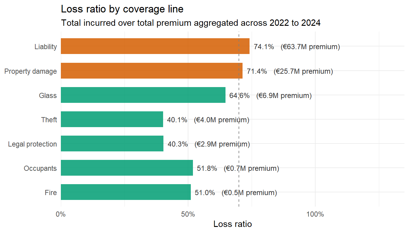
Liability premium is the largest line at 64 million EUR and runs a loss ratio of 74 percent. Property damage is the second largest at 26 million and runs 72 percent. Glass at 7 million runs 65 percent, just under threshold. The other four lines run between 40 and 52 percent and are profitable. Any portfolio rebuild is recommended to start with liability and property damage.
A treemap is used to show the premium volume by policy type at the outer level and by bonus score at the inner level. The rectangle area is proportional to premium volume. Fill colour is the loss ratio, with blue below the 70 percent threshold and red above. Policy type names appear as group labels, bonus tier labels appear inside each leaf.
# plotly native treemap
tree_data <- ins |>
group_by(policy_type, bonus_score) |>
summarise(premium = sum(total_premium, na.rm = TRUE),
incurred = sum(total_incurred, na.rm = TRUE),
.groups = "drop") |>
mutate(loss_ratio = incurred / premium)
parents <- tree_data |>
group_by(policy_type) |>
summarise(
label = first(policy_type),
parent = "",
value = sum(premium),
incurred = sum(incurred),
.groups = "drop"
) |>
mutate(
loss_ratio = incurred / value,
id = label
)
leaves <- tree_data |>
mutate(
label = bonus_score,
parent = policy_type,
value = premium,
id = paste(policy_type, bonus_score, sep = " / ")
) |>
select(id, label, parent, value, loss_ratio, incurred)
treemap_df <- bind_rows(
parents |> select(id, label, parent, value, loss_ratio, incurred),
leaves
) |>
mutate(
# Hover text formatted as HTML for plotly to render line breaks
hover = paste0(
"<b>", id, "</b><br>",
"Premium: \u20ac", scales::comma(round(value)), "<br>",
"Incurred: \u20ac", scales::comma(round(incurred)), "<br>",
"Loss ratio: ", scales::percent(loss_ratio, accuracy = 0.1)
),
# On-tile label: name above, loss ratio below
text = paste0(label, "<br>", scales::percent(loss_ratio, accuracy = 1))
)
plot_ly(
data = treemap_df,
type = "treemap",
ids = ~id,
labels = ~text,
parents = ~parent,
values = ~value,
branchvalues = "total",
hovertext = ~hover,
hoverinfo = "text",
marker = list(
colors = ~loss_ratio,
colorscale = list(
list(0, "#4393C3"),
list(0.5, "#FFFFBF"),
list(1, "#D6604D")
),
cmin = 0.4,
cmid = 0.7,
cmax = 1.1,
colorbar = list(
title = "Loss ratio",
tickformat = ".0%"
),
line = list(color = "white", width = 2)
),
textfont = list(color = "grey10", size = 13),
pathbar = list(visible = TRUE)
) |>
layout(
title = list(
text = paste0(
"<b>Premium volume by policy type and bonus score</b><br>",
"<span style='font-size:11px;color:grey'>",
"Click a tile to zoom in. Hover for exact figures. ",
"Colour shows loss ratio: blue below 70 percent, red above.",
"</span>"
),
x = 0.02
),
margin = list(t = 80, l = 10, r = 10, b = 10)
)The treemap analysis shows that CC with bad history runs at 61 percent and is actually one of the more profitable segments in the book. In contrast, the neutral tier shows elevated loss ratios across multiple products, with CC neutral at 87 percent and COMP_N at 94 percent being the most visible examples. COMP_N is loss making across all three bonus tiers, confirming that the product level problem is not driven by any single customer segment but by the product design itself. TPG bad history stands out as a small but high loss ratio segment consistent with the high CV finding in the volatility analysis. The overall picture suggests that an overall correction to the bad history loading alone would not resolve the profitability issues across the book. The neutral tier and the COMP_N product structure both warrant equal attention.
treemapify provides the ggplot grammar for hierarchical area charts. The area aesthetic sets rectangle size proportional to premium. The subgroup aesthetic groups leaves under their policy type parent and lets geom_treemap_subgroup_border and geom_treemap_subgroup_text add the outer-level annotations as a watermark behind the leaf labels. The scale_fill_gradient2 with midpoint = 0.7 anchors the neutral colour at the underwriting threshold, so blue tiles are profitable, yellow tiles sit at the threshold, and red tiles are loss making.
Within liability, the cookbook splits claims into property damage and bodily injury. Bodily injury is what costs. Bodily injury claims average roughly 5x the cost of property damage claims. The Occupants bar shows the average cost per claim for injuries to passengers inside the insured’s own vehicle, as distinct from the Liability injury bars which covers injuries to third parties outside the vehicle.
# bar chart
sev_decomp <- tribble(
~coverage, ~claims_col, ~incurred_col,
"Liability injury", "liability_injury_claims", "liability_injury_incurred",
"Liability property", "liability_property_claims", "liability_property_incurred",
"Property damage", "property_claims", "property_incurred",
"Theft", "theft_claims", "theft_incurred",
"Glass", "glass_claims", "glass_incurred",
"Fire", "fire_claims", "fire_incurred",
"Occupants", "occupants_claims", "occupants_incurred",
"Legal protection", "legal_protection_claims", "legal_protection_incurred"
) |>
rowwise() |>
mutate(total_claims = sum(ins[[claims_col]], na.rm = TRUE),
total_incurred = sum(ins[[incurred_col]], na.rm = TRUE),
severity = total_incurred / total_claims) |>
ungroup() |>
mutate(
coverage = fct_reorder(coverage, severity),
# Claim share as a percentage of all claims across all coverage lines
claims_pct = total_claims / sum(ins$total_claims, na.rm = TRUE)
)
ggplot(sev_decomp, aes(x = severity, y = coverage)) +
geom_col(fill = "#D55E00") +
geom_text(aes(label = paste0(dollar(severity, prefix = "\u20ac", accuracy = 1),
" (", comma(total_claims), " claims, ",
percent(claims_pct, accuracy = 0.1), ")")),
hjust = -0.05, size = 3.2, colour = "grey20") +
scale_x_continuous(labels = label_dollar(prefix = "\u20ac"),
expand = expansion(mult = c(0, 0.35))) +
labs(title = "Mean severity per claim by coverage line",
subtitle = "Bodily injury sits at the top end at approximately 4,940 EUR per claim",
x = "Mean incurred per claim", y = NULL) +
theme_minimal()
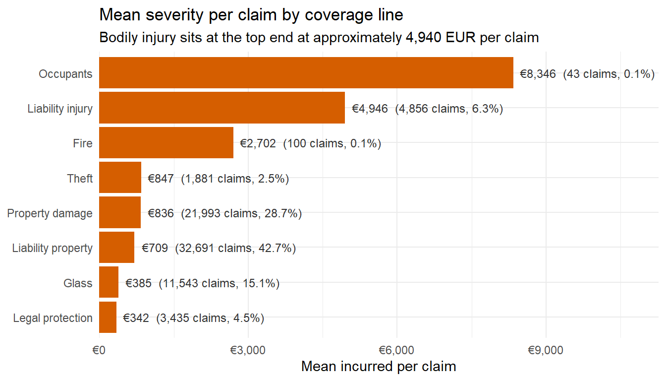
A bodily injury claim costs roughly 4,940 EUR on average, more than four times the next largest category. Property damage averages 706 EUR. Glass averages well under 200 EUR. Bodily injury claims are relatively rare, around 4,800 out of approximately X total claim events recorded at policy level, or roughly 9 percent of all claims. but every one of them is structurally more expensive. The implication for pricing is that the bodily injury sub tariff needs to track external indicators of medical and legal cost inflation, because that is where most of the recent loss ratio uplift in the liability line is comi
The loss ratio tells you whether a product is profitable on average. But the capital an insurer must hold is driven by how unpredictable the results are, not just by the average. A segment can have an acceptable average loss ratio but still require large capital reserves because in a bad year the actual losses could be far above that average. The coefficient of variation (CV) measures this unpredictability which is calculated by the standard deviation of incurred per policy divided by the mean. A CV of 1 means typical variation equals the average claim cost. A CV of 15 means the distribution is so spread out that the standard deviation is fifteen times the mean. The occasional large loss dominates everything.
# Heatmap with geom_tile
cv_data <- ins |>
group_by(policy_type, bonus_score) |>
summarise(n = n(),
cv = sd(total_incurred) / mean(total_incurred),
.groups = "drop") |>
filter(n >= 200)
ggplot(cv_data, aes(x = policy_type, y = bonus_score, fill = cv)) +
geom_tile(colour = "white") +
geom_text(aes(label = number(cv, accuracy = 0.1)), size = 3.2) +
scale_fill_continuous_sequential(palette = "Reds 3", name = "CV") +
labs(title = "Coefficient of variation of incurred per policy, by policy type and bonus score",
subtitle = "CV is standard deviation of incurred divided by mean, computed per cell",
x = NULL, y = "Bonus score") +
theme_minimal() +
theme(panel.grid = element_blank(),
axis.text.x = element_text(angle = 30, hjust = 1, size = 7))
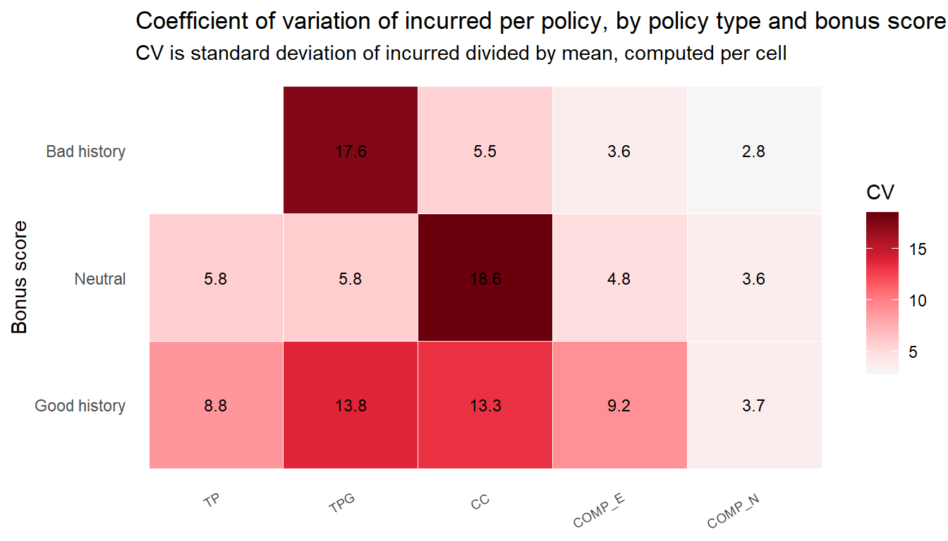
The observed pattern is the opposite of the loss ratio result. COMP_N, which has the worst loss ratio, has the lowest CV which means the claims distribution is denser and less skewed. TPG and CC under good history have high CV of around 13 and the highest CVs comes from TPG with bad history and CC with neutral history with CV of around 18. The implication for capital management is that the two product lines with high loss ratios are also the segments where most reserve risk sits. Profitability and volatility are different problems and demand different responses. The high CV in TPG and CC means these policies produce unpredictable large claims and the reinsurance should be reviewed.
A CV number summarises volatility in a single figure but does show the scale of the uncertainty. A Hypothetical Outcome Plot (HOP) addresses this by cycling through many random draws from each segment’s incurred distribution, one frame at a time. Each frame shows one plausible single-year outcome for that segment. The animation makes the spread visceral and a wide swing between frames means the segment is volatile and capital-intensive, a narrow swing means it is predictable.
library(ungeviz)
set.seed(99)
hop_base <- ins |>
filter(total_incurred > 0,
policy_type %in% c("COMP_N", "CC")) |>
mutate(segment = paste0(policy_type, " / ", bonus_score)) |>
filter(segment %in% c("COMP_N / Good history",
"CC / Good history",
"CC / Neutral")) |>
mutate(segment = factor(segment,
levels = c("COMP_N / Good history",
"CC / Good history",
"CC / Neutral")),
log_incurred = log10(total_incurred))
ggplot(hop_base, aes(x = segment, y = log_incurred)) +
geom_point(position = position_jitter(height = 0.3, width = 0.05),
size = 0.4, colour = "#0072B2", alpha = 0.5) +
geom_hpline(data = sampler(25, group = segment),
height = 0.6, colour = "#D55E00") +
scale_x_discrete(name = NULL,
labels = function(x) str_wrap(x, width = 12)) +
scale_y_continuous(name = "Incurred per claim (log10 EUR)",
breaks = c(1, 1.699, 2, 3, 4, 5),
labels = c("\u20ac10", "\u20ac50", "\u20ac100",
"\u20ac1k", "\u20ac10k", "\u20ac100k")) +
labs(title = "Hypothetical Outcome Plot: incurred per claim by segment",
subtitle = "Each frame draws 25 policies. Orange line = sample mean for that draw.") +
theme_bw() +
transition_states(.draw, 1, 3)
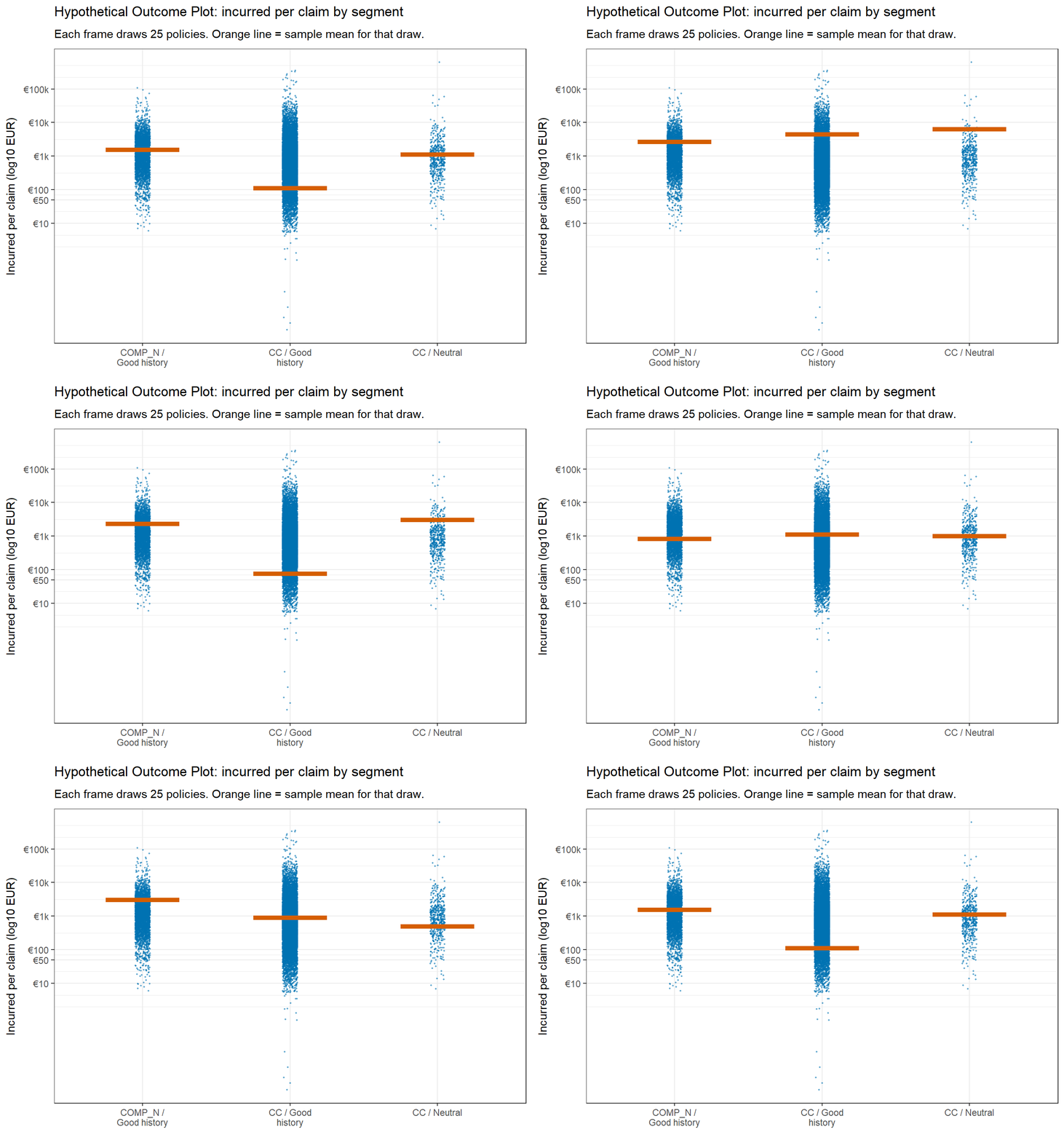
The animation shows that COMP_N / Good history barely moves between frames because its high claim frequency produces a stable average. CC with good and bad history swings widely, with the mean shifting hundreds of EUR from frame to frame. That swing is the capital risk means that in any given year the segment could perform significantly better or worse than the long run average.
The final analytical section brings all numerical variables into the same frame. Correlations between the continuous variables anchor the multivariate picture by showing which variables move together. The first version uses corrplot::corrplot.mixed for a glyph based corrgram with ellipses below and numbers above. The second uses ggstatsplot::ggcorrmat to bring statistical annotation onto the same matrix. Spearman is used because the variables are heavy tailed and would mislead Pearson.
num_vars <- ins |>
select(driver_age, vehicle_age, age_driving_licence, licence_tenure,
vehicle_value, seats, power_to_weight_ratio,
total_premium, total_claims, total_incurred, total_exposure)
corr_mat <- cor(num_vars, method = "spearman", use = "pairwise.complete.obs")
corrplot.mixed(corr_mat,
lower = "ellipse",
upper = "number",
tl.pos = "lt",
diag = "l",
order = "hclust",
hclust.method = "ward.D",
addrect = 3,
tl.col = "black",
tl.cex = 0.8,
number.cex = 0.7)
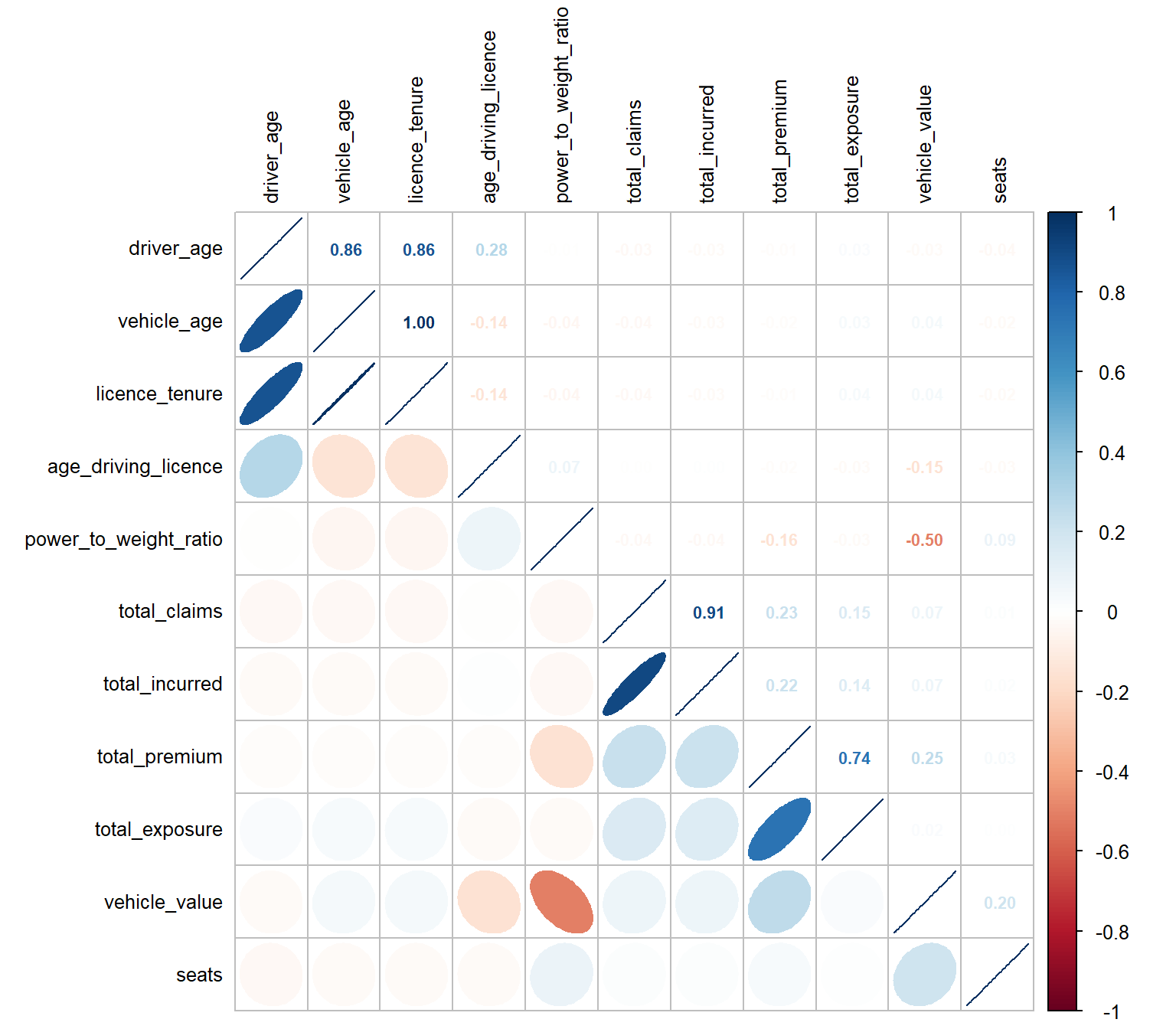
The ellipse in the lower triangle encodes correlation as shape, with a narrow ellipse tilted upward to the right meaning a strong positive correlation. The upper triangle gives the exact coefficient. Ward linkage reordering groups variables that share correlation structure, and the three rectangles enclose the resulting clusters. The strongest correlations in the chart are variable pairs age_driving_licence and licence_tenure at -0.96 as they are essentially measuring the same thing, and driver_age and vehicle_age at 0.86 which move together. The most important finding is that no individual risk factor shows meaningful correlation with total_incurred which means claim cost is not driven by any single variable in isolation and the pricing model needs segmentation or interaction effects rather than simple individual loadings.
ggstatsplot::ggcorrmat(
data = num_vars,
type = "nonparametric",
ggcorrplot.args = list(outline.color = "white",
hc.order = TRUE,
tl.cex = 9),
title = "Spearman correlations among numeric variables",
subtitle = "Non significant pairs marked with a cross at p < 0.05 (Holm corrected)",
p.adjust.method = "holm"
)
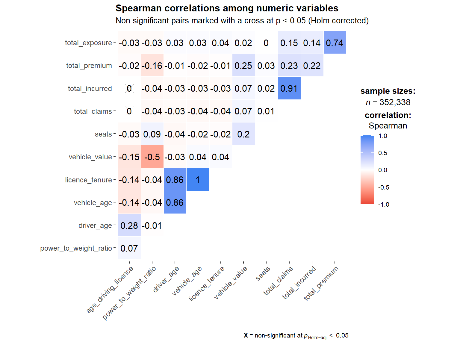
The spearman chart supports the above findings.
The two corrgrams trade off precision against statistical context. The corrplot.mixed view is denser and faster to read for the structural story. The ggcorrmat view is the better choice when a reader will ask which pairs are statistically reliable, because at this sample size of 352,000 even small correlations are significant and the absence of a cross stops carrying information. The Holm correction is conservative compared with FDR, and the crosses become a more useful filter for which pairs to ignore.
The analysis above answered the two questions the brief posed.
The portfolio loss ratio rose from 66 percent in 2022 to 75 percent in 2024, a 14 percent relative deterioration in two years. The deterioration is spread across products and customer segments, though some areas are more urgent than others.
By product, COMP_N crossed the break even point in 2024 at 102 percent loss ratio, meaning it is now paying out more in claims than it collects in premium. The analysis shows that removing the customer excess on this product means policyholders face no cost when making small claims, which drives up claim volumes. The ECDF analysis confirms that the problem comes from a broad shift upward in mid-sized claims rather than from a small number of catastrophic events. All other products also showed rising loss ratios, with the neutral bonus tier briefly exceeding 100 percent in 2024. This indicates that the price loadings applied to riskier customer segments have not kept pace with actual claims experience and need to be updated using recent data.
By coverage line, liability at 64 million EUR and property damage at 26 million EUR together carry two thirds of total premium and both run above the 70 percent profitability threshold. Within liability, bodily injury claims average approximately 4,940 EUR per claim, more than four times the next largest coverage type. Although bodily injury represents only 9 percent of claims by count, its high cost per claim means it drives a disproportionate share of the overall liability loss. The four smaller coverage lines, which are theft, fire, legal protection, and occupants, run between 40 and 52 percent and remain profitable.
By driver age, the over 75 segment runs a 102 percent loss ratio despite paying below average premium. The pricing model is currently undercharging this age group relative to the risk they represent. The segment is small at 0.8 percent of the book but the misalignment is clear.
The treemap analysis confirms that the the loss ratio is not specific to any type of history and an overall correction will not resolve the issue across the book. The neutral tier and COMP_N in particular requires more attention.
The loss ratio measures average outcomes. In contrast, volatility measures how much the actual annual result could differ from that average, which determines how much capital the insurer needs to hold in reserve to remain solvent in a bad year.
The coefficient of variation analysis produced a result that runs counter to the loss ratio ranking. COMP_N, which has the worst loss ratio, has the lowest volatility at a CV of 3.6 because the high volume of claims across this product averages out to a predictable result year on year. In contrast, TPG and CC carry CVs between 13 and 18, which means their claims results are far more spread out and harder to forecast. The highest values in the matrix, which are TPG with bad history at 17.6 and CC with neutral history at 18.6, are the segments where the gap between average and worst case outcome is largest.
The simulation analysis confirms this finding visually. The average claim cost for COMP_N barely shifts between simulated draws while CC swings by hundreds of EUR from one draw to the next. In any given year CC could perform significantly better or worse than its long run average, which makes financial planning for that product genuinely uncertain.
The Lorenz curve adds a further concern to the volatility picture. The Gini coefficient of 0.96 shows that loss is highly concentrated, with the top 5 percent of policies accounting for over 80 percent of total incurred costs and the top 1 percent carrying roughly half. This means the portfolio result is sensitive to how a small number of very large claims develop in any given year. Uniform price increases across the book would penalise the 80 percent of policies that contribute almost nothing to losses while leaving the highest cost policies under loaded.
Five areas require management attention based on the analysis.
The liability and property damage coverage lines together make up two thirds of total premium and both run above the profitability threshold and should be looked at for any pricing review.
Within liability, bodily injury claims stand out as the highest cost item in the book at nearly 5,000 EUR per claim on average. Although injury claims are relatively rare at 9 percent of total claims by count, their high individual cost means they have an outsized effect on the overall liability loss ratio and warrant closer examination.
COMP_N is the only product currently running at a loss and the analysis identifies claim frequency as the key driver. The product structure and its pricing both merit review.
The price loadings across bonus tiers show mixed results. The neutral tier shows elevated loss ratios across multiple products and represents a more consistent gap between pricing and actual claims experience than the bad history tier. The analysis suggests the loading structure across all three tiers warrants review using current claims data.
TPG and CC showed high year to year unpredictability in their claims results, and the concentration analysis showed that a small number of very large claims drive the majority of portfolio costs. Both findings suggest the current reinsurance cover, which limits the financial damage from very large individual claims, is an area worth examining against the actual tail risk in the book.
The dataset and cookbook are from Mendeley Data: Motor insurance portfolio.
The framing of profitability and volatility analysis in P&C insurance follows the Swiss Re sigma 4/2019 report, Advanced analytics: unlocking new frontiers in P&C insurance.
R packages used in this exercise: tidyverse, lubridate, patchwork, ggdist, ggridges, ggstatsplot, corrplot, GGally, treemapify, ggiraph, heatmaply, plotly, DT, scales, ggrepel, knitr, colorspace, gganimate, gifski, ragg.
---
title: "Take-home Exercise 1: Visual Analytics for Data Discovery"
subtitle: "Exploring profitability and volatility in a Spanish motor insurance portfolio"
author: "Yee Weicong Mark"
date: "May 23, 2026"
date-modified: "last-modified"
format:
html:
code-fold: true
code-tools: true
code-summary: "Show the code"
fig-cap-location: bottom
css: styles.css
execute:
echo: true
eval: true
warning: false
message: false
freeze: false
dev: ragg_png
editor: visual
---
# [1 Overview]{style="color: #4682B4; font-size: 38px;"}
## [1.1 Background]{style="color: #2C5282; font-size: 28px;"}
{width="618"}
Motor insurance portfolios in Europe are under pressure. The cost of bodily injury claims has been climbing, vehicle repair costs have followed a similar trajectory, and premiums in many books have not kept pace. Visual analytics offers a way to expose where the deterioration is concentrated, instead of relying only on aggregate combined ratios that hide the structure underneath.
The setting for this exercise comes from the Swiss Re *sigma 4/2019* report, which observes that insurers often carry underperforming portfolios where the root causes of poor profitability and high volatility are unknown. The argument the report makes is that visual analytics can reveal underlying loss drivers and help refine segmentation and underwriting strategy.
## [1.2 The data]{style="color: #2C5282; font-size: 28px;"}
The dataset comes from a Spanish non life insurer specialising in motor insurance and is hosted on [Mendeley Data](https://data.mendeley.com/datasets/sw4jmdb2sm/1). It covers three calendar years of policy year exposures across roughly 354,000 records. Each row represents one policy in one year, with information on the policyholder, the vehicle, the coverage structure, the premiums collected for each coverage, the claim counts, the incurred amounts, and the time on risk.
The variable documentation published alongside the dataset on Mendeley Data groups the columns into four blocks. The first block describes the policy and the insured. The second block describes the driver and the vehicle. The third block records the premium for each coverage. The fourth block records the exposure, claim counts, and incurred amounts for each coverage.
## [1.3 The task]{style="color: #2C5282; font-size: 28px;"}
The task is to apply univariate and bivariate visual analytics techniques to discover the distributions and characteristics of the variables, and to investigate the factors influencing the profitability and volatility of the portfolio.
Two definitions shape the analysis, **profitability** and **volatility**. Profitability in motor insurance is measured through the [loss ratio](https://content.naic.org/publications), which is incurred claims divided by earned premium. A loss ratio under one means the line is profitable before expenses. [Volatility](https://openacttexts.github.io/Loss-Data-Analytics/ChapSeverity.html) refers to how much the incurred amount swings from policy to policy, captured by tail percentiles and the coefficient of variation rather than by mean alone, because the loss distribution is heavy tailed.
# [2 Loading Packages]{style="color: #4682B4; font-size: 38px;"}
The packages below cover wrangling, statistical visualisation, layout composition, and statistical testing. The pacman package is used to load and install in a single call.
| Package | Role in this exercise |
|------------------------------------|------------------------------------|
| `tidyverse` | Data wrangling, `ggplot2` for the grammar of graphics |
| `lubridate` | Calendar arithmetic on the licence year |
| `patchwork` | Composing multiple panels into one figure |
| `ggdist` | Half eye and rain cloud geoms for distribution visualisation |
| `ggridges` | Ridgeline plots for comparing many distributions |
| `ggstatsplot` | Statistical annotation directly on the plot, including `ggcorrmat` |
| `corrplot` | Corrgrams with hierarchical clustering reordering |
| `GGally` | Parallel coordinates plot via `ggparcoord` |
| `treemapify` | Treemap geoms in the ggplot2 grammar |
| `ggiraph` | Interactive ggplot2 layer for tooltip and hover |
| `heatmaply` | Interactive heatmaps with clustering and normalisation |
| `plotly` | Converting ggplot objects to interactive HTML widgets |
| `DT` | Interactive HTML data tables with sort and search |
| `scales` | Axis formatting, percentage and currency labels |
| `ggrepel` | Non overlapping labels |
| `knitr` | Tables via `kable` |
| `colorspace` | Perceptually uniform palettes |
| `gganimate` | Animated ggplot2 graphics for Hypothetical Outcome Plots |
| `ragg` | High-quality PNG renderer that resolves the `gganimate` device conflict |
```{r}
pacman::p_load(
tidyverse, lubridate, patchwork,
ggdist, ggridges, ggstatsplot, corrplot,
GGally, treemapify, ggiraph, heatmaply,
plotly, DT,
scales, ggrepel, knitr, colorspace,
gganimate, gifski, ragg
)
```
# [3 Importing the data]{style="color: #4682B4; font-size: 38px;"}
The dataset arrives as a semicolon delimited CSV. `read_delim` from `readr` handles the delimiter and a fast first pass at column types.
```{r}
raw <- read_delim(
"data/Motor_insurance.csv",
delim = ";",
show_col_types = FALSE
)
dim(raw)
```
The data has 354,140 rows and 47 columns, matching the cookbook.
## [3.1 Schema]{style="color: #2C5282; font-size: 28px;"}
The first check is the schema, to confirm column types and to see the column names against the cookbook's four blocks.
```{r}
glimpse(raw)
```
Three aspects can be observed from the schema. First, the policy descriptors (`policy_type`, `policy_status`, `business_type`, `payment_frequency`, `bonus_score`, `fuel_type`, `municipality_type`, `circulation_area`) arrive as character codes and need recoding into factors before they can be used as grouping variables. Second, the premium and incurred columns appear in parallel pairs across eight coverage lines plus a total, matching the cookbook's premiums and exposure blocks. Third, the exposure variable arrives as a numeric ranging across partial and multi year contracts, which makes per exposure aggregation the right strategy for cross policy comparisons.
## [3.2 Year coverage]{style="color: #2C5282; font-size: 28px;"}
The schema does not surface the range of `year`. A separate count confirms the span and the distribution of records across years.
```{r}
raw |> count(year) |> kable(col.names = c("Year", "Policy years"))
```
The dataset covers 2022 through 2024, with the record count more than doubling over the period from 67,031 in 2022 to 168,302 in 2024.
## [3.3 Missing values]{style="color: #2C5282; font-size: 28px;"}
The next check is missingness column by column, because the wrangling decisions depend on how concentrated the gaps are.
```{r}
raw |>
summarise(across(everything(), ~ sum(is.na(.x)))) |>
pivot_longer(everything(), names_to = "variable", values_to = "missing") |>
filter(missing > 0) |>
mutate(pct = missing / nrow(raw)) |>
arrange(desc(missing)) |>
kable(caption = "Variables with missing values",
col.names = c("Variable", "Missing rows", "Share"),
digits = 4)
```
Only four variables carry any missing values, and all four affect well under one percent of rows. `fuel_type` has the largest gap at 1,287 rows. Since the share is small, the affected rows will be dropped instead of imputing to have a cleaner analysis.
## [3.4 Summary statistics for numeric variables]{style="color: #2C5282; font-size: 28px;"}
A five number summary of the numeric variables is done to establish the scale of each and flags any unexpected values.
```{r}
raw |>
select(driver_age, vehicle_age, age_driving_licence, vehicle_value,
seats, power_to_weight_ratio,
total_premium, total_incurred, total_claims, total_exposure) |>
summary()
```
The summary surfaces three points for consideration. First, `total_incurred` has a median of zero and a maximum near 580,000 EUR, which is right tail heavy and should be plotted on a log scale or to filter to claiming policies. Second, `vehicle_value` spans from low hundreds to over 370,000 EUR, and quintile transformation should be used in the bivariate analysis. Third, `age_driving_licence` reports the driver's age at the time of licence issuance (mean 23, range 0–80), not a calendar year. Subtracting it from `driver_age` gives the number of years of driving experience. The wrangling section derives a `licence_tenure` variable using this formula.
# [4 Data wrangling]{style="color: #4682B4; font-size: 38px;"}
The exploratory checks in Section 3 identified three categories of preparation work before analysis can begin: removing the small number of incomplete records, replacing opaque single-letter codes with readable labels, and computing variables the raw dataset does not supply directly. Each decision is documented below.
All three steps are implemented in a standalone preparation script `prepare_data.R`. Running the script once produces `data/motor_clean.csv`, which this report loads at the end of this section. This separation keeps the analytical document focused on insight rather than transformation mechanics, and eliminates rendering failures.
::: {.callout-tip title="How to regenerate the clean dataset"}
Run the following once from the project root before rendering this document:
``` r
source("prepare_data.R")
```
`prepare_data.R` reads `data/Motor_insurance.csv.gz`, applies all steps below, runs five validation checks, and writes `data/motor_clean.csv.gz` (352,338 rows × 50 columns).
:::
## [4.1 Dropping rows with missing values]{style="color: #2C5282; font-size: 28px;"}
The missingness audit in Section 3.3 identified four variables with gaps: `fuel_type` (1,287 rows), `vehicle_value`, `vehicle_age`, and `age_driving_licence` (each under 300 rows). All four fall below one percent of the total. The affected rows are dropped rather than imputed because the share is small enough that removal does not materially alter the distribution of any variable, and because the missing fields are underwriting inputs that cannot be reliably inferred from the remaining columns. The working dataset retains 352,338 rows, which is 99.5 percent of the original 354,140.
::: {.callout-note title="Things to Note"}
Dropping is justifiable here because the missingness is small. If `fuel_type` were missing in 10 percent of rows, creating an "Unknown" category would be the safer choice — dropping at that scale could bias aggregate metrics by systematically excluding a particular vehicle or driver segment.
:::
## [4.2 Recoding categorical variables]{style="color: #2C5282; font-size: 28px;"}
The raw dataset encodes eight categorical variables as single-letter or short codes (`TP`, `G`, `NB`, `U`, and so on). These codes are compact for storage but create unreadable axes and legend entries when plotted directly. Each code is replaced with a descriptive label and converted to an ordered or unordered factor so that charts respect a meaningful sequence rather than defaulting to alphabetical ordering.
Factor level order is meaningful where inherent ordering exists — `policy_type` runs from minimum cover to fully comprehensive, and `bonus_score` runs from best to worst driving history. For variables without a natural order, levels follow logical domain groupings. The full mapping is shown in the table below.
```{r}
recoding_map <- tribble(
~Variable, ~`Original code`, ~`Recoded label`,
"policy_type", "TP", "Third party only",
"policy_type", "TPG", "Third party + glass",
"policy_type", "CC", "Third party + 2 covers",
"policy_type", "COMP_E", "Comprehensive with excess",
"policy_type", "COMP_N", "Comprehensive no excess",
"policy_status", "A", "Active",
"policy_status", "C", "Cancelled",
"business_type", "NB", "New business",
"business_type", "P", "Portfolio renewal",
"payment_frequency", "A", "Annual",
"payment_frequency", "S", "Semiannual",
"payment_frequency", "Q", "Quarterly",
"bonus_score", "G", "Good history",
"bonus_score", "N", "Neutral",
"bonus_score", "B", "Bad history",
"fuel_type", "D", "Diesel",
"fuel_type", "G", "Gasoline",
"municipality_type", "I", "Inland",
"municipality_type", "C", "Coastal",
"municipality_type", "IS", "Islands",
"circulation_area", "U", "Urban",
"circulation_area", "R", "Rural"
)
recoding_map |> kable(caption = "Categorical variable recoding map")
```
::: {.callout-note title="Things to Note"}
The `factor` function preserves the level order as specified. This matters because alphabetical ordering would scatter related categories — for example, `COMP_E` and `COMP_N` would be separated from each other and from `CC` if sorted alphabetically.
:::
## [4.3 Derived variables]{style="color: #2C5282; font-size: 28px;"}
Three derived variables make the analysis cleaner and more direct. All three are computed in `prepare_data.R` and are present as ready-to-use columns in `motor_clean.csv`.
The first is **licence tenure** (`licence_tenure`), expressed as the number of years a driver has held a licence. The data dictionary confirms that `age_driving_licence` is the driver's age at the time of licence issuance (mean 23 years, range 0–80), not a calendar year. Subtracting it from `driver_age` gives the actual driving experience in years — for example, a driver who obtained their licence at age 20 and is currently 45 has a tenure of 25 years. A small number of records produce a negative value due to data entry errors; these are floored at zero as the most conservative interpretation. The validated output ranges from 0 to 68 years with a median of 25.
The second is **driver age band** (`age_band`), in ten-year intervals from 18 to 75 plus an over-75 group. The 18–25 band isolates young drivers as a single high-risk cohort, which is standard practice in motor pricing because claim frequency for this group is materially higher than for any other. The 76+ band isolates senior drivers as a separate cohort. The remaining ten-year bands group drivers with broadly similar risk profiles.
The third is **vehicle value quintile** (`value_quintile`), computed with `ntile`. A quintile divides a ranked variable into five equal-sized groups: group 1 contains the cheapest 20 percent of vehicles, group 5 the most expensive 20 percent. The transformation removes the influence of heavy right skew — raw vehicle values span from a few hundred EUR to over 374,000 EUR, and a linear analysis on the raw scale would let the top decile dominate every aggregate metric. The quintile gives every value band equal weight in the rest of the analysis.
## [4.4 Consolidated clean dataset]{style="color: #2C5282; font-size: 28px;"}
The three preparation steps above are implemented in `prepare_data.R` and their output consolidated into `data/motor_clean.csv`. Loading it here with explicit `col_types` restores the factor level order that was preserved as label strings in the CSV.
```{r}
ins <- readr::read_csv(
"data/motor_clean.csv.gz",
col_types = readr::cols(
policy_type = readr::col_factor(levels = c("TP", "TPG", "CC", "COMP_E", "COMP_N")),
policy_status = readr::col_factor(levels = c("Active", "Cancelled")),
business_type = readr::col_factor(levels = c("New business", "Portfolio renewal")),
payment_frequency = readr::col_factor(levels = c("Annual", "Semiannual", "Quarterly")),
bonus_score = readr::col_factor(levels = c("Good history", "Neutral", "Bad history")),
fuel_type = readr::col_factor(levels = c("Diesel", "Gasoline")),
municipality_type = readr::col_factor(levels = c("Inland", "Coastal", "Islands")),
circulation_area = readr::col_factor(levels = c("Urban", "Rural")),
year = readr::col_factor(levels = c("2022", "2023", "2024"), ordered = TRUE),
age_band = readr::col_factor(
levels = c("18-25","26-35","36-45",
"46-55","56-65","66-75","76+"),
ordered = TRUE),
value_quintile = readr::col_factor(
levels = c("Q1 Lowest","Q2","Q3","Q4","Q5 Highest"),
ordered = TRUE)
),
show_col_types = FALSE
)
# Confirm dimensions match expected output from prepare_data.R
cat(nrow(ins), "rows,", ncol(ins), "columns\n")
```
The clean dataset contains 352,338 rows and 50 columns: the original 47 from the raw file plus `licence_tenure`, `age_band`, and `value_quintile`. All subsequent sections use `ins` as their data source.
## [4.5 A function for portfolio metrics]{style="color: #2C5282; font-size: 28px;"}
Loss ratio and claim frequency are computed dozens of times in this report across different groupings. A small helper enforces a single definition and avoids subtle bugs from re-computation.
```{r}
portfolio_metrics <- function(df, ...) {
df |>
group_by(...) |>
summarise(
policies = n(),
exposure = sum(total_exposure, na.rm = TRUE),
premium = sum(total_premium, na.rm = TRUE),
incurred = sum(total_incurred, na.rm = TRUE),
claims = sum(total_claims, na.rm = TRUE),
.groups = "drop"
) |>
mutate(
loss_ratio = incurred / premium,
claim_freq = claims / exposure,
avg_premium = premium / exposure,
severity = incurred / pmax(claims, 1)
)
}
```
The function returns the building blocks (policies, exposure, premium, incurred, claims) and the four ratios that follow from them. Loss ratio is aggregated as a ratio of sums rather than a mean of ratios.
# [5 Exploratory data analysis]{style="color: #4682B4; font-size: 38px;"}
The exploratory section establishes the shape of each variable before any segmented analysis. Understanding what each variable looks like in isolation reveals where skew, outliers, and dominant categories sit, which shapes every subsequent chart choice. Numerical variables get histograms paired with boxplots; categorical variables get bar charts ordered by coverage breadth or by frequency. The goal is to know the data before asking it questions.
## [5.1 Target variables: premium and incurred amount]{style="color: #2C5282; font-size: 28px;"}
Before plotting, summary statistics establish the scale and the share of zero claim policies.
```{r}
target_summary <- tibble(
Metric = c("Min", "1st quartile", "Median", "Mean", "3rd quartile", "Max"),
`Total premium (EUR)` = c(
min(ins$total_premium),
quantile(ins$total_premium, 0.25),
median(ins$total_premium),
mean(ins$total_premium),
quantile(ins$total_premium, 0.75),
max(ins$total_premium)
),
`Total incurred (EUR)` = c(
min(ins$total_incurred),
quantile(ins$total_incurred, 0.25),
median(ins$total_incurred),
mean(ins$total_incurred),
quantile(ins$total_incurred, 0.75),
max(ins$total_incurred)
)
)
target_summary |>
kable(digits = 0, format.args = list(big.mark = ","))
zero_share <- mean(ins$total_incurred == 0)
tibble(
`Policy years` = nrow(ins),
`With at least one claim` = sum(ins$total_incurred > 0),
`Total claim count` = sum(ins$total_claims, na.rm = TRUE),
`Zero claim share` = scales::percent(zero_share, accuracy = 0.1)
) |> kable()
```
The table confirms three points the chart below visualises. The charts show a histogram of the distributions of total premium and total uncurred amount. The boxplot below each histogram anchors the median and IQR, while the histogram shows the full shape.
```{r}
#| fig-height: 7
# Premium histogram with median and mean reference lines
hist_prem <- ggplot(ins, aes(x = total_premium)) +
geom_histogram(bins = 40, fill = "#2C5282", colour = "white") +
geom_vline(xintercept = median(ins$total_premium),
colour = "grey20", linetype = "dashed") +
geom_vline(xintercept = mean(ins$total_premium),
colour = "#D55E00", linetype = "dashed") +
scale_x_continuous(labels = label_dollar(prefix = "\u20ac"),
limits = c(0, 1500)) +
labs(title = "Total premium per policy year",
subtitle = "Heavy right skew. Most policies pay under \u20ac400.",
x = NULL, y = "Number of policy years") +
theme_minimal()
# Boxplot stacked below the histogram
box_prem <- ggplot(ins, aes(x = total_premium, y = "")) +
geom_boxplot(fill = "grey80", outlier.alpha = 0.05, outlier.size = 0.6) +
stat_summary(fun = mean, geom = "point", colour = "#D55E00", size = 3) +
scale_x_continuous(labels = label_dollar(prefix = "\u20ac"),
limits = c(0, 1500)) +
labs(x = "Total premium", y = NULL) +
theme_minimal() +
theme(axis.text.y = element_blank())
# Filter to claiming policies for the incurred plots
inc_nonzero <- ins |> filter(total_incurred > 0)
hist_inc <- ggplot(inc_nonzero, aes(x = total_incurred)) +
geom_histogram(bins = 40, fill = "#D55E00", colour = "white") +
geom_vline(xintercept = median(inc_nonzero$total_incurred),
colour = "grey20", linetype = "dashed") +
geom_vline(xintercept = mean(inc_nonzero$total_incurred),
colour = "#2C5282", linetype = "dashed") +
scale_x_continuous(labels = label_dollar(prefix = "\u20ac"),
limits = c(0, 6000)) +
labs(title = "Total incurred per policy year (policies with at least one claim)",
subtitle = paste0("Among the ", scales::comma(nrow(inc_nonzero)),
" claiming policy years, the mean is well above the median."),
x = NULL, y = "Number of policy years") +
theme_minimal()
box_inc <- ggplot(inc_nonzero, aes(x = total_incurred, y = "")) +
geom_boxplot(fill = "grey80", outlier.alpha = 0.05, outlier.size = 0.6) +
stat_summary(fun = mean, geom = "point", colour = "#2C5282", size = 3) +
scale_x_continuous(labels = label_dollar(prefix = "\u20ac"),
limits = c(0, 6000)) +
labs(x = "Total incurred", y = NULL) +
theme_minimal() +
theme(axis.text.y = element_blank())
# Compose with patchwork
wrap_plots(hist_prem, box_prem, hist_inc, box_inc,
ncol = 1, heights = c(1, 0.25, 1, 0.25))
```
The premium distribution is right skewed but reasonably concentrated. The median (258 EUR) sits below the mean (296 EUR), and shows a right skew.The interquartile range sits between 175 EUR (Q1) and 367 EUR (Q3), with most policies paying between those values. The incurred distribution is more extreme. The zero claim share is 86 percent of policy years, which is why the histogram filters to the claiming subset only and the policy years that pay no claim are not plotted. Among the 14 percent that do claim, the mean is roughly 1,750 EUR but the median is under 1,000 EUR, with a tail well past 5,000 EUR and a maximum near 580,000 EUR. Any chart of incurred amounts later should take this into consideration.
::: {.callout-note title="Things to Note"}
Placing the boxplot below the histogram rather than above makes for easier comparison of the distribution in the histogramand the median, IQR, and outliers from the boxplot.
:::
## [5.2 Driver age, vehicle age, and licence tenure]{style="color: #2C5282; font-size: 28px;"}
These three numerical variables are the core underwriting inputs in motor insurance. Driver age is shown as the binned `age_band` variable will be used throughout the bivariate analysis, while vehicle age and licence tenure are shown as continuous densities to surface the shape of each distribution. The summary statistics below describe the raw continuous values for all three. Hover over any bar in the driver age band chart to see the exact policy count and share.
```{r}
age_summary <- ins |>
select(`Driver age` = driver_age,
`Vehicle age` = vehicle_age,
`Licence tenure` = licence_tenure) |>
pivot_longer(everything(), names_to = "Variable", values_to = "Years") |>
group_by(Variable) |>
summarise(
Min = min(Years),
Q1 = quantile(Years, 0.25),
Median = median(Years),
Mean = mean(Years),
Q3 = quantile(Years, 0.75),
Max = max(Years),
SD = sd(Years),
.groups = "drop"
)
age_summary |> kable(digits = 1)
```
```{r}
#| fig-height: 4
#| fig-width: 11
# Driver age band — interactive bars with tooltip and data_id
driver_counts <- ins |>
count(age_band) |>
mutate(pct = n / sum(n),
tip = paste0(age_band, ": ", comma(n),
" policies (", percent(pct, accuracy = 0.1), ")"))
p_age <- ggplot(driver_counts, aes(x = age_band, y = n)) +
geom_col_interactive(aes(tooltip = tip, data_id = age_band),
fill = "#2C5282") +
scale_y_continuous(labels = label_number(scale = 1e-3, suffix = "k")) +
labs(title = "Driver age band", x = NULL, y = "Policy years") +
theme_minimal()
# Vehicle age — pre-computed data frame (avoids inline data ops inside girafe)
vehicle_df <- ins |> select(vehicle_age)
vehicle_med <- median(vehicle_df$vehicle_age)
p_vehicle <- ggplot(vehicle_df, aes(x = vehicle_age)) +
geom_histogram(bins = 30, fill = "#D55E00", colour = "white") +
geom_vline(xintercept = vehicle_med,
linetype = "dashed", colour = "grey30") +
labs(title = "Vehicle age", x = "Years", y = "Count") +
theme_minimal()
# Licence tenure — pre-computed data frame so girafe renderer has a clean object.
# ins$licence_tenure was derived in Section 4.3; filter <= 60 drops implausible values.
licence_df <- ins |>
filter(licence_tenure <= 60) |>
select(licence_tenure)
licence_med <- median(licence_df$licence_tenure)
p_licence <- ggplot(licence_df, aes(x = licence_tenure)) +
geom_histogram(bins = 30, fill = "#009E73", colour = "white") +
geom_vline(xintercept = licence_med,
linetype = "dashed", colour = "grey30") +
labs(title = "Licence tenure", x = "Years held", y = "Count") +
theme_minimal()
girafe(ggobj = p_age + p_vehicle + p_licence,
width_svg = 11, height_svg = 4)
```
Driver age sits around a median of 49 years with an interquartile range from 39 to 58. The age band chart confirms that the 46-55 band is the largest single cohort, followed by 36-45 and 56-65. The 18-25 and 76+ bands are the smallest, each holding under 5 percent of policy years. Vehicle age has a median of 16 years and a heavier right tail, with the third quartile at 23 and the maximum above 80. Licence tenure has a median of 24 years and is the most unimodal of the three, with a peak around twenty years and a thin left tail of newly licensed drivers.
## [5.3 Categorical variables]{style="color: #2C5282; font-size: 28px;"}
The portfolio descriptors get a faceted bar chart so they can be read together. Bars are ordered by inherent meaning where one exists (coverage breadth, bonus score) and by frequency otherwise. There are eight categorical descriptors.
```{r}
#| fig-height: 8
cat_long <- ins |>
select(year, policy_type, policy_status, business_type,
payment_frequency, bonus_score, fuel_type, circulation_area) |>
mutate(across(everything(), as.character)) |>
pivot_longer(everything(), names_to = "variable", values_to = "level") |>
count(variable, level) |>
group_by(variable) |>
mutate(pct = n / sum(n)) |>
ungroup() |>
mutate(variable = factor(variable,
levels = c("year", "policy_type", "policy_status",
"business_type", "payment_frequency",
"bonus_score", "fuel_type",
"circulation_area")))
ggplot(cat_long, aes(x = level, y = pct)) +
geom_col(fill = "#2C5282") +
facet_wrap(~ variable, scales = "free", ncol = 3) +
scale_y_continuous(labels = percent_format(accuracy = 1)) +
labs(x = NULL, y = "Share of policies",
title = "Portfolio composition by descriptor") +
theme_minimal() +
theme(axis.text.x = element_text(angle = 30, hjust = 1, size = 7))
```
The book is growing fast which can be seen as 2024 contributes 47 percent of all policy years, up from 19 percent in 2022, so almost half of everything in this dataset is recent. CC (third party plus two additional covers) is the dominant product at 58 percent, followed by comprehensive with excess at 26 percent. Comprehensive without excess (COMP_N) and basic third party (TP) are the smallest segments. The portfolio is heavily skewed toward annual paying customers with a good bonus history, on diesel vehicles, in inland municipalities. The 11 percent cancellation is worth keeping in mind because cancelled policies often correlate with claims related issues.
## [5.4 Vehicle brand: long tail categorical]{style="color: #2C5282; font-size: 28px;"}
Vehicle brand has 68 distinct values, which exceeds what a bar chart can show legibly. The top 15 brands will be kept and the rest will be grouped as "other" as showing all 68 bars will be cluttered and hard to read. The chart will then be sorted by frequency.
```{r}
#| fig-height: 5
# bar chart, with fct_lump_n to keep only the top 15 brands
brand_tbl <- ins |>
mutate(brand_grouped = fct_lump_n(vehicle_brand, n = 15,
other_level = "Other")) |>
count(brand_grouped, sort = TRUE) |>
mutate(pct = n / sum(n),
brand_grouped = fct_reorder(brand_grouped, n))
ggplot(brand_tbl, aes(x = brand_grouped, y = pct)) +
geom_col(fill = "#2C5282") +
geom_text(aes(label = percent(pct, accuracy = 0.1)),
hjust = -0.1, size = 3, colour = "grey20") +
scale_y_continuous(labels = percent_format(accuracy = 1),
expand = expansion(mult = c(0, 0.15))) +
coord_flip() +
labs(title = "Top 15 vehicle brands plus 'Other'",
x = NULL, y = "Share of policy years") +
theme_minimal()
```
## [5.5 Portfolio mix of policy type and year]{style="color: #2C5282; font-size: 28px;"}
The stacked bar below shows the year-on-year mix of policy types. Each year's bar sums to 100 percent, so the bar shows composition rather than volume. Hover any segment to read the exact share.
```{r}
#| fig-height: 5
mix_data <- ins |>
count(year, policy_type) |>
group_by(year) |>
mutate(pct = n / sum(n),
tip = paste0(policy_type, "\n", year, ": ",
percent(pct, accuracy = 0.1))) |>
# Sort by policy_type within each year so the cumulative position
# calculation aligns with how geom_col stacks the bars. Then compute
# the midpoint of each segment manually as a label y-coordinate.
arrange(year, desc(policy_type)) |>
group_by(year) |>
mutate(label_y = cumsum(pct) - pct / 2) |>
ungroup()
p_stack <- ggplot(mix_data, aes(x = year, y = pct, fill = policy_type)) +
geom_col_interactive(aes(tooltip = tip, data_id = policy_type),
position = "stack") +
# Percentage labels removed; exact shares available via hover tooltip
scale_y_continuous(labels = percent_format(accuracy = 1)) +
scale_fill_brewer(palette = "Set2") +
labs(title = "Portfolio mix by policy type and year",
subtitle = "Bars sum to 100 percent",
x = NULL, y = "Share of book", fill = "Policy type") +
theme_minimal()
girafe(ggobj = p_stack, width_svg = 9, height_svg = 5)
```
The composition table below records the underlying counts and three-year totals for reference.
```{r}
ins |>
count(year, policy_type) |>
pivot_wider(names_from = year, values_from = n, values_fill = 0) |>
mutate(
`Three year total` = `2022` + `2023` + `2024`,
`2022 share` = scales::percent(`2022` / sum(`2022`), accuracy = 0.1),
`2024 share` = scales::percent(`2024` / sum(`2024`), accuracy = 0.1),
`Mix shift (ppt)` = scales::percent(
(`2024` / sum(`2024`)) - (`2022` / sum(`2022`)),
accuracy = 0.1
)
) |>
kable(
caption = "Policy years by type and year, with mix shift from 2022 to 2024",
format.args = list(big.mark = ",")
)
```
CC dominates the book throughout, holding around 58 percent of each year's volume. COMP_E is the second product at roughly 26 percent. The mix shift column in the table below quantifies the change from 2022 to 2024 for each product: the broad stability of the composition means that the loss ratio movement examined in the bivariate section is a portfolio wide phenomenon rather than the result of one product growing faster than another.
# [6 Is there a profitability problem?]{style="color: #4682B4; font-size: 38px;"}
With the data shape established, the next step will be to analyse if the portfolio is losing profitability over time, and if so, where is the deterioration concentrated. This is done by looking at the loss ratio across the different segments. The sections starts by confirming the aggregate trend, then identifying which product lines and driver segments are pulling the loss ratio up, and finally checking whether the pricing model is responding correctly. Statistical tests are also done to validate the charts.
## [6.1 Year on year deterioration]{style="color: #2C5282; font-size: 28px;"}
The first bivariate shows if the portfolio held its profitability over the three years and the accompanying trend of the claim frequency and the average premium. The below plots show the aggregated portfolio metrics by policy year.
```{r}
#| fig-height: 4
# bar charts composed with patchwork
yearly <- ins |> portfolio_metrics(year)
p_lr <- ggplot(yearly, aes(x = year, y = loss_ratio)) +
geom_col(fill = "#D55E00") +
geom_text(aes(label = percent(loss_ratio, accuracy = 0.1)),
vjust = -0.4, size = 3.6) +
geom_hline(yintercept = 1, linetype = "dashed", colour = "grey50") +
scale_y_continuous(labels = percent_format(),
expand = expansion(mult = c(0, 0.15))) +
labs(title = "Loss ratio", x = NULL, y = NULL) +
theme_minimal()
p_freq <- ggplot(yearly, aes(x = year, y = claim_freq)) +
geom_col(fill = "#2C5282") +
geom_text(aes(label = number(claim_freq, accuracy = 0.001)),
vjust = -0.4, size = 3.6) +
scale_y_continuous(expand = expansion(mult = c(0, 0.15))) +
labs(title = "Claim frequency", x = NULL, y = NULL) +
theme_minimal()
p_prem <- ggplot(yearly, aes(x = year, y = avg_premium)) +
geom_col(fill = "#009E73") +
geom_text(aes(label = dollar(avg_premium, prefix = "\u20ac", accuracy = 1)),
vjust = -0.4, size = 3.6) +
scale_y_continuous(labels = label_dollar(prefix = "\u20ac"),
expand = expansion(mult = c(0, 0.15))) +
labs(title = "Avg premium per exposure", x = NULL, y = NULL) +
theme_minimal()
wrap_plots(p_lr, p_freq, p_prem, nrow = 1) +
plot_annotation(title = "Aggregate portfolio metrics by year")
```
Loss ratio rose from 66 percent in 2022 to 75 percent in 2024, a 14 percent relative increase. Claim frequency drifted up only slightly, from 0.302 to 0.311, which is not significant. Average premium per exposure showed a decline, falling from 446 EUR to 404 EUR over the three years. The charts show that ***premium pricing is dropping while claim cost holds steady, and this would naturally results in the loss ratio increasing***. Further analysis will be done to determine which segments are pulling the loss ratio up.
## [6.2 Loss ratio by policy type]{style="color: #2C5282; font-size: 28px;"}
The first segment to investigate is the policy type.
```{r}
#| fig-height: 5
# bar chart with conditional fill on loss_ratio > 0.7 threshold
by_type <- ins |> portfolio_metrics(policy_type)
ggplot(by_type, aes(x = policy_type, y = loss_ratio)) +
geom_col(aes(fill = loss_ratio > 0.7), show.legend = FALSE) +
geom_text(aes(label = percent(loss_ratio, accuracy = 0.1)),
vjust = -0.4, size = 3.6) +
geom_hline(yintercept = 0.7, linetype = "dashed", colour = "grey50") +
scale_fill_manual(values = c("FALSE" = "#009E73", "TRUE" = "#D55E00")) +
scale_y_continuous(labels = percent_format(),
expand = expansion(mult = c(0, 0.15)),
limits = c(0, 1)) +
labs(title = "Loss ratio by policy type, 2022 to 2024 aggregate",
x = NULL, y = "Loss ratio") +
theme_minimal() +
theme(axis.text.x = element_text(angle = 30, hjust = 1, size = 8))
```
The five policy types fall into three bands. The baseline loss ratio will be set to 70 percent and follows directly from the structure of the combined ratio. The combined ratio equals the loss ratio plus the expense ratio, and a combined ratio at or below 100 percent marks the underwriting break-even point. P&C insurers in Europe typically operate at expense ratios in the range of 25 to 35 percent, so a loss ratio of 70 percent leaves sufficient margin before expenses to remain profitable on underwriting. The exact threshold would vary by the insurer's cost base. TP (third party only) and CC (third party plus two additional covers) sit well inside the green zone under the reference line. TPG (third party plus glass) sits just under at 69 percent. COMP_E (comprehensive with excess) crosses the line at 74 percent. ***COMP_N (comprehensive without excess) sits in its own band at 94 percent, very close to the underwriting break even point before expenses are included.*** The pattern is logical as COMP_N having no excess means all small claim cost will also fall on the insurer, so claim frequency should rise sharply. The next chart will investigate if that is the case.
## [6.3 How loss ratio is affected by frequency and severity]{style="color: #2C5282; font-size: 28px;"}
Loss ratio equals claim frequency multiplied by claim severity divided by average premium. Plotting frequency and severity side by side reveals which factor has more influence.
```{r}
#| fig-height: 4
# facet_wrap pattern
by_type_long <- by_type |>
select(policy_type, claim_freq, severity) |>
pivot_longer(c(claim_freq, severity), names_to = "metric", values_to = "value") |>
mutate(metric = recode(metric,
claim_freq = "Claim frequency (claims per exposure)",
severity = "Severity (mean incurred per claim)"))
ggplot(by_type_long, aes(x = policy_type, y = value, fill = metric)) +
geom_col(show.legend = FALSE) +
geom_text(aes(label = ifelse(metric == "Claim frequency (claims per exposure)",
number(value, accuracy = 0.01),
dollar(value, prefix = "\u20ac", accuracy = 1))),
vjust = -0.4, size = 3.2) +
scale_fill_manual(values = c("#2C5282", "#D55E00")) +
scale_y_continuous(expand = expansion(mult = c(0, 0.15))) +
facet_wrap(~ metric, scales = "free_y") +
labs(x = NULL, y = NULL,
title = "Severity and claim frequency by policy type") +
theme_minimal() +
theme(axis.text.x = element_text(angle = 30, hjust = 1, size = 7))
```
Severity is roughly stable across policy types, sitting between 750 EUR and 1,100 EUR per claim with COMP_N showing the lowest severity. Frequency varies by a factor of nearly eight, from 0.13 claims per exposure on TP to 1.04 on COMP_N. This shows that COMP_N policyholders are not having worse accidents, and supports the reasoning that they are claiming for every small loss because there is no excess to absorb small losses. ***To reduce the loss ratio, COMP_N would need to either have higher loading or reintroduce an excess amount***.
## [6.4 How the deterioration is concentrated by policy type and year]{style="color: #2C5282; font-size: 28px;"}
The previous two charts looked at aggregates over three years. The next chart checks whether the loss ratio increase is across the board or specific to particular policies. Hover over any line to isolate that policy type's trajectory.
```{r}
#| fig-height: 5
# geom_line_interactive and geom_point_interactive with data_id hover-to-highlight pattern
by_type_year <- ins |> portfolio_metrics(policy_type, year)
by_type_year <- by_type_year |>
mutate(tooltip = paste0(policy_type, "\n",
"Year: ", year, "\n",
"Loss ratio: ", percent(loss_ratio, accuracy = 0.1)))
p_trajectories <- ggplot(by_type_year,
aes(x = year, y = loss_ratio,
group = policy_type, colour = policy_type)) +
geom_line_interactive(aes(data_id = policy_type, tooltip = policy_type),
linewidth = 1) +
geom_point_interactive(aes(data_id = policy_type, tooltip = tooltip),
size = 3) +
geom_hline(yintercept = 1, linetype = "dashed", colour = "grey60") +
scale_colour_brewer(palette = "Set1") +
scale_y_continuous(labels = percent_format()) +
labs(title = "Loss ratio by policy type and year",
x = NULL, y = "Loss ratio", colour = "Policy type") +
theme_minimal()
girafe(ggobj = p_trajectories, width_svg = 8, height_svg = 5,
options = list(opts_hover(css = "stroke-width:2.5px;opacity:1;"),
opts_hover_inv(css = "opacity:0.2;")))
```
The loss ratio for every policy type except CC increases. COMP_N rose from 73 percent to 102 percent in two years, and is the only line that crosses the underwriting break even point. COMP_E and TPG climbed in step from around 60 to 80 percent. TP (the smallest book) more than doubled from 30 percent to 65 percent. CC, the largest book, oscillated around 65 percent and is the only segment holding steady. ***Overall there is a general increase across the board in loss ratio*** with TP increasing the most but still having the lowest loss ratio, and ***COMP_N in second and should be of more concern as it increased pass the underwriting break even point***.
::: {.callout-note title="Things to learn from the code chunk above"}
`geom_line_interactive` and `geom_point_interactive` are the `ggiraph` counterparts of the standard ggplot geoms. The `data_id` aesthetic groups the information for one policy type so they highlight together on hover, and the `opts_hover_inv` option fades unhovered elements to 20 percent opacity.
:::
## [6.5 Bonus score and the pricing versus experience gap]{style="color: #2C5282; font-size: 28px;"}
Bonus score is a proxy for the insurer's assessment of the policyholder, set at underwriting. A policyholder with a bad claims history pays a higher premium. The next part investigates if the current loading plan is sufficient.
```{r}
#| fig-height: 4
# patchwork side-by-side
by_bonus <- ins |> portfolio_metrics(bonus_score)
p_prem <- ggplot(by_bonus, aes(x = bonus_score, y = avg_premium)) +
geom_col(fill = "#2C5282") +
geom_text(aes(label = dollar(avg_premium, prefix = "\u20ac", accuracy = 1)),
vjust = -0.4, size = 3.6) +
scale_y_continuous(labels = label_dollar(prefix = "\u20ac"),
expand = expansion(mult = c(0, 0.15))) +
labs(title = "Average premium per exposure", x = NULL, y = NULL) +
theme_minimal()
p_lr <- ggplot(by_bonus, aes(x = bonus_score, y = loss_ratio)) +
geom_col(fill = "#D55E00") +
geom_text(aes(label = percent(loss_ratio, accuracy = 0.1)),
vjust = -0.4, size = 3.6) +
geom_hline(yintercept = 0.7, linetype = "dashed", colour = "grey50") +
scale_y_continuous(labels = percent_format(),
expand = expansion(mult = c(0, 0.15))) +
labs(title = "Loss ratio", x = NULL, y = NULL) +
theme_minimal()
p_prem + p_lr
```
In a normal system, good history drivers should run a low loss ratio at low premium, neutral drivers should sit roughly at break even, and bad history drivers should run a low loss ratio at high premium because the loading more than offsets their elevated risk. ***While the data shows that the trend is roughly correct, the loss ratio overall is too high***. Good drivers have a loss ratio at the reference line of 70 percent. Neutral drivers and bad driver both sit above with loss ratio of 82 percent and 80 percent respectively. ***Overall, the loading should be reviewed for calibration***. A look at the year on year breakdown helps determine the calibration.
```{r}
#| fig-height: 4
# ggiraph hover pattern
by_bonus_year <- ins |> portfolio_metrics(bonus_score, year) |>
mutate(tooltip = paste0(bonus_score, "\n",
"Year: ", year, "\n",
"Loss ratio: ", percent(loss_ratio, accuracy = 0.1)))
p_bonus_line <- ggplot(by_bonus_year,
aes(x = year, y = loss_ratio,
group = bonus_score, colour = bonus_score)) +
geom_line_interactive(aes(data_id = bonus_score, tooltip = bonus_score),
linewidth = 1) +
geom_point_interactive(aes(data_id = bonus_score, tooltip = tooltip),
size = 3) +
geom_hline(yintercept = 1, linetype = "dashed", colour = "grey60") +
scale_colour_manual(values = c("Good history" = "#009E73",
"Neutral" = "grey50",
"Bad history" = "#D55E00")) +
scale_y_continuous(labels = percent_format()) +
labs(title = "Loss ratio by bonus score and year",
x = NULL, y = "Loss ratio", colour = "Bonus score") +
theme_minimal()
girafe(ggobj = p_bonus_line, width_svg = 8, height_svg = 4,
options = list(opts_hover(css = "stroke-width:2.5px;opacity:1;"),
opts_hover_inv(css = "opacity:0.2;")))
```
Bad history policies climbed from 53 percent to 93 percent loss ratio in two years, and the neutral segment overshot bad history briefly in 2024 at 102 percent. Good history policies climbed too but stayed inside acceptable territory. It can be observed that ***the loadings for the risky segments have not kept pace with experience***. ***The pricing model needs the bad and neutral tiers recalibrated using recent claim data rather than a uniform rate increase across all tiers***.
## [6.6 Driver age versus loss ratio]{style="color: #2C5282; font-size: 28px;"}
Driver age in motor insurance is widely expected to follow a U shape, where the youngest and oldest drivers carry the highest risk and middle-aged drivers the lowest. The next section checks whether this portfolio conforms to that expectation.
```{r}
#| fig-height: 4
by_age <- ins |> portfolio_metrics(age_band)
# Panel 1: loss ratio
p_lr <- ggplot(by_age, aes(x = age_band, y = loss_ratio)) +
geom_col(aes(fill = loss_ratio > 0.7), show.legend = FALSE) +
geom_text(aes(label = percent(loss_ratio, accuracy = 0.1)),
vjust = -0.4, size = 3.2) +
geom_hline(yintercept = 0.7, linetype = "dashed", colour = "grey50") +
scale_fill_manual(values = c("FALSE" = "#009E73", "TRUE" = "#D55E00")) +
scale_y_continuous(labels = percent_format(),
expand = expansion(mult = c(0, 0.15))) +
labs(title = "Loss ratio by driver age band",
x = NULL, y = "Loss ratio") +
theme_minimal()
# Panel 2: average premium
p_prem <- ggplot(by_age, aes(x = age_band, y = avg_premium)) +
geom_col(fill = "#2C5282") +
geom_text(aes(label = dollar(avg_premium, prefix = "\u20ac", accuracy = 1)),
vjust = -0.4, size = 3.2) +
scale_y_continuous(labels = label_dollar(prefix = "\u20ac"),
expand = expansion(mult = c(0, 0.15))) +
labs(title = "Average premium per exposure",
x = NULL, y = "EUR") +
theme_minimal()
p_lr + p_prem
```
The chart shows that the 18-25 group has a loss ratio of 63 percent, the middle bands sit between roughly 68 and 73 percent, and the 76+ band jumps to 102 percent. The average premium per exposure chart does not follow a typical U shape. The average premium curve shows high loading on the 18-25 band, well above the portfolio average, which is consistent with the expectation for young drivers. However, the loading flattens after that, and at the over 75 end pricing falls back to 390 EUR, which is below the portfolio average. ***The pricing model treats older drivers as low risk when the data says they have crossed the underwriting break even point.*** The 76+ segment is small at about 0.8 percent of the book, so the financial impact is limited, but it is a clear signal that the ***senior driver tariff needs review***.
## [6.7 Violin plot: incurred distribution by policy type]{style="color: #2C5282; font-size: 28px;"}
A violin plot shows the full shape of the incurred distribution for each product by mirroring a kernel density estimate on both sides. Overlaying a narrow boxplot inside the violin allows comparison with the median and the IQR. The chart is restricted to claiming policies and uses a log scale to handle the heavy right tail.
```{r}
#| fig-height: 5
# violin and boxplot combined
claims_violin <- ins |>
filter(total_incurred > 0) |>
mutate(policy_type = fct_reorder(policy_type, total_incurred, .fun = median))
ggplot(claims_violin, aes(x = policy_type, y = total_incurred, fill = policy_type)) +
geom_violin(alpha = 0.7, colour = NA, scale = "width") +
geom_boxplot(width = 0.08, outlier.shape = NA, colour = "grey20",
fill = "white", alpha = 0.8) +
scale_y_log10(labels = label_dollar(prefix = "\u20ac"),
breaks = c(50, 250, 1000, 5000, 50000)) +
coord_cartesian(ylim = c(50, 50000)) +
scale_fill_brewer(palette = "Set2", guide = "none") +
labs(title = "Distribution of incurred per claim by policy type",
subtitle = "Ordered by median. Log scale. Claiming policies only.",
x = NULL, y = "Incurred per claim (log scale)") +
theme_minimal() +
theme(axis.text.x = element_text(angle = 30, hjust = 1, size = 7))
```
The medians sit between roughly €880 and €1,400 across the five products. CC and TPG share the lowest median at around €880. COMP_E sits slightly above at around €956. TP follows at €1,114. COMP_N has the highest median at around €1,399, and the broadest distribution shown by the width of the violin, not only indicating its claims are spread more evenly across the range than the others, but also that the individual claims are larger. ***With COMP_N having a high loss ratio, this results further emphasises that this policy should be one of the focus areas of redesign***.
::: {.callout-note title="Things to learn from the code chunk above"}
`geom_violin` is used to encode the full density shape without requiring sampling, and `scale = "width"` normalises all violins to the same maximum width so narrow groups are not visually marginalised by wider ones. The narrow `geom_boxplot` inside the violin uses `outlier.shape = NA` to suppress outlier dots, which would otherwise double-plot with the violin's own tails. `fct_reorder` sorts products from lowest to highest median incurred so the chart reads as a progression.
:::
## [6.8 Statistical validation with Kruskal Wallis]{style="color: #2C5282; font-size: 28px;"}
The Kruskal Wallis test is the nonparametric equivalent of ANOVA and is appropriate here because incurred amounts are heavy tailed and not normally distributed. The test is to find out when the comprehensive products show higher loss ratios than third party products, is that gap driven by genuinely more expensive individual claims, or just by chance variation in the sample.
```{r}
#| fig-height: 7
claims_only <- ins |> filter(total_incurred > 0)
kw_result <- kruskal.test(total_incurred ~ policy_type, data = claims_only)
ggplot(claims_only,
aes(x = policy_type, y = total_incurred, fill = policy_type)) +
geom_boxplot(alpha = 0.7, outlier.alpha = 0.05, outlier.size = 0.6) +
scale_y_log10(labels = label_dollar(prefix = "\u20ac"),
breaks = c(50, 250, 1000, 5000, 50000)) +
# coord_cartesian clips the display range without removing points from the statistical computation
coord_cartesian(ylim = c(50, 50000)) +
scale_fill_brewer(palette = "Set2", guide = "none") +
labs(
title = "Distribution of incurred per claim by policy type",
subtitle = paste0("Kruskal Wallis chi squared = ",
round(kw_result$statistic, 1),
", df = ", kw_result$parameter,
", p < 0.001"),
x = NULL,
y = "Incurred per claim (log scale)"
) +
theme_minimal() +
theme(axis.text.x = element_text(angle = 30, hjust = 1, size = 7))
```
The Kruskal Wallis test confirms a chi-squared statistic well above the critical value with a p value below 0.001. We can conclude that the ***cost differences between policy types are real and not due to chance***. COMP products genuinely produce more expensive individual claims than TP or CC.
::: {.callout-note title="Things to Note"}
The log scale on the y axis is needed because the raw incurred distribution spans from below 50 EUR to over 500,000 EUR, and a linear scale would compress all the boxes into the lower edge.
:::
## [6.9 ECDF of incurred amount by policy type]{style="color: #2C5282; font-size: 28px;"}
The violin and the Kruskal Wallis test confirm that claim costs differ between products. The next question is *where* on the cost scale the products diverge. Is COMP_N's loss ratio problem caused by many small cheap claims, or by a few catastrophic large ones? An empirical cumulative distribution function (ECDF) is used to visualise this. Each curve shows what share of that product's claims fall below a given cost.
Before the chart, a table of cost thresholds across products quantifies the divergence.
```{r}
ecdf_table <- ins |>
filter(total_incurred > 0) |>
group_by(policy_type) |>
summarise(
`Claims under 250 EUR` = scales::percent(mean(total_incurred < 250), accuracy = 0.1),
`Claims under 500 EUR` = scales::percent(mean(total_incurred < 500), accuracy = 0.1),
`Claims under 1,000 EUR` = scales::percent(mean(total_incurred < 1000), accuracy = 0.1),
`Median incurred (EUR)` = round(median(total_incurred)),
.groups = "drop"
)
ecdf_table |> kable(caption = "Cumulative share of claims below cost thresholds, by policy type")
```
```{r}
#| fig-height: 5
claims_only <- ins |> filter(total_incurred > 0)
ggplot(claims_only, aes(x = total_incurred, colour = policy_type)) +
stat_ecdf(geom = "step", linewidth = 1) +
geom_hline(yintercept = 0.5, colour = "grey50", linetype = "dashed") +
scale_x_log10(
labels = label_dollar(prefix = "\u20ac"),
breaks = c(100, 250, 500, 1000, 2500, 5000, 10000, 25000)
) +
coord_cartesian(xlim = c(100, 25000)) +
scale_y_continuous(labels = percent, breaks = c(0, 0.25, 0.5, 0.75, 1)) +
scale_colour_brewer(palette = "Set1", name = "Policy type") +
labs(
title = "Cumulative distribution of incurred per claim by policy type",
subtitle = "A curve to the left at any threshold means a higher share of small claims. A curve to the right means a heavier tail of large claims.",
x = "Incurred per claim (log scale)",
y = "Cumulative share of claims"
) +
theme_minimal() + # replaced theme_va()
theme(legend.position = "right",
axis.text.x = element_text(angle = 30, hjust = 1))
```
The 50 percent dashed line shows the product's median claim cost. CC and TPG cross the line first, followed by COMP_E, then TP, and finally COMP_N furthest to the right. The horizontal spread between the curves at any given cumulative share shows how different the products are at that part of the cost scale. COMP_N's curve sits consistently to the right of all others below the 80 percent mark, which means COMP_N has fewer small claims and more medium-cost claims compared to the other policies. Above 10,000 EUR the curves converge, indicating that large losses are generally rare and similar in scale across all products.
This pattern supports the loss ratio analysis where ***COMP_N's loss ratio problem stems from the distribution of mid-sized claims*** being shifted upward rather than from a heavier catastrophic tail. The combined cumulative table above gives the exact percentages at three reference thresholds (250, 500, and 1,000 EUR) for verification.
## [6.10 Statistical validation: claim frequency by payment frequency]{style="color: #2C5282; font-size: 28px;"}
The previous tests focused on the cost of individual claims. This section analyses if the likelihood of making any claim at all differ depending on how the policyholder pays. Annual payers and quarterly payers are the two groups. A chi-square test checks whether the proportion who claim in each group is different enough to be statistically meaningful rather than random variation.
```{r}
#| fig-height: 5
# ggbarstats for chi-squared test of association
ins_test <- ins |>
mutate(any_claim = total_claims > 0)
ggbarstats(
data = ins_test,
x = any_claim,
y = payment_frequency,
type = "parametric",
bf.message = FALSE,
proportion.test = TRUE,
label = "percentage",
title = "Share of policies with at least one claim, by payment frequency",
xlab = NULL,
ylab = "Share of policies",
legend.title = "At least one claim"
)
```
The chi square statistic is highly significant and test confirms ***quarterly payers claim significantly more often***. Quarterly payers are about 30 percent more likely to file at least one claim than annual payers. This would mean that ***quarterly payers need to be loaded more to reduce loss ratio***.
# [7 What is driving the losses?]{style="color: #4682B4; font-size: 38px;"}
The bivariate analysis established which segments have elevated loss ratios. The next section uses multivariate geometry to show the interaction of three or more dimensions simultaneously to observe what factors are causing the high loss ratio.
## [7.1 Loss ratio by age band and policy type]{style="color: #2C5282; font-size: 28px;"}
Two things need to be shown at the same time. The absolute loss ratio for each age band and product combination identifies which cells cross the 70 percent profitability threshold. The relative pattern within each product column identifies which age bands are unusually hot for that specific product. A single interactive heatmap with hierarchical clustering can visualise both. The colour shows the raw loss ratio. The percentage value is displayed inside each cell. The tooltip gives exact values and the underlying premium and claims data. The dendrograms attached to the rows and columns group cells that behave similarly across the matrix, which surfaces structural patterns that the colour alone may not.
```{r}
#| fig-height: 6
# heatmaply
heat_df <- ins |>
group_by(age_band, policy_type) |>
summarise(loss_ratio = sum(total_incurred) / sum(total_premium),
policies = n(), .groups = "drop") |>
filter(policies >= 200)
heat_matrix <- heat_df |>
select(-policies) |>
pivot_wider(names_from = policy_type, values_from = loss_ratio) |>
column_to_rownames("age_band") |>
as.matrix()
cell_labels <- ifelse(is.na(heat_matrix), "",
scales::percent(heat_matrix, accuracy = 1))
heatmaply(
heat_matrix,
cellnote = cell_labels,
cellnote_size = 11,
cellnote_textposition = "middle center",
scale = "none",
dist_method = "euclidean",
hclust_method = "ward.D",
colors = diverging_hcl(50, palette = "Blue-Red 3"),
limits = c(0.4, 1.3),
k_row = 3,
k_col = 2,
margins = c(80, 80, 40, 20),
fontsize_row = 10,
fontsize_col = 10,
main = "Loss ratio by age band and policy type",
xlab = "Policy type",
ylab = "Driver age band",
label_names = c("Age band", "Policy type", "Loss ratio")
)
```
Two distinct patterns can be observed. The ***76+ row is the most uniformly red across products with the hottest cell of 128% for CC policy***. Secondly, the ***COMP_N policy has red across all age groups***. The 18 to 25 row is mostly blue and the middle age bands sit close to the 70 percent threshold for most products.
::: {.callout-note title="Things to learn from the code chunk above"}
`heatmaply` from the `heatmaply` package wraps a plotly heatmap with row and column dendrograms and adds hover tooltips automatically. The `cellnote` argument writes the loss ratio percentage into each cell, while `cellnote_textposition = "middle center"` keeps the labels aligned. Setting `scale = "none"` preserves the raw loss ratio values so the colour encodes absolute profitability rather than relative deviation. The `diverging_hcl` palette from `colorspace` is perceptually balanced. `k_row = 3` and `k_col = 2` draw rectangles around the major clusters identified by Ward linkage, making the groupings explicit. Cells with fewer than 200 policies are excluded before building the matrix because loss ratios on small samples are too volatile to be informative.
:::
## [7.2 Claim cost drift by year and bonus score]{style="color: #2C5282; font-size: 28px;"}
This section analyses if the cost ratio increase is due to the increase in typical claim cost through the years. A quantile line chart is used to show the drift explicit by plotting the median and the 90th percentile of incurred per claim against year, with one line per bonus score group. The median tracks the typical claim cost while the 90th percentile tracks the upper end of the distribution where reserve risk sits.
```{r}
#| fig-height: 5
# combined geoms + facet_wrap
drift_data <- ins |>
filter(total_incurred > 0) |>
group_by(year, bonus_score) |>
summarise(
median_inc = median(total_incurred),
p90_inc = quantile(total_incurred, 0.9),
.groups = "drop"
) |>
pivot_longer(c(median_inc, p90_inc),
names_to = "metric", values_to = "value") |>
mutate(metric = recode(metric,
median_inc = "Median (typical claim)",
p90_inc = "90th percentile (tail risk)"),
metric = factor(metric, levels = c("Median (typical claim)",
"90th percentile (tail risk)")))
ggplot(drift_data, aes(x = year, y = value,
colour = bonus_score, group = bonus_score)) +
geom_line(linewidth = 1.1) +
geom_point(size = 3) +
geom_text(aes(label = paste0("\u20ac", scales::comma(round(value)))),
vjust = -1, size = 2.8, show.legend = FALSE) +
facet_wrap(~ metric, scales = "free_y") +
scale_y_continuous(labels = label_dollar(prefix = "\u20ac"),
expand = expansion(mult = c(0.15, 0.18))) +
scale_colour_manual(values = c("Good history" = "#009E73",
"Neutral" = "grey50",
"Bad history" = "#D55E00"),
name = "Bonus score") +
labs(title = "Claim cost drift by year and bonus score",
x = NULL, y = "Incurred per claim (EUR)") +
theme_minimal() +
theme(legend.position = "top")
```
***Bad history claim costs are increasing fast on both the typical claim and the tail***. The median rising 26% and P90 rising 40% means not just the rare big claims are getting worse but every claim from a bad history drivers are getting more expensive. Tail risk for Neutral drivers also jumped sharply in 2023. Good-history drivers are the only stable segment. Their claim costs barely moved on either metric. This indicates that ***premiums review should first focus on drivers with bad history***.
## [7.3 Bubble chart: severity, frequency and premium volume]{style="color: #2C5282; font-size: 28px;"}
This section decomposes the loss ratio into its two structural drivers and shows how much money each product earns to absorb its losses. Claim frequency on the x-axis answers how often claims happen per unit of exposure. Severity on the y-axis answers how much each individual claim costs. The product of these two numbers, divided by the average premium per exposure, is the loss ratio. The bubble size shows the premium volume. Hover over the bubble to reveal a tooltip with the precise loss ratio, frequency, severity, and premium.
```{r}
#| fig-height: 5
# geom_point_interactive with tooltip + data_id
fs <- ins |> portfolio_metrics(policy_type, year) |>
mutate(tip = paste0(policy_type, ", ", year, "\n",
"Loss ratio: ", percent(loss_ratio, accuracy = 0.1), "\n",
"Premium: ",
dollar(premium / 1e6, prefix = "\u20ac",
suffix = "M", accuracy = 0.1)))
p_bubble <- ggplot(fs, aes(x = claim_freq, y = severity,
size = premium, colour = policy_type)) +
geom_point_interactive(aes(tooltip = tip, data_id = policy_type),
alpha = 0.7) +
geom_text(aes(label = year), size = 2.8, colour = "grey20") +
scale_size(range = c(4, 18),
labels = label_dollar(prefix = "\u20ac", scale = 1e-6,
suffix = "M")) +
scale_y_log10(labels = label_dollar(prefix = "\u20ac")) +
scale_colour_brewer(palette = "Set1") +
labs(title = "Claim severity versus claim frequency by policy type and year",
x = "Claim frequency", y = "Severity per claim",
size = "Premium volume", colour = "Policy type") +
theme_minimal()
girafe(ggobj = p_bubble, width_svg = 9, height_svg = 5,
options = list(opts_hover(css = "stroke-width:2px;opacity:1;"),
opts_hover_inv(css = "opacity:0.2;")))
```
***COMP_N forms a tight cluster on the far right at high frequency*** and low severity which is typical of a product with no excess. The severity decreased towards 2024 but the frequency increased showing that frequency is the factor for the loss ratio. ***All other policies show an increase in severity*** but around the same frequency, showing severity is the issue.
## [7.4 Parallel coordinates: additional multivariate view]{style="color: #2C5282; font-size: 28px;"}
The bubble chart compares products on two axes plus volume. A parallel coordinates plot extends that to four axes simultaneously, which means the loss ratio, claim frequency, average premium, and average severity can all be compared at once for each product. The contribution to the analysis is that it surfaces the shape of each product's profile across all four metrics in one chart, which helps confirm whether two products that look similar on the loss ratio actually share the same underlying risk structure. If two products with similar loss ratios trace different polyline shapes, the loss ratio is being driven by different combinations of frequency, severity, and pricing, which means they call for different remedies.
```{r}
#| fig-height: 5
#| fig-width: 9
# ggparcoord from GGally
pcp_data <- ins |>
group_by(policy_type) |>
summarise(
`Loss ratio` = sum(total_incurred) / sum(total_premium),
`Claim frequency` = sum(total_claims) / sum(total_exposure),
`Avg premium` = sum(total_premium) / sum(total_exposure),
`Avg severity` = sum(total_incurred) / pmax(sum(total_claims), 1),
.groups = "drop"
)
ggparcoord(pcp_data,
columns = 2:5,
groupColumn = 1,
scale = "uniminmax",
showPoints = TRUE,
alphaLines = 0.8,
splineFactor = FALSE) +
scale_colour_brewer(palette = "Set1") +
labs(title = "Policy type profiles across four portfolio metrics",
subtitle = "Axes rescaled to 0 to 1 so the shape of the polyline conveys the joint profile",
x = NULL, y = "Normalised value",
colour = "Policy type") +
theme_minimal() +
theme(axis.text.x = element_text(angle = 20, hjust = 1))
```
The polylines reveal each product's structural profile. COMP_N climbs to the top of the claim frequency axis and the loss ratio axis while sitting near the bottom on severity. This is the polyline shape of a product priced as if accidents are occasional but actually paying out on every small bump. TP runs along the bottom of both frequency and loss ratio, the expected profile for a stripped down third party product. CC and COMP_E trace similar shapes, which is consistent with their being variants of the same comprehensive concept and suggests a shared remedy may apply to both.
::: {.callout-note title="Things to learn from the code chunk above"}
`ggparcoord` from `GGally` accepts column indices rather than aesthetic mappings. `scale = "uniminmax"` rescales each axis to 0 to 1 so no single variable dominates by magnitude. `splineFactor = FALSE` keeps lines straight, because curved interpolation between distinct metrics has no analytical meaning.
:::
# [8 How bad is the tail?]{style="color: #4682B4; font-size: 38px;"}
Profitability is the loss ratio and it measures average outcomes of the policies. But the capital an insurer must hold is driven by what can go wrong at the extremes of the distribution, not by the average. This section analyses whether among the policies that do claim, how concentrated and how volatile are the losses. The answer shapes reinsurance strategy and capital allocation.
## [8.1 Loss concentration: Lorenz curve and Gini coefficient]{style="color: #2C5282; font-size: 28px;"}
A Lorenz curve is used to establish how concentrated the losses are. The Lorenz curve sorts policies from smallest to largest incurred and plots cumulative share of policies against cumulative share of incurred. A book where every policy contributes equally to losses would trace the 45 degree line. The further the curve sags below the diagonal, the more concentrated the losses sit in a small number of policies. The gap between the curve and the diagonal is the Gini coefficient, a single number between zero (perfect equality) and one (one policy holds all the losses).
```{r}
#| fig-height: 6
#| fig-width: 7
lorenz_data <- ins |>
arrange(total_incurred) |>
mutate(
cum_share_policies = row_number() / n(),
cum_share_incurred = cumsum(total_incurred) / sum(total_incurred)
)
n_pol <- nrow(lorenz_data)
gini <- 1 - 2 * sum(lorenz_data$cum_share_incurred) / n_pol + 1 / n_pol
lorenz_thresholds <- tibble(
`Top % of policies by incurred` = c("Top 1%", "Top 5%", "Top 10%", "Top 25%", "Bottom 80%"),
`Share of total incurred` = scales::percent(
c(
1 - approx(lorenz_data$cum_share_policies,
lorenz_data$cum_share_incurred, xout = 0.99)$y,
1 - approx(lorenz_data$cum_share_policies,
lorenz_data$cum_share_incurred, xout = 0.95)$y,
1 - approx(lorenz_data$cum_share_policies,
lorenz_data$cum_share_incurred, xout = 0.90)$y,
1 - approx(lorenz_data$cum_share_policies,
lorenz_data$cum_share_incurred, xout = 0.75)$y,
approx(lorenz_data$cum_share_policies,
lorenz_data$cum_share_incurred, xout = 0.80)$y
),
accuracy = 0.1
)
)
lorenz_thresholds |>
DT::datatable(
caption = "Loss concentration thresholds. Sortable.",
options = list(dom = "t", pageLength = 5, ordering = TRUE),
rownames = FALSE
)
ref_points <- tibble(
cum_share_policies = c(0.80, 0.90, 0.95),
cum_share_incurred = approx(lorenz_data$cum_share_policies,
lorenz_data$cum_share_incurred,
xout = c(0.80, 0.90, 0.95))$y
)
ggplot(lorenz_data, aes(x = cum_share_policies, y = cum_share_incurred)) +
geom_ribbon(aes(ymin = cum_share_incurred, ymax = cum_share_policies),
fill = "#D55E00", alpha = 0.15) + # warm -> #D55E00
geom_abline(slope = 1, intercept = 0, colour = "grey50", linetype = "dashed") +
geom_line(colour = "#0072B2", linewidth = 0.9) + # acc -> #0072B2
geom_point(data = ref_points,
aes(x = cum_share_policies, y = cum_share_incurred),
colour = "#D55E00", size = 2.5) + # warm -> #D55E00
geom_text(data = ref_points,
aes(label = paste0("(",
scales::percent(cum_share_policies, accuracy = 1),
", ",
scales::percent(cum_share_incurred, accuracy = 1),
")")),
nudge_x = 0.02, nudge_y = -0.05, size = 3.2, hjust = 0,
colour = "grey20") +
annotate("text", x = 0.05, y = 0.92,
label = paste0("Gini coefficient: ", round(gini, 3)),
hjust = 0, size = 4.5, fontface = "bold", colour = "#0072B2") + # acc -> #0072B2
annotate("text", x = 0.05, y = 0.86,
label = "Higher Gini means more concentrated losses",
hjust = 0, size = 3, colour = "grey40") +
scale_x_continuous(labels = percent, expand = expansion(mult = c(0, 0.02))) +
scale_y_continuous(labels = percent, expand = expansion(mult = c(0, 0.02))) +
labs(
title = "Lorenz curve of incurred amount across all policies",
subtitle = "Reference points marked at the 80th, 90th, and 95th percentiles",
x = "Cumulative share of policies (sorted by incurred ascending)",
y = "Cumulative share of incurred"
) +
theme_minimal() + # replaced theme_va()
coord_equal()
```
The Gini coefficient is 0.96, which is high even by insurance standards. The bottom 80 percent of policies account for less than 5 percent of total incurred, which means four out of every five policies in the book contribute almost nothing to losses. The top 5 percent of policies account for over 80 percent of incurred, and the top 1 percent alone carry roughly half of total incurred cost. Reinsurance protection should be calibrated against the very top of the distribution rather than against average loss since uniform rate increases applied across the whole book disproportionately punish the 80 percent who are not driving losses.
::: {.callout-note title="Things to learn from the code chunk above"}
The Lorenz curve is constructed entirely from base dplyr verbs (`arrange`, `cumsum`, `row_number`). The Gini coefficient is one line of arithmetic, computed as one minus twice the area under the curve. The shaded ribbon between the curve and the diagonal makes the area of inequality visible without needing to compute or annotate it separately, which applies the data ink ratio principle by encoding the same concept (concentration) through two reinforcing visual channels (curve position and ribbon area). The `coord_equal` call forces the plot to render with equal x and y units, which is essential for a Lorenz curve because a stretched aspect ratio would distort the relationship between the curve and the diagonal.
:::
## [8.2 Where the loss is concentrated by coverage line]{style="color: #2C5282; font-size: 28px;"}
The total premium has eight coverage components. Decomposing the total loss ratio into per coverage loss ratios reveals which lines are profitable and which are loss making within each product. Loss ratio by coverage line.
```{r}
#| fig-height: 4
coverages <- tribble(
~coverage, ~premium_col, ~incurred_col,
"Liability", "liability_premium", "liability_incurred",
"Property damage", "property_damage_premium", "property_incurred",
"Glass", "glass_premium", "glass_incurred",
"Occupants", "occupants_premium", "occupants_incurred",
"Fire", "fire_premium", "fire_incurred",
"Theft", "theft_premium", "theft_incurred",
"Legal protection", "legal_protection_premium", "legal_protection_incurred"
)
coverage_lr <- coverages |>
rowwise() |>
mutate(
premium = sum(ins[[premium_col]], na.rm = TRUE),
incurred = sum(ins[[incurred_col]], na.rm = TRUE)
) |>
ungroup() |>
mutate(
loss_ratio = incurred / premium,
coverage = fct_reorder(coverage, premium)
)
ggplot(coverage_lr, aes(x = loss_ratio, y = coverage)) +
geom_col(aes(fill = loss_ratio > 0.7), alpha = 0.85, width = 0.65, show.legend = FALSE) +
geom_text(aes(label = paste0(percent(loss_ratio, accuracy = 0.1), " (",
dollar(premium / 1e6, prefix = "\u20ac", accuracy = 0.1),
"M premium)")),
hjust = -0.05, size = 3.2, colour = "grey20") +
geom_vline(xintercept = 0.7, colour = "grey50", linetype = "dashed") +
scale_fill_manual(values = c("FALSE" = "#009E73", "TRUE" = "#D55E00")) + # warm -> #D55E00
scale_x_continuous(labels = percent_format(accuracy = 1),
expand = expansion(mult = c(0, 0.35)),
limits = c(0, 1)) +
labs(
title = "Loss ratio by coverage line",
subtitle = "Total incurred over total premium aggregated across 2022 to 2024",
x = "Loss ratio", y = NULL
) +
theme_minimal() # replaced theme_va()
```
Liability premium is the largest line at 64 million EUR and runs a loss ratio of 74 percent. Property damage is the second largest at 26 million and runs 72 percent. Glass at 7 million runs 65 percent, just under threshold. The other four lines run between 40 and 52 percent and are profitable. Any ***portfolio rebuild is recommended to start with liability and property damage***.
## [8.3 Premium composition as a treemap]{style="color: #2C5282; font-size: 28px;"}
A treemap is used to show the premium volume by policy type at the outer level and by bonus score at the inner level. The rectangle area is proportional to premium volume. Fill colour is the loss ratio, with blue below the 70 percent threshold and red above. Policy type names appear as group labels, bonus tier labels appear inside each leaf.
```{r}
#| fig-height: 7
# plotly native treemap
tree_data <- ins |>
group_by(policy_type, bonus_score) |>
summarise(premium = sum(total_premium, na.rm = TRUE),
incurred = sum(total_incurred, na.rm = TRUE),
.groups = "drop") |>
mutate(loss_ratio = incurred / premium)
parents <- tree_data |>
group_by(policy_type) |>
summarise(
label = first(policy_type),
parent = "",
value = sum(premium),
incurred = sum(incurred),
.groups = "drop"
) |>
mutate(
loss_ratio = incurred / value,
id = label
)
leaves <- tree_data |>
mutate(
label = bonus_score,
parent = policy_type,
value = premium,
id = paste(policy_type, bonus_score, sep = " / ")
) |>
select(id, label, parent, value, loss_ratio, incurred)
treemap_df <- bind_rows(
parents |> select(id, label, parent, value, loss_ratio, incurred),
leaves
) |>
mutate(
# Hover text formatted as HTML for plotly to render line breaks
hover = paste0(
"<b>", id, "</b><br>",
"Premium: \u20ac", scales::comma(round(value)), "<br>",
"Incurred: \u20ac", scales::comma(round(incurred)), "<br>",
"Loss ratio: ", scales::percent(loss_ratio, accuracy = 0.1)
),
# On-tile label: name above, loss ratio below
text = paste0(label, "<br>", scales::percent(loss_ratio, accuracy = 1))
)
plot_ly(
data = treemap_df,
type = "treemap",
ids = ~id,
labels = ~text,
parents = ~parent,
values = ~value,
branchvalues = "total",
hovertext = ~hover,
hoverinfo = "text",
marker = list(
colors = ~loss_ratio,
colorscale = list(
list(0, "#4393C3"),
list(0.5, "#FFFFBF"),
list(1, "#D6604D")
),
cmin = 0.4,
cmid = 0.7,
cmax = 1.1,
colorbar = list(
title = "Loss ratio",
tickformat = ".0%"
),
line = list(color = "white", width = 2)
),
textfont = list(color = "grey10", size = 13),
pathbar = list(visible = TRUE)
) |>
layout(
title = list(
text = paste0(
"<b>Premium volume by policy type and bonus score</b><br>",
"<span style='font-size:11px;color:grey'>",
"Click a tile to zoom in. Hover for exact figures. ",
"Colour shows loss ratio: blue below 70 percent, red above.",
"</span>"
),
x = 0.02
),
margin = list(t = 80, l = 10, r = 10, b = 10)
)
```
The treemap analysis shows that CC with bad history runs at 61 percent and is actually one of the more profitable segments in the book. In contrast, the neutral tier shows elevated loss ratios across multiple products, with CC neutral at 87 percent and COMP_N at 94 percent being the most visible examples. COMP_N is loss making across all three bonus tiers, confirming that the product level problem is not driven by any single customer segment but by the product design itself. TPG bad history stands out as a small but high loss ratio segment consistent with the high CV finding in the volatility analysis. The overall picture suggests that an ***overall correction to the bad history loading alone would not resolve the profitability issues across the book. The neutral tier and the COMP_N product structure both warrant equal attention.***
::: {.callout-note title="Things to learn from the code chunk above"}
`treemapify` provides the ggplot grammar for hierarchical area charts. The `area` aesthetic sets rectangle size proportional to premium. The `subgroup` aesthetic groups leaves under their policy type parent and lets `geom_treemap_subgroup_border` and `geom_treemap_subgroup_text` add the outer-level annotations as a watermark behind the leaf labels. The `scale_fill_gradient2` with `midpoint = 0.7` anchors the neutral colour at the underwriting threshold, so blue tiles are profitable, yellow tiles sit at the threshold, and red tiles are loss making.
:::
## [8.4 The injury claim severity problem]{style="color: #2C5282; font-size: 28px;"}
Within liability, the cookbook splits claims into property damage and bodily injury. Bodily injury is what costs. Bodily injury claims average roughly 5x the cost of property damage claims. The Occupants bar shows the average cost per claim for injuries to passengers **inside** the insured's own vehicle, as distinct from the Liability injury bars which covers injuries to third parties **outside** the vehicle.
```{r}
#| fig-height: 4
# bar chart
sev_decomp <- tribble(
~coverage, ~claims_col, ~incurred_col,
"Liability injury", "liability_injury_claims", "liability_injury_incurred",
"Liability property", "liability_property_claims", "liability_property_incurred",
"Property damage", "property_claims", "property_incurred",
"Theft", "theft_claims", "theft_incurred",
"Glass", "glass_claims", "glass_incurred",
"Fire", "fire_claims", "fire_incurred",
"Occupants", "occupants_claims", "occupants_incurred",
"Legal protection", "legal_protection_claims", "legal_protection_incurred"
) |>
rowwise() |>
mutate(total_claims = sum(ins[[claims_col]], na.rm = TRUE),
total_incurred = sum(ins[[incurred_col]], na.rm = TRUE),
severity = total_incurred / total_claims) |>
ungroup() |>
mutate(
coverage = fct_reorder(coverage, severity),
# Claim share as a percentage of all claims across all coverage lines
claims_pct = total_claims / sum(ins$total_claims, na.rm = TRUE)
)
ggplot(sev_decomp, aes(x = severity, y = coverage)) +
geom_col(fill = "#D55E00") +
geom_text(aes(label = paste0(dollar(severity, prefix = "\u20ac", accuracy = 1),
" (", comma(total_claims), " claims, ",
percent(claims_pct, accuracy = 0.1), ")")),
hjust = -0.05, size = 3.2, colour = "grey20") +
scale_x_continuous(labels = label_dollar(prefix = "\u20ac"),
expand = expansion(mult = c(0, 0.35))) +
labs(title = "Mean severity per claim by coverage line",
subtitle = "Bodily injury sits at the top end at approximately 4,940 EUR per claim",
x = "Mean incurred per claim", y = NULL) +
theme_minimal()
```
A bodily injury claim costs roughly 4,940 EUR on average, more than four times the next largest category. Property damage averages 706 EUR. Glass averages well under 200 EUR. Bodily injury claims are relatively rare, around 4,800 out of approximately X total claim events recorded at policy level, or roughly 9 percent of all claims. but every one of them is structurally more expensive. The implication for pricing is that the ***bodily injury sub tariff needs to track external indicators of medical and legal cost inflation***, because that is where most of the recent loss ratio uplift in the liability line is comi
## [8.5 Volatility: the coefficient of variation by segment]{style="color: #2C5282; font-size: 28px;"}
The loss ratio tells you whether a product is profitable on average. But the capital an insurer must hold is driven by how unpredictable the results are, not just by the average. A segment can have an acceptable average loss ratio but still require large capital reserves because in a bad year the actual losses could be far above that average. The coefficient of variation (CV) measures this unpredictability which is calculated by the standard deviation of incurred per policy divided by the mean. A CV of 1 means typical variation equals the average claim cost. A CV of 15 means the distribution is so spread out that the standard deviation is fifteen times the mean. The occasional large loss dominates everything.
```{r}
#| fig-height: 4
# Heatmap with geom_tile
cv_data <- ins |>
group_by(policy_type, bonus_score) |>
summarise(n = n(),
cv = sd(total_incurred) / mean(total_incurred),
.groups = "drop") |>
filter(n >= 200)
ggplot(cv_data, aes(x = policy_type, y = bonus_score, fill = cv)) +
geom_tile(colour = "white") +
geom_text(aes(label = number(cv, accuracy = 0.1)), size = 3.2) +
scale_fill_continuous_sequential(palette = "Reds 3", name = "CV") +
labs(title = "Coefficient of variation of incurred per policy, by policy type and bonus score",
subtitle = "CV is standard deviation of incurred divided by mean, computed per cell",
x = NULL, y = "Bonus score") +
theme_minimal() +
theme(panel.grid = element_blank(),
axis.text.x = element_text(angle = 30, hjust = 1, size = 7))
```
The observed pattern is the opposite of the loss ratio result. COMP_N, which has the worst loss ratio, has the lowest CV which means the claims distribution is denser and less skewed. TPG and CC under good history have high CV of around 13 and the highest CVs comes from TPG with bad history and CC with neutral history with CV of around 18. The implication for capital management is that the two product lines with high loss ratios are also the segments where most reserve risk sits. Profitability and volatility are different problems and demand different responses. ***The high CV in TPG and CC means these policies produce unpredictable large claims and the reinsurance should be reviewed***.
A CV number summarises volatility in a single figure but does show the scale of the uncertainty. A Hypothetical Outcome Plot (HOP) addresses this by cycling through many random draws from each segment's incurred distribution, one frame at a time. Each frame shows one plausible single-year outcome for that segment. The animation makes the spread visceral and a wide swing between frames means the segment is volatile and capital-intensive, a narrow swing means it is predictable.
```{r}
#| fig-height: 5
library(ungeviz)
set.seed(99)
hop_base <- ins |>
filter(total_incurred > 0,
policy_type %in% c("COMP_N", "CC")) |>
mutate(segment = paste0(policy_type, " / ", bonus_score)) |>
filter(segment %in% c("COMP_N / Good history",
"CC / Good history",
"CC / Neutral")) |>
mutate(segment = factor(segment,
levels = c("COMP_N / Good history",
"CC / Good history",
"CC / Neutral")),
log_incurred = log10(total_incurred))
ggplot(hop_base, aes(x = segment, y = log_incurred)) +
geom_point(position = position_jitter(height = 0.3, width = 0.05),
size = 0.4, colour = "#0072B2", alpha = 0.5) +
geom_hpline(data = sampler(25, group = segment),
height = 0.6, colour = "#D55E00") +
scale_x_discrete(name = NULL,
labels = function(x) str_wrap(x, width = 12)) +
scale_y_continuous(name = "Incurred per claim (log10 EUR)",
breaks = c(1, 1.699, 2, 3, 4, 5),
labels = c("\u20ac10", "\u20ac50", "\u20ac100",
"\u20ac1k", "\u20ac10k", "\u20ac100k")) +
labs(title = "Hypothetical Outcome Plot: incurred per claim by segment",
subtitle = "Each frame draws 25 policies. Orange line = sample mean for that draw.") +
theme_bw() +
transition_states(.draw, 1, 3)
```
The animation shows that COMP_N / Good history barely moves between frames because its high claim frequency produces a stable average. CC with good and bad history swings widely, with the mean shifting hundreds of EUR from frame to frame. That swing is the capital risk means that in any given year the segment could perform significantly better or worse than the long run average.
# [9 Correlations between numeric variables]{style="color: #4682B4; font-size: 38px;"}
The final analytical section brings all numerical variables into the same frame. Correlations between the continuous variables anchor the multivariate picture by showing which variables move together. The first version uses `corrplot::corrplot.mixed` for a glyph based corrgram with ellipses below and numbers above. The second uses `ggstatsplot::ggcorrmat` to bring statistical annotation onto the same matrix. Spearman is used because the variables are heavy tailed and would mislead Pearson.
```{r}
#| fig-height: 7
#| fig-width: 8
num_vars <- ins |>
select(driver_age, vehicle_age, age_driving_licence, licence_tenure,
vehicle_value, seats, power_to_weight_ratio,
total_premium, total_claims, total_incurred, total_exposure)
corr_mat <- cor(num_vars, method = "spearman", use = "pairwise.complete.obs")
corrplot.mixed(corr_mat,
lower = "ellipse",
upper = "number",
tl.pos = "lt",
diag = "l",
order = "hclust",
hclust.method = "ward.D",
addrect = 3,
tl.col = "black",
tl.cex = 0.8,
number.cex = 0.7)
```
The ellipse in the lower triangle encodes correlation as shape, with a narrow ellipse tilted upward to the right meaning a strong positive correlation. The upper triangle gives the exact coefficient. Ward linkage reordering groups variables that share correlation structure, and the three rectangles enclose the resulting clusters. The strongest correlations in the chart are variable pairs age_driving_licence and licence_tenure at -0.96 as they are essentially measuring the same thing, and driver_age and vehicle_age at 0.86 which move together. The most important finding is that no individual risk factor shows meaningful correlation with total_incurred which means ***claim cost is not driven by any single variable in isolation*** and the ***pricing model needs segmentation or interaction effects rather than simple individual loadings***.
```{r}
#| fig-height: 6
#| fig-width: 8
ggstatsplot::ggcorrmat(
data = num_vars,
type = "nonparametric",
ggcorrplot.args = list(outline.color = "white",
hc.order = TRUE,
tl.cex = 9),
title = "Spearman correlations among numeric variables",
subtitle = "Non significant pairs marked with a cross at p < 0.05 (Holm corrected)",
p.adjust.method = "holm"
)
```
The spearman chart supports the above findings.
::: {.callout-note title="Things to learn from the code chunk above"}
The two corrgrams trade off precision against statistical context. The `corrplot.mixed` view is denser and faster to read for the structural story. The `ggcorrmat` view is the better choice when a reader will ask which pairs are statistically reliable, because at this sample size of 352,000 even small correlations are significant and the absence of a cross stops carrying information. The Holm correction is conservative compared with FDR, and the crosses become a more useful filter for which pairs to ignore.
:::
# [10 Summary]{style="color: #4682B4; font-size: 38px;"}
The analysis above answered the two questions the brief posed.
## [10.1 Profitability]{style="color: #2C5282; font-size: 28px;"}
The portfolio loss ratio rose from 66 percent in 2022 to 75 percent in 2024, a 14 percent relative deterioration in two years. The deterioration is spread across products and customer segments, though some areas are more urgent than others.
By product, COMP_N crossed the break even point in 2024 at 102 percent loss ratio, meaning it is now paying out more in claims than it collects in premium. The analysis shows that removing the customer excess on this product means policyholders face no cost when making small claims, which drives up claim volumes. The ECDF analysis confirms that the problem comes from a broad shift upward in mid-sized claims rather than from a small number of catastrophic events. All other products also showed rising loss ratios, with the neutral bonus tier briefly exceeding 100 percent in 2024. This indicates that the price loadings applied to riskier customer segments have not kept pace with actual claims experience and need to be updated using recent data.
By coverage line, liability at 64 million EUR and property damage at 26 million EUR together carry two thirds of total premium and both run above the 70 percent profitability threshold. Within liability, bodily injury claims average approximately 4,940 EUR per claim, more than four times the next largest coverage type. Although bodily injury represents only 9 percent of claims by count, its high cost per claim means it drives a disproportionate share of the overall liability loss. The four smaller coverage lines, which are theft, fire, legal protection, and occupants, run between 40 and 52 percent and remain profitable.
By driver age, the over 75 segment runs a 102 percent loss ratio despite paying below average premium. The pricing model is currently undercharging this age group relative to the risk they represent. The segment is small at 0.8 percent of the book but the misalignment is clear.
The treemap analysis confirms that the the loss ratio is not specific to any type of history and an overall correction will not resolve the issue across the book. The neutral tier and COMP_N in particular requires more attention.
## [10.2 Volatility]{style="color: #2C5282; font-size: 28px;"}
The loss ratio measures average outcomes. In contrast, volatility measures how much the actual annual result could differ from that average, which determines how much capital the insurer needs to hold in reserve to remain solvent in a bad year.
The coefficient of variation analysis produced a result that runs counter to the loss ratio ranking. COMP_N, which has the worst loss ratio, has the lowest volatility at a CV of 3.6 because the high volume of claims across this product averages out to a predictable result year on year. In contrast, TPG and CC carry CVs between 13 and 18, which means their claims results are far more spread out and harder to forecast. The highest values in the matrix, which are TPG with bad history at 17.6 and CC with neutral history at 18.6, are the segments where the gap between average and worst case outcome is largest.
The simulation analysis confirms this finding visually. The average claim cost for COMP_N barely shifts between simulated draws while CC swings by hundreds of EUR from one draw to the next. In any given year CC could perform significantly better or worse than its long run average, which makes financial planning for that product genuinely uncertain.
The Lorenz curve adds a further concern to the volatility picture. The Gini coefficient of 0.96 shows that loss is highly concentrated, with the top 5 percent of policies accounting for over 80 percent of total incurred costs and the top 1 percent carrying roughly half. This means the portfolio result is sensitive to how a small number of very large claims develop in any given year. Uniform price increases across the book would penalise the 80 percent of policies that contribute almost nothing to losses while leaving the highest cost policies under loaded.
## [10.3 Implications for action]{style="color: #2C5282; font-size: 28px;"}
Five areas require management attention based on the analysis.
1. The liability and property damage coverage lines together make up two thirds of total premium and both run above the profitability threshold and should be looked at for any pricing review.
2. Within liability, bodily injury claims stand out as the highest cost item in the book at nearly 5,000 EUR per claim on average. Although injury claims are relatively rare at 9 percent of total claims by count, their high individual cost means they have an outsized effect on the overall liability loss ratio and warrant closer examination.
3. COMP_N is the only product currently running at a loss and the analysis identifies claim frequency as the key driver. The product structure and its pricing both merit review.
4. The price loadings across bonus tiers show mixed results. The neutral tier shows elevated loss ratios across multiple products and represents a more consistent gap between pricing and actual claims experience than the bad history tier. The analysis suggests the loading structure across all three tiers warrants review using current claims data.
5. TPG and CC showed high year to year unpredictability in their claims results, and the concentration analysis showed that a small number of very large claims drive the majority of portfolio costs. Both findings suggest the current reinsurance cover, which limits the financial damage from very large individual claims, is an area worth examining against the actual tail risk in the book.
# [11 References]{style="color: #4682B4; font-size: 38px;"}
The dataset and cookbook are from [Mendeley Data: Motor insurance portfolio](https://data.mendeley.com/datasets/sw4jmdb2sm/1).
The framing of profitability and volatility analysis in P&C insurance follows the Swiss Re sigma 4/2019 report, *Advanced analytics: unlocking new frontiers in P&C insurance*.
R packages used in this exercise: tidyverse, lubridate, patchwork, ggdist, ggridges, ggstatsplot, corrplot, GGally, treemapify, ggiraph, heatmaply, plotly, DT, scales, ggrepel, knitr, colorspace, gganimate, gifski, ragg.