pacman::p_load(ggiraph, plotly, patchwork, DT, tidyverse)Hands-on Exercise 3
3 Programming Interactive Data Visualisation with R
3.1 Learning Outcome
This chapter is the bridge from static ggplot2 (Chapters 1–2) to Shneiderman’s mantra “Overview first, zoom and filter, details-on-demand.” Static ggplot2 charts are decent on their own but this chapter shows how to make them interactive and why that is important for visual analytics. The techniques below map to one of those three actions:
| Shneiderman action | Technique in this chapter |
|---|---|
| Overview first | The static ggplot underneath |
| Zoom and filter | plotly zoom, crosstalk brushing, data_id linked highlighting |
| Details-on-demand | tooltip, onclick |
The chapter demonstrates how to build tooltips that show computed statistics rather than raw values, how to set up coordinated multiple views where hovering or brushing in one plot highlights matching points in another, and how to pick between ggiraph, plotly, and crosstalk based on what the chart actually needs to do, rather than defaulting to whichever appeared first.
3.2 Getting Started
First, the following code chunk is used to check, install and launch the following R packages:
The function of each package are as follow:
ggiraph turns ggplot2 graphics interactive.
plotly uses Javascript library for having interactivity such as zoom, pan, hover and selection out of box.
DT creates interactive HTML tables for sorting, search, or paginate.
patchwork combines multiple ggplots side by side that helps create coordinated multiple views.
tidyverse to use
readrfor import,dplyrfor wrangling, andggplot2as the static base.
3.3 Importing Data
The file Exam_data is used for this exercise. The file can be imported using the read_csv() function of readr package.
exam_data <- read_csv("data/Exam_data.csv")3.4 Interactive Data Visualisation - ggiraph Methods
Interactivity is made with ggiraph geometries that understands three aesthetics in line with Shneiderman’s mantra.
| Aesthetics | User action | Shneiderman mantra |
|---|---|---|
tooltip |
hover | details-on-demand |
data_id |
hover (highlight linked elements) | filter / focus |
onclick |
click | drill-down |
It can be used to add interactive elements to your Shiny applications.
3.4.1 Tooltip Effect with tooltip aesthetic
Below shows a typical code chunk to plot an interactive statistical graph by using ggiraph package. First, an ggplot object will be created. Next, girafe() of ggiraph will be used to create an interactive svg object.
p <- ggplot(data=exam_data,
aes(x = MATHS)) +
geom_dotplot_interactive(
aes(tooltip = ID),
stackgroups = TRUE,
binwidth = 1,
method = "histodot") +
scale_y_continuous(NULL, breaks = NULL)
girafe(
ggobj = p,
width_svg = 6,
height_svg = 6*0.618
)First, an interactive version of ggplot2 geom (i.e. geom_dotplot_interactive()) is used to create the basic graph. Then, girafe()is used to generate an svg object to be displayed on an html page.
There are other types of interactive version of ggplot2. Below are some examples and when to use them:
| Interactive geom | What it shows | When to use |
|---|---|---|
geom_point_interactive() |
scatterplot points | bivariate continuous |
geom_col_interactive() / geom_bar_interactive() |
bars | categorical comparisons |
geom_line_interactive() |
lines | time series, trends |
geom_boxplot_interactive() |
boxplots | distribution by group |
geom_dotplot_interactive() |
stacked dots | small-n distributions |
geom_jitter_interactive() |
points with random noise added | overlapping categorical-vs-continuous data; alternative to boxplot when n is small enough to show every observation |
geom_tile_interactive() |
heatmap tiles | matrices, calendars |
geom_polygon_interactive() / geom_sf_interactive() |
filled shapes / map features | geospatial |
You can use the following code to see the full list.
ls("package:ggiraph") stackgroup = TRUE in a dotplot means that the dots are stacked vertically when their x-values fall in the same bin (so multiple students with MATHS = 75 will be stacked on top of each other).
method = histodot is one of the two methods that geom_dotplot() support:
dotdensity (default) - Dots are positioned at the actual data values; bin widths adapt locally. Displays accurate data but stacks can look uneven.
“histodot - Dots are placed in fixed bins like a histogram, so you get tidy vertical columns. Looks neater and easier to read but values might be slightly adjusted.
scale_y_continuous(NULL, breaks = NULL) removed the y-axis title, tick marks and tick labels.
tooltip = ID determines the text shown on hover. For this case we can also use CLASS to show the class instead.
binwidth = 1 meant the graph is one mark wide per integer score.
TipGolden Ratio.
width_svg = 6, height_svg = 6*0.618 are considered to be the golden ratio. Alberto Cairo and Claus Wilke both use this default for aesthetic balance.
3.5 Interactivity
Comparing the plots, we can see the following differences on the second plot:
The y-axis has the label “Score” as well as the ticks marks and tick labels. Changing
break = c(0, 0.5, 1)tobreak = waiver()lets ggplot2 decide the scale.On hover, the ID (e.g Student099) is changed to the CLASS (e.g. 3F).
The bins are also larger and there are less dots.
Note
A smaller binwidth is more faithful to the data but might be visually noisy. A larger binwidth is smoother, easier to read overall shape, but you lose individual student resolution. The right binwidth depends on the question. If you want to spot individual outliers, a smaller binwidth is better. If you want to compare cohort shape across subjects, a larger one provides better overall comparison but do note hover precision decreases as a bin could contain multiple values (e.g. Students with MATHS = 71,72,73,74,75) and the tooltip only shows 1 value (e.g. Student 057, MATHS=71).
3.6 Displaying Multiple Information on Tooltip
The content of the tooltip can be customised by including a list object as shown in the code chunk below.
exam_data$tooltip <- c(paste0(
"Name = ", exam_data$ID,
"\n Class = ", exam_data$CLASS))
p <- ggplot(data=exam_data,
aes(x = MATHS)) +
geom_dotplot_interactive(
aes(tooltip = exam_data$tooltip),
stackgroups = TRUE,
binwidth = 1,
method = "histodot") +
scale_y_continuous(NULL,
breaks = NULL)
girafe(
ggobj = p,
width_svg = 8,
height_svg = 8*0.618
)The first three lines of codes in the code chunk create a new field called tooltip. At the same time, it populates text in ID and CLASS fields into the newly created field. Next, this newly created field is used as tooltip field as shown in the code of line 7.
3.6.1 Customising Tooltip Style
Code chunk below uses opts_tooltip() of ggiraph to customize tooltip rendering by add css declarations.
tooltip_css <- "background-color:white;
font-style:bold; color:black;"
p <- ggplot(data=exam_data,
aes(x = MATHS)) +
geom_dotplot_interactive(
aes(tooltip = ID),
stackgroups = TRUE,
binwidth = 1,
method = "histodot") +
scale_y_continuous(NULL,
breaks = NULL)
girafe(
ggobj = p,
width_svg = 6,
height_svg = 6*0.618,
options = list( #<<
opts_tooltip( #<<
css = tooltip_css)) #<<
) Notice that the background colour of the tooltip is white and the font colour is black and bold.
Refer to Customizing girafe objects to learn more about how to customise ggiraph objects.
3.6.2 Displaying Statistics on Tooltip
The Code chunk below shows an advanced way to customise tooltip. In this example, a function is used to compute around 68% confidence interval of the mean. The derived statistics are then displayed in the tooltip.
fmt_tooltip <- function(y, ymax, accuracy = .01) {
mean <- scales::number(y, accuracy = accuracy)
sem <- scales::number(ymax - y, accuracy = accuracy)
paste("Mean maths scores:", mean, "+/-", sem)
}
gg_point <- ggplot(data=exam_data,
aes(x = RACE),
) +
stat_summary(aes(y = MATHS,
tooltip = after_stat(
fmt_tooltip(y, ymax))),
fun.data = "mean_se",
geom = GeomInteractiveCol,
fill = "lightblue"
) +
stat_summary(aes(y = MATHS),
fun.data = mean_se,
geom = "errorbar", width = 0.2, size = 0.2
)
girafe(ggobj = gg_point,
width_svg = 8,
height_svg = 8*0.618) If we take a look at the code and decompose it:
stat_summary()computes a summary (fun.data = mean_sereturns y, ymin, ymax, and mean ± standard error) and plots that.geom = GeomInteractiveColuses ggiraph’s interactive column geom instead of the default bar. This is what makes the bar respond to hover.after_stat(tooltip(y, ymax))compute the expression after the stat has run, using the stat’s output columns. Soyis the mean,ymaxis mean + SE, and the custom function formats them.The second
stat_summary()overlays an error bar on top.
3.6.3 Hover Effect with data_id aesthetic
The code chunk below shows the second interactive feature of ggiraph, namely data_id.
p <- ggplot(data=exam_data,
aes(x = MATHS)) +
geom_dotplot_interactive(
aes(data_id = CLASS),
stackgroups = TRUE,
binwidth = 1,
method = "histodot") +
scale_y_continuous(NULL,
breaks = NULL)
girafe(
ggobj = p,
width_svg = 6,
height_svg = 6*0.618
) Interactivity: Elements associated with a data_id (i.e CLASS) will be highlighted upon mouse over.
Tip
Note that the default value of the hover css is hover_css = “fill:orange;”.
Code can be edited as such:
girafe(
ggobj = p,
width_svg = 6,
height_svg = 6*0.618,
options = list(
opts_hover(css = "fill: red;"))
)3.6.4 Styling Hover Effect
In the code chunk below, css codes are used to change the highlighting effect.
p <- ggplot(data=exam_data,
aes(x = MATHS)) +
geom_dotplot_interactive(
aes(data_id = CLASS),
stackgroups = TRUE,
binwidth = 1,
method = "histodot") +
scale_y_continuous(NULL,
breaks = NULL)
girafe(
ggobj = p,
width_svg = 6,
height_svg = 6*0.618,
options = list(
opts_hover(css = "fill: #202020;"),
opts_hover_inv(css = "opacity:0.2;")
)
) Interactivity: Elements associated with a data_id (i.e CLASS) will be highlighted upon mouse over.
Tip
Note: Different from previous example, in this example the css customisation requests are encoded directly.
3.6.5 Combining Tooltip and Hover Effect
When you combine the tooltip and hover effect one hover gesture will show two pieces of information. You will be able to see (a) a tooltip about its class, and (b) all dots in that class highlighted.
p <- ggplot(data=exam_data,
aes(x = MATHS)) +
geom_dotplot_interactive(
aes(tooltip = CLASS,
data_id = CLASS),
stackgroups = TRUE,
binwidth = 1,
method = "histodot") +
scale_y_continuous(NULL,
breaks = NULL)
girafe(
ggobj = p,
width_svg = 6,
height_svg = 6*0.618,
options = list(
opts_hover(css = "fill: #202020;"),
opts_hover_inv(css = "opacity:0.2;")
)
) Interactivity: Elements associated with a data_id (i.e CLASS) will be highlighted upon mouse over. At the same time, the tooltip will show the CLASS.
3.6.6 Click Effect with onclick
onclick argument of ggiraph provides hotlink interactivity on the web.
The code chunk below shows an example of onclick.
exam_data$onclick <- sprintf("window.open(\"%s%s\")",
"https://www.moe.gov.sg/schoolfinder?journey=Primary%20school",
as.character(exam_data$ID))
p <- ggplot(data=exam_data,
aes(x = MATHS)) +
geom_dotplot_interactive(
aes(onclick = onclick),
stackgroups = TRUE,
binwidth = 1,
method = "histodot") +
scale_y_continuous(NULL,
breaks = NULL)
girafe(
ggobj = p,
width_svg = 6,
height_svg = 6*0.618) Interactivity: Web document link with a data object will be displayed on the web browser upon mouse click.
Warning
Note that click actions must be a string column in the dataset containing valid javascript instructions.
3.6.7 Coordinated Multiple Views with ggiraph
Coordinated multiple views methods have been implemented in the data visualisation below. With two plots having the same data, shared data_id, when hovering a dot in one plot, the corresponding dot in the other plot lights up.
You can answer questions like “This student is good at MATHS — how do they do at ENGLISH?” by hovering a single dot.
In order to build a coordinated multiple views as shown in the example above, the following programming strategy will be used:
Appropriate interactive functions of ggiraph will be used to create the multiple views.
patchwork function of patchwork package will be used inside girafe function to create the interactive coordinated multiple views.
p1 <- ggplot(data=exam_data,
aes(x = MATHS)) +
geom_dotplot_interactive(
aes(data_id = ID),
stackgroups = TRUE,
binwidth = 1,
method = "histodot") +
coord_cartesian(xlim=c(0,100)) +
scale_y_continuous(NULL,
breaks = NULL)
p2 <- ggplot(data=exam_data,
aes(x = ENGLISH)) +
geom_dotplot_interactive(
aes(data_id = ID),
stackgroups = TRUE,
binwidth = 1,
method = "histodot") +
coord_cartesian(xlim=c(0,100)) +
scale_y_continuous(NULL,
breaks = NULL)
girafe(code = print(p1 + p2),
width_svg = 6,
height_svg = 3,
options = list(
opts_hover(css = "fill: #202020;"),
opts_hover_inv(css = "opacity:0.2;")
)
)
Tip
The data_id aesthetic is critical to link observations between plots and the tooltip aesthetic is optional but nice to have when mouse over a point.
3.7 Interactive Data Visualisaion - plotly methods!
Plotly’s R graphing library creates interactive web graphics from ggplot2 graphs and/or a custom interface to the (MIT-licensed) JavaScript library plotly.js inspired by the grammar of graphics. Different from other plotly platform, plotly is free and open source. It gives you zoom, pan, lasso-select, box-select, hover, and a download button.
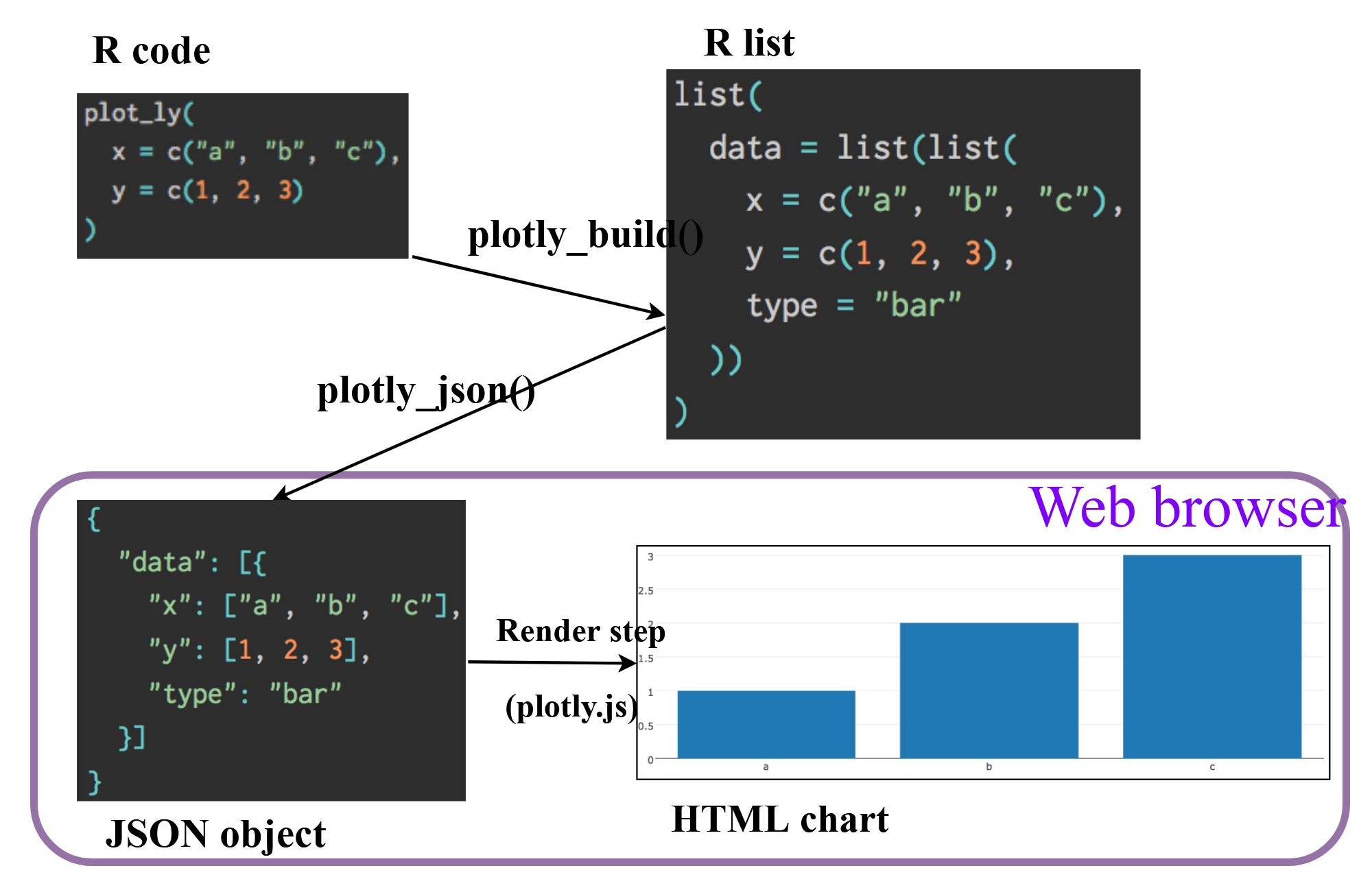
There are two ways to create interactive graph by using plotly, they are:
by using plot_ly(), and
by using ggplotly()
3.7.1 Creating an Interactive Scatter Plot: plot_ly() method
The tabset below shows an example of a basic interactive plot created by using plot_ly().
plot_ly(data = exam_data,
x = ~MATHS,
y = ~ENGLISH)3.7.2 Working with Visual Variable: plot_ly() method
In the code chunk below, color argument is mapped to a qualitative visual variable (i.e.RACE).
You are able to toggle the colour on and off by clicking on the RACE in the legend.
plot_ly(data = exam_data,
x = ~ENGLISH,
y = ~MATHS,
color = ~RACE)3.7.3 Creating an Interactive Scatter Plot: ggplotly() method
The code chunk below plots an interactive scatter plot by using ggplotly().
p <- ggplot(data=exam_data,
aes(x = MATHS,
y = ENGLISH)) +
geom_point(size=1) +
coord_cartesian(xlim=c(0,100),
ylim=c(0,100))
ggplotly(p)Notice that the only extra line you need to include in the code chunk is ggplotly().
3.7.4 Coordinated Multiple Views with plotly
The creation of a coordinated linked plot by using plotly involves three steps:
highlight_key()of plotly package is used as shared data.two scatterplots will be created by using ggplot2 functions.
lastly, subplot() of plotly package is used to place them next to each other side-by-side.
d <- highlight_key(exam_data)
p1 <- ggplot(data=d,
aes(x = MATHS,
y = ENGLISH)) +
geom_point(size=1) +
coord_cartesian(xlim=c(0,100),
ylim=c(0,100))
p2 <- ggplot(data=d,
aes(x = MATHS,
y = SCIENCE)) +
geom_point(size=1) +
coord_cartesian(xlim=c(0,100),
ylim=c(0,100))
subplot(ggplotly(p1),
ggplotly(p2))Things to learn from the code chunk:
highlight_key()simply creates an object of class crosstalk::SharedData.Visit this link to learn more about crosstalk.
3.8 Interactive Data Visualisaion - crosstalk methods!
Crosstalk is an add-on to the html widgets package. It extends html widgets with a set of classes, functions, and conventions for implementing cross-widget interactions (currently, linked brushing and filtering). Where ggiraph linking only works inside a girafe object, and plotly linking only works between plotly objects, crosstalk allows a plotly chart, a DT table, and a leaflet map to share one selection state which is important when creating a multi-view dashboard.
3.8.1 Interactive Data Table: DT package
A wrapper of the JavaScript Library DataTables
Data objects in R can be rendered as HTML tables using the JavaScript library ‘DataTables’ (typically via R Markdown or Shiny).
DT::datatable(exam_data, class= "compact")3.8.2 Linked Brushing: crosstalk method
Code chunk below is used to implement the coordinated brushing shown above.
d <- highlight_key(exam_data)
p <- ggplot(d,
aes(ENGLISH,
MATHS)) +
geom_point(size=1) +
coord_cartesian(xlim=c(0,100),
ylim=c(0,100))
gg <- highlight(ggplotly(p),
"plotly_selected")
crosstalk::bscols(gg,
DT::datatable(d),
widths = 5) Things to learn from the code chunk:
highlight() is a function of plotly package. It sets a variety of options for brushing (i.e., highlighting) multiple plots. These options are primarily designed for linking multiple plotly graphs, and may not behave as expected when linking plotly to another htmlwidget package via crosstalk. In some cases, other htmlwidgets will respect these options, such as persistent selection in leaflet.
bscols() is a helper function of crosstalk package. It makes it easy to put HTML elements side by side. It can be called directly from the console but is especially designed to work in an R Markdown document. Warning: This will bring in all of Bootstrap!
3.9 Consolidation
NoteWhen to use ggiraph vs plotly
ggiraph and plotly both make ggplot charts interactive, but they suit different situations. Here are some examples when to use which.
Use ggiraph when:
You want to show extra info on hover (a student’s name, a class mean score).
You want hovering one element to highlight related ones (hover one student to light up their whole class).
You want clicks to open a link or trigger something simple.
Use plotly when:
The chart is dense and the user needs to zoom into a region to see detail.
The user might want to lasso-select a group of points to study them.
You want users to toggle groups on and off by clicking a legend.
You are building a dashboard component, not just embedding one chart in a document, and you might want to do animation, 3D, or sliders later on.
A quick mental test: If you are happy with a screenshot of the chart on paper, ggiraph is probably enough. If the chart only makes sense when the user can poke around in it, then use plotly.
3.9.1 Consolidated ggiraph Plot Example
This dotplot uses all three ggiraph aesthetics in one chart. Hovering any dot shows the student’s ID, class, MATHS score, percentile rank, and how far above or below the cohort mean they sit, computed once and embedded in the rich_tooltip field. The data_id = CLASS aesthetic links every student to their class, so hovering one dot highlights all classmates while everything else fades to 15% opacity (Cairo’s haze technique). Clicking a dot opens a Google search for that class, demonstrating the onclick drill-down pattern. The dashed reference line marks the cohort mean. Zoom is enabled via opts_zoom for inspecting dense regions.
3.9.2 Consolidated plotly Example
This scatter uses plotly’s native interactivity toolbox. Dragging on the chart zooms into that region; double-clicking resets the view. The lasso and box-select tools (in the toolbar at the top right) let the user grab a cluster of students for closer inspection. Clicking any race in the legend hides those points; double-clicking isolates them. The hover tooltip is custom-built — instead of plotly’s default x: 76, y: 82 format, it shows the student’s ID, class, demographics, and all three subject scores in one styled HTML block. The colors = “Set2” override replaces plotly’s default categorical palette, which fails for common forms of red-green colourblindness. The displaylogo = FALSE and removed mode-bar buttons declutter the toolbar to keep it focused on the interactions that actually matter for this chart.
4 Programming Animated Statistical Graphics with R
4.1 Overview
Chapter 3 was about interactivity where the user can hover and click to interact with the chart. Chapter 4 is about animation where the user watches animated illustrations. Both parts will add a temporal dimension to a static plot, but in different ways.
Chapter 4 shows how to create animated data visualisation by using gganimate and plotly r packages. At the same time, the chapter teaches how to (i) reshape data by using tidyr package, and (ii) process, wrangle and transform data by using dplyr package.
4.1.1 Basic Concept of Animation
When creating animations, the plot does not actually move. Instead, many individual plots are built and then stitched together as movie frames, just like an old-school flip book or cartoon. An animation is a sequence of static plots, each one with a slightly different subset of data and the motion comes from displaying them in quick successions. This means animation is rendering-heavy.
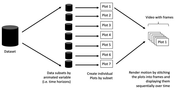
4.1.2 Terminology
Before we dive into the steps for creating an animated statistical graph, it’s important to understand some of the key concepts and terminology related to this type of visualization.
Frame: In an animated line graph, each frame represents a different point in time or a different category. When the frame changes, the data points on the graph are updated to reflect the new data.
Animation Attributes: The animation attributes are the settings that control how the animation behaves. For example, you can specify the duration of each frame, the easing function used to transition between frames, and whether to start the animation from the current frame or from the beginning.
Tip
Before you start making animated graphs, you should first ask yourself: Does it make sense to go through the effort? If you are conducting an exploratory data analysis, an animated graphic may not be worth the time investment. However, if you are giving a presentation, a few well-placed animated graphics can help an audience connect with your topic remarkably better than static counterparts.
4.2 Getting Started
4.2.1 Loading the R packages
First, write a code chunk to check, install and load the following R packages:
plotly, R library for plotting interactive statistical graphs.
gganimate, an ggplot extension for creating animated statistical graphs.
gifski converts video frames to GIF animations using pngquant’s fancy features for efficient cross-frame palettes and temporal dithering. It produces animated GIFs that use thousands of colors per frame.
gapminder: An excerpt of the data available at Gapminder.org. We just want to use its country_colors scheme.
tidyverse, a family of modern R packages specially designed to support data science, analysis and communication task including creating static statistical graphs.
pacman::p_load(readxl, gifski, gapminder,
plotly, gganimate, tidyverse)4.2.1 Importing the Data
In this chapter, the Data worksheet from the GlobalPopulation Excel workbook will be used. The following code is used to import the data.
col <- c("Country", "Continent")
globalPop <- read_xls("data/GlobalPopulation.xls",
sheet="Data") %>%
mutate(across(col, as.factor)) %>%
mutate(Year = as.integer(Year))4.3 Animated Data Visualisation: gganimate methods
gganimate adds five new layer families to ggplot2’s grammar, each handling a different aspect of animation:
| Layer family | What it controls | Common functions |
|---|---|---|
transition_*() |
How the data should be spread out and how it relates to itself across time. | transition_time(), transition_states(), transition_reveal(), transition_manual() |
view_*() |
How the positional scales should change along the animation | view_follow(), view_static(), view_step() |
shadow_*() |
How data from other points in time should be presented in the given point in time | shadow_mark(), shadow_wake(), shadow_trail() |
enter_*()/exit_*() |
How new data should appear and how old data should disappear during the course of the animation. | enter_fade(), exit_shrink() |
ease_aes() |
How smoothly aesthetics transition between frames. | 'linear', 'cubic-in-out', 'bounce-out' |
4.3.1 Building a Static Population Bubble Plot
In the code chunk below, the basic ggplot2 functions are used to create a static bubble plot.
ggplot(globalPop, aes(x = Old, y = Young,
size = Population,
colour = Country)) +
geom_point(alpha = 0.7,
show.legend = FALSE) +
scale_colour_manual(values = country_colors) +
scale_size(range = c(2, 12)) +
labs(title = 'Year: {frame_time}',
x = '% Aged',
y = '% Young') 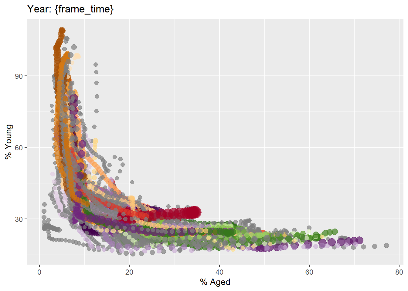
4.3.2 Building the Animated Bubble Plot
In the code chunk below,
transition_time()of gganimate is used to create transition through distinct states in time (i.e. Year).ease_aes()is used to control easing of aesthetics. The default islinear. Other methods are: quadratic, cubic, quartic, quintic, sine, circular, exponential, elastic, back, and bounce.
ggplot(globalPop, aes(x = Old, y = Young,
size = Population,
colour = Country)) +
geom_point(alpha = 0.7,
show.legend = FALSE) +
scale_colour_manual(values = country_colors) +
scale_size(range = c(2, 12)) +
labs(title = 'Year: {frame_time}',
x = '% Aged',
y = '% Young') +
transition_time(Year) +
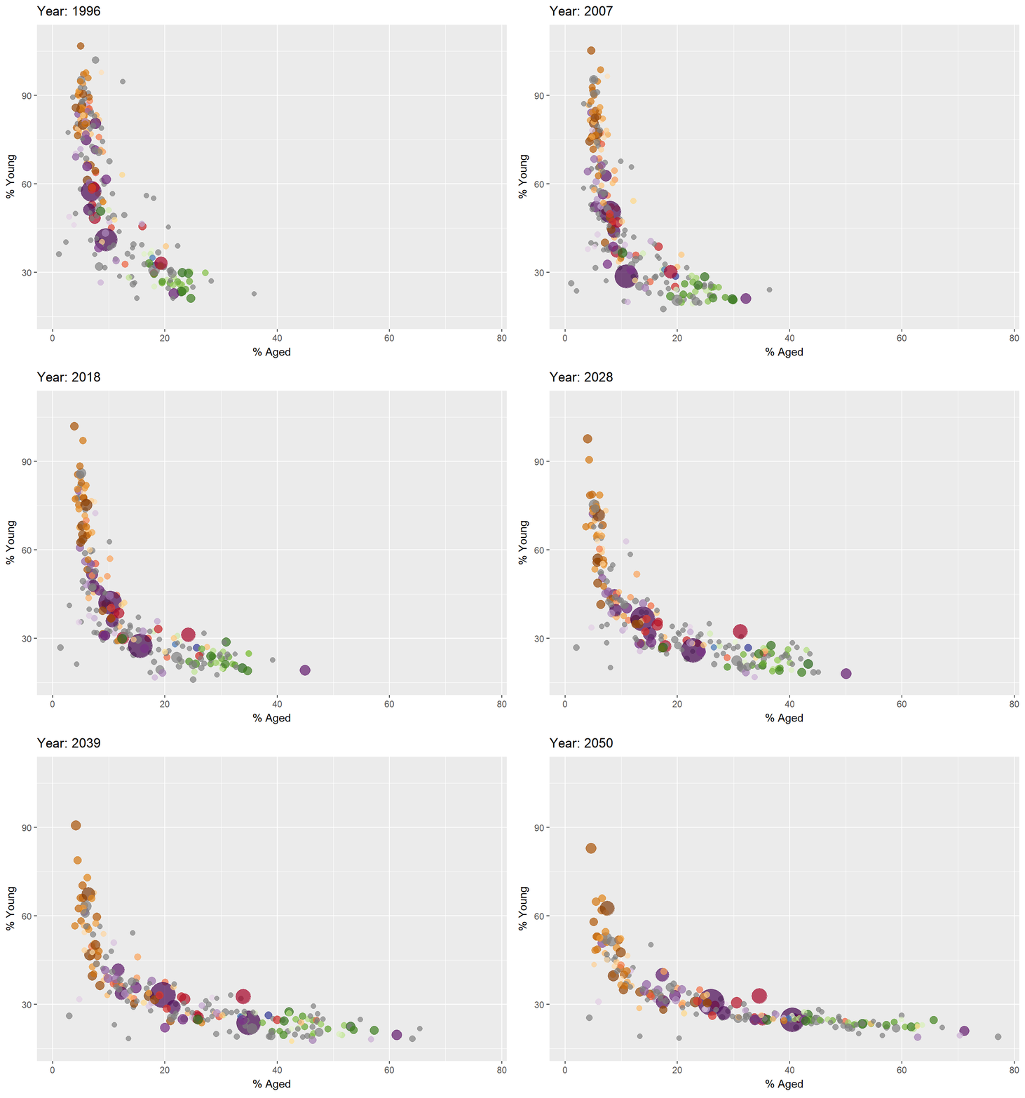
ease_aes('linear') The animated bubble chart with examples of transition_time(), transition_state().
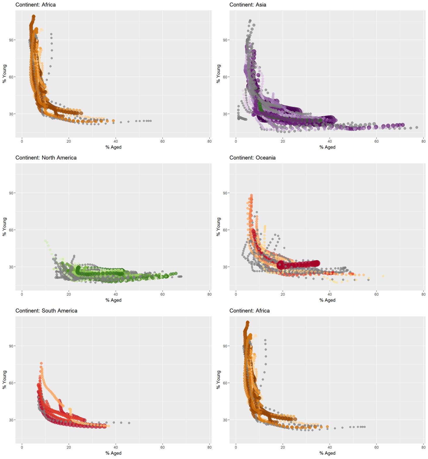
4.4 Animated Data Visualisation: plotly
In Plotly R package, both ggplotly() and plot_ly() support key frame animations through the frame argument/aesthetic. They also support an ids argument/aesthetic to ensure smooth transitions between objects with the same id (which helps facilitate object constancy).
4.4.1 Building the Animated Bubble Plot: ggplotly() method
In this sub-section, you will learn how to create an animated bubble plot by using ggplotly() method.
gg <- ggplot(globalPop,
aes(x = Old,
y = Young,
size = Population,
colour = Country)) +
geom_point(aes(frame = Year),
alpha = 0.7,
show.legend = FALSE) +
scale_colour_manual(values = country_colors) +
scale_size(range = c(2, 12)) +
labs(x = '% Aged',
y = '% Young')
ggplotly(gg)Notice that although show.legend = FALSE argument was used, the legend still appears on the plot. To overcome this problem, theme(legend.position='none') should be used as shown in the plot and code chunk below.
gg <- ggplot(globalPop,
aes(x = Old,
y = Young,
size = Population,
colour = Country)) +
geom_point(aes(size = Population,
frame = Year),
alpha = 0.7) +
scale_colour_manual(values = country_colors) +
scale_size(range = c(2, 12)) +
labs(x = '% Aged',
y = '% Young') +
theme(legend.position='none')
ggplotly(gg)4.4.2 Building the Animated Bubble Plot: plot_ly() method
In this sub-section, you will learn how to create an animated bubble plot by using plot_ly() method.
bp <- globalPop %>%
plot_ly(x = ~Old,
y = ~Young,
size = ~Population,
color = ~Continent,
sizes = c(2, 100),
frame = ~Year,
text = ~Country,
hoverinfo = "text",
type = 'scatter',
mode = 'markers'
) %>%
layout(showlegend = FALSE)
bp🕹️ LEVEL COMPLETE 🕹️
★ ★ ★ ★ ★
CHAPTER 3 & 4 CLEARED!
+1000 XP · ACHIEVEMENT UNLOCKED: Interactive Architect 🏗️
Press any key to continue…