options(repos = c(CRAN = "https://cran.r-project.org"))

if (!requireNamespace("remotes", quietly = TRUE)) {
  install.packages("remotes")
}
# Render this document against ggplot2 3.5.x from an isolated library folder, so
# the gtExtras sparklines do not render as black blocks. The main library keeps
# ggplot2 4.0 for the other exercises (TH_EX01 needs it for ggstatsplot). This
# affects this page only, because each Quarto file renders in its own session.
gg_lib <- file.path(getwd(), "_ggplot2_35")
dir.create(gg_lib, showWarnings = FALSE)
.libPaths(c(gg_lib, .libPaths()))
if (utils::packageVersion("ggplot2") >= "4.0.0") {
  remotes::install_version("ggplot2", version = "3.5.1",
                           lib = gg_lib, upgrade = "never")
}
if (!requireNamespace("dataui", quietly = TRUE)) {
  remotes::install_github("timelyportfolio/dataui",
                          upgrade = "never")
}
if (!requireNamespace("reactablefmtr", quietly = TRUE)) {
  remotes::install_version("reactablefmtr",
                           version = "2.0.0",
                           upgrade = "never")
}
if (!requireNamespace("svglite", quietly = TRUE)) install.packages("svglite")
if (!requireNamespace("ragg", quietly = TRUE)) install.packages("ragg")Hands-on Exercise 10
Information Dashboard Design: R Methods
31 Information Dashboard Design: R Methods
31.1 Overview
An information dashboard packs many small, comparable views into one screen so a reader can scan the state of a business at a glance. This chapter builds the building blocks of such a dashboard in R.
By the end of this hands-on exercise you will be able to:
- create a bullet chart using ggplot2,
- create sparklines using ggplot2,
- build a static dashboard table using gt and gtExtras,
- build an interactive dashboard table using reactable and reactablefmtr.
31.2 Getting Started
The following R packages are used in this exercise.
- tidyverse for importing, tidying, wrangling and visualising data,
- lubridate for working with dates and times,
- ggthemes for additional ggplot2 themes,
- gt and gtExtras for building and styling tables with inline charts,
- reactable and reactablefmtr for building interactive data tables,
- dataui for the interactive sparklines that reactablefmtr draws,
- svglite and ragg as the graphics backend that gtExtras uses to render its inline sparklines.
The guard below prepares the environment before the packages are loaded. Two of the packages can no longer be installed from CRAN, so they come from their original sources. dataui has always been a GitHub-only package, and reactablefmtr was archived from CRAN in March 2026. reactablefmtr is pure R and its dependencies are still live on CRAN, so no build tools are required. The guard also installs ggplot2 3.5.x into a library folder used only by this page, because gtExtras renders its inline sparklines as black blocks under ggplot2 4.0. The main library keeps ggplot2 4.0 for the other exercises. These steps run only on the first render.
pacman::p_load(lubridate, ggthemes, reactable,
               gt, gtExtras, svglite, ragg, tidyverse)
library(reactablefmtr)
library(dataui)
31.3 Importing Microsoft Access Database
31.3.1 The Data Set
A personal database in Microsoft Access mdb format called Coffee Chain is used. It records sales and budgeted sales for a chain of coffee products.
31.3.2 Importing Database into R
odbcConnectAccess2007() of the RODBC package imports a database query table into R. The code chunk below is shown for reference. It is not executed here because the Access driver runs on a 32-bit R session rather than the 64-bit session used to render this page.
library(RODBC)
con <- odbcConnectAccess2007('data/Coffee Chain.mdb')
coffeechain <- sqlFetch(con, 'CoffeeChain Query')
write_rds(coffeechain, "data/rds/CoffeeChain.rds")
odbcClose(con)
NoteThings to Learn from the Code Chunk Above
odbcConnectAccess2007() opens a connection to the Access file, sqlFetch() pulls a named query into an R data frame, and odbcClose() closes the connection. The result is cached as an rds file so the rest of the exercise can read it directly without the Access driver.
31.3.3 Data Preparation
The prepared CoffeeChain.rds is read into R. This step is the practical starting point once the rds file is available.
coffeechain <- read_rds("data/rds/CoffeeChain.rds")Sales and budgeted sales are aggregated at the product level.
product <- coffeechain %>%
  group_by(`Product`) %>%
  summarise(`target` = sum(`Budget Sales`),
            `current` = sum(`Sales`)) %>%
  ungroup()
31.3.4 Bullet Chart in ggplot2
A bullet chart shows a single measure against qualitative ranges and a target marker. The code chunk below builds one from layered geom_col() bars and a geom_errorbar() target line.
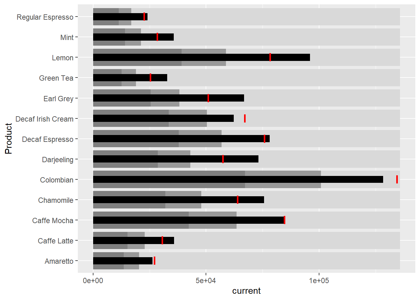
ggplot(product, aes(Product, current)) +
  geom_col(aes(Product, max(target) * 1.01),
           fill="grey85", width=0.85) +
  geom_col(aes(Product, target * 0.75),
           fill="grey60", width=0.85) +
  geom_col(aes(Product, target * 0.5),
           fill="grey50", width=0.85) +
  geom_col(aes(Product, current),
           width=0.35,
           fill = "black") +
  geom_errorbar(aes(y = target,
                    x = Product,
                    ymin = target,
                    ymax= target),
                width = .4,
                colour = "red",
                size = 1) +
  coord_flip()
NoteThings to Learn from the Code Chunk Above
The three wide grey bars run from light to dark to mark qualitative bands of performance. The thin black bar is the actual value for each product, and the red geom_errorbar() marks the target. coord_flip() turns the chart on its side so the product labels are readable.
TipReading the Plot
A black bar that reaches past the red marker means the product met its target. The grey bands give quick context for whether a value is poor, fair or good without reading the axis precisely.
31.4 Plotting Sparklines Using ggplot2
A sparkline is a small line chart drawn without axes that shows the shape of a series in the space of a word. This section builds one sparkline per product from the monthly sales.
31.4.1 Preparing the Data
Monthly sales per product are derived from the daily records.
sales_report <- coffeechain %>%
  filter(Date >= "2013-01-01") %>%
  mutate(Month = month(Date)) %>%
  group_by(Month, Product) %>%
  summarise(Sales = sum(Sales)) %>%
  ungroup() %>%
  select(Month, Product, Sales)
The minimum, maximum and end-of-series sales per product are computed for the labelled points.
mins <- group_by(sales_report, Product) %>%
  slice(which.min(Sales))
maxs <- group_by(sales_report, Product) %>%
  slice(which.max(Sales))
ends <- group_by(sales_report, Product) %>%
  filter(Month == max(Month))
The 25th and 75th percentiles per product are computed for the shaded band.
quarts <- sales_report %>%
  group_by(Product) %>%
  summarise(quart1 = quantile(Sales,
                              0.25),
            quart2 = quantile(Sales,
                              0.75)) %>%
  right_join(sales_report)
31.4.2 Sparklines in ggplot2
The sparklines are faceted one row per product, with a trend line, an interquartile band and labelled extreme points.
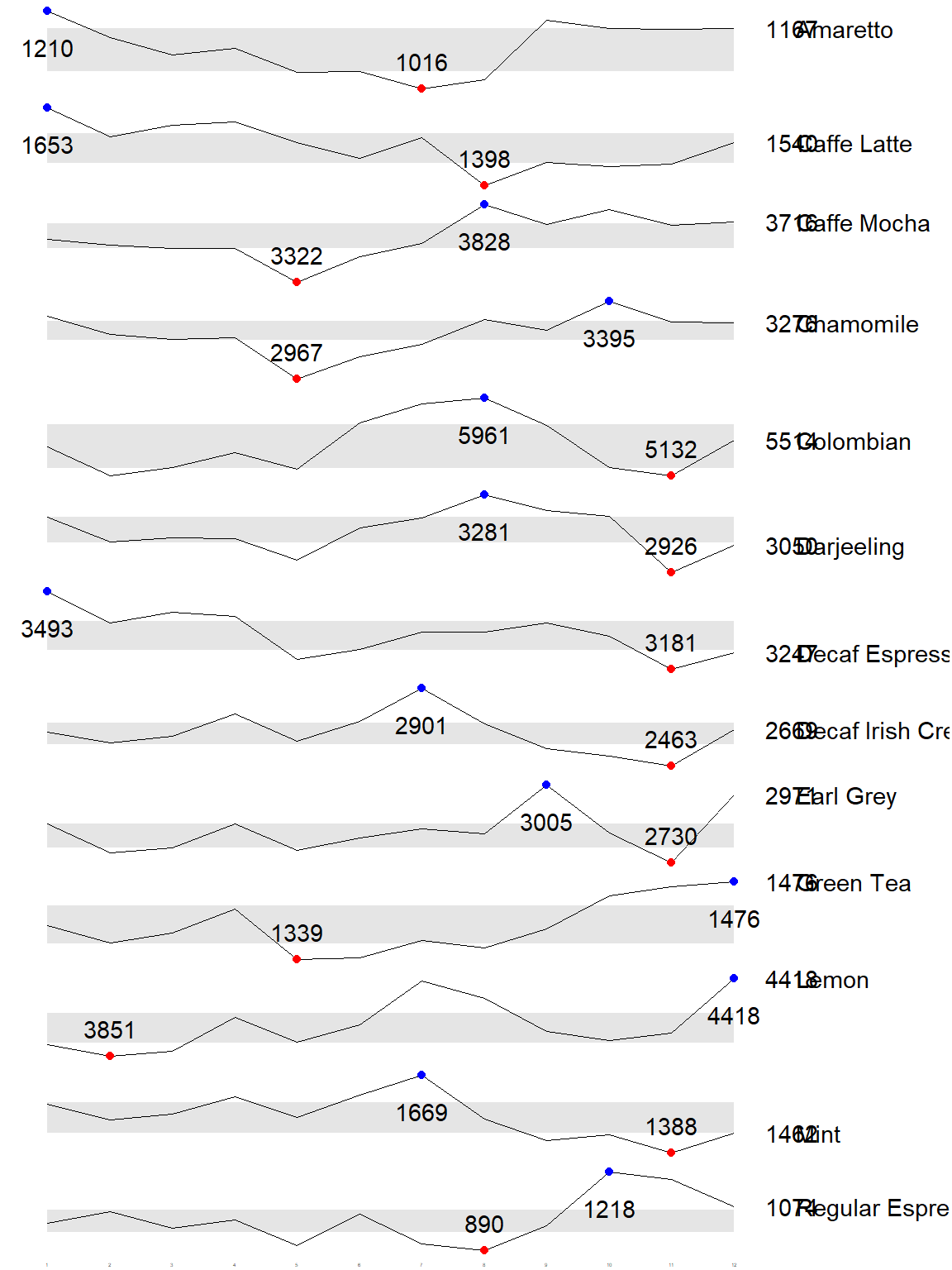
ggplot(sales_report, aes(x=Month, y=Sales)) +
  facet_grid(Product ~ ., scales = "free_y") +
  geom_ribbon(data = quarts, aes(ymin = quart1, ymax = quart2),
              fill = 'grey90') +
  geom_line(size=0.3) +
  geom_point(data = mins, col = 'red') +
  geom_point(data = maxs, col = 'blue') +
  geom_text(data = mins, aes(label = Sales), vjust = -1) +
  geom_text(data = maxs, aes(label = Sales), vjust = 2.5) +
  geom_text(data = ends, aes(label = Sales), hjust = 0, nudge_x = 0.5) +
  geom_text(data = ends, aes(label = Product), hjust = 0, nudge_x = 1.0) +
  expand_limits(x = max(sales_report$Month) +
                  (0.25 * (max(sales_report$Month) - min(sales_report$Month)))) +
  scale_x_continuous(breaks = seq(1, 12, 1)) +
  scale_y_continuous(expand = c(0.1, 0)) +
  theme_tufte(base_size = 3, base_family = "Helvetica") +
  theme(axis.title=element_blank(), axis.text.y = element_blank(),
        axis.ticks = element_blank(), strip.text = element_blank())
NoteThings to Learn from the Code Chunk Above
facet_grid(Product ~ ., scales = "free_y") stacks one small panel per product and lets each panel scale its own y-axis. geom_ribbon() shades the interquartile band, the red and blue points mark the lowest and highest months, and theme_tufte() strips the axes so only the shape of the series remains.
TipReading the Plot
Each row reads as a single glance at one product’s year. The blue and red points anchor the peak and trough, and the grey band shows the middle half of the values, so an unusual month stands out against it.
31.5 Static Information Dashboard Design: gt and gtExtras Methods
The gt package builds publication-quality tables, and gtExtras adds helper functions that draw small charts inside table cells. This section places a bullet chart inside a table.
31.5.1 Plotting a Simple Bullet Chart
gt_plt_bullet() draws an inline bullet chart for each row, comparing the current value against its target.
| Product | current |
|---|---|
| Amaretto | |
| Caffe Latte | |
| Caffe Mocha | |
| Chamomile | |
| Colombian | |
| Darjeeling | |
| Decaf Espresso | |
| Decaf Irish Cream | |
| Earl Grey | |
| Green Tea | |
| Lemon | |
| Mint | |
| Regular Espresso |
product %>%
  gt::gt() %>%
  gt_plt_bullet(column = current,
              target = target,
              width = 60,
              palette = c("lightblue",
                          "black")) %>%
  gt_theme_538()
NoteThings to Learn from the Code Chunk Above
gt::gt() turns the data frame into a gt table. gt_plt_bullet() replaces the numeric column with an inline bullet chart, where column is the actual value and target is the reference. gt_theme_538() applies a clean newsroom-style theme.
31.6 Sparklines: gtExtras Method
gtExtras can also draw sparklines inside a table. The data is first reshaped into the form gtExtras expects.
report <- coffeechain %>%
  mutate(Year = year(Date)) %>%
  filter(Year == "2013") %>%
  mutate (Month = month(Date,
                        label = TRUE,
                        abbr = TRUE)) %>%
  group_by(Product, Month) %>%
  summarise(Sales = sum(Sales)) %>%
  ungroup()
gtExtras functions almost always require a data frame with list columns. The code chunk below collapses each product’s monthly sales into a single list column.
report %>%
  group_by(Product) %>%
  summarize('Monthly Sales' = list(Sales),
            .groups = "drop")
# A tibble: 13 × 2
Product `Monthly Sales`
<chr> <list>
1 Amaretto <dbl [12]>
2 Caffe Latte <dbl [12]>
3 Caffe Mocha <dbl [12]>
4 Chamomile <dbl [12]>
5 Colombian <dbl [12]>
6 Darjeeling <dbl [12]>
7 Decaf Espresso <dbl [12]>
8 Decaf Irish Cream <dbl [12]>
9 Earl Grey <dbl [12]>
10 Green Tea <dbl [12]>
11 Lemon <dbl [12]>
12 Mint <dbl [12]>
13 Regular Espresso <dbl [12]>
NoteThings to Learn from the Code Chunk Above
list(Sales) packs the twelve monthly values of each product into one cell. A list column holds a vector in every row, which is the shape gt_plt_sparkline() reads to draw one sparkline per product.
31.6.1 Plotting Coffee Chain Sales Report
gt_plt_sparkline() draws an inline sparkline from the list column.
| Product | Monthly Sales |
|---|---|
| Amaretto | |
| Caffe Latte | |
| Caffe Mocha | |
| Chamomile | |
| Colombian | |
| Darjeeling | |
| Decaf Espresso | |
| Decaf Irish Cream | |
| Earl Grey | |
| Green Tea | |
| Lemon | |
| Mint | |
| Regular Espresso |
report %>%
  group_by(Product) %>%
  summarize('Monthly Sales' = list(Sales),
            .groups = "drop") %>%
   gt() %>%
   gt_plt_sparkline('Monthly Sales',
                    same_limit = FALSE)
NoteThings to Learn from the Code Chunk Above
same_limit = FALSE lets each sparkline use its own y-scale, so the shape of every product is visible even when the products differ greatly in sales volume.
31.6.2 Adding Statistics
Summary statistics per product are computed and shown in a gt table.
| Product | Min | Max | Average |
|---|---|---|---|
| Amaretto | 1016 | 1210 | 1,119.00 |
| Caffe Latte | 1398 | 1653 | 1,528.33 |
| Caffe Mocha | 3322 | 3828 | 3,613.92 |
| Chamomile | 2967 | 3395 | 3,217.42 |
| Colombian | 5132 | 5961 | 5,457.25 |
| Darjeeling | 2926 | 3281 | 3,112.67 |
| Decaf Espresso | 3181 | 3493 | 3,326.83 |
| Decaf Irish Cream | 2463 | 2901 | 2,648.25 |
| Earl Grey | 2730 | 3005 | 2,841.83 |
| Green Tea | 1339 | 1476 | 1,398.75 |
| Lemon | 3851 | 4418 | 4,080.83 |
| Mint | 1388 | 1669 | 1,519.17 |
| Regular Espresso | 890 | 1218 | 1,023.42 |
report %>%
  group_by(Product) %>%
  summarise("Min" = min(Sales, na.rm = T),
            "Max" = max(Sales, na.rm = T),
            "Average" = mean(Sales, na.rm = T)
            ) %>%
  gt() %>%
  fmt_number(columns = 4,
    decimals = 2)
NoteThings to Learn from the Code Chunk Above
fmt_number(columns = 4, decimals = 2) formats the Average column to two decimal places. The Min and Max columns are left as whole numbers.
31.6.3 Combining the data.frame
The sparkline list column and the statistics are built separately, then joined into one table.
spark <- report %>%
  group_by(Product) %>%
  summarize('Monthly Sales' = list(Sales),
            .groups = "drop")
sales <- report %>%
group_by(Product) %>%
summarise("Min" = min(Sales, na.rm = T),
"Max" = max(Sales, na.rm = T),
"Average" = mean(Sales, na.rm = T)
)sales_data = left_join(sales, spark)31.6.4 Plotting the Updated data.table
The combined table shows the statistics alongside the sparkline.
| Product | Min | Max | Average | Monthly Sales |
|---|---|---|---|---|
| Amaretto | 1016 | 1210 | 1119.000 | |
| Caffe Latte | 1398 | 1653 | 1528.333 | |
| Caffe Mocha | 3322 | 3828 | 3613.917 | |
| Chamomile | 2967 | 3395 | 3217.417 | |
| Colombian | 5132 | 5961 | 5457.250 | |
| Darjeeling | 2926 | 3281 | 3112.667 | |
| Decaf Espresso | 3181 | 3493 | 3326.833 | |
| Decaf Irish Cream | 2463 | 2901 | 2648.250 | |
| Earl Grey | 2730 | 3005 | 2841.833 | |
| Green Tea | 1339 | 1476 | 1398.750 | |
| Lemon | 3851 | 4418 | 4080.833 | |
| Mint | 1388 | 1669 | 1519.167 | |
| Regular Espresso | 890 | 1218 | 1023.417 |
sales_data %>%
  gt() %>%
  gt_plt_sparkline('Monthly Sales',
                   same_limit = FALSE)
31.6.5 Combining Bullet Chart and Sparklines
A bullet chart and a sparkline can sit in the same table. The actual and target values are prepared, joined onto the table, then both inline charts are drawn.
bullet <- coffeechain %>%
  filter(Date >= "2013-01-01") %>%
  group_by(`Product`) %>%
  summarise(`Target` = sum(`Budget Sales`),
            `Actual` = sum(`Sales`)) %>%
  ungroup()
sales_data = sales_data %>%
left_join(bullet)| Product | Min | Max | Average | Monthly Sales | Actual |
|---|---|---|---|---|---|
| Amaretto | 1016 | 1210 | 1119.000 | ||
| Caffe Latte | 1398 | 1653 | 1528.333 | ||
| Caffe Mocha | 3322 | 3828 | 3613.917 | ||
| Chamomile | 2967 | 3395 | 3217.417 | ||
| Colombian | 5132 | 5961 | 5457.250 | ||
| Darjeeling | 2926 | 3281 | 3112.667 | ||
| Decaf Espresso | 3181 | 3493 | 3326.833 | ||
| Decaf Irish Cream | 2463 | 2901 | 2648.250 | ||
| Earl Grey | 2730 | 3005 | 2841.833 | ||
| Green Tea | 1339 | 1476 | 1398.750 | ||
| Lemon | 3851 | 4418 | 4080.833 | ||
| Mint | 1388 | 1669 | 1519.167 | ||
| Regular Espresso | 890 | 1218 | 1023.417 |
sales_data %>%
  gt() %>%
  gt_plt_sparkline('Monthly Sales') %>%
  gt_plt_bullet(column = Actual,
                target = Target,
                width = 28,
                palette = c("lightblue",
                          "black")) %>%
  gt_theme_538()
TipReading the Plot
Each row now carries the year’s shape as a sparkline and the target comparison as a bullet chart, alongside the summary numbers. The table reads as a compact dashboard where every product can be judged on trend and on target in one line.
31.7 Interactive Information Dashboard Design: reactable and reactablefmtr Methods
reactable builds interactive tables, and reactablefmtr adds interactive sparklines. The interactive sparklines are drawn by the dataui package, which was installed and loaded in section 31.2 so that reactablefmtr could register its sparkline functions.
31.7.1 Plotting Interactive Sparklines
As with gtExtras, the monthly sales are packed into a list column first.
report <- report %>%
  group_by(Product) %>%
  summarize(`Monthly Sales` = list(Sales))
react_sparkline() then draws the interactive sparkline inside the reactable.
reactable(
  report,
  columns = list(
    Product = colDef(maxWidth = 200),
    `Monthly Sales` = colDef(
      cell = react_sparkline(report)
    )
  )
)
TipReading the Plot
Hovering over a sparkline reveals the value at each month, which the static versions cannot show. The interactivity turns the small chart into a quick lookup tool.
31.7.2 Changing the Pagesize
The default page size is ten rows. defaultPageSize changes it so all thirteen products show on one page.
reactable(
  report,
  defaultPageSize = 13,
  columns = list(
    Product = colDef(maxWidth = 200),
    `Monthly Sales` = colDef(
      cell = react_sparkline(report)
    )
  )
)
31.7.3 Adding Points and Labels
highlight_points marks the minimum and maximum values, and labels prints the first and last values.
reactable(
  report,
  defaultPageSize = 13,
  columns = list(
    Product = colDef(maxWidth = 200),
    `Monthly Sales` = colDef(
      cell = react_sparkline(
        report,
        highlight_points = highlight_points(
          min = "red", max = "blue"),
        labels = c("first", "last")
        )
    )
  )
)
31.7.4 Adding Reference Line
statline adds a reference line at a summary statistic such as the mean.
reactable(
  report,
  defaultPageSize = 13,
  columns = list(
    Product = colDef(maxWidth = 200),
    `Monthly Sales` = colDef(
      cell = react_sparkline(
        report,
        highlight_points = highlight_points(
          min = "red", max = "blue"),
        statline = "mean"
        )
    )
  )
)
31.7.5 Adding Bandline
A bandline shades a range behind the sparkline. The code chunk below adds the interquartile band.
reactable(
  report,
  defaultPageSize = 13,
  columns = list(
    Product = colDef(maxWidth = 200),
    `Monthly Sales` = colDef(
      cell = react_sparkline(
        report,
        highlight_points = highlight_points(
          min = "red", max = "blue"),
        line_width = 1,
        bandline = "innerquartiles",
        bandline_color = "green"
        )
    )
  )
)
31.7.6 Changing from Sparkline to Sparkbar
react_sparkbar() shows the values as bars instead of a line.
reactable(
  report,
  defaultPageSize = 13,
  columns = list(
    Product = colDef(maxWidth = 200),
    `Monthly Sales` = colDef(
      cell = react_sparkbar(
        report,
        highlight_bars = highlight_bars(
          min = "red", max = "blue"),
        bandline = "innerquartiles",
        statline = "mean")
    )
  )
)
TipReading the Plot
The sparkbar suits readers who compare individual months more than the overall trend. The bandline and mean line give the same context as the sparkline version while each month reads as a discrete bar.
31.8 Reference
Kam, T. S. (2026). R for Visual Analytics, Chapter 31, Information Dashboard Design: R Methods. Singapore Management University.
🕹️ LEVEL COMPLETE 🕹️
★ ★ ★ ★ ★
CHAPTER 31 CLEARED!
+1000 XP · ACHIEVEMENT UNLOCKED: Dashboard Architect 📊
Press any key to continue…