Hands-On Exercise Index
Hands-On Exercises Index
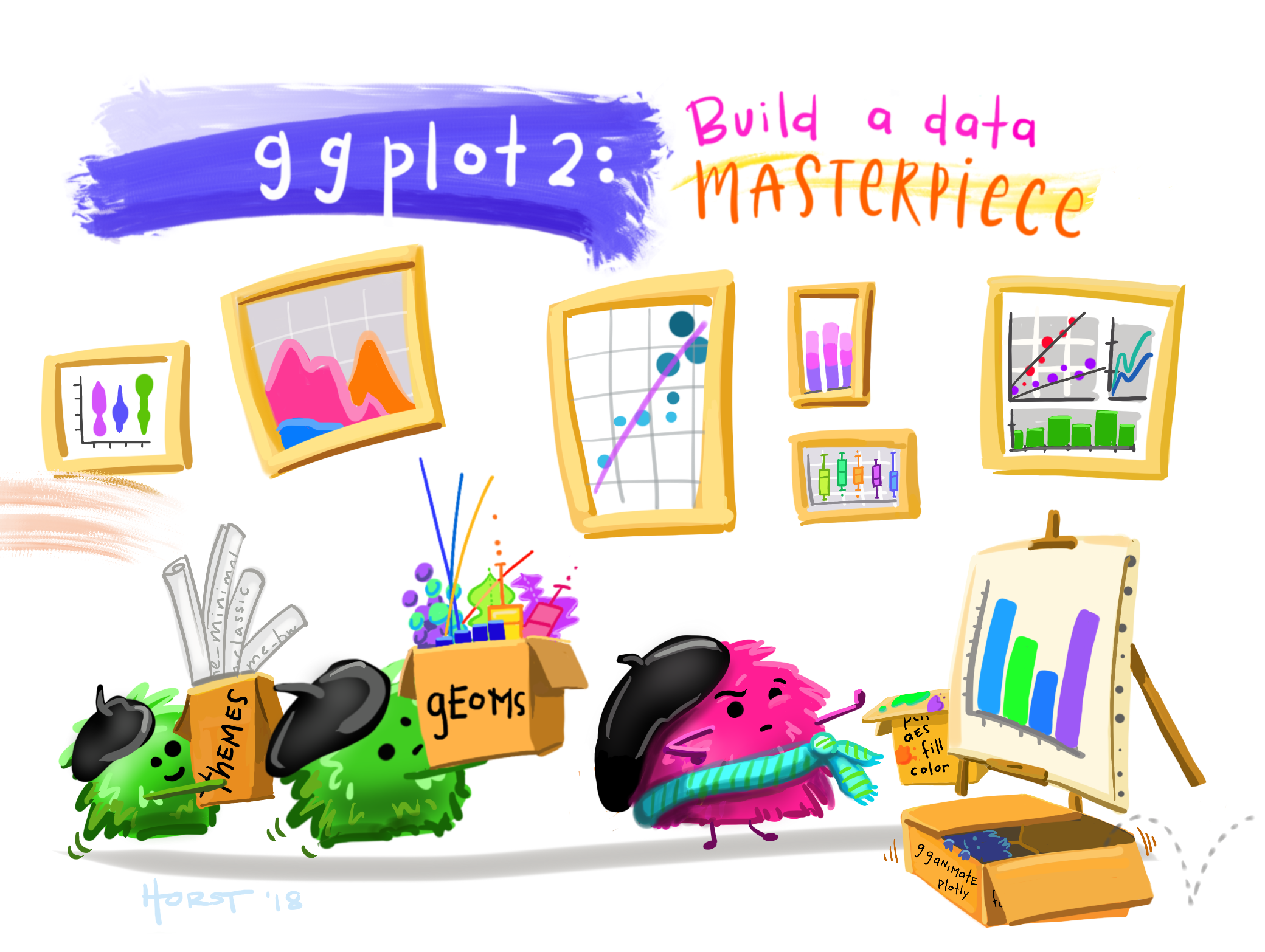
Hands-on Exercise 1 — Basic Principles and Essential Components of ggplot2
Explore the Layered Grammar of Graphics and learn how ggplot2 implements it through its essential components.
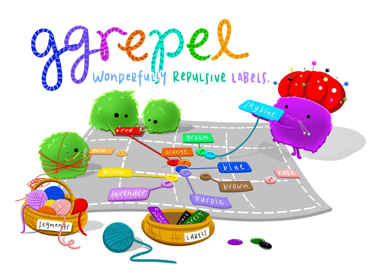
Hands-on Exercise 2 — Beyond ggplot Fundamentals
Explored several ggplot2 extensions for creating more elegant and effective statistical graphics — covering label placement, themes, and combining plots into one figure.
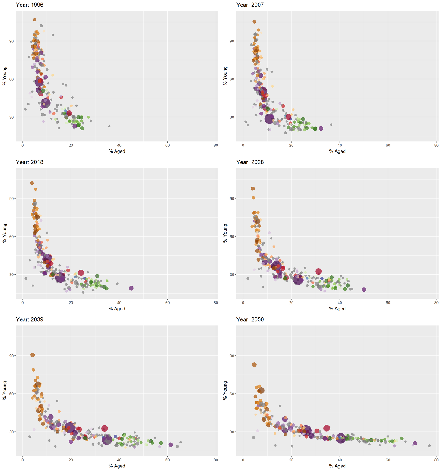
Hands-on Exercise 3 — Programming Interactive Data Visualisation and Animated Statistical Graphics with R
Explored several R packages for adding interactivity to static ggplots covering hover tooltips, linked highlighting, click-throughs, and coordinated multiple views.
Explored several R packages for adding motion to static ggplots covering frame transitions, easing functions, object constancy, and animated bubble charts.
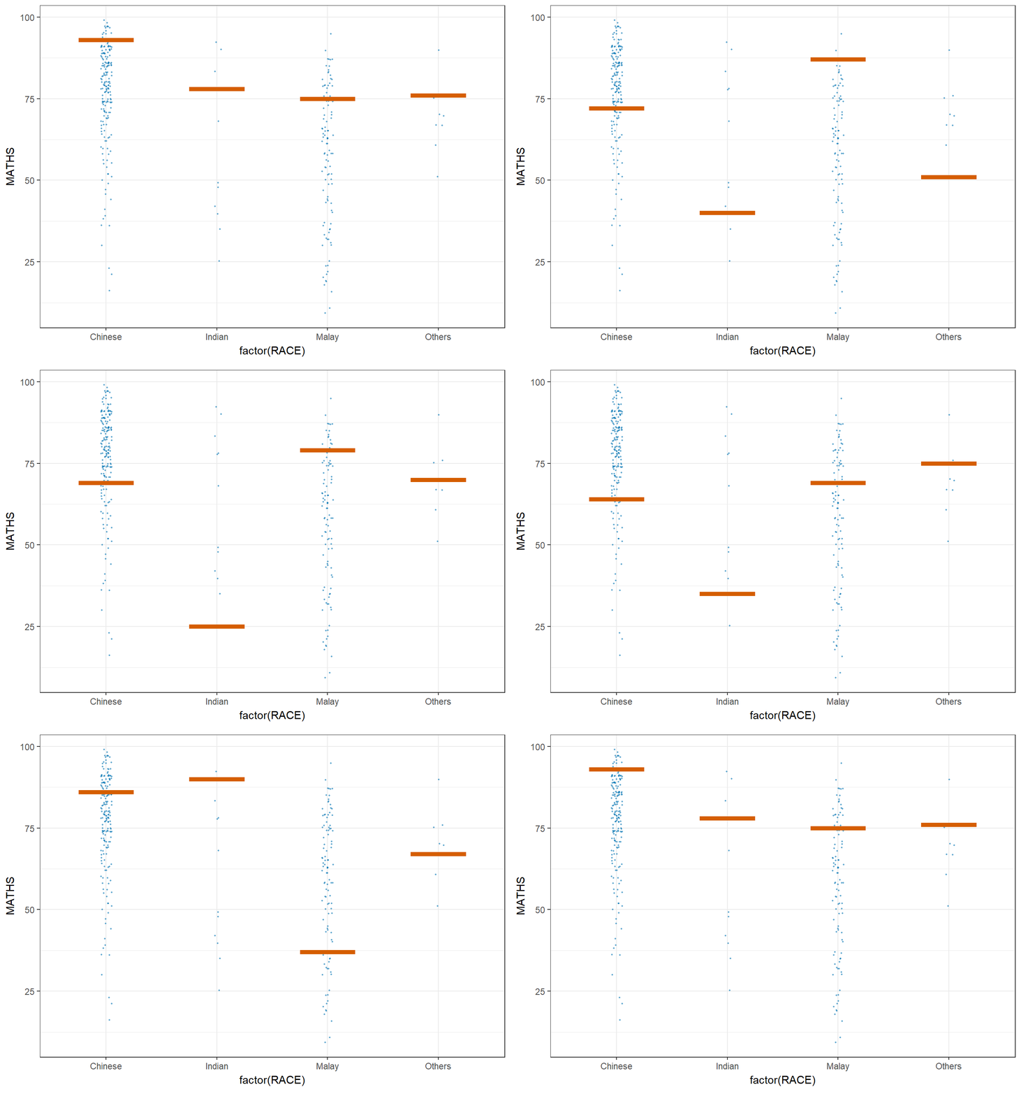
Hands-on Exercise 4 — Funnel Plots, Distribution Charts, Visual Statistical Analysis, and Visualising Uncertainty
Explored (1) fair comparisons across units of different sizes covering funnel plots, control limits, and overdispersion adjustments, (2) visualising distributions covering ridgeline plots, raincloud plots, quantile colouring, and gradient fills along the x-axis, (3) visual statistical analysis covering one-sample tests, ANOVA, correlation tests, and chi-square tests with statistical details embedded in the chart, and (4) visualising uncertainty covering standard error bars, confidence intervals, gradient intervals, and Hypothetical Outcome Plots (HOPs).
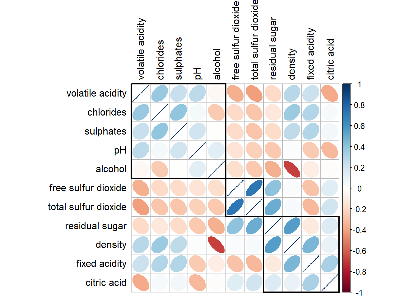
Hands-on Exercise 5 — Correlation Analysis, Heatmaps, Ternary Plots, Parallel Coordinates Plots, and Treemaps
Explored (1) visual correlation analysis covering scatterplot matrices, corrgrams, glyph types, and hierarchical reordering, (2) heatmaps covering data transformation, clustering, seriation, and interactive versions, (3) ternary plots covering three-part compositional data with ggtern and plotly, (4) parallel coordinates plots covering grouping, scaling, faceting, and interactive D3 versions, and (5) treemaps covering hierarchical part-of-whole data, palette and layout choices, and drill-down interactivity.
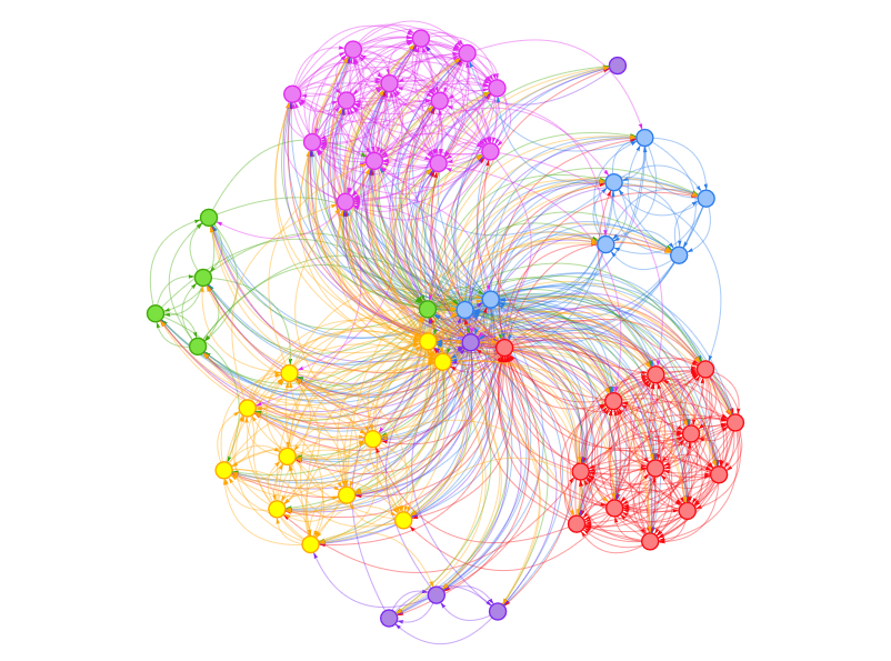
Hands-on Exercise 7 — Network Visualisation and Text Mining
Explored (1) network data analysis covering tidygraph object construction, ggraph static plots with multiple layouts, node and edge faceting, centrality metrics, community detection with concave hulls and interactive networks with visNetwork, (2) text data analysis covering bulk import from nested folders, header and quote cleaning, tokenisation with tidytext, wordclouds with wordcloud and ggwordcloud, tf-idf computation and visualisation, pairwise correlation across newsgroups and bigram networks with ggraph.
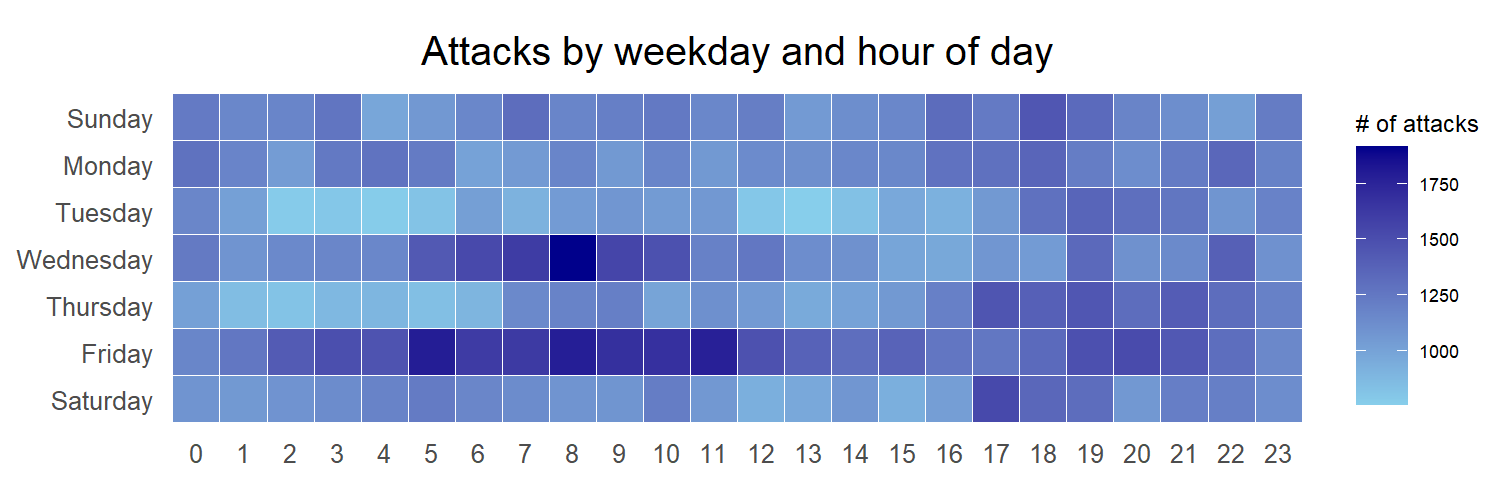
Hands-on Exercise 8 — Visualising and Analysing Time-oriented Data
Explored three time-oriented displays in R: (1) calendar heatmaps covering date-time parsing and time-zone localisation with lubridate, deriving weekday and hour fields through a custom function, tile grids styled with theme_tufte, and faceting across the top attacking countries, (2) cycle plots covering month and year derivation, year-average reference lines, and facet_grid to separate seasonal pattern from long-run trend in visitor arrivals, and (3) slopegraphs covering two-point rank-and-value comparison of Asian rice yields with newggslopegraph from CGPfunctions.
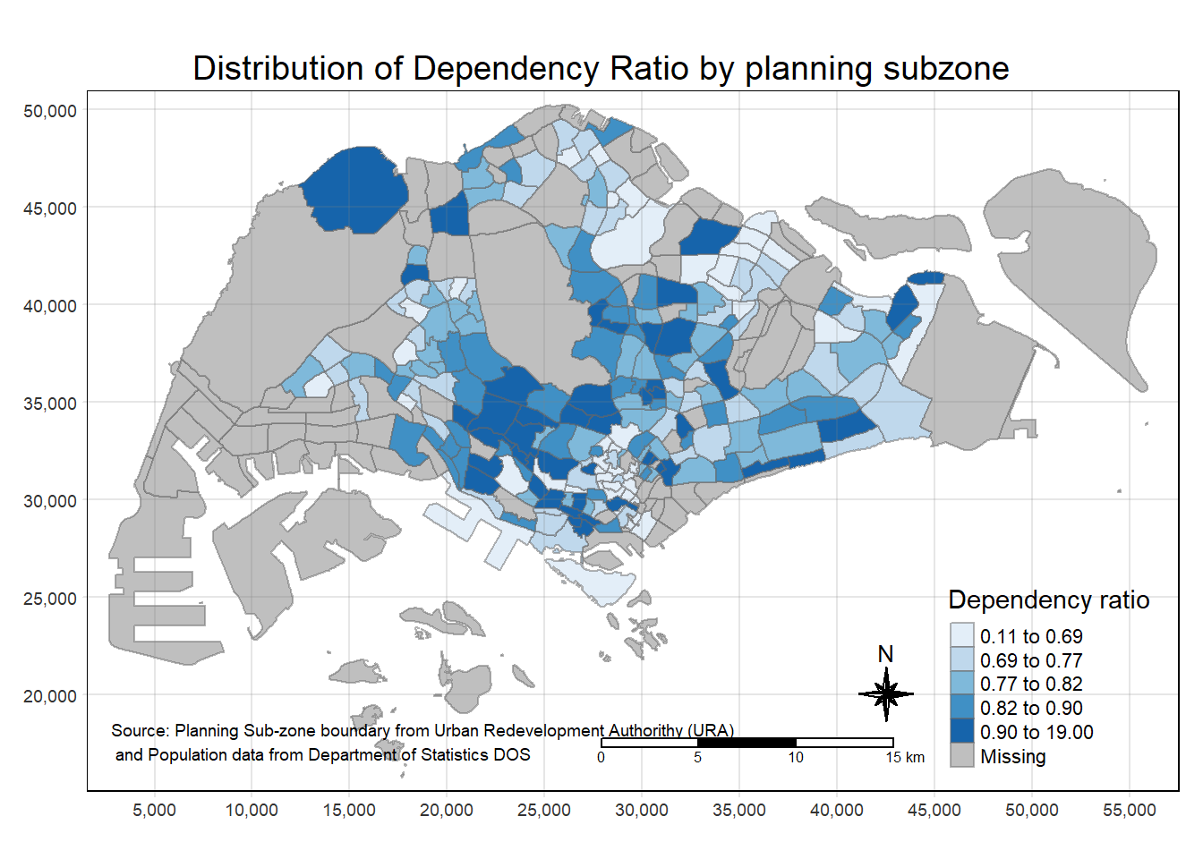
Hands-on Exercise 9 — Geospatial Choropleth, Point and Analytical Mapping
Explored three geospatial mapping workflows with sf and tmap, (1) choropleth mapping covering shapefile and aspatial data import, georelational joins, qtm and tmap element layers, data classification methods, colour schemes, map layouts and small multiple facet maps, (2) geospatial point data covering aspatial-to-sf conversion with projection assignment and interactive proportional symbol maps in tmap view mode, and (3) analytical mapping covering rate maps, percentile maps and box maps built with custom break functions over Nigeria water-point data.
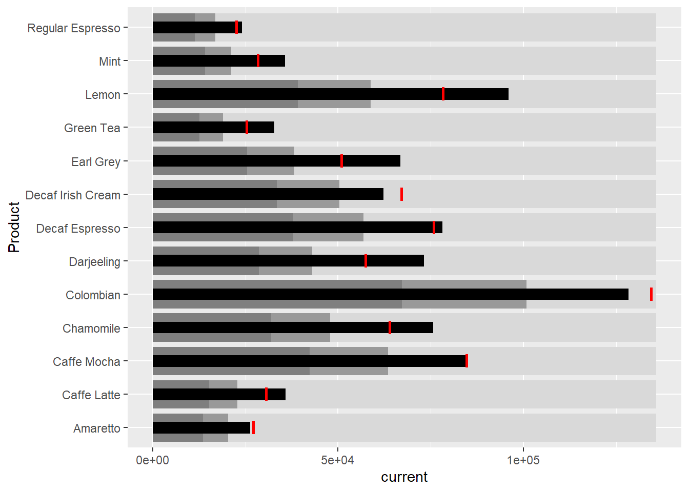
Hands-on Exercise 10 — Information Dashboard Design with R
Explored the building blocks of an information dashboard in R, (1) bullet charts and sparklines drawn with ggplot2, (2) static dashboard tables with inline bullet charts and sparklines built using gt and gtExtras, and (3) interactive dashboard tables built using reactable and reactablefmtr, covering highlighted points, labels, reference lines, bandlines and sparkbars over Coffee Chain sales data.